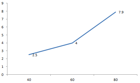
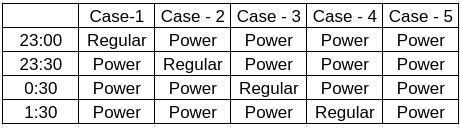
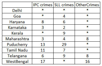
The air-conditioner (AC) in a large room can be operated either in REGULAR mode or in POWER mode to reduce the temperature.
If the AC operates in REGULAR mode, then it brings down the temperature inside the room(called inside temperature) at a constant rate to the set temperature in 1 hour. If it operates in POWER mode, then this is achieved in 30 minutes.
If the AC is switched off, then the inside temperature rises at a constant rate so as to reach the temperature outside at the time of switching off in 1 hour.
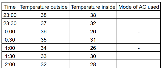
The temperature outside has been falling at a constant rate from 7 pm onward until 3 am on a particular night. The following graph shows the inside temperature between 11 pm (23:00)and 2 am (2:00) that night.
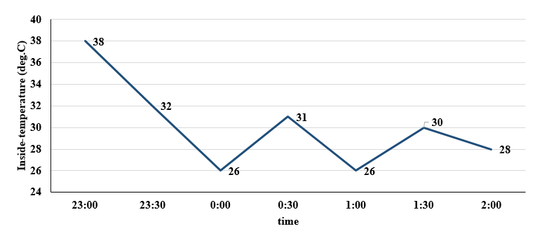
The following facts are known about the AC operation that night.
• The AC was turned on for the first time that night at 11 pm (23:00).
• The AC setting was changed (including turning it on/off, and/or setting different temperatures) only at the beginning of the hour or at 30 minutes after the hour.
• The AC was used in POWER mode for longer duration than in REGULAR mode during this 3-hour period.


_4xriv7G.png)