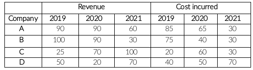
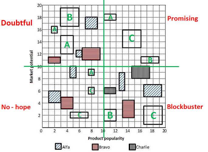
Let us divide the given figure in four quadrants (Q1, Q2, Q3, Q4).
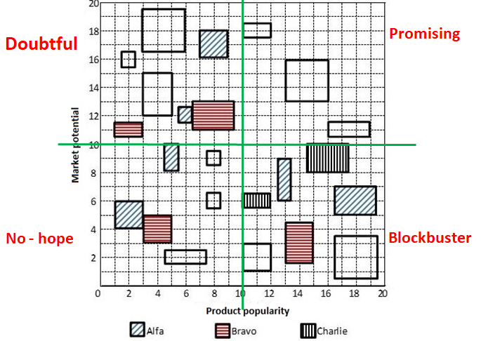
Let us solve this problem by considering only one category at a time.
(A) Blockbuster category: We have two information regarding Blockbuster category.
1. Alfa and Bravo had the same number of products in the Blockbuster category.
There are a total of 7 products in Blockbuster category. Alfa already has two products in blockbuster category. If Alfa has 3 products in blockbuster category then Bravo will also have 3 products in Blockbuster category which is not possible as there are 2 products of Charlie. Hence, we can say that Alfa and Bravo have 2 products each in Blockbuster category whereas Charlie has 3 products in Blockbuster category.
2. It is also given that Charlie had a higher revenue than Bravo from products in the Blockbuster category.
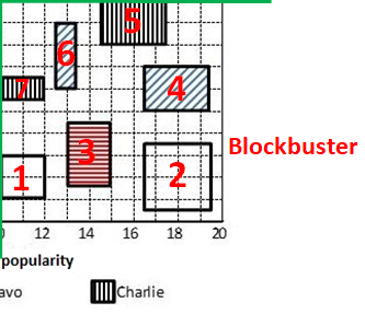
We know that one of the product 1 and 2 is from Charlie and the other is from Bravo.
If product 1 is from Charlie, then we can say that products 1, 7 and 5 are from Charlie. Therefore, revenue generated by products in Charlie category = 2 + 4 + 6 = 12 units. (Assuming area of a square to be 1 unit)
In this case product 2 and product n are from Bravo.Therefore, revenue generated by products in Bravo category = 6 + 9 = 15 units.
We can see that products from Charlie have a higher revenue than Bravo. Hence, this case in not possible.
Therefore, we can say that Product 1 is from Bravo and Product 2 is from Charlie. We have determined each product's company name in Blockbuster category.
(B) No-hope category: We have two information regarding No-hope category.
(1) Charlie had more products than Bravo but fewer products than Alfa in the No-hope category. Bravo and Charlie had the same revenue from products in the No-hope category.There are a total of 6 products in no-hope category.
Therefore, we can say that Alfa, Charlie and Bravo have 3, 2 and 1 products in No-hope category in that order.
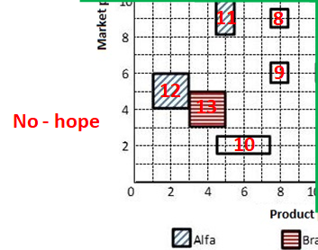
Bravo and Charlie had the same revenue from products in the No-hope category.
Revenue generated for Bravo in the No-hope category = 4 units. We need same revenue for Charlie which ha s 2 products in this category. Hence, we can say that Product 10 and one of product 8 and 9 is from Charlie and other is from Alfa. Let's assume that product 8 is from Charlie and product 9 is from Alfa.
(C) Doubtful category: We have two information regarding Doubtful category.
(1). Charlie did not have any product in the Doubtful category, while Alfa had one product more than Bravo in this category .
(2). Bravo had a higher revenue than Alfa from products in the Doubtful category.
We can see that there are a total of 7 products in this category. Hence, we can say that 4 products are from Alfa and 3 products are from Bravo.
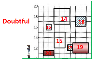
We can see that one of product 14, 15 and 16 is from Bravo company and others are from Alfa company. Bravo will have higher revenue than Alfa only when product no. 14 is from Bravo and others (15 and 16) are from Alfa category.
In this case total revenue by Bravo = Product 14 + Product 19 + Product 20 = 9 + 6 + 2 = 17
Similarly, total revenue by Charlie = Product 15 + Product 16 + Product 17 + Product 18 = 6 + 1 + 1 + 4 = 12
(D) Promising category: We have only 1 direct information regarding Promising category.
1. Each company had an equal number of products in the Promising category.

There are a total of 3 products in promising category with different revenue. Therefore, we can say that each company had 1 product in promising category. We are given that Alfa and Charlie had the same total revenue considering all products. We can calculate the revenue generated by Alfa and Charlie from the products in categories.
Revenue generated by Charlie from all categories except Promising = From Blockbuster + From No-hope + From Doubtful
$$\Rightarrow$$ (9+6+2) + (3+1) + (0) = 21 units
Revenue generated by Alfa from all categories except Promising = From Blockbuster + From No-hope + From Doubtful
$$\Rightarrow$$ (6+3) + (4+2+1) + (1+6+4+1) = 28 units
We can see the difference between revenue generated by Charlie and Alfa from remaining categories is 7 units. Hence, we can say that Charlie's product's revenue should be 7 units more than Alfa's product's revenue in Promising category. That is possible only in one case where product 22 is from Charlie and product 21 is form Alfa. Consequently, we can say that product 23 is from Bravo. Now we have identified each product's company name we can answer all the questions.
Let us check all options.
Option (A): Alfa's revenue from Blockbuster products was the same as Charlie's revenue from Promising products
Alfa's revenue from Blockbuster products = 6 + 3 = 9 units.
Charlie's revenue from Promising products = 9 units. Hence, this statement is true.
Option (B): Bravo's revenue from Blockbuster products was greater than Alfa's revenue from Doubtful products.
Bravo's revenue from Blockbuster products = 6 + 4 = 10 units.
Alfa's revenue from Doubtful products = 6 + 4 +1 + 1 = 12 units. Hence, this statement is false.
Option (C): Bravo and Charlie had the same revenues from No-hope products.
Bravo's revenue from No-hope products = 4 units.
Charlie's revenue from No-hope products = 3 + 1 = 4 units. Hence, this statement is true.
Option (D): The total revenue from No-hope products was less than the total revenue from Doubtful products
Revenue generated by the products in Doubtful category = 1 + 9 + 4 + 6 + 2 + 1 + 6 = 29 units.
Revenue generated by the products in No-hope category = 4 + 4 + 3 + 2 + 1 + 1 = 15 units. Hence, this statement is true.
We can see that statement mentioned in option B is false. Therefore, option B is the correct answer.