NPAT 27th June 2021 Shift 1
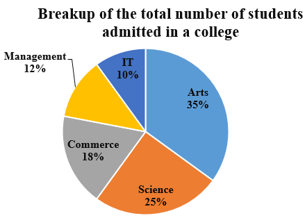
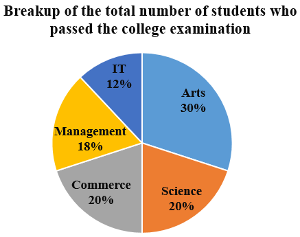
The following pie charts show the percentage-wise distribution of the total number of students admitted across five different streams in a college, as well as the percentage-wise distribution of students who passed the college examination in each stream. Study the pie charts carefully and answer the questions that follow.
NPAT 27th June 2021 Shift 1 - Question 71
If 5000 students were admitted in the college and 60% of them passed the college examination, how many students in the Commerce stream failed?
NPAT 27th June 2021 Shift 1 - Question 72
If the ratio of the number of students admitted to the total number of students who passed the examination is 5: 3, the ratio of the number of students admitted in the Science stream to the number of students passing the examination in the Science stream is:
NPAT 27th June 2021 Shift 1 - Question 73
If 360 students were admitted in the Management stream and 180 of them passed, what was the ratio of the total number of students admitted in all the streams to the total number of students who passed the examination in all the streams?
NPAT 27th June 2021 Shift 1 - Question 74
f the number of students passing the examination in the Arts stream was 270 more than those passing in the IT stream and 50% of the students admitted in the Science stream passed the examination, how many students were admitted in the college in all the streams?
Question Label: Comprehension
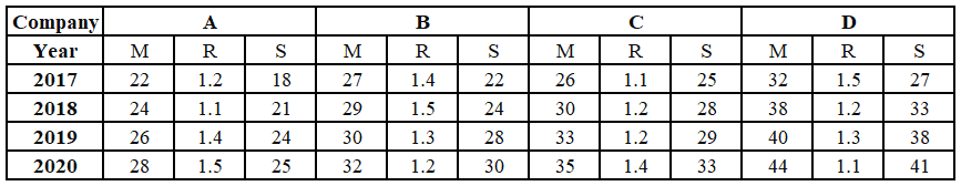
The following table shows the number of cars (in thousands) manufactured (M), rejected (R), and sold (S) by four companies—A, B, C, and D—over a period of four years. Study the table carefully and answer the questions that follow.
NPAT 27th June 2021 Shift 1 - Question 75
Approximately, what per cent of the accepted cars were sold by Company C in the year 2020?
NPAT 27th June 2021 Shift 1 - Question 76
The number of cars accepted by Companies A and Din 2017 and 20 19 is approximately how many times of the number of cars rejected by these two companies in the same two years?
NPAT 27th June 2021 Shift 1 - Question 77
The average number of accepted cars per year remaining unsold by Company B during the four-year period is:
NPAT 27th June 2021 Shift 1 - Question 78
The number of accepted cars remaining unsold in 20 18 was the highest for which of the following companies?
Question Label: Comprehension
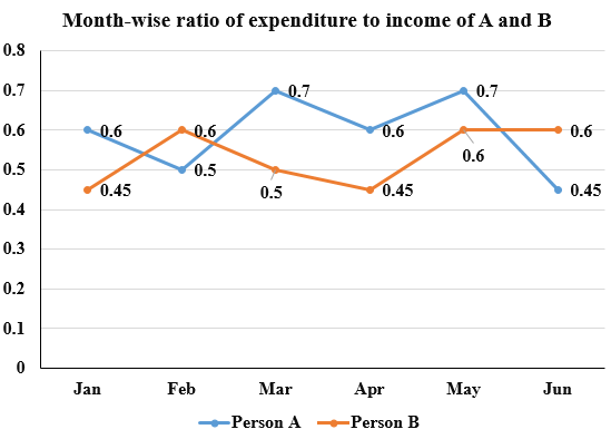
The following line graph shows the month-wise ratio of expenditure to income of two persons, A and B, over a period of six months. Study the graph carefully and answer the questions that follow.
NPAT 27th June 2021 Shift 1 - Question 79
If A and B had the same monthly income during the entire period, then whose average monthly expenditure was more than the other?
NPAT 27th June 2021 Shift 1 - Question 80
If the income of A was f30,000 and that of B was f15,000 every month, in which of the following months was the difference between the expenditures of A and B the highest?