Study the pie chart and answer the questions that follow:
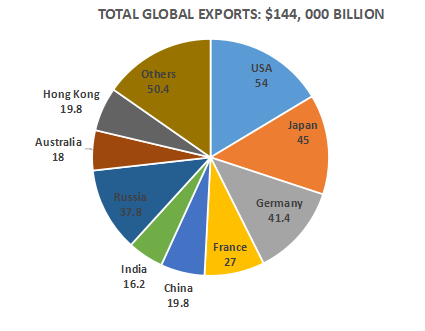
Note : The value of exports represents the angle corresponding to each country in the pie chart.
Sign in
Please select an account to continue using cracku.in
↓ →
Study the pie chart and answer the questions that follow:
Note : The value of exports represents the angle corresponding to each country in the pie chart.
The ratio of the value of exports between the total exports of USA and Japan to the total exports of Australia and France is
Total value for USA and Japan = 54+45 = 99
Total value for Australia and Japan = 18+27 = 45
The ratio of the total exports of the USA and Japan to the total exports of Australia and France = 99:45 = 11:5
What is number of countries whose exports are more than the average exports per country? (Assume‘Others’ as a single country)
Total countries = 10
So average angle will be 360/10 = 36
Now therefore countries subtending angle>35 are 5 .
By how much does the value of the exports of Japan exceed that of Australia?
Angle exceeds by 45-18 =27
so value will be $$\frac{27}{360}\times\ 144,000$$= 10,800 billion$
What is value of total exports of USA and France as a percentage of the total exports of Japan, China, Russia and Hongkong?
Total angle of USA and France =81
Total angle of Japan, China, Russia and Hongkong =122.4
Now therefore total exports of USA and France as a percentage of the total exports of Japan, China, Russia and Hongkong:$$\frac{81}{122.4}\times\ 100=66.1764$$
Yes, Charts is an important topic in the Data Interpretation portion of the Quantitative Aptitude section of CMAT. It evaluates a candidate's ability to interpret graphical data and solve numerical problems accurately.
The number of Charts questions varies from year to year. CMAT does not prescribe a fixed number of questions from any individual Data Interpretation topic.
CMAT may include questions based on bar charts, line graphs, pie charts, tables, mixed graphs, and caselets involving percentages, ratios, averages, and data comparison.
Practice interpreting different types of charts regularly, strengthen arithmetic concepts, improve calculation speed using approximation techniques, and solve previous year questions and mock tests consistently.
Most Charts questions in CMAT are of easy to moderate difficulty. With regular practice and strong calculation skills, candidates can solve them accurately and efficiently.
Cracku's CMAT Charts Questions provide topic-wise practice, detailed solutions, and exam-oriented question sets that help candidates improve data interpretation skills, speed, and accuracy for CMAT 2027.

Educational materials for CAT preparation