Join WhatsApp Icon JEE WhatsApp Group
NCERT Solutions for Class 8 Maths

Chapter 5: Tales by Dots and Lines

Download Solutions PDF
Daily JEE Updates, Tips & Important Alerts
Join 30,000+ students and stay updated with JEE notifications and preparation insights.
Join Now!
Free PDF
Complete NCERT Solution PDF for Chapter 5: Tales by Dots and Lines
Download Solutions PDF

Intext Questions (Section 5.1: The Balancing Act)

1 Consider any 2 numbers. Find their average/arithmetic mean. Repeat this by taking other pairs. What do you observe?

Solution

Let us pick a few pairs and find their means:

Pair $$3, 7$$: mean $$= \dfrac{3+7}{2} = 5$$.

Pair $$8, 9$$: mean $$= \dfrac{8+9}{2} = 8.5$$.

Pair $$4, 20$$: mean $$= \dfrac{4+20}{2} = 12$$.

Pair $$11, 15$$: mean $$= \dfrac{11+15}{2} = 13$$.

Observation: In every case the mean lies exactly halfway between the two numbers. If the two numbers are $$a$$ and $$b$$, then the distance of the mean $$\dfrac{a+b}{2}$$ from $$a$$ equals its distance from $$b$$ (both equal $$\dfrac{|b-a|}{2}$$). So the mean of two numbers is the midpoint of the pair.

Answer

The arithmetic mean of any two numbers lies exactly halfway between them; it is equidistant from both.

2

Calculate and mark the mean of each collection of data below.

(The four dot plots shown are: (a) three teal dots at 6, 7, 8 on a 0-8 scale; (b) three teal dots at 3, 6, 9 on a 0-8 scale; (c) three yellow dots at 2, 4, 8 on a 0-8 scale; (d) three yellow dots at 3, 9, 15 on a 3-15 scale.)

Solution

(a) Values $$6, 7, 8$$: $$\text{mean} = \dfrac{6+7+8}{3} = \dfrac{21}{3} = 7$$. Mark the mean at $$7$$.

(b) Values $$3, 6, 9$$: $$\text{mean} = \dfrac{3+6+9}{3} = \dfrac{18}{3} = 6$$. Mark the mean at $$6$$.

(c) Values $$2, 4, 8$$: $$\text{mean} = \dfrac{2+4+8}{3} = \dfrac{14}{3} \approx 4.67$$. Mark the mean at $$\dfrac{14}{3}$$.

(d) Values $$3, 9, 15$$: $$\text{mean} = \dfrac{3+9+15}{3} = \dfrac{27}{3} = 9$$. Mark the mean at $$9$$.

Answer

(a) $$7$$; (b) $$6$$; (c) $$\dfrac{14}{3} \approx 4.67$$; (d) $$9$$.

3 Can you explain how the mean is the centre of each collection?

Solution

The mean can be viewed as a balance point of the collection. For each collection, if we look at the distances of every value from the mean, the total distance of values that are less than the mean equals the total distance of values that are greater than the mean.

(a) Values $$6, 7, 8$$, mean $$= 7$$. Distance below: $$|6-7| = 1$$. Distance above: $$|8-7| = 1$$. Both sides balance ($$1 = 1$$).

(b) Values $$3, 6, 9$$, mean $$= 6$$. Below: $$|3-6| = 3$$. Above: $$|9-6| = 3$$. Balanced.

(c) Values $$2, 4, 8$$, mean $$= \dfrac{14}{3}$$. Below: $$\left(\dfrac{14}{3}-2\right) + \left(\dfrac{14}{3}-4\right) = \dfrac{8}{3} + \dfrac{2}{3} = \dfrac{10}{3}$$. Above: $$8 - \dfrac{14}{3} = \dfrac{10}{3}$$. Balanced.

(d) Values $$3, 9, 15$$, mean $$= 9$$. Below: $$|3-9| = 6$$. Above: $$|15-9| = 6$$. Balanced.

So in each collection the mean is a point where the total distance of smaller values matches the total distance of larger values — a natural centre.

Answer

The mean is the balance point of the data — the total distance of the values below the mean equals the total distance of the values above the mean.

4

Mark the mean for the collections below.

(Four dot plots are shown: (a) orange dots at 10, 12, 14, 16, 18; (b) orange dots at 4, 5, 15, 16 on a 4-16 scale; (c) green dots at 9, 10, 17 on a 9-17 scale; (d) green dots at 2, 3, 10, 12 on a 0-12 scale.)

Solution

(a) Values $$10, 12, 14, 16, 18$$: $$\text{mean} = \dfrac{10+12+14+16+18}{5} = \dfrac{70}{5} = 14$$. Mark the mean at $$14$$.

(b) Values $$4, 5, 15, 16$$: $$\text{mean} = \dfrac{4+5+15+16}{4} = \dfrac{40}{4} = 10$$. Mark the mean at $$10$$.

(c) Values $$9, 10, 17$$: $$\text{mean} = \dfrac{9+10+17}{3} = \dfrac{36}{3} = 12$$. Mark the mean at $$12$$.

(d) Values $$2, 3, 10, 12$$: $$\text{mean} = \dfrac{2+3+10+12}{4} = \dfrac{27}{4} = 6.75$$. Mark the mean at $$6.75$$.

Answer

(a) $$14$$; (b) $$10$$; (c) $$12$$; (d) $$6.75$$.

5 Can you explain how the mean is the centre of each collection?

Solution

As before, the mean acts as a balance point: the total distance from the mean to the smaller values equals the total distance from the mean to the larger values.

(a) $$10, 12, 14, 16, 18$$, mean $$= 14$$. LHS: $$(14-10)+(14-12)=4+2=6$$. RHS: $$(16-14)+(18-14)=2+4=6$$. Balanced.

(b) $$4, 5, 15, 16$$, mean $$= 10$$. LHS: $$(10-4)+(10-5)=6+5=11$$. RHS: $$(15-10)+(16-10)=5+6=11$$. Balanced.

(c) $$9, 10, 17$$, mean $$= 12$$. LHS: $$(12-9)+(12-10)=3+2=5$$. RHS: $$(17-12)=5$$. Balanced.

(d) $$2, 3, 10, 12$$, mean $$= 6.75$$. LHS: $$(6.75-2)+(6.75-3)=4.75+3.75=8.5$$. RHS: $$(10-6.75)+(12-6.75)=3.25+5.25=8.5$$. Balanced.

Notice that the mean need not be the midpoint of the extreme values — it is the point where the total distances on either side are equal.

Answer

For each collection the total distance of values below the mean equals the total distance of values above it, so the mean is the balance-point of the data.

6 Verify that this holds for all the collections of data shown earlier.

Solution

For every collection encountered so far we compute LHS $$=$$ sum of (mean $$-$$ each smaller value) and RHS $$=$$ sum of (each larger value $$-$$ mean) and check LHS $$=$$ RHS.

DataMeanLHS (below)RHS (above)
$$6,7,8$$$$7$$$$7-6=1$$$$8-7=1$$
$$3,6,9$$$$6$$$$6-3=3$$$$9-6=3$$
$$2,4,8$$$$\dfrac{14}{3}$$$$\dfrac{8}{3}+\dfrac{2}{3}=\dfrac{10}{3}$$$$8-\dfrac{14}{3}=\dfrac{10}{3}$$
$$3,9,15$$$$9$$$$9-3=6$$$$15-9=6$$
$$10,12,14,16,18$$$$14$$$$4+2=6$$$$2+4=6$$
$$4,5,15,16$$$$10$$$$6+5=11$$$$5+6=11$$
$$9,10,17$$$$12$$$$3+2=5$$$$5$$
$$2,3,10,12$$$$6.75$$$$4.75+3.75=8.5$$$$3.25+5.25=8.5$$

In every case LHS equals RHS, so the mean is indeed the balancing centre for each collection.

Answer

Verified — for every collection the total distance below the mean equals the total distance above it.

7 Can there be more than one such 'centre'? In other words, is there any other value such that the sum of the distances to the values lower than it and the values higher than it will still be equal?

Solution

No — there is only one such balance point, and it is the mean.

Take any value $$c$$ that is larger than the mean $$a$$. Compared with the balance at $$a$$, every distance from a smaller value increases by $$(c-a)$$ and every distance from a larger value decreases by $$(c-a)$$ (values that were larger than $$a$$ but smaller than $$c$$ actually flip sides — but even then the LHS grows and RHS shrinks overall). So LHS becomes bigger than RHS and the balance is lost.

Symmetrically, if we take $$c$$ smaller than $$a$$, then LHS shrinks and RHS grows, again breaking the balance.

Hence the only value that keeps the two sums of distances equal is the mean itself.

Answer

No — the mean is the unique value at which the total distances on either side balance.

8 In the case of the collection $$10, 10, 11,$$ and $$17$$ whose mean is $$12$$, suppose there is a different centre larger than $$12$$.

Solution

At the mean $$12$$, LHS $$= (12-10)+(12-10)+(12-11) = 2+2+1 = 5$$ and RHS $$= 17-12 = 5$$; the two sides balance.

Now try a value $$c > 12$$. Since $$10, 10, 11$$ are all less than $$c$$, each of these distances increases compared to the distances from $$12$$. Meanwhile the value $$17$$, which is still larger than $$c$$ (as long as $$c<17$$), contributes a smaller distance $$17-c$$. So:

LHS increases while RHS decreases $$\Longrightarrow$$ LHS $$>$$ RHS.

For example, at $$c = 13$$: LHS $$= 3+3+2 = 8$$, RHS $$= 17-13 = 4$$ — clearly unequal. So no value larger than $$12$$ can serve as the centre. By the same reasoning, no value smaller than $$12$$ can either. The mean $$12$$ is the unique centre.

Answer

For every $$c > 12$$ the sum of distances to values below $$c$$ exceeds the sum to values above, so no value greater than $$12$$ can be a centre — $$12$$ (the mean) is the only balance point.

9 Will including a new value in the data increase or decrease the mean?

Solution

Suppose the current data has $$n$$ values with mean $$a$$, so the total is $$na$$. Include a new value $$v$$. The new total is $$na + v$$ and the new mean is:

$$a' = \dfrac{na + v}{n+1}.$$

Compare with $$a$$: $$a' - a = \dfrac{na+v}{n+1} - a = \dfrac{na + v - a(n+1)}{n+1} = \dfrac{v - a}{n+1}.$$

So the change in mean has the same sign as $$(v-a)$$:

  • If $$v > a$$ (new value greater than the old mean), the mean increases.
  • If $$v < a$$, the mean decreases.
  • If $$v = a$$, the mean stays the same.

Answer

It depends on the new value: the mean increases if the new value is greater than the current mean, decreases if it is smaller, and stays the same if it equals the mean.

10 What happens to the mean when an existing value is removed? When will the mean increase, decrease, or stay the same?

Solution

Suppose there are $$n$$ values with mean $$a$$, so the total is $$na$$. Remove a value $$v$$. The new total is $$na - v$$ and the new mean is:

$$a' = \dfrac{na - v}{n-1}.$$

Compare with $$a$$: $$a' - a = \dfrac{na - v}{n-1} - a = \dfrac{na - v - a(n-1)}{n-1} = \dfrac{a - v}{n-1}.$$

So the change has the same sign as $$(a - v)$$:

  • If $$v < a$$ (we removed a value smaller than the mean), then $$a - v > 0$$, so the mean increases.
  • If $$v > a$$, the mean decreases.
  • If $$v = a$$, the mean stays the same.

Removing a value pulls the mean away from that value.

Answer

Removing a value smaller than the mean increases the mean; removing a value greater than the mean decreases it; removing a value equal to the mean leaves the mean unchanged.

11 What happens to the mean if a value equal to the mean is included or removed? Try to explain this using the fair-share interpretation of mean that we studied last year.

Solution

The mean does not change.

Algebra: If the current mean is $$a$$ with $$n$$ values (total $$na$$), then including a value equal to $$a$$ gives new mean $$\dfrac{na + a}{n+1} = \dfrac{a(n+1)}{n+1} = a$$. Removing a value equal to $$a$$ gives $$\dfrac{na - a}{n-1} = \dfrac{a(n-1)}{n-1} = a$$.

Fair-share interpretation: The mean is what each person would get if the total were shared equally. If everyone already has $$a$$ units and one more person joins with exactly $$a$$ units, no one has to give up or receive anything — each person still ends up with $$a$$. Similarly, if a person who had exactly $$a$$ units leaves, the remaining people still have $$a$$ each. So the fair share does not change.

Answer

The mean stays the same. Including (or removing) a person with exactly the mean amount does not disturb the fair-share equal distribution.

12

Explore if it is possible to include or remove 2 values such that the mean is unchanged.

You may use the following data to experiment with. (A dot plot with a collection of orange dots between 2 and 15 with mean $$= 9$$ is provided.)

Solution

Yes, it is possible. If we add two values $$u$$ and $$v$$ to a data of $$n$$ values with mean $$a$$, the new mean is:

$$a' = \dfrac{na + u + v}{n+2}.$$

For $$a' = a$$ we need $$na + u + v = a(n+2)$$, i.e. $$u + v = 2a$$, so the two new values must have average $$a$$.

For the shown data (mean $$= 9$$), any pair whose sum is $$18$$ works. Examples:

  • Add $$4$$ and $$14$$ (both new values average to $$9$$). Sum increases by $$18$$, count by $$2$$, and mean stays $$9$$.
  • Add $$6$$ and $$12$$, or $$5$$ and $$13$$, or $$9$$ and $$9$$ itself.

The same rule applies to removal: remove any two values whose average equals the mean. From the shown data one could remove two dots whose values sum to $$18$$ (say a $$7$$ and an $$11$$) and the mean would still be $$9$$.

Answer

Yes. Two values can be added (or removed) without changing the mean whenever the sum of those two values equals $$2 \times \text{mean}$$. For the shown data (mean $$= 9$$), any pair summing to $$18$$ works, e.g., $$4$$ and $$14$$.

13 How about including or removing 3 values without changing the mean? Is it possible?

Solution

Yes. Adding three new values $$u, v, w$$ to a data of $$n$$ values with mean $$a$$ gives new mean:

$$a' = \dfrac{na + u + v + w}{n+3}.$$

For $$a' = a$$ we need $$u + v + w = 3a$$, i.e., the three new values must themselves have mean $$a$$.

For the shown data (mean $$= 9$$), any triplet whose sum is $$27$$ works. Examples:

  • Add $$3, 9, 15$$ (sum $$= 27$$, mean $$= 9$$).
  • Add $$5, 8, 14$$ (sum $$= 27$$).
  • Add $$9, 9, 9$$ (three copies of the mean).

The same idea applies to removal — remove any three values whose sum is $$3a$$ and the mean stays the same.

Answer

Yes. Add (or remove) any three values whose sum equals $$3 \times \text{mean}$$. For the shown data (mean $$= 9$$) any triple summing to $$27$$ works, e.g., $$3, 9, 15$$.

14 Can we include 2 values less than the mean and 1 value greater than the mean, so that the mean remains the same?

Solution

Yes. From the previous exploration, the three added values must sum to $$3 \times \text{mean}$$. For the shown data (mean $$= 9$$), the sum must be $$27$$.

We now insist that two of the three values are less than $$9$$ and one is greater than $$9$$.

Example: pick $$5$$ and $$7$$ (both less than $$9$$). Their sum is $$12$$, so the third value must be $$27 - 12 = 15$$, which is indeed greater than $$9$$. So we can add $$5, 7$$ and $$15$$.

Another example: $$3, 8, 16$$ (both $$3, 8 < 9$$ and $$16 > 9$$, sum $$= 27$$).

So it is definitely possible — as long as the total of the two smaller additions and one larger addition equals $$27$$.

Answer

Yes. Any triplet with two values less than $$9$$ and one greater than $$9$$ whose total is $$27$$ works — for example, $$5, 7,$$ and $$15$$.

15 Try to include 2 values greater than the mean and 1 value less than the mean, so that the mean stays the same.

Solution

Again the three added values must sum to $$27$$ (since the current mean is $$9$$).

Choose two values greater than $$9$$, say $$10$$ and $$14$$; their sum is $$24$$, so the third value (which must be less than $$9$$) has to be $$27 - 24 = 3$$. So we can add $$10, 14$$ and $$3$$.

Another possibility: $$11$$ and $$12$$ (sum $$23$$) and $$4$$ ($$< 9$$) — sum $$= 27$$.

Or $$10, 13$$ and $$4$$.

Answer

Yes. For example, add $$10, 14$$ (both greater than $$9$$) and $$3$$ (less than $$9$$). Their sum $$27 = 3 \times 9$$ keeps the mean at $$9$$.

16 We saw what happens to the mean when values are included or removed from the collection. What happens to the mean if every value in the collection increases by some fixed number?

Solution

Suppose there are $$n$$ values $$x_1, x_2, \ldots, x_n$$ with mean $$a = \dfrac{x_1 + x_2 + \cdots + x_n}{n}$$.

Add the same fixed number $$k$$ to every value. The new values are $$x_1 + k,\ x_2 + k,\ \ldots,\ x_n + k$$, and their mean is:

$$\dfrac{(x_1+k) + (x_2+k) + \cdots + (x_n+k)}{n} = \dfrac{(x_1 + x_2 + \cdots + x_n) + nk}{n} = a + k.$$

So the mean also increases by exactly $$k$$. Every dot on the dot plot shifts right by $$k$$, and so does the balance point.

Answer

The mean also increases by exactly the same fixed number.

17 Consider the data: $$8, 3, 10, 13, 4, 6, 7, 7, 8, 8, 5$$. Calculate its mean.

Solution

Add up all $$11$$ values:

$$8+3+10+13+4+6+7+7+8+8+5 = 79.$$

Divide by the number of values ($$n = 11$$):

$$\text{Mean} = \dfrac{79}{11} \approx 7.18.$$

Answer

Mean $$= \dfrac{79}{11} \approx 7.18$$.

18

Now, consider this data with every value increased by 10: $$18, 13, 20, 23, 14, 16, 17, 17, 18, 18, 15$$. What is its mean? Is there a quicker way to find out?

[Hint: Observe the dot plots corresponding to the two data collections.]

Solution

The new data is obtained from the previous one by adding $$10$$ to every value. By the property we just proved (question 16), the mean also increases by $$10$$:

$$\text{New mean} = \dfrac{79}{11} + 10 = \dfrac{79 + 110}{11} = \dfrac{189}{11} \approx 17.18.$$

Direct check: $$18+13+20+23+14+16+17+17+18+18+15 = 189$$ and $$189 \div 11 \approx 17.18$$. ✓

The quicker way: since every value shifted right by $$10$$, the mean shifts right by $$10$$ too — no need to recompute the whole sum.

Answer

Mean $$= \dfrac{189}{11} \approx 17.18$$, which is $$10$$ more than the previous mean $$7.18$$ — quicker to compute by shifting.

19 Try to explain, using algebra, what the average is when a fixed number, e.g. 2 is subtracted from every value in the collection.

Solution

Let the collection be $$x_1, x_2, \ldots, x_n$$ with mean $$a = \dfrac{x_1 + x_2 + \cdots + x_n}{n}$$.

Subtract $$2$$ from every value. The new values are $$x_1 - 2, x_2 - 2, \ldots, x_n - 2$$. Their mean is:

$$\dfrac{(x_1-2) + (x_2-2) + \cdots + (x_n-2)}{n} = \dfrac{(x_1 + x_2 + \cdots + x_n) - 2n}{n} = a - 2.$$

So subtracting the fixed number $$2$$ from every value decreases the mean by $$2$$. More generally, subtracting any fixed $$k$$ decreases the mean by $$k$$.

Answer

Subtracting the same fixed number (here $$2$$) from every value decreases the mean by exactly that number, giving new mean $$= a - 2$$.

20 Try to explain this using the fair-share interpretation of average that you learnt last year.

Solution

Recall the fair-share picture: the mean is the amount each person would end up with if the total were shared equally.

Suppose there are $$n$$ people currently holding a fair-share of $$a$$ units each. If every person now gives away the same fixed amount (say $$2$$ units), each person is left with $$a - 2$$ units, which is still an equal share. So the new fair share — that is, the new average — is exactly $$a - 2$$.

The same reasoning explains why adding a fixed amount $$k$$ to every value raises the average by $$k$$: everyone gains the same $$k$$, so the fair share also rises by $$k$$.

Answer

If each person parts with the same fixed amount, everyone still has an equal share, only reduced by that amount — so the average decreases by exactly the amount subtracted.

21 What happens to the average if every value in the collection is doubled?

Solution

Let the data be $$x_1, x_2, \ldots, x_n$$ with mean $$a = \dfrac{x_1 + x_2 + \cdots + x_n}{n}$$.

Doubling every value gives $$2x_1, 2x_2, \ldots, 2x_n$$. Their mean is:

$$\dfrac{2x_1 + 2x_2 + \cdots + 2x_n}{n} = \dfrac{2(x_1 + x_2 + \cdots + x_n)}{n} = 2a.$$

So the average is also doubled. More generally, if every value is multiplied by a constant $$c$$, the average is multiplied by $$c$$.

Answer

The average is also doubled.

22

Will including a new value to the data increase or decrease the median?

Let us consider the following data (a dot plot with dots at $$5, 7, 8, 11, 13$$). The median of this data is $$8$$.

Solution

The median of $$5, 7, 8, 11, 13$$ is the middle value $$8$$ (there are $$5$$ values, so the $$3$$rd is the median).

Case 1: new value greater than the median. Include $$11$$. New sorted data: $$5, 7, 8, 11, 11, 13$$ — $$6$$ values. The median is the average of the $$3$$rd and $$4$$th values: $$\dfrac{8+11}{2} = 9.5$$. The median increased from $$8$$ to $$9.5$$.

Case 2: new value less than the median. Include $$4$$. New sorted data: $$4, 5, 7, 8, 11, 13$$. Median $$= \dfrac{7+8}{2} = 7.5$$. The median decreased.

Case 3: new value equal to the median. Include $$8$$. New sorted: $$5, 7, 8, 8, 11, 13$$. Median $$= \dfrac{8+8}{2} = 8$$. The median stays the same.

So the effect on the median depends on how the new value compares with the current median.

Answer

Including a value greater than the median tends to increase the median, a value less than it tends to decrease the median, and a value equal to the median leaves it unchanged.

23

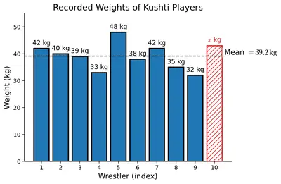
Coach Balwan noted down the weights of the kushti players (wrestlers) and the mean as shown. But one value that was written down got smudged. Can you find out the missing value?

The recorded weights (in kg) are: $$42, 40, 39, 33, 48, 38, 42, 35, 32$$, and one smudged value. The recorded average is $$39.2$$.

Figure
Figure

Solution

Let the missing (smudged) weight be $$w$$ kg. There are $$10$$ players in all, and the average weight is $$39.2$$ kg. Using

$$\text{Average} = \dfrac{\text{Total weight}}{\text{Number of players}},$$

we get:

$$\dfrac{42+40+39+33+48+38+42+35+32+w}{10} = 39.2.$$

Add up the nine known weights: $$42+40+39+33+48+38+42+35+32 = 349$$.

So $$\dfrac{349 + w}{10} = 39.2$$, giving $$349 + w = 392$$, and therefore $$w = 392 - 349 = 43$$.

The missing weight is $$43$$ kg.

Answer

The missing weight is $$43$$ kg.

24 Venkayya keeps track of the coconut harvest in his farm. He calculates the average harvest per tree as $$25.6$$. His son verifies the counts and finds that one tree's harvest count is incorrectly noted as $$3$$ more than the actual number. Can you find the correct average if the number of trees is $$15$$?

Solution

Let the (incorrect) total number of coconuts be $$z$$. Since the incorrect average is $$25.6$$ with $$15$$ trees:

$$\dfrac{z}{15} = 25.6 \implies z = 25.6 \times 15 = 384.$$

One tree's count was noted as $$3$$ more than the actual, so the actual total is

$$384 - 3 = 381.$$

The correct average harvest per tree is:

$$\dfrac{381}{15} = 25.4.$$

Answer

The correct average is $$\dfrac{381}{15} = 25.4$$ coconuts per tree.

25 Can we still find out the number of coconuts harvested? (Given that the data of harvest per tree is not given, but the average is $$25.6$$ and the number of trees is $$15$$.)

Solution

Yes. Even without the individual tree-wise data, we can find the total using

$$\text{Total} = \text{Average} \times \text{Number of trees}.$$

So the (originally recorded) total number of coconuts $$= 25.6 \times 15 = 384$$. After subtracting the over-count of $$3$$ on one tree, the actual number of coconuts harvested $$= 384 - 3 = 381$$.

Answer

Yes — the original count was $$25.6 \times 15 = 384$$, and the correct number of coconuts harvested is $$384 - 3 = 381$$.

26 What is the average family size of students in your class? How would you find this out?

Solution

To find the average family size, we would:

  1. Ask each student in the class how many members are there in their family (including themselves).
  2. Add up all these numbers to get the total family-member count across the class.
  3. Divide the total by the number of students in the class.

Formally, $$\text{Average family size} = \dfrac{\text{Sum of family sizes of all students}}{\text{Number of students}}$$.

The exact numerical value depends on your particular class. In many Indian classrooms today the answer typically lies between about $$4$$ and $$6$$.

Answer

Collect each student's family size, add them, and divide by the number of students. The value varies from class to class (commonly around $$4$$–$$6$$).

27

What is the average family size of this class?

The family size data of students in a class is shown in the table below:

NumberFrequency
33
411
59
67
73
81
91
101

Solution

The family size $$3$$ occurs $$3$$ times, size $$4$$ occurs $$11$$ times, and so on. So we must multiply each value by its frequency, add these products, and divide by the total number of students.

Total number of students $$= 3+11+9+7+3+1+1+1 = 36$$.

Sum of family sizes $$= (3\times 3)+(4\times 11)+(5\times 9)+(6\times 7)+(7\times 3)+(8\times 1)+(9\times 1)+(10\times 1)$$

$$= 9+44+45+42+21+8+9+10 = 188.$$

Average family size $$= \dfrac{188}{36} = \dfrac{47}{9} \approx 5.22$$.

Answer

Average family size $$= \dfrac{188}{36} \approx 5.22$$.

28 What is the median family size of this class?

Solution

There are $$36$$ students, so when the data is sorted, the median is the average of the $$18$$th and $$19$$th values.

Build the cumulative frequency:

Family sizeFrequencyCumulative count
333
41114
5923
6730
7333
8134
9135
10136

Positions $$15$$ through $$23$$ (in sorted order) all correspond to family size $$5$$. So both the $$18$$th and $$19$$th values are $$5$$, giving:

$$\text{Median} = \dfrac{5+5}{2} = 5.$$

Answer

The median family size is $$5$$.

29 Do we need to write all the 36 numbers in order? Is there a quicker way to find out (the median)?

Solution

No, we do not need to write all $$36$$ numbers. Because we already have the frequency table, we can use cumulative frequencies:

  • Start with the smallest value and add up frequencies as we go along.
  • The moment the cumulative count reaches (or exceeds) the median position (here, positions $$18$$ and $$19$$), the corresponding value is the median.

In this data, adding frequencies of family sizes $$3, 4, 5$$ gives $$3+11+9 = 23$$. Since $$14 < 18 \le 23$$ and $$14 < 19 \le 23$$, both the $$18$$th and $$19$$th sorted values are $$5$$. So the median is $$5$$.

This is much faster than listing all $$36$$ values in sorted order.

Answer

No. Use cumulative frequencies to locate the $$18$$th and $$19$$th values directly. Both are $$5$$, so the median is $$5$$.

30

Can you tell which cell has the marks obtained by Farooq in Mathematics?

Sudhakar has collected the mid-term exam marks obtained by his Grade 8 students in the following table:

NameOdiaTeluguEnglishMathsSocial ScienceScience
Ratna253929363437
Nagesh414348394039
Ashwin293133343028
Farooq474638424944
Mrinal333528323036
Gowri272934313230
Pankaj161922171820
Jaya313840504346
Ganesh393735383640
Shravan121721201418
Aishwarya484546474443
Hari252824212326
Trupti293630332733
Veeresh232528311922
Vidhya343637403234
Sanskruti354241463840
Shanker424539363139
Vyshnavi373229333135
Govind151812202018
Shiva292432342830
Tarun414439433742
Jyothi293033283429

In the spreadsheet, cells are named and referred to using the column headers labelled A, B, C, ... , and row headers labelled 1, 2, 3, ... (with row 1 as the header row).

Solution

In the spreadsheet the first row is a header row and Row $$1$$ has the column titles Name (A), Odia (B), Telugu (C), English (D), Maths (E), Social Science (F), Science (G).

The student rows start from Row $$2$$. In the given order, Farooq is the $$4$$th student, so his data lies in Row $$5$$ (because Row $$1$$ is the header and Rows $$2$$–$$4$$ hold Ratna, Nagesh, Ashwin).

Farooq's Mathematics mark ($$42$$) is therefore in the cell where column E meets row 5 — cell E5.

Answer

Cell $$\mathbf{E5}$$.

31 Can you tell what data is in column B (in the spreadsheet of Sudhakar's class marks)?

Solution

Column A of the spreadsheet contains the student names, so column B contains the marks of the next header — which is Odia.

Specifically, cells B2 through B23 hold the Odia marks of Ratna, Nagesh, Ashwin, Farooq, ..., Jyothi (in that order).

Answer

Column B contains the Odia marks of every student (cells B2–B23).

32 In which subjects has Ashwin scored more than 30 marks?

Solution

Reading Ashwin's row of marks:

SubjectOdiaTeluguEnglishMathsSocial ScienceScience
Mark293133343028

We need marks that are strictly greater than $$30$$. Comparing each:

  • Odia $$= 29$$ (not $$> 30$$)
  • Telugu $$= 31$$ ✓
  • English $$= 33$$ ✓
  • Maths $$= 34$$ ✓
  • Social Science $$= 30$$ (equal, not greater)
  • Science $$= 28$$ (not $$> 30$$)

So Ashwin scored more than $$30$$ in Telugu, English and Maths.

Answer

Telugu, English, and Maths.

33 What formula would you type to find out the class average marks in Science?

Solution

The Science marks lie in column G (the sixth subject column), starting from cell G2 (Ratna) to cell G23 (Jyothi), covering all $$22$$ students. The spreadsheet function that computes an average is AVERAGE.

So the formula to type in an empty cell is:

$$\texttt{=AVERAGE(G2:G23)}$$

Answer

$$\texttt{=AVERAGE(G2:G23)}$$

34 Find out if the class average marks in Odia is greater than the class average marks in Telugu.

Solution

In a spreadsheet, we would type $$\texttt{=AVERAGE(B2:B23)}$$ (Odia) in one cell and $$\texttt{=AVERAGE(C2:C23)}$$ (Telugu) in another, then compare.

Doing the arithmetic by hand:

Odia total: $$25+41+29+47+33+27+16+31+39+12+48+25+29+23+34+35+42+37+15+29+41+29 = 687$$.

Odia average $$= \dfrac{687}{22} \approx 31.23$$.

Telugu total: $$39+43+31+46+35+29+19+38+37+17+45+28+36+25+36+42+45+32+18+24+44+30 = 739$$.

Telugu average $$= \dfrac{739}{22} \approx 33.59$$.

Since $$31.23 < 33.59$$, the Odia class average is not greater than the Telugu class average — in fact, Telugu has the higher average.

Answer

No. Odia average $$\approx 31.23$$ while Telugu average $$\approx 33.59$$, so Telugu is greater than Odia.

35 Show the average marks in other subjects after the last row by typing the appropriate formulae.

Solution

The last student's row is Row $$23$$. In Row $$24$$, type the following formulae in the cells B24 to G24:

CellSubjectFormula
B24Odia$$\texttt{=AVERAGE(B2:B23)}$$
C24Telugu$$\texttt{=AVERAGE(C2:C23)}$$
D24English$$\texttt{=AVERAGE(D2:D23)}$$
E24Maths$$\texttt{=AVERAGE(E2:E23)}$$
F24Social Science$$\texttt{=AVERAGE(F2:F23)}$$
G24Science$$\texttt{=AVERAGE(G2:G23)}$$

Instead of typing each formula, you can also type only the first (B24) and then drag the fill handle rightwards through G24 — the spreadsheet automatically adjusts the column letter, giving each subject its own average.

Answer

In row 24, use $$\texttt{=AVERAGE(B2:B23)}$$ for Odia, and similarly $$\texttt{=AVERAGE(C2:C23)}, \ldots, \texttt{=AVERAGE(G2:G23)}$$ for the other subjects.

36 Get the total scores of each student by typing the appropriate formulae.

Solution

The six subject-marks of each student lie in columns B through G. Put a heading Total in cell H1. Then in cell H2 (for Ratna) type:

$$\texttt{=SUM(B2:G2)}$$

This adds up Ratna's six marks. Drag the fill handle downward through H23 (or copy the formula into H3, H4, ..., H23). The spreadsheet automatically changes the row number, giving:

  • H3 becomes $$\texttt{=SUM(B3:G3)}$$ (Nagesh's total)
  • H4 becomes $$\texttt{=SUM(B4:G4)}$$ (Ashwin's total)
  • ...and so on down to H23 for Jyothi.

Now column H contains the total marks scored by every student.

Answer

In cell H2 type $$\texttt{=SUM(B2:G2)}$$ and drag it down to H23 (or write $$\texttt{=SUM(B3:G3)}, \ldots, \texttt{=SUM(B23:G23)}$$ one per row).

Figure it Out (Section 5.1)

1 Find the mean of the following data and share your observations:

(i) The first $$50$$ natural numbers.

Solution

The first $$50$$ natural numbers are $$1, 2, 3, \ldots, 50$$. Their sum is

$$1+2+\cdots+50 = \dfrac{50 \times 51}{2} = 1275.$$

Number of values $$= 50$$, so

$$\text{Mean} = \dfrac{1275}{50} = 25.5.$$

Observation: The mean is exactly the midpoint of $$1$$ and $$50$$: $$\dfrac{1+50}{2} = 25.5$$ — the average of the first and last term. This is a special property of an evenly-spaced (arithmetic) sequence.

Answer

Mean $$= 25.5$$.

(ii) The first $$50$$ odd numbers.

Solution

The first $$50$$ odd numbers are $$1, 3, 5, \ldots, 99$$. There is a well-known identity: the sum of the first $$n$$ odd numbers is $$n^2$$. So

$$1+3+5+\cdots+99 = 50^2 = 2500.$$

Number of values $$= 50$$, so

$$\text{Mean} = \dfrac{2500}{50} = 50.$$

Observation: Again, this equals the average of the first and last terms, $$\dfrac{1+99}{2} = 50$$.

Answer

Mean $$= 50$$.

(iii) The first $$50$$ multiples of $$4$$.

Solution

The first $$50$$ multiples of $$4$$ are $$4, 8, 12, \ldots, 200$$. Factor out $$4$$:

$$4+8+12+\cdots+200 = 4(1+2+3+\cdots+50) = 4 \times \dfrac{50 \times 51}{2} = 4 \times 1275 = 5100.$$

Number of values $$= 50$$, so

$$\text{Mean} = \dfrac{5100}{50} = 102.$$

Observation: Since every value in (i) is multiplied by $$4$$ to obtain the values here, by the multiplication property of means (question 21) the mean is also multiplied by $$4$$: $$4 \times 25.5 = 102$$. ✓ It is also the midpoint $$\dfrac{4+200}{2} = 102$$.

Answer

Mean $$= 102$$.

2

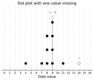
The dot plot below shows a collection of data and its average; but one dot is missing. Mark the missing value so that the mean is $$9$$ (as shown below).

(A dot plot on a $$0$$ to $$16$$ scale is shown with dots at $$4$$, $$7$$, $$8$$ (three dots stacked), $$9$$ (multiple dots), and $$11$$.)

Figure
Figure

Solution

Let the value of the missing dot be $$x$$. If the visible dots have sum $$S$$ and count $$n$$, then after adding the missing dot the total becomes $$S + x$$ across $$n + 1$$ values. Setting the mean equal to $$9$$:

$$\dfrac{S + x}{n + 1} = 9 \implies x = 9(n+1) - S.$$

Reading the dot plot, the visible dots are one at $$4$$, one at $$7$$, two dots at $$8$$, four dots at $$9$$, and one at $$11$$ — so $$n = 9$$ visible dots and

$$S = 4 + 7 + 2(8) + 4(9) + 11 = 4 + 7 + 16 + 36 + 11 = 74.$$

After adding the missing dot the total count becomes $$n+1 = 10$$, and we need $$9 \times 10 = 90$$ as the new sum. So

$$x = 90 - 74 = 16.$$

Mark the missing dot at position $$16$$ on the number line.

Answer

The missing dot should be placed at position $$16$$ (since $$x = 9 \times 10 - 74 = 16$$).

3 Sudhakar, the class teacher, asks Shreyas to measure the heights of all $$24$$ students in his class and calculate the average height. Shreyas informs the teacher that the average height is $$150.2$$ cm. Sudhakar discovers that the students were wearing uniform shoes when the measurements were taken and the shoes add $$1$$ cm to the height.

(i) Should the teacher get all the heights measured again without the shoes to find the correct average height? Or is there a simpler way?

Solution

There is no need to re-measure every student. The shoes added exactly the same extra height ($$1$$ cm) to every student. Recall the property (question 16 / 19): if every value in a data set is increased by a fixed number $$k$$, the mean also increases by exactly $$k$$.

So to get the correct mean (heights measured without shoes), we simply subtract $$1$$ cm from the reported average — a single subtraction, no re-measurement needed.

Answer

No re-measurement is needed. Since every reading is $$1$$ cm too high, just subtract $$1$$ cm from the reported average.

(ii)

What is the correct average height of the class?

(a) $$174.2$$ cm    (b) $$126.2$$ cm    (c) $$150.2$$ cm
(d) $$149.2$$ cm    (e) $$151.2$$ cm    (f) None of the above
(g) Insufficient information

Solution

Using the observation from part (i), subtract $$1$$ cm from the reported average:

$$\text{Correct average} = 150.2 - 1 = 149.2 \text{ cm}.$$

This matches option (d).

Answer

(d) $$149.2$$ cm.

4

The three dot plots below show the lengths, in minutes, of songs of different albums. Which of these has a mean of $$5.57$$ minutes? Explain how you arrived at the answer.

(Three dot plots labelled A, B, and C are shown on a scale from $$0$$ to $$7.5$$ minutes.)

Solution

Rather than compute each mean exactly, we can use the balance-point idea: the mean lies near the ‘centre of mass’ of the dots. A mean of $$5.57$$ minutes is fairly high — most of the dots must be clustered towards the higher end of the scale (between $$5$$ and $$7$$ minutes), with only a few (if any) low values pulling the mean down.

Plot A has almost all of its dots between $$5$$ and $$6.5$$ minutes; its balance point is roughly $$5.5$$–$$5.6$$. This matches $$5.57$$ well.

Plot B has several dots between $$0.5$$ and $$1.5$$ minutes, along with a cluster between $$3.5$$ and $$5$$. These small values pull the mean well below $$5$$, so the mean cannot be $$5.57$$.

Plot C has all dots between $$3.5$$ and $$4.5$$ minutes; the balance point is roughly $$4$$. This cannot give a mean of $$5.57$$ either.

Therefore Plot A has the mean of $$5.57$$ minutes.

(A quick verification for A: adding up the dot values (approximately $$5, 5, 5, 5.5, 5.5, 5.5, 5.5, 5.5, 6, 6, 6.5$$ or similar) and dividing by the count gives a value very close to $$5.57$$.)

Answer

Plot A — because its dots cluster around $$5.5$$, its balance point is near $$5.57$$; Plot B is pulled below $$5$$ by small values, and Plot C's dots sit near $$4$$.

5 Find the median of $$8, 10, 19, 23, 26, 34, 40, 41, 41, 48, 51, 55, 70, 84, 91, 92$$.

(i) If we include one value to the data (in the given list) without affecting the median, what could that value be?

Solution

Recall from the parent question that the median of the given list is $$41$$, obtained as the average of the $$8$$th and $$9$$th values (both equal to $$41$$).

If we add a $$17$$th value $$v$$, the new median becomes the average of the $$8$$th and $$9$$th sorted values (positions $$8.5$$ becomes just the $$9$$th value now that $$n = 17$$ is odd). Actually with $$n = 17$$ the median is the single middle value — the $$9$$th.

Case A: $$v \le 41$$. Sorting, $$v$$ enters the lower half. The values at positions $$8$$ and $$9$$ (previously the two $$41$$s) shift so that the new $$9$$th value is still $$41$$ (one of the original $$41$$s). Median $$= 41$$. ✓

Case B: $$v \ge 41$$. Now $$v$$ enters the upper half. The new $$9$$th value is still $$41$$ (one of the $$41$$s). Median $$= 41$$. ✓

So any counting number $$v$$ works — for instance $$v = 41$$ (adding another $$41$$) keeps the median $$= 41$$.

Answer

Any single value keeps the median at $$41$$; e.g., add $$41$$ itself (or any other number).

(ii) If we include two values to the data without affecting the median what could the two values be?

Solution

Adding two values to $$16$$ gives $$n = 18$$ sorted values. Median then becomes the average of the $$9$$th and $$10$$th values. For the median to remain $$41$$, both the $$9$$th and $$10$$th values must equal $$41$$ (since $$41 + 41 = 82$$ and this is the only pair of equal numbers around $$41$$).

This happens whenever one of the added values is $$\le 41$$ and the other is $$\ge 41$$. The original two $$41$$s slide into the $$9$$th and $$10$$th positions.

Examples that work:

  • Add $$25$$ and $$60$$: sorted list has $$41$$s in positions $$9$$ and $$10$$. Median $$= 41$$.
  • Add $$41$$ and $$41$$ (two more copies of the median).
  • Add $$5$$ and $$100$$ (any value below $$41$$ paired with any value above $$41$$).

Adding two values both less than $$41$$ (or both greater than $$41$$) would shift the middle positions and change the median.

Answer

Any pair with one value $$\le 41$$ and the other $$\ge 41$$ (e.g., $$25$$ and $$60$$, or two more $$41$$s).

(iii) If we remove one value from the data without affecting the median what could the value be?

Solution

Removing a value from $$16$$ gives $$n = 15$$, so the new median is simply the $$8$$th value in the sorted list.

Look at the original sorted order: positions $$8$$ and $$9$$ are both $$41$$. Whatever value we remove:

  • If we remove a value at position $$\le 8$$ (including one of the $$41$$s at position $$8$$), the value that was at position $$9$$ (namely $$41$$) slides down to position $$8$$. New median $$= 41$$.
  • If we remove the value at position $$9$$ (a $$41$$), positions $$1$$–$$8$$ don't move; new $$8$$th value is still $$41$$.
  • If we remove a value at position $$\ge 10$$ (i.e., $$48$$ or above), positions $$1$$–$$9$$ don't move; new $$8$$th value is still $$41$$.

So any single value from the list can be removed without disturbing the median. For example, remove $$70$$, or one of the $$41$$s, or $$8$$ — the median is $$41$$ in every case.

Answer

Any single value in the list can be removed; the median stays at $$41$$. For example remove $$70$$ (or an $$8$$, or one of the $$41$$s).

6 Examine the statements below and justify if the statement is always true, sometimes true, or never true.

(i) Removing a value less than the median will decrease the median.

Solution

Never true.

When we remove a value that is below the median, we take away one element from the lower half. The middle position of the shrunken list moves upward (toward larger values), not downward. So the new median is either equal to the old median or larger — never smaller.

Example (median increases): $$\{1,2,3,4,5\}$$ has median $$3$$. Remove $$1$$ (which is $$< 3$$): $$\{2,3,4,5\}$$ has median $$\dfrac{3+4}{2} = 3.5 > 3$$.

Example (median stays same): $$\{1,2,3,3,4\}$$ has median $$3$$. Remove $$1$$: $$\{2,3,3,4\}$$ has median $$\dfrac{3+3}{2} = 3$$.

No arrangement makes it decrease.

Answer

Never true. Removing a value less than the median either keeps the median the same or increases it.

(ii) Including a value less than the mean will decrease the mean.

Solution

Always true.

Suppose the current data has $$n$$ values with mean $$m$$. Including a value $$v < m$$ gives new mean

$$m' = \dfrac{nm + v}{n+1}.$$

Compare with $$m$$: $$m' - m = \dfrac{v - m}{n+1}.$$ Since $$v < m$$, the numerator is negative and the denominator is positive, so $$m' < m$$. The mean must decrease.

Answer

Always true. Any value strictly less than the current mean pulls the mean down.

(iii) Including any $$4$$ values will not affect the median.

Solution

Sometimes true.

It depends entirely on which four values are added. If two of the added values are $$\le$$ the current median and two are $$\ge$$ the current median, the middle positions shift by two on each side and the median can stay the same. Otherwise the median usually changes.

Median unchanged (works): $$\{1,2,3,4,5\}$$ has median $$3$$. Include $$0, 1, 6, 7$$ (two below, two above): sorted $$\{0,1,1,2,3,4,5,6,7\}$$; median is the $$5$$th value $$= 3$$. Same as before.

Median changes (fails): $$\{1,2,3,4,5\}$$ has median $$3$$. Include $$10, 20, 30, 40$$ (all above): sorted $$\{1,2,3,4,5,10,20,30,40\}$$; median $$= 5 \ne 3$$.

So the statement is only sometimes true.

Answer

Sometimes true. It depends on which four values are included — if two are below and two are above the current median, the median can stay the same; otherwise it usually changes.

(iv) Including $$4$$ values less than the median will increase the median.

Solution

Never true.

Adding four values that are all less than the current median pushes the sorted middle positions downward (toward smaller values), so the median cannot increase.

Example (median decreases): $$\{1,2,3,4,5\}$$ has median $$3$$. Include four values $$-1, 0, 0.5, 1.5$$ (all less than $$3$$). Sorted list: $$\{-1, 0, 0.5, 1, 1.5, 2, 3, 4, 5\}$$; new median $$= 5$$th value $$= 1.5$$, which is less than $$3$$.

In some special cases (e.g., adding four copies of a value equal to the previous median or when there are many repeats) the median could stay the same, but it will never increase.

Answer

Never true. Adding four values less than the median can only keep the median the same or decrease it — never increase it.

7 The mean of the numbers $$8, 13, 10, 4, 5, 20, y, 10$$ is $$10.375$$. Find the value of $$y$$.

Solution

There are $$8$$ numbers with mean $$10.375$$, so the total sum must be:

$$\text{Sum} = 10.375 \times 8 = 83.$$

Adding up the seven known numbers:

$$8 + 13 + 10 + 4 + 5 + 20 + 10 = 70.$$

Therefore

$$70 + y = 83 \implies y = 13.$$

Answer

$$y = 13$$.

8 The mean of a set of data with $$15$$ values is $$134$$. Find the sum of the data.

Solution

Using $$\text{Sum} = \text{Mean} \times \text{Number of values}$$:

$$\text{Sum} = 134 \times 15 = 2010.$$

Answer

Sum $$= 2010$$.

9 Consider the data: $$12, 47, 8, 73, 18, 35, 39, 8, 29, 25, p$$. Which of the following number(s) could be $$p$$ if the median of this data is $$29$$?

(i) $$10$$

Solution

Substitute $$p = 10$$ and sort: $$8, 8, 10, 12, 18, 25, 29, 35, 39, 47, 73$$. The $$6$$th value is $$25$$, so the median is $$25$$, not $$29$$.

Answer

No — $$p = 10$$ gives median $$25$$.

(ii) $$25$$

Solution

Substitute $$p = 25$$ and sort: $$8, 8, 12, 18, 25, 25, 29, 35, 39, 47, 73$$. The $$6$$th value is $$25$$, so the median is $$25$$, not $$29$$.

Answer

No — $$p = 25$$ gives median $$25$$.

(iii) $$40$$

Solution

Substitute $$p = 40$$ and sort: $$8, 8, 12, 18, 25, 29, 35, 39, 40, 47, 73$$. The $$6$$th value is $$29$$, so the median is $$29$$. ✓

Answer

Yes — $$p = 40$$ gives median $$29$$.

(iv) $$100$$

Solution

Substitute $$p = 100$$ and sort: $$8, 8, 12, 18, 25, 29, 35, 39, 47, 73, 100$$. The $$6$$th value is $$29$$, so the median is $$29$$. ✓

Answer

Yes — $$p = 100$$ gives median $$29$$.

(v) $$29$$

Solution

Substitute $$p = 29$$ and sort: $$8, 8, 12, 18, 25, 29, 29, 35, 39, 47, 73$$. The $$6$$th value is $$29$$, so the median is $$29$$. ✓

Answer

Yes — $$p = 29$$ gives median $$29$$.

(vi) $$47$$

Solution

Substitute $$p = 47$$ and sort: $$8, 8, 12, 18, 25, 29, 35, 39, 47, 47, 73$$. The $$6$$th value is $$29$$, so the median is $$29$$. ✓

Answer

Yes — $$p = 47$$ gives median $$29$$.

(vii) $$30$$

Solution

Substitute $$p = 30$$ and sort: $$8, 8, 12, 18, 25, 29, 30, 35, 39, 47, 73$$. The $$6$$th value is $$29$$, so the median is $$29$$. ✓

Answer

Yes — $$p = 30$$ gives median $$29$$.

10

The number of times students rode their cycles in a week is shown in the dot plot below. Four students rode their cycles twice in that week.

(A dot plot is shown on a scale from $$0$$ to $$10$$, showing the frequency of students who cycled that many times in the week.)

(i) Find the average number of times students rode their cycles.

Solution

Reading the dot plot, the number of students at each cycling frequency is:

Times cycled012345678910
Students33445533201

Total students $$= 3+3+4+4+5+5+3+3+2+0+1 = 33$$.

Sum of all cycle counts:

$$0(3)+1(3)+2(4)+3(4)+4(5)+5(5)+6(3)+7(3)+8(2)+9(0)+10(1)$$

$$= 0+3+8+12+20+25+18+21+16+0+10 = 133.$$

Average $$= \dfrac{133}{33} \approx 4.03$$ times per week.

Answer

Average $$\approx 4.03$$ times per week (i.e., $$\dfrac{133}{33}$$).

(ii) Find the median number of times students rode their cycles.

Solution

Since there are $$33$$ students (odd), the median is the value at the $$17$$th sorted position. Build the cumulative frequency:

TimesFreqCumulative
033
136
2410
3414
4519
5524

The cumulative count reaches $$14$$ at value $$3$$ and jumps to $$19$$ at value $$4$$. So positions $$15$$ through $$19$$ (which includes $$17$$) all correspond to value $$4$$.

Median $$= 4$$.

Answer

Median $$= 4$$ times per week.

(iii)

Which of the following statements are valid? Why?

(a) Everyone used their cycle at least once.
(b) Almost everyone used their cycle a few times.
(c) There are some students who cycled more than once on some days.
(d) Exactly $$5$$ students have used their cycles more than once on some days.

Solution

(a) Not valid. The plot shows $$3$$ dots at position $$0$$, meaning $$3$$ students did not ride their cycle even once. So it is not true that everyone used the cycle at least once.

(b) Valid. Out of $$33$$ students, only $$3$$ rode $$0$$ times. The vast majority ($$30$$ out of $$33$$) rode their cycle a few times during the week — a fair description of "almost everyone."

(c) Valid. A week has only $$7$$ days. Any student who cycled more than $$7$$ times must have cycled more than once on at least one day (pigeon-hole principle). The plot shows $$2$$ students at position $$8$$ and $$1$$ student at position $$10$$, i.e., $$3$$ students who cycled more than $$7$$ times, so they definitely cycled more than once on some days.

(d) Not valid. From (c) we can be sure of $$3$$ such students (those who cycled $$8$$ or more times). Others might also have cycled more than once on a day, but we cannot deduce this from the plot alone. So we certainly cannot claim exactly $$5$$ students did so.

Answer

(b) and (c) are valid; (a) and (d) are not valid.

(e) The following week, if all of them cycled $$1$$ more time than they did the previous week, what would be the average and median of the next week's data?

Solution

If every value in the data is increased by $$1$$, then by the shift property (question 16), both the average and the median also increase by $$1$$.

New average $$= 4.03 + 1 \approx 5.03$$ times per week.

New median $$= 4 + 1 = 5$$ times per week.

Answer

Average $$\approx 5.03$$ and median $$= 5$$ (each is $$1$$ more than the previous week).

11

A dart-throwing competition was organised in a school. The number of throws participants took to hit the bull's eye (the centre circle) is given in the table below. Describe the data using its minimum, maximum, mean and median.
No. of trials12345678910
No. of students10014912151010

Solution

Total students: $$1+0+0+1+4+9+12+15+10+10 = 62$$.

Minimum: Looking at the table, the smallest value with a non-zero frequency is $$1$$ (one student hit the bull's eye on the very first throw). So minimum $$= 1$$.

Maximum: The largest value with a non-zero frequency is $$10$$. Maximum $$= 10$$.

Mean: Sum $$= 1(1)+2(0)+3(0)+4(1)+5(4)+6(9)+7(12)+8(15)+9(10)+10(10)$$

$$= 1+0+0+4+20+54+84+120+90+100 = 473.$$

$$\text{Mean} = \dfrac{473}{62} \approx 7.63.$$

Median: There are $$62$$ students (even), so the median is the average of the $$31$$st and $$32$$nd sorted values. Build cumulative frequencies:

TrialsCumulative
11
42
56
615
727
842

Positions $$28$$ through $$42$$ are the value $$8$$. Both the $$31$$st and $$32$$nd values are $$8$$. So median $$= 8$$.

Summary: min $$= 1$$, max $$= 10$$, mean $$\approx 7.63$$, median $$= 8$$. Most students needed $$6$$–$$10$$ trials to hit the bull's eye, and both the mean and median suggest the typical student needed around $$7$$–$$8$$ trials.

Answer

Minimum $$= 1$$, Maximum $$= 10$$, Mean $$\approx 7.63$$ (i.e., $$\dfrac{473}{62}$$), Median $$= 8$$.

Intext Questions (Section 5.2: Visualising and Interpreting Data — Line Graphs)

37

Now, observe the following graph. Do both these graphs represent the same information?

(A clustered-column graph and a line graph, each showing the monthly maximum temperature in Kerala and Punjab in 2023, are shown for comparison.)

Solution

Yes — both graphs display the same data (the monthly maximum temperatures in Kerala and Punjab across the $$12$$ months of $$2023$$). What differs is the visualisation:

  • The clustered-column graph uses side-by-side vertical bars for each month.
  • The line graph uses points connected by straight-line segments — one line per state.

A line graph is especially useful when the data changes over time, because it makes trends (rises, falls, stability) visually obvious and lets us compare two series easily.

Answer

Yes — the two graphs contain the same data, just presented differently (bars vs lines).

38 How do we get the maximum temperature over a month in a state?

Solution

Weather stations spread across the state (in different cities and towns) record the daily temperature. For a given month, we:

  1. Note the highest temperature recorded on each day at each station.
  2. The state's monthly maximum is the largest value among all those daily maxima across the whole state and the whole month.

In practice, agencies such as the India Meteorological Department (IMD) collect data from many weather stations and publish the monthly maximum temperature for each state.

Answer

By taking the largest value among all the daily temperature readings recorded by the state's weather stations during that month.

39 Notice how the graph is organised, what scale is used, and what patterns the data shows. (For the monthly maximum temperature line graph of Kerala and Punjab.)

Solution

Organisation. The horizontal axis shows the twelve months (January to December) of $$2023$$. The vertical axis shows temperature in degrees Celsius. Two lines are drawn — blue circular markers for Kerala and red square markers for Punjab — with a legend at the top explaining the colours/markers.

Scale. Temperature axis goes from $$0^{\circ}\mathrm{C}$$ to about $$40^{\circ}\mathrm{C}$$ in equal steps of $$10^{\circ}\mathrm{C}$$.

Patterns.

  • Kerala's line is nearly flat, hovering between $$29^{\circ}\mathrm{C}$$ and $$33^{\circ}\mathrm{C}$$ all year.
  • Punjab's line is very variable: it starts low in January ($$\approx 19^{\circ}\mathrm{C}$$), rises steeply to a peak near $$38^{\circ}\mathrm{C}$$ in June, and then falls again to about $$23^{\circ}\mathrm{C}$$ by December.
  • Kerala is warmer than Punjab in winter, but Punjab overtakes Kerala from April through October.

Answer

The graph is organised with months on the x-axis, temperature ($$0^{\circ}$$–$$40^{\circ}\mathrm{C}$$) on the y-axis, and two lines (Kerala flat, Punjab peaking in summer). Kerala's temperature is nearly constant; Punjab's varies widely across seasons.

40 Analyse and interpret each of the observations you made. Share appropriate summary/conclusion statements. (For the monthly maximum temperature line graph of Kerala and Punjab.)

Solution

  • In Punjab, the monthly maximum temperature rises steadily from January ($$\approx 19^{\circ}\mathrm{C}$$) to a peak of about $$38^{\circ}\mathrm{C}$$ in June, drops slightly in July, stays around $$34$$–$$35^{\circ}\mathrm{C}$$ until September, and then falls continuously to about $$23^{\circ}\mathrm{C}$$ in December. January is the coldest month.
  • Kerala shows a very different picture — its line stays roughly flat between about $$29^{\circ}\mathrm{C}$$ and $$33^{\circ}\mathrm{C}$$ all year, with a mild peak of about $$33^{\circ}\mathrm{C}$$ in April and a mild dip to about $$29^{\circ}\mathrm{C}$$ in July.
  • Punjab experiences distinct summers and winters, while Kerala's temperature is nearly constant year-round.

Conclusion: Punjab has a strongly seasonal climate (hot summers, cool winters), whereas Kerala has a moderate, uniform tropical climate. This is because Punjab lies in the northern plains, far from the sea, whereas Kerala is a coastal state near the equator; the sea moderates its temperature.

Answer

Punjab experiences a strongly seasonal climate with a large temperature swing from about $$19^{\circ}\mathrm{C}$$ (Jan) to $$38^{\circ}\mathrm{C}$$ (Jun), while Kerala's maximum temperature stays nearly constant ($$\sim 29$$–$$33^{\circ}\mathrm{C}$$) throughout the year.

41 What thoughts or questions occur to you?

Solution

Some natural follow-up questions:

  • Why is Punjab's climate so seasonal but Kerala's is not? What geographical factors (latitude, altitude, proximity to sea) are at play?
  • What do the monthly minimum temperature graphs look like? Would Kerala still stay flat and Punjab still swing widely?
  • How do other states behave — do coastal states (e.g., Tamil Nadu, Odisha) look like Kerala, and inland states (e.g., Rajasthan, Uttar Pradesh) look like Punjab?
  • Has the pattern changed over the last few decades because of climate change?
  • How does the temperature difference between the two states affect crops, clothing, festivals, tourism, and school schedules?

Answer

Natural questions include: what causes the difference in the two states' climates, what the minimum-temperature graphs look like, whether other states resemble Kerala or Punjab, and how climate has changed over time.

42

What could be the possible method used to derive this data? Discuss.

(Refers to the line graph showing the annual number of objects launched into space by the World, United States, China, and Russia from $$2012$$ to $$2024$$.)

Solution

The source given on the graph is the United Nations Office for Outer Space Affairs ($$2025$$). Every country that launches a spacecraft is expected to register the launch (spacecraft name, launch date, orbit, purpose) with this UN body under the international Registration Convention. So the data are compiled by:

  1. Collecting launch registrations from every country's space agency.
  2. Counting the number of objects (satellites, probes, landers, crewed spacecraft, space station modules) launched each calendar year.
  3. Adding up the country-wise counts to get the worldwide total for that year.

The graph then shows these counts for the World and the three biggest-contributing nations (USA, China, Russia) year by year from $$2012$$ to $$2024$$.

Answer

By collecting the annual number of spacecraft launches registered with the UN Office for Outer Space Affairs from each country's space agency, and summing them per year for each country and for the World.

43 Notice how the graph is organised, what scale is used, and what patterns the data shows. (For the annual number of objects launched into space line graph.)

Solution

Organisation. Horizontal axis: years from $$2012$$ to $$2024$$ (marked every $$2$$ years). Vertical axis: number of space objects launched. Four labelled lines — World (green), United States (blue), China (grey) and Russia (red).

Scale. Y-axis runs from $$0$$ to $$3{,}000$$ in equal steps of $$500$$.

Patterns.

  • From $$2012$$ to about $$2016$$, all four counts are very low ($$< 500$$).
  • Starting around $$2017$$ the World and USA lines rise sharply, and both keep climbing very steeply after $$2020$$.
  • By $$2024$$ the World count is roughly $$2900$$, the USA is close behind at about $$2300$$, China is around $$300$$, and Russia is under $$100$$.
  • The USA's line rises fastest — a large chunk of the worldwide growth comes from the USA (largely driven by SpaceX's Starlink launches).

Answer

The graph plots years ($$2012$$–$$2024$$) against annual launches ($$0$$–$$3000$$) for the World, USA, China and Russia. All four counts were small before $$\sim 2017$$; then World and USA rise sharply while China and Russia stay much lower.

44 Analyse and interpret each of the observations you made. Once all interpretations are made, summarising/concluding statements can be made.

Solution

  • The world launched relatively few objects each year up to about $$2016$$ (a couple of hundred per year). The pace has accelerated dramatically since then, largely due to constellations of small satellites (like Starlink, OneWeb) that require dozens of launches at once.
  • The USA is by far the largest contributor to recent growth; its line runs parallel to and just below the World line from about $$2020$$ onward, indicating it accounts for roughly $$\dfrac{3}{4}$$ of worldwide launches by $$2024$$.
  • China's launches have grown steadily but at a much slower rate; by $$2024$$ they are roughly $$300$$ per year.
  • Russia's line has stayed low and roughly flat (under $$100$$ per year), suggesting a decline in its share of world launches compared with the Soviet-era peaks.
  • The gap between the sum of USA + China + Russia and the World line represents launches by all other countries (Europe, India, Japan, etc.).

Conclusion: Space activity has entered a new era of rapid growth after $$2017$$, dominated primarily by the USA. Understanding this trend is important for issues such as satellite congestion, space debris, and international space policy.

Answer

Space launches have grown enormously since about $$2017$$, driven primarily by the USA (about $$\dfrac{3}{4}$$ of the World total by $$2024$$), with China rising slowly and Russia staying low.

45

Which of the following statements are valid inferences?
  • From $$2012$$ till $$2024$$, the worldwide count of space object launches increased every year.
  • USA is a major contributor in the years $$2022$$–$$24$$, launching about $$\frac{3}{4}$$th of the worldwide count.
  • Nepal did not launch any object in the period $$2012$$–$$24$$.
  • The combined count of object launches by China and Russia in $$2024$$ is about $$400$$.

Solution

(1) Not valid. Looking closely at the World line, we see that the count did not increase in every single year. For instance, between $$2023$$ and $$2024$$ the worldwide count actually dips slightly (from about $$2900$$ to about $$2800$$). So the statement "increased every year" is false.

(2) Valid. In $$2022$$–$$24$$, the USA line lies very close to the World line — the USA count ($$\sim 2300$$) is roughly $$\dfrac{3}{4}$$ of the World count ($$\sim 2900$$) in $$2024$$. So the USA is indeed a major contributor.

(3) Not valid. The graph only shows data for the World, USA, China and Russia — Nepal is not shown at all. We cannot make any inference about Nepal from this graph.

(4) Not valid. Reading off the graph, in $$2024$$ China is around $$300$$ and Russia is under $$100$$, so their combined total is roughly $$300$$–$$400$$. The value $$400$$ is close but not quite exact. The graph itself shows the combined count is about $$300$$, so "about $$400$$" is a slight over-estimate — the statement is questionable at best. (Some students may accept it as valid; a careful reading suggests it is not accurate.)

Answer

Only the second statement is a valid inference. The first is false (the world count did not increase every year), the third cannot be inferred from the graph, and the fourth is inaccurate.

46 Identify two consecutive years where the worldwide count increased by $$2$$ times or more.

Solution

Looking at the World line, we compare each pair of consecutive years to see where the count roughly doubled (or more) from one year to the next.

  • $$2019 \to 2020$$: the World count jumped from about $$500$$ to about $$1000$$ — approximately a doubling.
  • $$2020 \to 2021$$: rose from about $$1000$$ to about $$2000$$ — again nearly a doubling.

So one such consecutive-year pair is $$\mathbf{2019 \to 2020}$$ (about $$500 \to 1000$$, roughly $$2\times$$); another is $$\mathbf{2020 \to 2021}$$ (about $$1000 \to 2000$$).

Answer

Between $$2019$$ and $$2020$$ (about $$500 \to 1000$$) and between $$2020$$ and $$2021$$ (about $$1000 \to 2000$$) the worldwide count roughly doubled.

47

What could be the possible method to compile this data?

(Refers to the two line graphs showing monthly average rainfall for cities along the west coast — Kovalam, Udupi, Mumbai — and the east coast — Rameswaram, Chennai, Puri.)

Solution

Rainfall in each city is measured daily by rain-gauges maintained by the meteorological department. For each month:

  1. Add up the daily rainfall over all the days of that month in that city — this gives the monthly rainfall for one year.
  2. Repeat this for several years (for example, the last $$10$$ or $$30$$ years).
  3. Compute the average of the monthly rainfall values across all those years. That is the "monthly average rainfall" plotted on the graph.

Averaging over several years smooths out year-to-year variations and shows the typical pattern of monsoon and dry periods.

Answer

Measure daily rainfall in each city with rain-gauges, sum up the daily rainfall to get the total for each month, then average the monthly totals across several years.

48 Mark these cities on a map of India. What is common to how they are grouped in the graphs? Share your observations and inferences about the graphs.

Solution

Locating the six cities on a map of India:

  • West-coast group — Kovalam (Kerala, southern tip), Udupi (coastal Karnataka) and Mumbai (Maharashtra). All three lie along the Arabian Sea on India's western coastline.
  • East-coast group — Rameswaram (Tamil Nadu), Chennai (Tamil Nadu) and Puri (Odisha). All three lie along the Bay of Bengal on India's eastern coastline.

What is common: the three cities in each graph are grouped by the coast (sea) they face.

Observations from the graphs:

  • The west coast gets very heavy rainfall between June and September (all three cities peak in this window). Udupi has the highest peak (about $$900$$ mm in July), Mumbai next (about $$600$$ mm), Kovalam moderate (about $$300$$ mm).
  • The east coast cities show a different pattern: rainfall is generally lower and the peak comes later in the year (October–December). Chennai and Rameswaram peak in November, while Puri (further north) peaks in July.

Inference: The west coast is dominated by the South-West Monsoon (June–Sep), whereas most of the Tamil Nadu east coast receives its rain from the North-East Monsoon (Oct–Dec).

Answer

The three cities in each graph share the same coast — one graph is entirely west-coast cities (Arabian Sea), the other entirely east-coast cities (Bay of Bengal). West-coast cities peak during June–September (S-W monsoon), whereas the east coast (esp. Tamil Nadu) peaks in October–December (N-E monsoon).

49 Identify the peak months and low months of rainfall for each city.

Solution

Reading the peaks (highest points) and lows (near-zero) from each city's line:

CityPeak month(s)Low month(s)
KovalamJun (peak $$\sim 300$$ mm)Jan, Feb
UdupiJul (peak $$\sim 900$$ mm)Jan–Mar
MumbaiJul (peak $$\sim 600$$ mm)Dec, Jan
RameswaramNov (peak $$\sim 350$$ mm)May–Sep
ChennaiNov (peak $$\sim 300$$ mm)Feb, Mar
PuriJul (peak $$\sim 350$$ mm)Nov–Feb

West-coast cities all peak in the middle of the year (June–August). Chennai and Rameswaram peak in November; Puri (further north on the east coast) peaks in July like the west coast.

Answer

Kovalam peaks in June, Udupi and Mumbai in July, Puri in July, and Chennai and Rameswaram in November. All are near-dry in January–March (or May–September for Rameswaram/Chennai).

50 Read about the south-west monsoon and north-east monsoon and which regions come under the influence of these and when.

Solution

South-West (SW) Monsoon. From around June to September, moisture-laden winds blow from the Arabian Sea and the Bay of Bengal towards the Indian sub-continent, driven from the south-west. These winds first hit the west coast (Kerala, Karnataka, Konkan, Goa, Maharashtra), then move north and east across most of India. So the SW monsoon brings the main rainy season to the west coast, central India, north India, most of the northeast, and to some extent Odisha.

North-East (NE) Monsoon. From around October to December, the winds reverse and blow from the north-east, picking up moisture over the Bay of Bengal. These winds bring the rainy season to the south-eastern coast of India — particularly Tamil Nadu, coastal Andhra Pradesh, southern Karnataka, and parts of Kerala. That is why cities like Chennai and Rameswaram get most of their rain in October, November and December, rather than in the SW monsoon months.

These two monsoons together define India's overall rainfall pattern and explain the different peak months seen on the west-coast and east-coast rainfall graphs.

Answer

The SW monsoon (June–Sep) brings rain to the west coast, central and north India. The NE monsoon (Oct–Dec) brings rain to the south-east coast (mainly Tamil Nadu and coastal Andhra Pradesh).

Figure it Out (Section 5.2, Part 1)

1

The average number of customers visiting a shop and the average number of customers actually purchasing items over different days of the week is shown in the table below. Visualise this data on a line graph.
MonTueWedThuFriSatSun
Visiting16191014202235
Purchasing108711121626

Solution

How to draw the line graph:

  1. Draw two perpendicular axes. On the horizontal axis, mark the seven days (Mon, Tue, ..., Sun) at equal intervals.
  2. On the vertical axis, mark "Number of customers" using an even scale. Since the largest value is $$35$$, a scale from $$0$$ to $$40$$ in steps of $$5$$ works well.
  3. For each day, plot a point for the Visiting value at that day. Join these seven points in order with straight-line segments — this gives the Visiting line (use one colour, say blue).
  4. Repeat for the Purchasing row using a different colour (say red). Add a small legend on the graph identifying each colour.

Approximate shape of the graph (values from the table):

DayMonTueWedThuFriSatSun
Visiting (blue)16191014202235
Purchasing (red)108711121626

What the graph shows: The Visiting line lies above the Purchasing line every day. Both lines dip on Wednesday and rise sharply to a peak on Sunday. Both visitors and purchasers are highest on Sunday and lowest on Wednesday.

Answer

Plot two lines on the same axes — one for Visiting (Mon $$16$$, Tue $$19$$, Wed $$10$$, Thu $$14$$, Fri $$20$$, Sat $$22$$, Sun $$35$$) and one for Purchasing ($$10, 8, 7, 11, 12, 16, 26$$). Both lines dip on Wednesday and peak on Sunday; the Purchasing line always stays below the Visiting line.

2

The average number of days of rainfall in each month for a few cities is shown in the table below:
JanFebMarAprMayJunJulAugSepOctNovDec
Mangaluru0.100.11.86.224.127.724.5148.83.90.9
New Delhi
Port Blair2.41.30.93.315.518.717.318.816.814.111.35.4
Rameswaram2.61.31.93.42.50.4111.98.110.47.8

(i) What could be the possible method to compile this data?

Solution

For each city, a network of rain-gauges (usually at the local meteorological station) is used to record rainfall every day. Then:

  1. Note whether it rained on each day of the month (a day is counted as "rainy" if the rainfall exceeds a small threshold, typically $$2.5$$ mm).
  2. Count the number of rainy days in the month.
  3. Do this for several years and average the count of rainy days for each month across those years.

The result is the average number of rainy days in each month for that city.

Answer

By counting the number of rainy days in each month (using rain-gauge data from meteorological stations) over several years and averaging the counts.

(ii)

Mark the data for Mangaluru, Port Blair, and Rameswaram in the line graph shown below. You can round off the values to the nearest integer.

(A line graph with month on the x-axis (Jan to Dec) and number of days from $$0$$ to $$30$$ on the y-axis is shown, with an existing line already plotted.)

Solution

Round each city's monthly value to the nearest whole number and plot the twelve points, joining them with straight-line segments. Use a different colour/marker per city.

CityJanFebMarAprMayJunJulAugSepOctNovDec
Mangaluru0002624282514941
Port Blair2113161917191714115
Rameswaram3123301128108

The Mangaluru line rises sharply in June, peaks in July ($$28$$ days), and falls back by December. Port Blair is fairly rainy from May through October ($$14$$–$$19$$ days each month), and Rameswaram has few rainy days for most of the year but a small peak in October–December.

Answer

Round each value to the nearest integer and plot: Mangaluru — $$0, 0, 0, 2, 6, 24, 28, 25, 14, 9, 4, 1$$; Port Blair — $$2, 1, 1, 3, 16, 19, 17, 19, 17, 14, 11, 5$$; Rameswaram — $$3, 1, 2, 3, 3, 0, 1, 1, 2, 8, 10, 8$$.

(iii) Based on the line for New Delhi in the graph fill the data in the table.

Solution

Reading approximate values off the existing (pre-plotted) line for New Delhi in the graph, the number of rainy days per month is:

CityJanFebMarAprMayJunJulAugSepOctNovDec
New Delhi11112410104101

So Delhi is nearly dry from October to May and receives most of its rain in July and August (the SW monsoon period).

Answer

Reading the graph: New Delhi has approximately $$1, 1, 1, 1, 2, 4, 10, 10, 4, 1, 0, 1$$ rainy days from January through December.

(iv) Which city among these receives the most number of days of rainfall per year? Which city gets the least number of days of rainfall per year?

Solution

Add up the monthly rainy-day counts for each city (from the table):

  • Mangaluru: $$0.1+0+0.1+1.8+6.2+24.1+27.7+24.5+14+8.8+3.9+0.9 \approx 112.1$$ days.
  • New Delhi: $$1+1+1+1+2+4+10+10+4+1+0+1 = 36$$ days.
  • Port Blair: $$2.4+1.3+0.9+3.3+15.5+18.7+17.3+18.8+16.8+14.1+11.3+5.4 = 125.8$$ days.
  • Rameswaram: $$2.6+1.3+1.9+3.4+2.5+0.4+1+1+1.9+8.1+10.4+7.8 = 42.3$$ days.

So Port Blair receives the most rainy days per year ($$\approx 126$$ days) and New Delhi receives the fewest ($$\approx 36$$ days).

Answer

Most rainy days: Port Blair ($$\approx 126$$ days/year). Fewest rainy days: New Delhi ($$\approx 36$$ days/year).

(v) Looking at the table, when is the rainy season in New Delhi and Rameswaram?

Solution

New Delhi: The rainy-day count is close to zero from October through May and rises to about $$10$$ days each in July and August. So the rainy season is July–August (with some rain in June and September). This corresponds to the South-West monsoon.

Rameswaram: The counts are small (about $$1$$–$$3$$ days) from January through September but rise to $$8$$–$$10$$ days in October and November, and stay elevated into December. So Rameswaram's rainy season is October–December, corresponding to the North-East monsoon.

Answer

New Delhi's rainy season is around July–August (SW monsoon); Rameswaram's is October–December (NE monsoon).

3

The following line graph shows the number of births in every month in India over a time period:

(A line graph is shown with time (Jul $$2017$$ to Jan $$2020$$) on the x-axis and live births (from $$0.5$$M to $$2$$M) on the y-axis. Source: Nambiar et al (Forthcoming) — "Seasonal variations in births in India".)

(i) What are your observations?

Solution

Studying the line graph of monthly live births in India:

  • The number of monthly live births in India stays roughly between $$1.4$$ million and $$2$$ million throughout the period shown.
  • The graph shows a clear seasonal pattern: within each year, births rise to a peak around the middle of the calendar year (roughly August–October) and fall to a low around February–April.
  • This pattern repeats each year, suggesting that certain months have consistently more births than others.
  • Overall the level (average height of the graph) is fairly stable from $$2017$$ to $$2020$$ — there is no obvious sharp long-term rise or fall in the total number of births.

Answer

The number of monthly live births in India cycles up and down each year — a peak in late summer/autumn, a low in early spring — while the overall level stays roughly $$1.5$$–$$2$$ million per month.

(ii) What was the approximate number of births in July $$2017$$?

Solution

Reading the graph directly above the label "Jul $$2017$$", the point lies roughly at the level of $$1.5$$M on the y-axis (i.e., about $$1{,}500{,}000$$ live births).

Answer

About $$1.5$$ million ($$1{,}500{,}000$$) live births in July $$2017$$.

(iii) What time period does the graph capture?

Solution

The x-axis starts at July $$2017$$ and ends around January $$2020$$. So the graph shows about $$2$$ years and $$6$$ months (July $$2017$$ through January $$2020$$), giving roughly $$30$$ monthly data points.

Answer

The graph covers roughly $$2$$ years and $$6$$ months, from July $$2017$$ to January $$2020$$.

(iv) Compare the number of births in the month of January in the years $$2018$$, $$2019$$, and $$2020$$.

Solution

Reading the graph values at each January:

  • Jan $$2018$$: approximately $$1.7$$ million births.
  • Jan $$2019$$: approximately $$1.55$$ million births.
  • Jan $$2020$$: approximately $$1.5$$ million births.

The number of January births has decreased slightly from year to year over this three-year window, though the values are all in the same broad range ($$1.5$$–$$1.7$$ M).

Answer

Jan $$2018$$ $$\approx 1.7$$ M, Jan $$2019$$ $$\approx 1.55$$ M, Jan $$2020$$ $$\approx 1.5$$ M — January births have been slowly decreasing.

(v) Estimate the number of births in the year $$2019$$.

Solution

Read off the monthly value for each month of $$2019$$ from the graph (approximate):

MonthBirths (millions)
Jan$$1.55$$
Feb$$1.35$$
Mar$$1.55$$
Apr$$1.55$$
May$$1.7$$
Jun$$1.75$$
Jul$$1.85$$
Aug$$1.85$$
Sep$$1.8$$
Oct$$1.85$$
Nov$$1.8$$
Dec$$1.7$$

Total $$\approx 1.55+1.35+1.55+1.55+1.7+1.75+1.85+1.85+1.8+1.85+1.8+1.7 = 20.3$$ million.

So the number of live births in India during $$2019$$ is approximately $$\mathbf{2.0}$$ crore (about $$20$$ million).

Answer

Approximately $$20$$ million ($$\sim 2$$ crore) live births in $$2019$$.

Intext Questions (Section 5.2 continued — Infographics, Strips, Sleep)

51

Share your observations. Based on this infographic, answer the following:

(The infographic titled "Wheat vs Rice" shows a map of India colour-coded by state preference between rice and wheat. Preferences are mapped to values between $$-100$$ (Mostly Wheat) and $$+100$$ (Mostly Rice). National Preference is shown as $$+13.48$$ (Rice Wins). Source: 68th National Sample Survey June 2014, data from $$2011$$–$$12$$.)

(i) The value of Karnataka is hidden. Can you guess what it could be?

Solution

Karnataka's neighbours (Kerala $$+79$$, Tamil Nadu $$+85$$, Andhra Pradesh $$+92$$, Goa $$+57$$, Maharashtra $$-15$$) mostly have positive (rice-preferring) values, with only Maharashtra to the north-west showing a small wheat preference. Karnataka sits inside this southern cluster, so it should also lean rice, but perhaps not as strongly as Andhra or Tamil Nadu because northern Karnataka has some wheat consumption.

A reasonable estimate is around $$+60$$ to $$+80$$ ("prefers rice").

Answer

Around $$+60$$ to $$+80$$ — Karnataka should have a fairly strong rice preference, similar to its southern neighbours.

(ii) Which are the top $$5$$ states where rice is the most popular?

Solution

The states with the largest positive values on the infographic (i.e., closest to $$+100$$, meaning strongest rice preference) are:

  1. Manipur ($$+100$$)
  2. Nagaland ($$+99$$)
  3. Mizoram ($$+97$$)
  4. Tripura ($$+96$$)
  5. Meghalaya ($$+95$$)

All five are north-eastern states — traditionally rice-eating regions.

Answer

The top five rice-preferring states are Manipur ($$+100$$), Nagaland ($$+99$$), Mizoram ($$+97$$), Tripura ($$+96$$) and Meghalaya ($$+95$$).

(iii) Which are the top $$5$$ states where wheat is the most popular?

Solution

The most negative values (closest to $$-100$$, meaning strongest wheat preference) come from the north-western states:

  1. Rajasthan ($$-93$$)
  2. Haryana ($$-81$$)
  3. Punjab ($$-78$$)
  4. Madhya Pradesh ($$-60$$)
  5. Delhi ($$-45$$)

All of these lie in the wheat-belt of northern and north-western India.

Answer

The top five wheat-preferring states are Rajasthan ($$-93$$), Haryana ($$-81$$), Punjab ($$-78$$), Madhya Pradesh ($$-60$$) and Delhi ($$-45$$).

(iv) List a few states where the preference between rice and wheat is more or less balanced.

Solution

States whose value is close to $$0$$ (roughly between $$-20$$ and $$+20$$) show a fairly balanced preference between rice and wheat. From the infographic, these include:

  • Maharashtra ($$-15$$)
  • Uttarakhand ($$-18$$)
  • Himachal Pradesh ($$-19$$)
  • Chhattisgarh (about $$+3$$)

In these states neither rice nor wheat dominates by a large margin — people eat a mix of both staples.

Answer

States such as Maharashtra ($$-15$$), Uttarakhand ($$-18$$), Himachal Pradesh ($$-19$$) and Chhattisgarh (about $$+3$$) have a nearly balanced rice–wheat preference.

52

Look at the three coloured strips carefully.

(Manoj recorded five types of activities — (i) Sleeping, (ii) Eating, (iii) Meeting friends, hobbies, media, time with family, (iv) Attending classes, studying and homework, (v) Showering and getting dressed, yoga or exercise, (vi) Travelling — for three different days of the week on three coloured strips of paper with 48 boxes marking time in $$30$$ minute intervals from midnight to midnight.)

(i) What activity does each colour stand for?

Solution

Each of Manoj's six activities is represented by a distinct colour on the strip. By comparing which time-slots take the biggest share and where each colour appears, we can match colours to activities. A reasonable identification is:

  • Light blue — Sleeping (the longest continuous block during the night, roughly midnight to $$6$$–$$7$$ am).
  • Yellow — Eating (short blocks near typical meal-times: breakfast, lunch, dinner).
  • Green — Meeting friends, hobbies, media, family time (irregular blocks in evenings and weekends).
  • Orange — Attending classes / studying / homework (long blocks during weekday daytime).
  • Dark grey — Showering, getting dressed, exercise (short blocks near morning and evening).
  • Purple / another distinct colour — Travelling (short blocks around class start/end).

(Exact colours depend on the printed strip; the key idea is that each activity has its own unique colour used consistently across all three days.)

Answer

Each colour corresponds to one activity — a plausible mapping is: light blue $$=$$ Sleeping, yellow $$=$$ Eating, green $$=$$ Meeting friends/hobbies/media, orange $$=$$ Classes/Studying, dark grey $$=$$ Showering/exercise, another distinct colour $$=$$ Travelling.

(ii) The three strips correspond to the days Friday–Sunday in some order. Which day do you think each strip represents?

Solution

The key giveaway is the presence or absence of the "Classes / studying" colour during the daytime (roughly $$9$$ am to $$4$$ pm):

  • The strip that has a long orange (Class/Study) block during $$9$$ am–$$4$$ pm is a school dayFriday.
  • The strip that has almost no orange during the day but lots of green (hobbies/friends) and family time is a Sunday (full holiday).
  • The middle strip that has some orange in the morning (perhaps homework) and a lot of free-time colour is Saturday (half-holiday in some schools, or a light day).

So the three strips represent Friday, Saturday and Sunday — identifiable by how the daytime activity mix changes across a school-day → half-day → holiday sequence.

Answer

The strip with a long class/study block during $$9$$ am–$$4$$ pm is Friday; the strip with no class-time block and lots of hobby/family time is Sunday; the third (mixed) strip is Saturday.

(iii) On one of these days, he went out with friends to watch a long movie. When do you think this happened?

Solution

A long movie (about $$3$$ hours including travel) shows up as an unusually long continuous block of the "friends/hobbies/media" colour, bracketed by two blocks of the "travelling" colour.

Looking at the strips, the most likely time is a Saturday or Sunday evening — for example, roughly $$5$$ pm to $$8$$ pm (or afternoon $$2$$ pm to $$5$$ pm on the Sunday strip). A weekday evening rarely has enough uninterrupted free time.

Answer

Most likely on a weekend (Saturday or Sunday) evening, when the strip shows a long uninterrupted "friends/media" block bracketed by short "travelling" blocks.

(iv) At what time does his school break for lunch?

Solution

Look at the school-day strip (Friday). During the block of "attending classes" colour, there is a short interruption in the middle where the colour switches to "Eating" — this is the lunch break.

Reading the strip, the change happens roughly between $$12$$:$$30$$ and $$1$$:$$00$$ pm and lasts about $$30$$ minutes.

Answer

Manoj's school breaks for lunch around $$12$$:$$30$$ pm–$$1$$:$$00$$ pm.

(v) What more can the strips tell us?

Solution

The strips let us read off several things about Manoj's daily routine:

  • Sleep pattern: How many hours he sleeps each night (typically the length of the light-blue block from late night to early morning) and whether he sleeps in on weekends.
  • Meal times: The clock-times of breakfast, lunch and dinner (positions of the yellow blocks).
  • Travel time: How long the daily commute to school takes (short bracketing blocks around $$9$$ am and $$4$$ pm).
  • Study vs. free time: Roughly how much time each day is spent on classes/homework versus hobbies and family.
  • Exercise / self-care time: When and how long he showers or exercises.
  • Comparison across days: How his day changes between a school day, a light day, and a full holiday.

Sum the widths of each colour block over $$24$$ hours to find the total time spent per activity per day.

Answer

The strips reveal Manoj's daily routine — his sleep length, meal times, commute time, ratio of study to free time, exercise time, and how his activities differ between weekdays and weekends.

53 What would your strip for a weekday look like? How similar or different is it to Manoj's?

Solution

A typical weekday strip for a Grade $$8$$ student in India would look like this (roughly, per $$30$$-minute box):

  • $$12$$:$$00$$ am – $$6$$:$$30$$ am: Sleeping (about $$6.5$$ hours of night sleep).
  • $$6$$:$$30$$ – $$7$$:$$00$$ am: Getting ready, showering.
  • $$7$$:$$00$$ – $$7$$:$$30$$ am: Breakfast.
  • $$7$$:$$30$$ – $$8$$:$$00$$ am: Travel to school.
  • $$8$$:$$00$$ am – $$3$$:$$00$$ pm: School (with a $$30$$-minute lunch break around $$1$$ pm).
  • $$3$$:$$00$$ – $$3$$:$$30$$ pm: Travel back home.
  • $$3$$:$$30$$ – $$5$$:$$00$$ pm: Snack, rest, hobbies.
  • $$5$$:$$00$$ – $$7$$:$$00$$ pm: Studies / homework.
  • $$7$$:$$00$$ – $$8$$:$$00$$ pm: Free time / family / media.
  • $$8$$:$$00$$ – $$9$$:$$00$$ pm: Dinner.
  • $$9$$:$$00$$ – $$10$$:$$00$$ pm: Reading, family time.
  • $$10$$:$$00$$ pm onwards: Sleep.

Comparison with Manoj's weekday: Both students have long class/study blocks during the day and dedicated sleeping and eating times. Differences may include amount of screen/media time, whether one takes tuition classes, sports practice, or hobby time in the evening. Your exact strip depends on your personal schedule.

Answer

A typical weekday strip has a long night-sleep block, morning routine, school block ($$\sim 7$$ hours with a lunch break), travel, study time in the evening, dinner and family time before bed. It is similar to Manoj's in its overall shape but differs in details (extra classes, sports, or media time).

54 What would a strip of your typical day during your vacation look like? How similar/different would it look?

Solution

A vacation-day strip typically has:

  • A longer sleep block (waking up later — perhaps $$8$$ am instead of $$6$$:$$30$$ am).
  • No school/class block during the daytime.
  • Much more time spent on hobbies, friends, media, family and travel (outings).
  • Meal times may become slightly irregular.
  • Some students may still keep a small study block for revision or reading; others drop it entirely.

Comparison with a school day: The school block (the biggest block on a weekday) is replaced by leisure and family time. The wake-up and bed-times shift later. Overall, the strip becomes more colourful/varied and less repetitive across days.

Answer

A vacation day usually has more sleep, no school block, larger blocks of hobbies/friends/media, and later meal-times. Compared with a school day, the biggest change is that the class/study block gives way to leisure and family time.

55 What would a strip for any of the adults in your family look like? Make a strip of a day for any adult at home. Compare your strip with theirs. What do you find interesting?

Solution

A typical adult's weekday strip (e.g., a working parent) might look like:

  • $$11$$:$$00$$ pm – $$6$$:$$00$$ am: Sleeping ($$7$$ hours).
  • $$6$$:$$00$$ – $$7$$:$$00$$ am: Getting ready, exercise, tea/breakfast.
  • $$7$$:$$00$$ – $$8$$:$$00$$ am: Household chores or preparing kids for school.
  • $$8$$:$$00$$ – $$9$$:$$00$$ am: Travel to work.
  • $$9$$:$$00$$ am – $$1$$:$$00$$ pm: Work.
  • $$1$$:$$00$$ – $$2$$:$$00$$ pm: Lunch.
  • $$2$$:$$00$$ – $$6$$:$$00$$ pm: Work (or business tasks).
  • $$6$$:$$00$$ – $$7$$:$$00$$ pm: Travel back / errands.
  • $$7$$:$$00$$ – $$9$$:$$00$$ pm: Cooking/family time/dinner.
  • $$9$$:$$00$$ – $$11$$:$$00$$ pm: Media/relaxation/reading.

Interesting comparisons with a student's day:

  • Adults typically sleep less (about $$7$$ hours) than school-going children ($$8$$–$$9$$ hours).
  • The "class/school" block is replaced by a longer "work" block, and it often extends into the evening.
  • Adults spend more time on household chores and cooking.
  • Free/hobby time is usually shorter for adults.

Answers will vary depending on which adult is chosen.

Answer

An adult's day usually has less sleep ($$\sim 7$$ hours), a long work block (often longer than a student's school day), more household chores, and less hobby time than a student's day.

56

Share your observations on this graph. What do you find interesting?

(Refers to the line graphs showing typical night sleep durations of Indians across ages $$6$$ to $$75$$. Source: National Time Use Survey $$2024$$.)

Solution

Observations from the sleep-across-ages line graph:

  • Children of about age $$6$$ sleep the longest — around $$9.5$$ hours per night.
  • The sleep duration decreases steadily as we move from childhood through the teen years into adulthood, reaching a minimum of about $$8$$ hours somewhere between ages $$30$$ and $$50$$.
  • After age $$50$$, the sleep duration starts increasing again, reaching about $$8.5$$ hours by age $$75$$.
  • So the curve is U-shaped (long in childhood, minimum in middle age, longer again in old age).
  • The zoomed-in version of the same data makes the small dip in middle age easier to see (from $$\sim 8.0$$ to $$\sim 9.5$$ hours vertically).

Interesting points: The graph is smooth because it has $$70+$$ closely-packed data points; a bar chart would look cluttered. Middle-aged adults consistently get the least sleep — perhaps because of work and family responsibilities.

Answer

Sleep duration decreases from $$\sim 9.5$$ hours at age $$6$$ down to $$\sim 8$$ hours between ages $$30$$–$$50$$, then rises again to $$\sim 8.5$$ hours by age $$75$$ — a U-shaped curve. The smooth curve exploits many closely-spaced data points; a bar chart would look cluttered.

Figure it Out (Section 5.2, Part 2)

1 Mean Grids:

(i)

Fill the grid with $$9$$ distinct numbers such that the average along each row, column, and diagonal is $$10$$.

(A $$3 \times 3$$ grid is provided.)

Solution

If the average along each row of $$3$$ numbers is $$10$$, then the row sum is $$3 \times 10 = 30$$. Similarly each column and each diagonal must also sum to $$30$$. So the grid is a $$3\times 3$$ magic square with magic sum $$30$$.

Start from the classical $$3\times 3$$ magic square (using $$1$$–$$9$$ with magic sum $$15$$) and add $$5$$ to every entry. By the shift property, the row/column/diagonal sums all increase by $$3\times 5 = 15$$, becoming $$15 + 15 = 30$$. Since all $$9$$ original entries are distinct, the shifted entries are also distinct.

The resulting grid:

$$7$$$$12$$$$11$$
$$14$$$$10$$$$6$$
$$9$$$$8$$$$13$$

Check: Row sums $$= 7+12+11 = 30$$; $$14+10+6 = 30$$; $$9+8+13 = 30$$. Column sums $$= 7+14+9 = 30$$; $$12+10+8 = 30$$; $$11+6+13 = 30$$. Diagonal sums $$= 7+10+13 = 30$$; $$11+10+9 = 30$$. Every average is $$30/3 = 10$$. ✓

Answer

One valid grid is
$$\begin{array}{|c|c|c|} \hline 7 & 12 & 11 \\ \hline 14 & 10 & 6 \\ \hline 9 & 8 & 13 \\ \hline \end{array}$$ — obtained by adding $$5$$ to every cell of the classical $$1$$–$$9$$ magic square.

(ii) Can we fill the grid by changing a few numbers and still get $$10$$ as the average in all directions?

Solution

Yes — many different grids give the average $$10$$ in every row, column and diagonal. Some ways to generate new ones:

  • Add or subtract the same constant $$k$$ to two symmetrically-placed cells. For example, add $$k$$ to the top-left cell and subtract $$k$$ from the bottom-right cell. This keeps the diagonal sum the same, but breaks the row and column sums, so we may need further adjustments.
  • Rotate or reflect the magic square. All $$8$$ symmetries of the classical square give different-looking arrangements with the same magic sum.
  • Use a completely different set of $$9$$ distinct numbers whose average is $$10$$. For instance, use $$5, 6, 7, 8, 10, 12, 13, 14, 15$$ (sum $$= 90$$, average $$= 10$$) arranged as a magic square.

Example (another valid grid, obtained by reflecting):

$$11$$$$12$$$$7$$
$$6$$$$10$$$$14$$
$$13$$$$8$$$$9$$

Every row, column and diagonal still sums to $$30$$, so the average in every direction is still $$10$$. Thus there are many valid answers.

Answer

Yes — many grids work. Any magic square with magic sum $$30$$ does the job; e.g., swap the outer columns of the above grid, or use $$\{5,6,7,8,10,12,13,14,15\}$$ rearranged as a magic square. All such grids have average $$10$$ in every direction.

2 Give two examples of data that satisfy each of the following conditions:

(i) $$3$$ numbers whose mean is $$8$$.

Solution

The three numbers must sum to $$3 \times 8 = 24$$.

Example 1: $$7, 8, 9$$ (sum $$= 24$$; mean $$= 8$$).

Example 2: $$4, 8, 12$$ (sum $$= 24$$; mean $$= 8$$).

Answer

Two possibilities: $$\{7, 8, 9\}$$ and $$\{4, 8, 12\}$$ (each sums to $$24$$).

(ii) $$4$$ numbers whose median is $$15.5$$.

Solution

For $$4$$ sorted numbers, the median is the average of the $$2$$nd and $$3$$rd values, i.e., $$\dfrac{a_2 + a_3}{2} = 15.5$$, so $$a_2 + a_3 = 31$$.

Example 1: $$10, 15, 16, 20$$ (middle two average $$= \dfrac{15+16}{2} = 15.5$$).

Example 2: $$5, 14, 17, 100$$ (middle two average $$= \dfrac{14+17}{2} = 15.5$$).

Answer

Two possibilities: $$\{10, 15, 16, 20\}$$ and $$\{5, 14, 17, 100\}$$ (middle two average $$15.5$$ in each).

(iii) $$5$$ numbers whose mean is $$13.6$$.

Solution

The five numbers must sum to $$5 \times 13.6 = 68$$.

Example 1: $$10, 12, 13, 15, 18$$ (sum $$= 68$$; mean $$= 13.6$$).

Example 2: $$5, 10, 15, 18, 20$$ (sum $$= 68$$; mean $$= 13.6$$).

Answer

Two possibilities: $$\{10, 12, 13, 15, 18\}$$ and $$\{5, 10, 15, 18, 20\}$$ (each sums to $$68$$).

(iv) $$6$$ numbers whose mean $$=$$ median.

Solution

An easy way to make mean equal to median is to choose a symmetric set (values equally spaced around the middle).

Example 1: $$1, 2, 3, 5, 6, 7$$. Median $$= \dfrac{3+5}{2} = 4$$. Mean $$= \dfrac{1+2+3+5+6+7}{6} = \dfrac{24}{6} = 4$$. So mean $$=$$ median $$= 4$$. ✓

Example 2: $$10, 15, 20, 30, 35, 40$$. Median $$= \dfrac{20+30}{2} = 25$$. Mean $$= \dfrac{10+15+20+30+35+40}{6} = \dfrac{150}{6} = 25$$. ✓

Answer

Two possibilities: $$\{1, 2, 3, 5, 6, 7\}$$ (mean $$=$$ median $$= 4$$) and $$\{10, 15, 20, 30, 35, 40\}$$ (mean $$=$$ median $$= 25$$).

(v) $$6$$ numbers whose mean $$>$$ median.

Solution

If we include a few very large values (or one huge outlier) among mostly small values, the outlier pulls the mean up while the median (a middle position) is unaffected.

Example 1: $$1, 2, 3, 4, 5, 100$$. Median $$= \dfrac{3+4}{2} = 3.5$$. Mean $$= \dfrac{1+2+3+4+5+100}{6} = \dfrac{115}{6} \approx 19.17$$. Mean $$>$$ median. ✓

Example 2: $$2, 3, 5, 6, 20, 50$$. Median $$= \dfrac{5+6}{2} = 5.5$$. Mean $$= \dfrac{2+3+5+6+20+50}{6} = \dfrac{86}{6} \approx 14.33$$. Mean $$>$$ median. ✓

Answer

Two possibilities: $$\{1, 2, 3, 4, 5, 100\}$$ (median $$3.5$$, mean $$\approx 19.17$$) and $$\{2, 3, 5, 6, 20, 50\}$$ (median $$5.5$$, mean $$\approx 14.33$$). In both, a large outlier pulls the mean above the median.

3 Fill in the blanks such that the median of the collection is $$13$$: $$5, 21, 14, \_\_\_\_, \_\_\_\_, \_\_\_\_$$. How many possibilities exist if only counting numbers are allowed?

Solution

We have $$6$$ values in all, so the median is the average of the $$3$$rd and $$4$$th sorted values. For the median to be $$13$$, we need $$a_3 + a_4 = 26$$.

Given values already: $$5, 14, 21$$. Three blanks (say $$a, b, c$$) must be filled with counting numbers to make the sorted median $$13$$.

The two structural cases:

  1. $$14$$ is the $$4$$th sorted value. Then the $$3$$rd value must be $$26 - 14 = 12$$, so exactly one blank is $$12$$; one other blank must be a counting number $$\le 12$$ (goes into positions $$1$$ or $$2$$); the third blank must be a counting number $$\ge 14$$ (goes into position $$5$$).
  2. $$14$$ is the $$5$$th sorted value. Then $$a_3 + a_4 = 26$$ with both $$\le 14$$, forcing $$a_3 = a_4 = 13$$. So two blanks must equal $$13$$, and the third blank is either a counting number $$\le 13$$ (in positions $$1$$ or $$2$$) or $$\ge 21$$ (in position $$6$$).

Example fillings that work:

  • $$5, 21, 14, 8, 12, 20$$ — sorted: $$5, 8, 12, 14, 20, 21$$; median $$= \dfrac{12+14}{2} = 13$$. ✓
  • $$5, 21, 14, 6, 13, 13$$ — sorted: $$5, 6, 13, 13, 14, 21$$; median $$= 13$$. ✓
  • $$5, 21, 14, 12, 15, 3$$ — sorted: $$3, 5, 12, 14, 15, 21$$; median $$= 13$$. ✓

How many possibilities? In case 1, one blank is fixed at $$12$$, a second blank can be any counting number in $$\{1, 2, \ldots, 12\}$$, and a third can be any counting number in $$\{14, 15, 16, \ldots\}$$ — this last range is unbounded. In case 2, two blanks are fixed at $$13$$ and the third can be any counting number in $$\{1, \ldots, 13\} \cup \{21, 22, 23, \ldots\}$$ — again unbounded.

So there are infinitely many possibilities.

Answer

Infinitely many possibilities. Two example fillings: $$5, 21, 14, 8, 12, 20$$ and $$5, 21, 14, 6, 13, 13$$.

4 Fill in the blanks such that the mean of the collection is $$6.5$$: $$3, 11, \_\_\_\_, \_\_\_\_, 15, 6$$. How many possibilities exist if only counting numbers are allowed?

Solution

There are $$6$$ values in all, so the sum must be $$6 \times 6.5 = 39$$.

Sum of the four known values: $$3 + 11 + 15 + 6 = 35$$. Therefore the two blanks $$a, b$$ must satisfy:

$$a + b = 39 - 35 = 4.$$

Since $$a, b$$ are counting numbers (positive integers $$\ge 1$$), the pairs $$(a, b)$$ that satisfy $$a + b = 4$$ are:

  • $$(1, 3)$$ — sum $$= 4$$
  • $$(2, 2)$$ — sum $$= 4$$
  • $$(3, 1)$$ — sum $$= 4$$

Treating the two blank positions as distinguishable (they are different slots in the list), there are $$3$$ possibilities. If instead we treat $$(1,3)$$ and $$(3,1)$$ as the same unordered pair, there are $$2$$ distinct unordered fillings.

Verification for $$(1, 3)$$: collection is $$3, 11, 1, 3, 15, 6$$; sum $$= 39$$; mean $$= 39/6 = 6.5$$. ✓

Answer

The blanks must sum to $$4$$, so the ordered possibilities are $$(1,3), (2,2), (3,1)$$ — $$3$$ possibilities in all (or $$2$$ if we treat $$(1,3)$$ and $$(3,1)$$ as the same).

5 Check whether each of the statements below is true. Justify your reasoning. Use algebra, if necessary, to justify.

(i) The average of two even numbers is even.

Solution

False. Any two even numbers can be written as $$2a$$ and $$2b$$ for integers $$a, b$$. Their average is:

$$\dfrac{2a + 2b}{2} = a + b.$$

The result $$a + b$$ is an integer, but it need not be even — it could be even or odd.

Counter-example: $$2$$ and $$4$$ are both even, but $$\dfrac{2+4}{2} = 3$$, which is odd. So the statement is false.

(It is true only when $$a$$ and $$b$$ have the same parity; e.g., $$2$$ and $$6$$ give $$\dfrac{2+6}{2} = 4$$, which is even.)

Answer

False — for example, $$\dfrac{2+4}{2} = 3$$ is odd.

(ii) The average of any two multiples of $$5$$ will be a multiple of $$5$$.

Solution

False. Two multiples of $$5$$ can be written as $$5a$$ and $$5b$$ for integers $$a, b$$. Their average is:

$$\dfrac{5a + 5b}{2} = \dfrac{5(a + b)}{2}.$$

This is a multiple of $$5$$ only if $$\dfrac{a+b}{2}$$ is an integer, i.e., $$a + b$$ is even. Otherwise the result may not even be an integer.

Counter-example: $$5$$ and $$10$$ are both multiples of $$5$$, but their average is $$\dfrac{5 + 10}{2} = 7.5$$ — not a multiple of $$5$$ (in fact not an integer at all). So the statement is false.

Answer

False — for example, $$\dfrac{5 + 10}{2} = 7.5$$ is not a multiple of $$5$$.

(iii) The average of any $$5$$ multiples of $$5$$ will also be a multiple of $$5$$.

Solution

False. Five multiples of $$5$$ can be written as $$5a_1, 5a_2, 5a_3, 5a_4, 5a_5$$ for integers $$a_1, \ldots, a_5$$. Their average is:

$$\dfrac{5a_1 + 5a_2 + 5a_3 + 5a_4 + 5a_5}{5} = a_1 + a_2 + a_3 + a_4 + a_5.$$

This is always an integer (since each $$a_i$$ is an integer), but it is not necessarily a multiple of $$5$$.

Counter-example: Take $$5, 10, 15, 20, 30$$. Sum $$= 80$$, average $$= 16$$. Now $$16$$ is not a multiple of $$5$$. So the statement is false.

(It is true only when $$a_1 + a_2 + \cdots + a_5$$ happens to be a multiple of $$5$$.)

Answer

False — for example, the average of $$5, 10, 15, 20, 30$$ is $$16$$, which is not a multiple of $$5$$.

6 There were $$2$$ new admissions to Sudhakar's class just a couple of days after the class average height was found to be $$150.2$$ cm.

(i)

Which of the following statements are correct? Why?

(a) The average height of the class will increase as there are $$2$$ new values.
(b) The average height of the class will remain the same.
(c) The heights of the new students have to be measured to find out the new average height.
(d) The heights of everyone in the class has to be measured again to calculate the new average height.

Solution

(a) Incorrect. Whether the average increases depends on the new heights: if the new students are shorter than the current mean the average would decrease. Simply adding new values does not guarantee the mean will go up.

(b) Incorrect. The average will only remain the same if the new students' heights exactly balance the old mean (specifically, if their sum equals $$2 \times \text{old mean}$$). We don't know that yet.

(c) Correct. To find the new mean we need to know the heights of the two new joinees. Together with the old total ($$24 \times 150.2$$), the new total gives us the updated average.

(d) Incorrect. There is no need to re-measure the original $$24$$ students. Their total height is already $$24 \times 150.2 = 3604.8$$ cm — we just add the two new heights and divide by $$26$$.

Answer

Only (c) is correct — we only need the heights of the two new students, not everyone.

(ii)

The heights of the two new joinees are $$149$$ cm and $$152$$ cm. Which of the following statements about the class' average height are correct? Why?

(a) The average will remain the same.
(b) The average will increase.
(c) The average will decrease.
(d) The information is not sufficient to make a claim about the average.

Solution

Current class total $$= 24 \times 150.2 = 3604.8$$ cm.

After adding the two new heights ($$149$$ cm and $$152$$ cm): new total $$= 3604.8 + 149 + 152 = 3905.8$$ cm and new count $$= 26$$.

New average $$= \dfrac{3905.8}{26} \approx 150.22$$ cm.

Compared to the old average $$150.2$$ cm, the new average is a tiny bit larger ($$150.22$$ vs. $$150.2$$). So (b) is correct — the average will increase (very slightly).

Alternative shortcut: the average of the two new heights is $$\dfrac{149 + 152}{2} = 150.5$$, which is $$0.3$$ cm above the class average. Because we are adding values whose mean is above the old mean, the class mean must go up.

Answer

(b) The average will increase. New average $$= \dfrac{3905.8}{26} \approx 150.22$$ cm, a small increase because the new joinees' average height ($$150.5$$) is greater than the old class mean ($$150.2$$).

(iii)

Which of the following statements about the new class average height are correct? Why?

(a) The median will remain the same.
(b) The median will increase.
(c) The median will decrease.
(d) The information is not sufficient to make a claim about median.

Solution

The median depends on the ordered positions of every student's height, not just on totals. We only know the class mean was $$150.2$$ cm — we do not know the individual heights or the current median. Depending on where the new heights ($$149$$ and $$152$$) fall relative to the (unknown) old middle values, the new median could increase, decrease, or stay the same.

For example, if the old class was very short with $$149$$ being above the middle, adding $$149$$ and $$152$$ might raise the median. If the class was mostly taller with $$152$$ around the middle, adding $$149$$ and $$152$$ might barely move the median. Without the individual heights we cannot decide.

So (d) The information is not sufficient is the correct choice.

Answer

(d) Insufficient information — the median depends on individual heights, which we don't know.

7

Is $$17$$ the average of the data shown in the dot plot below? Share the method you used to answer this question.

(A dot plot on a scale from $$14$$ to $$23$$ is shown, with varying frequencies at each value.)

Solution

No — $$17$$ is not the average.

Method 1 (balance point): If $$17$$ were the average, the total distance of dots below $$17$$ should equal the total distance of dots above $$17$$. Looking at the plot, only a few dots lie to the left of $$17$$ (at $$14, 15, 16$$), each contributing a small distance ($$1$$–$$3$$). But many dots lie to the right ($$18, 19, 20, 21, 22, 23$$), several at large distances up to $$6$$. So the right-side distances clearly outweigh the left-side distances, meaning the true balance point (the mean) lies to the right of $$17$$.

Method 2 (direct calculation): Reading approximate frequencies from the plot — $$14$$: $$2$$, $$15$$: $$2$$, $$16$$: $$3$$, $$17$$: $$5$$, $$18$$: $$5$$, $$19$$: $$4$$, $$20$$: $$3$$, $$21$$: $$2$$, $$22$$: $$1$$, $$23$$: $$1$$ — gives:

Total dots $$= 28$$. Sum $$= 2(14)+2(15)+3(16)+5(17)+5(18)+4(19)+3(20)+2(21)+22+23 = 504$$. Mean $$= \dfrac{504}{28} = 18$$.

So the true average is about $$18$$, not $$17$$.

Answer

No. The balance point of the dots lies to the right of $$17$$ because the right side has more dots at greater distances; a direct calculation gives a mean close to $$18$$.

8 The weights of people in a group were measured every month. The average weight for the previous month was $$65.3$$ kg and the median weight was $$67$$ kg. The data for this month showed that one person has lost $$2$$ kg and two have gained $$1$$ kg. What can we say about the change in mean weight and median weight this month?

Solution

Let $$n$$ be the number of people in the group. The old total weight is $$65.3n$$ kg.

Change in mean: The total weight changes by $$(-2) + 1 + 1 = 0$$ kg. So the new total is still $$65.3n$$ kg, and the mean is still

$$\dfrac{65.3n}{n} = 65.3 \text{ kg}.$$

The mean is unchanged at $$65.3$$ kg.

Change in median: Individual weights have moved by small amounts (by $$\pm 1$$ or $$-2$$). Whether the median shifts depends on which people gained/lost weight and how close they were to the middle. If none of the three affected people were among the middle values, the median stays exactly the same. If they were near the middle, the median could shift slightly (by at most $$\pm 2$$ kg in principle).

Without knowing individual weights we cannot pin down the new median exactly, but it can change by at most a small amount.

Answer

The mean stays exactly the same ($$65.3$$ kg) because the net weight change is $$0$$. The median may or may not change — that depends on whether the three affected people were near the middle of the sorted list; we cannot tell without more information.

9

The following table shows the retail price (in ₹) of iodised salt in the month of January in a few states over $$10$$ years. For your calculations and plotting you may round off values to the nearest counting number.
Andaman and Nicobar IslandsAssamGujaratMizoramUttar PradeshWest Bengal
201616616.52016.159.47
2017121214.752016.9711.65
2018121214.752216.1811.63
2019121214.752218.2411.43
202013.8812132018.9611.11
202118.221514.452220.6312.79
202218.731414.282521.316.14
202320.6312.0214.5427.6525.3918.43
202419.7313.7214.829.0326.921.66
202520.9912.3519.229.824.8123.99

(i) Choose data from any $$3$$ states you find interesting and present it through a line graph using an appropriate scale.

Solution

Choose three states with contrasting behaviour, say Andaman & Nicobar Islands (A&N), Mizoram, and West Bengal. Round the prices (in ₹) to the nearest counting number:

YearA&NMizoramWest Bengal
201616209
2017122012
2018122212
2019122211
2020142011
2021182213
2022192516
2023212818
2024202922
2025213024

How to draw the graph:

  1. On the horizontal axis, mark years from $$2016$$ to $$2025$$ (equal steps).
  2. On the vertical axis, mark price in ₹ with a scale from $$0$$ to $$30$$ in steps of $$5$$ (since prices range from about $$9$$ to $$30$$).
  3. Plot the data-points for each state and join with lines. Use a different colour for each state and include a legend.

All three lines generally trend upward, but Mizoram is always the highest and West Bengal starts the lowest. The gap between the highest and lowest lines narrows over time as West Bengal's price catches up.

Answer

Choose (say) A&N Islands, Mizoram, and West Bengal — plot years ($$2016$$–$$2025$$) on the x-axis and price (₹) on the y-axis (scale $$0$$–$$30$$, step $$5$$). All three lines rise, but Mizoram's is highest and West Bengal's starts the lowest but catches up.

(ii) What do you find interesting in this data? Share your observations.

Solution

A few notable observations from the salt-price table:

  • Prices in Mizoram are consistently the highest — from about ₹$$20$$ in $$2016$$ to about ₹$$30$$ by $$2025$$. Its remote north-eastern location and difficult transport probably drive this.
  • Assam's price starts unusually low (₹$$6$$ in $$2016$$) but doubles very quickly by $$2017$$ (to ₹$$12$$). After that it stays fairly flat around ₹$$12$$–$$15$$.
  • Gujarat has the most stable price — hovering around ₹$$14.5$$ for most of the decade before jumping to ₹$$19$$ in $$2025$$.
  • West Bengal's price has more than doubled over the decade (from about ₹$$9$$ in $$2016$$ to ₹$$24$$ in $$2025$$), the biggest relative rise among these states.
  • Uttar Pradesh, Andaman & Nicobar, and Mizoram all show a fairly steady rising trend.
  • Overall, prices generally rise but at different rates in different states, reflecting local demand, transport, and taxation.

Answer

Mizoram has consistently the highest salt price; Assam's price jumped abruptly between $$2016$$ and $$2017$$; Gujarat's price is the most stable; West Bengal's price has increased the most in relative terms.

(iii) Compare the price variation in Gujarat and Uttar Pradesh.

Solution

Gujarat: prices are ₹$$16.5, 14.75, 14.75, 14.75, 13, 14.45, 14.28, 14.54, 14.8, 19.2$$. Range $$= 19.2 - 13 = 6.2$$. The price stays close to ₹$$14$$–$$15$$ for nine years and then jumps to ₹$$19.2$$ in $$2025$$. Overall variation is small.

Uttar Pradesh: prices are ₹$$16.15, 16.97, 16.18, 18.24, 18.96, 20.63, 21.3, 25.39, 26.9, 24.81$$. Range $$= 26.9 - 16.15 = 10.75$$. The price rises steadily from about ₹$$16$$ in $$2016$$ to about ₹$$25$$–$$27$$ in $$2024$$–$$25$$.

Comparison: Gujarat's price shows little year-to-year variation (mostly flat around ₹$$14.5$$) whereas Uttar Pradesh's price rises steadily over the decade. In absolute terms Uttar Pradesh's variation ($$≈ ₹10.75$$) is nearly double that of Gujarat's ($$≈ ₹6.2$$).

Answer

Gujarat's salt price stays roughly flat around ₹$$14.5$$ (range $$≈ ₹6.2$$), while Uttar Pradesh's price steadily rises from ₹$$16$$ in $$2016$$ to ₹$$25$$–$$27$$ in $$2024$$–$$25$$ (range $$≈ ₹10.75$$).

(iv) In which state has the price increased the most from $$2016$$ to $$2025$$?

Solution

Compute the price change (rounded to 2 decimal places) for each state from $$2016$$ to $$2025$$:

State2016 price2025 priceIncrease (₹)
A&N Islands1620.994.99
Assam612.356.35
Gujarat16.519.22.7
Mizoram2029.89.8
Uttar Pradesh16.1524.818.66
West Bengal9.4723.9914.52

West Bengal has the largest absolute price increase (about ₹$$14.52$$) from $$2016$$ to $$2025$$ — the price more than doubled in that period.

Answer

West Bengal — its price increased by about ₹$$14.52$$ (from ₹$$9.47$$ in $$2016$$ to ₹$$23.99$$ in $$2025$$), the largest rise among the six states.

(v) What are you curious to explore further?

Solution

Some natural follow-up questions:

  • Why is salt so much more expensive in Mizoram than in Gujarat? Is it because of transport costs to remote regions or because Gujarat is a major salt-producing state?
  • Why did Assam's price double so suddenly between $$2016$$ and $$2017$$?
  • How do these salt prices compare with the overall inflation rate in India over the same period?
  • Do prices of other essential goods (like sugar, wheat, rice) show similar trends across these states?
  • Is West Bengal's rapid rise driven by local demand, supply issues, or policy changes?
  • How would a graph of the national average salt price look — a smoother trend?

Answer

Curiosities: why is Mizoram's price so much higher, why did Assam's price jump in $$2017$$, how do salt prices track overall inflation, and how do prices of other essentials vary similarly?

10

Referring to the graph below, which of the following statements are valid? Why?

(Two line graphs titled "Primary source of energy for household lighting over time" are shown — one for Rural and one for Urban — with electricity and kerosene as the primary sources from $$1983$$ to $$2023$$. Source: Household Consumer Expenditure Survey (HCES), various years, by National Sample Survey Office (NSSO).)

(i) In $$1983$$, the majority in rural areas used kerosene as a primary lighting source while the majority in urban areas used electricity.

Solution

Valid. Reading the graphs at $$1983$$:

  • Rural areas: kerosene share $$\approx 80\%$$, electricity share $$\approx 15\%$$. Kerosene was clearly the majority (more than $$50\%$$).
  • Urban areas: electricity share $$\approx 65\%$$, kerosene share $$\approx 30\%$$. Electricity was the majority.

So the statement matches the graph.

Answer

Valid. In $$1983$$ rural households mostly used kerosene ($$\sim 80\%$$) and urban households mostly used electricity ($$\sim 65\%$$).

(ii) The use of kerosene as a primary lighting source has decreased over time in both rural and urban areas.

Solution

Valid. The kerosene line falls monotonically over the years shown:

  • Rural: from about $$80\%$$ in $$1983$$ down to near $$0\%$$ in $$2023$$.
  • Urban: from about $$30\%$$ in $$1983$$ down to near $$0\%$$ in $$2023$$.

So in both settings the share of kerosene has decreased dramatically.

Answer

Valid. In both rural and urban graphs the kerosene line falls steadily from a higher level in $$1983$$ to near $$0\%$$ by $$2023$$.

(iii) In the year $$2000$$, $$10\%$$ of the urban households used electricity as a primary lighting source.

Solution

Not valid. Reading the urban graph at year $$2000$$, the electricity line lies close to $$90\%$$, not $$10\%$$. So in urban areas around $$90\%$$ of households used electricity as their primary lighting source in $$2000$$ (only about $$10\%$$ were on kerosene). The statement swaps electricity and kerosene.

Answer

Not valid. In $$2000$$, urban electricity share was about $$90\%$$ (not $$10\%$$); it was kerosene that was around $$10\%$$.

(iv) In $$2023$$, there were no power cuts.

Solution

Not valid. The graph shows the primary source of lighting energy used by households, not whether the supply is uninterrupted. Even if $$100\%$$ of households list electricity as their primary source, power cuts can still occur — during a cut people may switch to inverters, torches, or candles. The graph tells us nothing about power-cut frequency.

Answer

Not valid. The graph only shows the primary energy source, not whether power supply was uninterrupted.

11

Answer the following questions based on the line graph.

(A line graph titled "Average Daily Time Spent on Hobbies and Games" shows time (with markings at $$1$$h and $$2$$h) versus age (from about $$10$$ to over $$20$$) for Urban and Rural children.)

(i) How long do children aged $$10$$ in urban areas spend each day on hobbies and games?

Solution

Reading the Urban line at age $$10$$: the curve is between the $$2$$h and $$3$$h grid lines, roughly at $$2.5$$h. So $$10$$-year-old urban children spend about $$2.5$$ hours per day on hobbies and games.

Answer

About $$2.5$$ hours per day.

(ii)

At what age is the average time spent daily on hobbies and games by rural kids $$1.5$$ hours?

(a) $$8$$ years    (b) $$10$$ years    (c) $$12$$ years    (d) $$14$$ years    (e) $$18$$ years

Solution

Find where the Rural line meets $$1.5$$h on the y-axis. The rural line starts near $$2.5$$h at age $$10$$ and falls smoothly, crossing $$1.5$$h somewhere between ages $$13$$ and $$15$$. From the graph, the crossing occurs at approximately age $$14$$.

So the answer is (d) $$14$$ years.

Answer

(d) $$14$$ years.

(iii)

Are the following statements correct?

(a) The average time spent daily on hobbies and games by kids aged $$15$$ is twice that of kids aged $$10$$.
(b) All rural kids aged $$15$$ spend at least $$1$$ hour on hobbies and games everyday.

Solution

(a) Not correct. From the graph, $$10$$-year-olds spend about $$2.5$$ hours per day, and $$15$$-year-olds spend about $$1$$ hour per day. So $$10$$-year-olds spend more than $$15$$-year-olds — roughly $$2.5$$ times more, not the other way around. The statement gets the ratio backwards (and calls it "twice").

(b) Not correct. The graph shows the average time spent by $$15$$-year-olds is about $$1$$ hour, but that is an average across many children. Individual $$15$$-year-olds could spend more or less than $$1$$ hour — some might spend $$0$$ hours (e.g., during exam-time) and others $$2$$ hours. We cannot conclude that every rural $$15$$-year-old spends at least $$1$$ hour.

Answer

(a) Incorrect — $$10$$-year-olds spend more time ($$\sim 2.5$$h) than $$15$$-year-olds ($$\sim 1$$h), not less. (b) Incorrect — the graph shows only averages, not individual times.

12 Individual project: Make your own activity strip for different days of the week.

(i) Do you eat and sleep at regular times every day? Typically how long do you spend outdoors?

Solution

This is a self-observation question. A typical response for a Grade $$8$$ student:

  • Sleep: Roughly regular — usually sleep by $$10$$–$$11$$ pm and wake up by $$6$$:$$30$$ am on school days ($$7.5$$–$$8$$ hours), but a bit later on weekends.
  • Meals: Breakfast around $$7$$:$$30$$ am, lunch $$1$$ pm (at school) or $$1$$:$$30$$ pm (at home), dinner around $$8$$:$$30$$ pm. Weekends: meals shift by $$30$$–$$60$$ minutes.
  • Outdoor time: On school days about $$1$$–$$1.5$$ hours (games period + playtime after school). On weekends, could be $$2$$–$$3$$ hours (or more if there is a sports match / trip).

Individual answers will vary — track your own eating, sleeping, and outdoor times for a week to answer accurately.

Answer

Answers depend on the student. Typical school-day pattern: sleep $$10$$–$$11$$ pm to $$6$$:$$30$$ am, meals at $$7$$:$$30$$ am / $$1$$ pm / $$8$$:$$30$$ pm, and $$1$$–$$1.5$$ hours outdoors (more on weekends).

(ii) Calculate the average time spent per activity. Represent this average day using a strip.

Solution

To find the average time spent per activity: for each activity, add up the time you spent on it across all $$7$$ days of the week, and divide by $$7$$. Do this for every activity.

Example (hypothetical Grade $$8$$ student):

ActivityTotal time per week (hours)Average per day (hours)
Sleep$$56$$$$8$$
Eating$$10.5$$$$1.5$$
Classes/Homework$$52.5$$$$7.5$$
Hobbies/Media/Friends$$21$$$$3$$
Personal (showering, exercise)$$10.5$$$$1.5$$
Travelling$$7$$$$1$$
Miscellaneous / leftover$$10.5$$$$1.5$$

Averages sum to $$24$$ hours as required. To represent the average day using a strip, divide a strip of paper into $$48$$ boxes (each $$= 30$$ min) and colour the boxes proportional to each activity's average time — e.g., $$16$$ blue boxes for sleep, $$3$$ yellow for eating, $$15$$ orange for classes, $$6$$ green for hobbies, $$3$$ grey for personal, $$2$$ purple for travel, and the remaining boxes for miscellaneous.

Answer

For each activity add up your weekly time and divide by $$7$$ to get the daily average. Represent the averages on a $$48$$-box strip using a colour per activity (about $$16$$ boxes for sleep, $$3$$ for eating, $$15$$ for classes/study, $$6$$ for hobbies, and so on).

(iii) Similarly, track the activities of any adult at home. Compare your data with theirs.

Solution

Track any adult's day for a week using the same activity strip idea. Then compare with your own averages.

Typical comparison:

ActivityStudent (avg/day)Adult (avg/day)
Sleep$$8$$ h$$7$$ h
Work / School$$7.5$$ h$$9$$ h (may include commute)
Household chores / cooking$$0.5$$ h$$2$$ h
Meals$$1.5$$ h$$1.5$$ h
Hobbies / Media / Family$$3$$ h$$1.5$$ h
Personal (bath, exercise)$$1.5$$ h$$1.5$$ h
Travelling$$1$$ h$$1.5$$ h

Interesting observations: Adults typically sleep about $$1$$ hour less than students, spend more time on chores and cooking, and get less time for hobbies. Students spend more time on classes/studies (a fixed school schedule), while adults have a more variable work schedule and often work in the evening as well.

Answer

Adults usually sleep less, spend more time on chores/cooking, work longer than a student's school day, and have less hobby time. Students have more hobby/media time but a fixed school schedule.

13 Small group project: Make a group of $$3$$–$$4$$ members. Do at least one of the following:

(i)

Track daily sleep time of all your family members for a week. Daily sleep time includes night sleep, naps, and any sleep during the day.

(a) Represent this on strips.
(b) Put together the data of all your group members. Calculate the average and median sleep time of children, adults, elderly.
(c) Share your findings and observations.

Solution

(a) Strips: For each family member, prepare a $$48$$-box strip per day (each box $$= 30$$ min). Colour the boxes corresponding to hours spent sleeping — night sleep in dark blue, day naps in a lighter blue. Do this for $$7$$ days, so each person has $$7$$ strips.

(b) Combining group data: Pool the daily sleep hours of every child, adult and elderly member from all group members' families. For each of the three age groups, compute:

$$\text{Average sleep} = \dfrac{\text{total sleep hours across all people}}{\text{number of person-days}}, \quad \text{Median} = \text{middle value when the sleep-hours are sorted}.$$

Typical expected values (from surveys such as NCERT's cited data):

Age groupAverage sleep (hrs/day)Median sleep (hrs/day)
Children ($$\le 12$$ yrs)$$\approx 9$$$$\approx 9$$
Adults ($$25$$–$$55$$ yrs)$$\approx 7.5$$$$\approx 8$$
Elderly ($$65+$$ yrs)$$\approx 8.5$$$$\approx 8.5$$

(c) Findings: Children sleep the most and adults sleep the least; the elderly have longer total sleep than adults (often including naps). Sleep patterns also differ on weekdays vs weekends. Any anomalies (a family member sleeping far less/more than others) may be worth investigating.

Answer

Track everyone's daily sleep, colour it on strips, then pool the data. Typically: children sleep about $$9$$ hrs, adults about $$7.5$$ hrs, and the elderly about $$8.5$$ hrs — matching a U-shaped pattern of sleep across age.

(ii) When do schools start and end? On a weekday, Manoj's school starts at $$9{:}30$$ am and ends at $$4{:}30$$ pm, i.e., $$7$$ hours which include class time and breaks. Collect information on the daily timings of different schools for Grade $$8$$, including class time and break time (the schools can be anywhere in the country. You can ask your neighbours, relatives, parents and friends to find out). Analyse and present the data collected.

Solution

Method: Collect from at least $$10$$ different schools (through classmates, neighbours, cousins) the following for Grade $$8$$: start time, end time, total school-day length, and the total break time (short break + lunch break).

Sample data from $$5$$ schools (illustrative):

SchoolStartEndLengthBreak timeClass time
Manoj's9:30 am4:30 pm$$7$$ h$$45$$ min$$6$$ h $$15$$ min
School A8:00 am2:30 pm$$6.5$$ h$$40$$ min$$5$$ h $$50$$ min
School B7:30 am1:30 pm$$6$$ h$$30$$ min$$5$$ h $$30$$ min
School C8:30 am3:30 pm$$7$$ h$$50$$ min$$6$$ h $$10$$ min
School D9:00 am3:00 pm$$6$$ h$$40$$ min$$5$$ h $$20$$ min

Presentation: Use a bar graph (school on x-axis, hours on y-axis) with two stacked bars per school — one for class time, one for break time — or a line graph comparing total school-day lengths.

Analysis: Compute the average and median school length and break time across the schools you surveyed. In this sample, average total length $$\approx 6.5$$ hours and average break time $$\approx 41$$ minutes. Schools in warmer regions may start earlier; schools with more sports/activities may run longer.

Answer

Collect start/end times and break durations from several schools, tabulate the data, and compute averages/medians. Schools typically run $$6$$–$$7$$ hours with about $$30$$–$$50$$ minutes of break time; start times vary widely (from $$7$$:$$30$$ am to $$9$$:$$30$$ am).

14

The following graphs show the sunrise and sunset times across the year at $$4$$ locations in India. Observe how the graphs are organised. Are you able to identify which lines indicate the sunrise and which indicate the sunset?

(Two graphs are shown: one with lines for Kibithu and Ghuar Moti, and another with lines for Srinagar and Kanyakumari. Both show times from $$04{:}00$$ to $$20{:}00$$ across the months Jan to Dec.)

Answer the following questions based on the graphs:

(i) At which place does the sun rise the earliest in January? What is the approximate day length at this place in January?

Solution

Look at the four sunrise lines in January. Kibithu (which lies in the far north-east of Arunachal Pradesh) has the earliest sunrise because it is the easternmost location in India — the sun reaches it first each day.

Reading its January values: sunrise $$\approx 06$$:$$00$$ am, sunset $$\approx 16$$:$$30$$ pm ($$4$$:$$30$$ pm). So the approximate day length is

$$16{:}30 - 06{:}00 = 10 \text{ hours } 30 \text{ minutes}.$$

Answer

Kibithu has the earliest January sunrise (about $$6$$ am), giving a day length of roughly $$10$$ hours $$30$$ minutes.

(ii) Which place has the longest day length over the year?

Solution

The day length at a location is the vertical gap between its sunset line and its sunrise line. On average over the whole year, all four places should have similar totals (near $$12$$ hours per day on average), because Earth's total daylight over a year evens out. But the maximum day length depends on latitude — places further from the equator have longer days in summer (and shorter in winter).

Looking at the graphs, Srinagar (northernmost, in Kashmir) reaches the widest gap between sunset ($$\sim 19$$:$$30$$) and sunrise ($$\sim 5$$:$$00$$) in June — about $$14$$ hours $$30$$ minutes. Kanyakumari (southernmost, near the equator) stays close to $$12$$ hours all year. Kibithu also has a fairly big summer day but not as long as Srinagar.

So Srinagar has the longest day of the year (in June).

Answer

Srinagar has the longest day of the year — about $$14$$ hours $$30$$ minutes in June — because it is the northernmost of the four places.

(iii) Share your observations — what do you find interesting? What are you curious to find out?

Solution

Interesting observations:

  • Kanyakumari (near the equator) has almost the same sunrise and sunset time every day — its day length hardly changes across the year.
  • Srinagar has the most dramatic seasonal swing — days are long in summer and short in winter.
  • Kibithu, being far east, has the earliest sunrise and earliest sunset of the four places on any given day.
  • Ghuar Moti (in western Rajasthan) has late sunrise and late sunset compared to Kibithu — because it is far west and India uses a single time zone (IST).
  • All the graphs are roughly mirror-symmetric about June (the summer solstice) and December (the winter solstice).

Curiosities:

  • Why does India use a single time zone despite its width from Kibithu to Ghuar Moti? Would multiple time zones make school and work easier?
  • How do day-lengths compare with places outside India (e.g., near the Arctic circle)?
  • How does day length affect farming (crop growth), festivals, sleep patterns and energy use?
  • What causes the sunrise/sunset times to shift by about $$1$$–$$2$$ hours across the year?

Answer

Observations: Kanyakumari's day length is nearly constant, Srinagar swings the most, Kibithu is always the earliest for sunrise/sunset. Curiosities: why does India use one time zone? How does day length affect crops, festivals, and daily life?

15

We all know the typical sunrise and sunset timings. Do you know when the moon rises and sets? Does it follow a regular pattern like the sun? Let's find out. The following graph shows the moonrise and moonset time over a month:

(A graph is shown with days $$1$$ to $$31$$ on the x-axis and time from $$00{:}00$$ to $$00{:}00$$ (next day) on the y-axis, with orange diamond markers for Moonrise and blue square markers for Moonset.)

(i) Find out on what dates amavasya (new moon) and purnima (full moon) were in this month.

Solution

Recall two useful facts about moon phases:

  • Full moon (purnima): The moon is on the opposite side of the Earth from the Sun. It rises around sunset and sets around sunrise.
  • New moon (amavasya): The moon is on the same side of the Earth as the Sun. It rises around sunrise and sets around sunset — often it is not visible in the sky at night.

Look at the graph:

  • The moonrise point (orange) that lies near $$18$$:$$00$$ (sunset) marks purnima. From the graph, this happens around day $$14$$ or $$15$$ of the month — the moon rises at sunset.
  • The moonrise point near $$06$$:$$00$$ (sunrise) marks amavasya. From the graph, this happens around day $$28$$–$$30$$ of the month (near the end of the moon cycle, after which it wraps around).

Answer

Purnima (full moon) is around day $$14$$–$$15$$ (moon rising near sunset). Amavasya (new moon) is around day $$28$$–$$30$$ (moon rising near sunrise).

(ii) What do you notice? What do you wonder?

Solution

Things to notice:

  • The moonrise and moonset times both shift later by roughly $$50$$ minutes each day — they don't stay fixed like sunrise and sunset.
  • Both graphs are roughly straight lines with the same slope, indicating a steady, predictable pattern (unlike sunrise/sunset which curve with the seasons).
  • Roughly every $$29$$–$$30$$ days the pattern repeats — this is the length of a lunar month.
  • When moonrise is near sunrise (around day $$28$$–$$30$$), the moon is very hard to see — this is amavasya. When moonrise is near sunset (day $$14$$–$$15$$), the moon shines all night — purnima.

Things to wonder about:

  • Why do the moonrise/moonset times shift by about $$50$$ minutes per day?
  • Why is the moon's cycle about $$29$$–$$30$$ days long?
  • How does this pattern connect to the Hindu, Islamic, and other lunar calendars?
  • Why do the moon and sun rise/set at different times even though both are in the same sky?
  • What happens to the tides during purnima and amavasya?

Answer

Notice: moonrise/moonset times shift about $$50$$ minutes later each day and repeat every $$\sim 29$$–$$30$$ days. Wondering: why does the moon shift by $$50$$ minutes daily, why is the lunar month about $$29$$–$$30$$ days long, and how does this tie in with tides and calendars?
NCERT Solutions for Class 8
Maths
NCERT Solutions for Class 8 Maths
Chapter-wise step-by-step
solutions with explanations
explore solutions Maths bg
Science
NCERT Solutions for Class 8 Science
Chapter-wise step-by-step
solutions with explanations
explore solutions Science bg

50,000+ JEE Students Trusted Our Score Calculator

Predict your JEE Main percentile, rank & performance in seconds