NCERT Solutions for Class 7 Maths

Chapter 5: Connecting the dots

Download Solutions PDF
Daily JEE Updates, Tips & Important Alerts
Join 30,000+ students and stay updated with JEE notifications and preparation insights.
Join Now!
Free PDF
Complete NCERT Solution PDF for Chapter 5: Connecting the dots

NCERT Solutions For Class 7 Maths Part 2 Chapter 5 Connecting the Dots... helps students discover mathematical relationships by linking points, patterns, and geometric ideas. The page includes detailed NCERT Solutions that guide learners through the different problems and activities included in the chapter. NCERT Solutions For Class 7 Maths help students understand how individual points and relationships can come together to form meaningful mathematical structures. The chapter promotes observation and encourages learners to look for connections rather than treating each question separately. Step-by-step solutions make the reasoning behind the exercises easier to follow. Students can download the PDF for offline revision and regular practice. The resource can support classroom learning, homework, and Class 7 Maths exam preparation.

Download Solutions PDF

Intext Questions (Pages 98–100)

Intext 1 Which of the following are statistical questions?

(a) What is the price of a tennis ball in India?

Solution

A statistical question is one that anticipates variability in the answers β€” the response is expected to be different depending on who, where or when we ask, so we need to collect and analyse a set of values, not just one.

The price of a tennis ball is not fixed. It depends on the brand, the shop, the city, and the time of purchase. So to answer this question we would have to collect prices from many shops across India and study how they vary.

Since the question anticipates a range of prices (not a single number), it is a statistical question.

Answer

Yes, it is a statistical question.

(b) How old are the dogs that live on this street?

Solution

Different dogs on the same street will almost certainly be of different ages. Some may be puppies, others may be several years old. To answer this question we must find out the ages of every dog on the street and look at the whole set of numbers.

Because the question expects a variety of ages (variability), it is a statistical question.

Answer

Yes, it is a statistical question.

(c) What fraction of the students in your class like walking up a hill?

Solution

To answer this we have to survey every student in the class β€” some will say yes and some will say no β€” and then compute the fraction $$\dfrac{\text{number who like it}}{\text{total number of students}}$$.

The individual answers vary from student to student, so data has to be collected and analysed. It is a statistical question.

Answer

Yes, it is a statistical question.

(d) Do you like reading?

Solution

This is addressed to one person and has only one answer β€” either yes or no. There is no variability and no data set to analyse.

Hence it is not a statistical question.

Answer

No, it is not a statistical question.

(e) Approximately how many bricks are in this wall?

Solution

The wall is a single object and it contains a fixed (though possibly hard-to-count) number of bricks. Whoever counts carefully will get the same answer. There is no variability among values because there is only one value β€” the count.

So it is not a statistical question.

Answer

No, it is not a statistical question.

(f) Who was the best bowler in the match yesterday?

Solution

The question is asking about one particular match played on one particular day and expects a single name as the answer. Everyone looking at that match's records will pick the same bowler β€” there is no varying data to collect and study.

So it is not a statistical question.

Answer

No, it is not a statistical question.

(g) What was the rainfall pattern in Barmer last year?

Solution

Rainfall changes from day to day and month to month across a year. To describe the pattern we have to collect the day-wise (or month-wise) rainfall values for Barmer and then look at how they vary.

Because the answer requires studying a whole set of values that differ, it is a statistical question.

Answer

Yes, it is a statistical question.

Intext 2

The runs scored by Shubman and Yashasvi in a cricket series are given in the table below. Who do you think performed better?

Match 1Match 2Match 3Match 4
Shubman0172190
Yashasvi67551835

Solution

Both players played the same number of matches (4). Let us compare their totals and averages.

Shubman. Total runs $$= 0 + 17 + 21 + 90 = 128$$. Average per match $$= \dfrac{128}{4} = 32$$.

Yashasvi. Total runs $$= 67 + 55 + 18 + 35 = 175$$. Average per match $$= \dfrac{175}{4} = 43.75$$.

Yashasvi scored more runs in the series (175 vs 128) and a higher average per match (43.75 vs 32). Yashasvi also scored above 15 in every match, while Shubman scored 0 in Match 1 and got most of his runs from a single big score of 90.

So Yashasvi was both the higher scorer and the more consistent batter, and performed better in this series.

Answer

Yashasvi performed better β€” he scored more runs in total (175 vs 128) and had a higher average (43.75 vs 32), and was also more consistent than Shubman.

Intext 3

The table below shows the runs scored by Shubman and Yashasvi in another series.

Match 1Match 2Match 3Match 4Match 5
Shubman2307105218
Yashasvi265302-15

Vaishnavi says, "Here, Shubman performed better since his total is 110 runs, while Yashasvi's total is 96 runs." What do you think of Vaishnavi's statement?

Solution

Vaishnavi's comparison is not fair, because the two players did not play the same number of matches. The dash ("–") in Yashasvi's Match 4 shows that he did not play that match.

So Shubman's 110 runs come from 5 matches while Yashasvi's 96 runs come from only 4 matches. To compare fairly we should look at the runs per match β€” the average.

Shubman: played 5 matches. $$\text{Average} = \dfrac{23 + 7 + 10 + 52 + 18}{5} = \dfrac{110}{5} = 22 \text{ runs per match}.$$

Yashasvi: played 4 matches. $$\text{Average} = \dfrac{26 + 53 + 2 + 15}{4} = \dfrac{96}{4} = 24 \text{ runs per match}.$$

Yashasvi's average (24) is higher than Shubman's (22). So on a per-match basis, Yashasvi actually performed slightly better in this series. Comparing only the totals β€” as Vaishnavi did β€” is misleading when the number of matches is different.

Answer

Vaishnavi's comparison is unfair. Shubman played 5 matches while Yashasvi played only 4. On a per-match basis Yashasvi did better: his average is $$96 \div 4 = 24$$ runs per match, compared to Shubman's $$110 \div 5 = 22$$ runs per match.

Intext 4 Can a single number act as a representative of a group of numbers? For example, can we represent Shubman's or Yashasvi's batting in this series with one number? Discuss.

Solution

Yes, a single number can be used to summarise a whole group of numbers. Such a number is called a measure of central tendency. Two very common ones are:

  • The average (mean) β€” the total divided by the number of matches. For Shubman it is $$110 \div 5 = 22$$ and for Yashasvi it is $$96 \div 4 = 24$$.
  • The median β€” the middle value when the scores are arranged in order.

A single number is convenient because it lets us compare the two batters at a glance, and it works even if they played different numbers of matches. But it also has a limitation: it hides how the runs are distributed. For example, the mean 22 for Shubman doesn't tell us that he scored a huge 52 in one match and only 7 in another.

So a single number is a useful summary, but for a complete picture we should also look at the individual match scores (the variability).

Answer

Yes. A single number such as the mean (average) β€” Shubman: 22, Yashasvi: 24 β€” or the median can summarise a batter's performance. It is useful for quick comparison but it hides how the individual scores are spread out.

Intext 5 Shreyas and 4 of his friends have collected the following numbers of guavas: 3, 8, 10, 5, and 4. Parag and 5 of his friends have collected the following numbers of guavas: 5, 4, 6, 3, 4, and 8. Each group will share their guavas equally amongst themselves. In which group will each member get a bigger share of guavas?

Solution

An equal share for each member of a group means the total number of guavas divided by the number of members in the group. That is exactly the average (mean) for each group.

Shreyas' group has $$1 + 4 = 5$$ members (Shreyas and 4 friends).

Total guavas $$= 3 + 8 + 10 + 5 + 4 = 30$$.

$$\text{Share per member} = \dfrac{30}{5} = 6 \text{ guavas}.$$

Parag's group has $$1 + 5 = 6$$ members (Parag and 5 friends).

Total guavas $$= 5 + 4 + 6 + 3 + 4 + 8 = 30$$.

$$\text{Share per member} = \dfrac{30}{6} = 5 \text{ guavas}.$$

Even though both groups collected the same total of 30 guavas, Shreyas' group has fewer members, so each member gets more.

Answer

In Shreyas' group each member gets a bigger share β€” 6 guavas each, compared to 5 guavas each in Parag's group.

Intext 6 Vaishnavi tracks the number of Hibiscus flowers blooming in her garden each day. The data for the last few days' is 2, 7, 9, 4, 3. What is the average number of Hibiscus flowers blooming per day in Vaishnavi's garden?

Solution

The average (mean) is the total divided by the number of days.

Total flowers over the 5 days $$= 2 + 7 + 9 + 4 + 3 = 25$$.

Number of days $$= 5$$.

$$\text{Average} = \dfrac{25}{5} = 5.$$

So on average, 5 Hibiscus flowers bloomed per day in Vaishnavi's garden.

Answer

5 flowers per day.

Figure it Out (Page 101)

1 Shreyas is playing with a bat and a ball β€” but not cricket. He counts the number of times he can bounce the ball on the bat before it falls to the ground. The data for 8 attempts is 6, 2, 9, 5, 4, 6, 3, 5. Calculate the average number of bounces of the ball that Shreyas is able to make with his bat.

Solution

The average (mean) $$=$$ total of all values $$\div$$ number of values.

Total number of bounces $$= 6 + 2 + 9 + 5 + 4 + 6 + 3 + 5 = 40$$.

Number of attempts $$= 8$$.

$$\text{Average} = \dfrac{40}{8} = 5 \text{ bounces per attempt}.$$

Answer

The average number of bounces is $$5$$.

2 Try the activity above on your own. Collect data for 7 or more attempts and find the average.

Solution

This is an activity you should perform yourself. The steps are:

  1. Take a bat and a ball.
  2. Try to bounce the ball on the bat and count how many bounces you make before it falls. Record that count.
  3. Repeat for 7 (or more) attempts, writing down each count.
  4. Add all the counts and divide by the number of attempts. That gives the average.

Sample working. Suppose the 7 attempts give 4, 6, 3, 8, 5, 7, 2.

Total $$= 4 + 6 + 3 + 8 + 5 + 7 + 2 = 35$$.

Number of attempts $$= 7$$.

$$\text{Average} = \dfrac{35}{7} = 5.$$

So the average number of bounces for this sample data is 5. Your own average will depend on your data.

Answer

Activity β€” the answer depends on the data you collect. Use $$\text{Average} = \dfrac{\text{total bounces}}{\text{number of attempts}}$$. For sample data 4, 6, 3, 8, 5, 7, 2 the average is $$35 \div 7 = 5$$ bounces per attempt.

3 Identify a flowering plant in your neighbourhood. Track the number of flowers that bloom every day over a week during its flowering season. What is the average number of flowers that bloomed per day?

Solution

This is an observation activity. The steps are:

  1. Choose one flowering plant near your home or school.
  2. Every morning for 7 days, count the number of flowers that are open on the plant and note it in your notebook.
  3. Add the seven daily counts.
  4. Divide the total by 7 (the number of days) β€” that is the average number of flowers per day.

Sample working. Suppose on Monday through Sunday you count 3, 5, 4, 6, 8, 5, 4 flowers.

Total $$= 3 + 5 + 4 + 6 + 8 + 5 + 4 = 35$$.

$$\text{Average per day} = \dfrac{35}{7} = 5 \text{ flowers}.$$

So this plant produced on average 5 flowers per day during the observed week. Your own figures will depend on the plant and the week.

Answer

Observation activity β€” depends on the plant and the week. Compute $$\text{Average} = \dfrac{\text{total flowers over 7 days}}{7}$$. Sample: 3, 5, 4, 6, 8, 5, 4 gives an average of $$35 \div 7 = 5$$ flowers per day.

4 Two friends are training to run a 100 m race. Their running times over the past week are given in seconds β€” Nikhil: 17, 18, 17, 16, 19, 17, 18; Sunil: 20, 18, 18, 17, 16, 16, 17. Who on average ran quicker?

Solution

The one who is quicker takes less time. So we compare the average times.

Nikhil. Total time $$= 17 + 18 + 17 + 16 + 19 + 17 + 18 = 122$$ seconds. Number of runs $$= 7$$.

$$\text{Average} = \dfrac{122}{7} \approx 17.43 \text{ seconds}.$$

Sunil. Total time $$= 20 + 18 + 18 + 17 + 16 + 16 + 17 = 122$$ seconds. Number of runs $$= 7$$.

$$\text{Average} = \dfrac{122}{7} \approx 17.43 \text{ seconds}.$$

Both averages come out to be the same. So on average, Nikhil and Sunil ran at the same speed β€” neither was quicker on average.

Answer

Both ran equally quickly on average β€” each has the same total time (122 s over 7 runs) and hence the same average of about $$17.43$$ seconds per run.

5 The enrolment in a school during six consecutive years was as follows: 1555, 1670, 1750, 2013, 2040, 2126. Find the mean enrolment in the school during this period.

Solution

Mean $$=$$ total enrolment $$\div$$ number of years.

Total enrolment: add the numbers in pairs to reduce mistakes.

$$1555 + 1670 = 3225$$

$$1750 + 2013 = 3763$$

$$2040 + 2126 = 4166$$

$$3225 + 3763 + 4166 = 11154$$

Number of years $$= 6$$.

$$\text{Mean enrolment} = \dfrac{11154}{6} = 1859.$$

So the mean enrolment during the six years was 1859 students.

Answer

Mean enrolment $$= 1859$$ students.

Intext Questions (Pages 101–110)

Intext 7

Know Your Onions!

The table shows the monthly price of onions, in rupees per kilogram (kg), at two towns. Where are onions costlier, according to you?

MonthYahapurWahapur
January2519
February2417
March2623
April2830
May3038
June3535
July3942
August4339
September4953
October5660
November5952
December4442

Solution

The prices go up and down every month, so we cannot say straight away where onions are costlier. A fair way is to compare the two towns month by month, and also compare their average (mean) prices over the year.

Month-by-month comparison. In Yahapur, prices are higher than in Wahapur in Jan, Feb, Mar, Aug, Nov, Dec (6 months). In Wahapur, prices are higher in Apr, May, Jul, Sep, Oct (5 months). In June both towns are the same (β‚Ή35).

Average price for the year.

Yahapur: total $$= 25+24+26+28+30+35+39+43+49+56+59+44 = 458$$; over 12 months, $$\text{mean} = \dfrac{458}{12} \approx 38.17$$ rupees.

Wahapur: total $$= 19+17+23+30+38+35+42+39+53+60+52+42 = 450$$; over 12 months, $$\text{mean} = \dfrac{450}{12} = 37.5$$ rupees.

The two averages are very close (about β‚Ή38), but Yahapur's average is slightly higher. Also Yahapur is more often the costlier of the two (6 months vs 5). So overall, onions are (a bit) costlier in Yahapur, but the difference is small.

Answer

Onions are slightly costlier in Yahapur. Its yearly average price is β‚Ή38.17/kg while Wahapur's is β‚Ή37.5/kg, and Yahapur is the costlier town in 6 of the 12 months (vs 5 for Wahapur).

Intext 8 Can you think of any other ways to compare the data?

Solution

Comparing two tables of numbers directly is tiring. There are several other ways that make the comparison easier:

  • Dot plots β€” mark each month's price as a dot along a number line. We can quickly see which town's prices are usually higher or spread over a wider range.
  • Double bar (column) graph β€” two bars side by side for every month, one for each town. Easy to see the month-wise gap.
  • Line graphs β€” draw a line joining the monthly prices for each town on the same axes. This shows the trend across the year.
  • Summary numbers β€” the mean, the median, the range (highest $$-$$ lowest), or the maximum and minimum price.

Each of these presents the same data in a different way and helps us see a different aspect (variability, trend, or overall level).

Answer

Yes β€” using dot plots, double bar/column graphs, line graphs, or by comparing summary numbers such as the mean, median, range, or the highest and lowest prices.

Intext 9 Considering the dot plots of the monthly onion prices in Yahapur and Wahapur, does this visualisation capture all the data presented in the tables earlier?

Solution

No, the dot plot does not capture all the information that was in the table.

A dot plot for onion prices shows each price value as a dot on a number line. From it we can see how many months had a particular price, the range of prices, and where the prices are clustered. But every dot loses its "identity" β€” we no longer know which month a particular dot came from. The table linked each price to a specific month; the dot plot does not.

So the dot plot captures the values of the prices and their distribution, but it drops the month information.

Answer

No. The dot plot shows every price value and how the prices are distributed, but it loses the information about which month each price belongs to.

Intext 10 Looking at the dot plot, can we tell the price of onions in Yahapur in the month of January?

Solution

No, we cannot. As explained above, a dot plot only tells us which prices occurred and how many times. It does not remember the month a price came from.

Looking at Yahapur's dot plot, we can see that the price β‚Ή25/kg occurred once during the year, but we cannot tell from the dot plot alone whether that occurred in January or some other month. For that we have to go back to the original table.

Answer

No. The dot plot does not preserve the month information; to know January's price we must look back at the table.

Intext 11 Find the average price of onions at Yahapur and Wahapur.

Solution

Add up the 12 monthly prices and divide by 12 for each town.

Yahapur.

$$25 + 24 + 26 + 28 + 30 + 35 + 39 + 43 + 49 + 56 + 59 + 44 = 458.$$

$$\text{Average} = \dfrac{458}{12} \approx 38.17 \text{ rupees per kg}.$$

Wahapur.

$$19 + 17 + 23 + 30 + 38 + 35 + 42 + 39 + 53 + 60 + 52 + 42 = 450.$$

$$\text{Average} = \dfrac{450}{12} = 37.5 \text{ rupees per kg}.$$

The two averages are close, but Yahapur's average price is a little higher.

Answer

Yahapur average $$= \dfrac{458}{12} \approx 38.17$$ (β‚Ή per kg). Wahapur average $$= \dfrac{450}{12} = 37.50$$ (β‚Ή per kg).

Intext 12 What else do you wonder about (about the two locations Yahapur and Wahapur)?

Solution

This is an open-ended question meant to make you think of further questions the data raises. Some things one might wonder about are:

  • Why are onions the cheapest in the early months (Jan–Mar) and the most expensive around October–November?
  • Is the price rise linked to the harvest season, monsoon damage or storage costs?
  • Are Yahapur and Wahapur close to each other? If yes, why do their prices differ month to month?
  • Are onions grown locally in these two towns, or are they brought in from elsewhere?
  • Do the residents of these towns eat about the same amount of onions each month?
  • Would other vegetables (potatoes, tomatoes) show the same pattern of monthly change?

Any similar question that helps us understand the reasons behind the price changes is a good answer.

Answer

Open-ended. Sample wonderings: why do prices peak around October–November?; are the two towns near each other?; is the pattern related to the harvest season or monsoon?; are the onions locally grown or imported?; do other vegetables show similar monthly variation?

Intext 13

The heights of the family members of Yaangba and Poovizhi are as follows:

Yaangba's family: 169 cm, 173 cm, 155 cm, 165 cm, 160 cm, 164 cm.
Poovizhi's family: 170 cm, 173 cm, 165 cm, 118 cm, 175 cm.

Find the average height of each family. Can we say that Yaangba's family is taller than Poovizhi's family?

Solution

Yaangba's family (6 members).

Total $$= 169 + 173 + 155 + 165 + 160 + 164 = 986$$ cm.

$$\text{Average} = \dfrac{986}{6} \approx 164.33 \text{ cm}.$$

Poovizhi's family (5 members).

Total $$= 170 + 173 + 165 + 118 + 175 = 801$$ cm.

$$\text{Average} = \dfrac{801}{5} = 160.20 \text{ cm}.$$

So Yaangba's family has a higher average height (about $$164.33$$ cm) than Poovizhi's family (about $$160.20$$ cm).

But is Yaangba's family really taller? Look at Poovizhi's family carefully. Four of the five heights (170, 173, 165, 175 cm) are actually bigger than every single height in Yaangba's family. The height 118 cm is very small compared to the others β€” most likely a young child. This one very small value pulls Poovizhi's average down.

So the higher average of Yaangba's family is misleading. We cannot honestly say that Yaangba's family is taller than Poovizhi's β€” in fact, most of Poovizhi's family members are taller than the members of Yaangba's family.

Answer

Yaangba's family's average height $$= \dfrac{986}{6} \approx 164.33$$ cm; Poovizhi's family's average height $$= \dfrac{801}{5} = 160.20$$ cm. Although Yaangba's average is greater, we cannot conclude that Yaangba's family is taller β€” Poovizhi's average is pulled down by the very small value 118 cm (an outlier, likely a child). In fact four of Poovizhi's five members are taller than every member of Yaangba's family.

Intext 14 Can you think of any other number that can represent the data better (than the average, given the outlier in Poovizhi's family heights)?

Solution

The problem with the average (mean) is that even a single very small (or very large) value called an outlier can shift it a lot. In Poovizhi's family the value 118 cm pulled the mean down.

A number that is not affected much by an outlier is the median β€” the middle value of the data when it is arranged in order.

Arrange the heights of Poovizhi's family in increasing order: $$118, 165, 170, 173, 175$$. The middle value (the 3rd number) is $$170$$ cm. This is much closer to the typical height in the family than the mean $$160.2$$ cm.

So a better representative number here is the median, which is $$170$$ cm for Poovizhi's family (and $$\dfrac{164 + 165}{2} = 164.5$$ cm for Yaangba's family).

Answer

The median β€” the middle value when the heights are arranged in order β€” is a better representative because it is not affected much by outliers. Poovizhi's median height is $$170$$ cm and Yaangba's is $$164.5$$ cm.

Intext 15 In this case, does the median represent the heights of the families better than the average?

Solution

Let us compute both measures for each family.

Yaangba's family (heights sorted): $$155, 160, 164, 165, 169, 173$$. There are 6 values, so the median is the average of the 3rd and 4th values: $$\dfrac{164 + 165}{2} = 164.5$$ cm. The mean is $$164.33$$ cm. Both are almost the same.

Poovizhi's family (heights sorted): $$118, 165, 170, 173, 175$$. There are 5 values, so the median is the middle (3rd) value: $$170$$ cm. The mean is $$160.20$$ cm. Here the two are quite different.

The mean 160.20 cm is well below almost every height in Poovizhi's family; it does not look like a typical member of that family. The median 170 cm sits comfortably in the middle of the four normal heights (165, 170, 173, 175) and is not dragged down by the outlier 118 cm. So the median is a much better representative of Poovizhi's family.

Also, comparing families by the median gives Yaangba 164.5 vs Poovizhi 170 β€” that matches our intuition that Poovizhi's family members are, on the whole, taller.

So yes β€” in this case, the median represents the family heights better than the average.

Answer

Yes. Because of the outlier (118 cm) in Poovizhi's family, the mean (160.2 cm) is pulled down and does not describe the family well. The median (170 cm) is close to the typical height and is a better representative. Comparing medians (Yaangba $$= 164.5$$ cm, Poovizhi $$= 170$$ cm) correctly reflects the fact that Poovizhi's family is generally taller.

Intext 16 Find the mean and median in Poovizhi's data without the outlier value 118. What change do you notice?

Solution

Removing 118 leaves the four heights $$165, 170, 173, 175$$ cm.

Mean. Total $$= 165 + 170 + 173 + 175 = 683$$ cm; number of values $$= 4$$.

$$\text{Mean} = \dfrac{683}{4} = 170.75 \text{ cm}.$$

Median. The values in order are $$165, 170, 173, 175$$. There are 4 values, so the median is the average of the middle two: $$\dfrac{170 + 173}{2} = 171.5$$ cm.

What changed. Earlier (with 118) the mean was $$160.20$$ cm and the median was $$170$$ cm.

  • Mean jumped from $$160.20$$ to $$170.75$$ cm β€” a big change of about $$10.55$$ cm.
  • Median moved only slightly from $$170$$ to $$171.5$$ cm β€” a change of $$1.5$$ cm.

This shows that the mean is very sensitive to outliers β€” removing (or including) one extreme value shifts it a lot. The median hardly changes β€” it only depends on the middle position and not on how far away the outlier lies.

Answer

Without 118 cm: mean $$= \dfrac{683}{4} = 170.75$$ cm and median $$= \dfrac{170 + 173}{2} = 171.5$$ cm. The mean rose sharply (from $$160.20$$ to $$170.75$$ β€” a change of about $$10.5$$ cm) while the median changed only slightly (from $$170$$ to $$171.5$$). This shows that the mean is very sensitive to outliers, whereas the median is not.

Intext 17

Are you a bookworm?

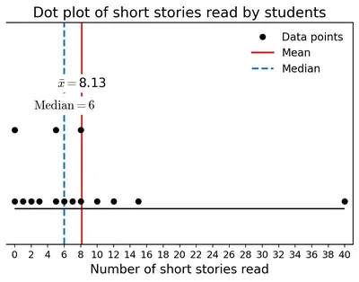
After the summer vacation, a class teacher asked his class how many short stories they had read. Each student answered the number of stories read on a piece of paper, as shown below. The values are: 6, 8, 5, 15, 3, 0, 2, 7, 12, 40, 0, 8, 10, 5, 1. Find the mean and median number of short stories read. Before calculating them, can you guess whether the mean will be less than or greater than the median?

Mark the data, the mean, and the median on the dot plot (0 to 40).

Figure
Figure

Solution

Guess first. The number 40 in the list is far bigger than the rest of the values (most are between 0 and 15). A large value on the right side of the data usually pulls the mean up while the median stays near the middle. So we expect the mean to be greater than the median.

Mean. Total of all values: add them in convenient groups.

$$6 + 8 + 5 + 15 + 3 + 0 + 2 + 7 + 12 + 40 + 0 + 8 + 10 + 5 + 1$$

$$= (6 + 8 + 5 + 15) + (3 + 0 + 2 + 7 + 12) + (40 + 0 + 8 + 10 + 5 + 1)$$

$$= 34 + 24 + 64 = 122.$$

Number of students $$= 15$$.

$$\text{Mean} = \dfrac{122}{15} \approx 8.13.$$

Median. Arrange the 15 values in increasing order:

$$0, 0, 1, 2, 3, 5, 5, 6, 7, 8, 8, 10, 12, 15, 40.$$

There are 15 values (an odd number), so the median is the middle one β€” the 8th value. Counting from the left: 1st is 0, 2nd 0, 3rd 1, 4th 2, 5th 3, 6th 5, 7th 5, 8th 6.

So median $$= 6$$.

As guessed, the mean ($$8.13$$) is greater than the median ($$6$$) β€” the outlier 40 has pulled the mean up.

On the dot plot (0 to 40). Place one dot above each value: two dots at 0, one at 1, one at 2, one at 3, two at 5, one at 6, one at 7, two at 8, one at 10, one at 12, one at 15, one at 40. Mark the median with an arrow at 6, and the mean with an arrow slightly to the right at about 8.1. The single dot at 40 sits far away on the right β€” clearly an outlier.

Answer

Mean $$= \dfrac{122}{15} \approx 8.13$$; median $$= 6$$. As guessed, mean $$>$$ median, because the value 40 is an outlier on the higher side and pulls the mean up.

Intext 18 Which of the values (in the short-stories data 6, 8, 5, 15, 3, 0, 2, 7, 12, 40, 0, 8, 10, 5, 1) would you consider an outlier?

Solution

An outlier is a value that lies very far away from the rest of the data.

Arrange the values in order: $$0, 0, 1, 2, 3, 5, 5, 6, 7, 8, 8, 10, 12, 15, 40$$. All values other than $$40$$ lie between $$0$$ and $$15$$; the next-highest value is $$15$$, which is $$25$$ less than $$40$$. The value $$40$$ stands out clearly.

So the outlier is 40.

Answer

The value $$40$$ is the outlier β€” it lies far above every other value (the next-highest is 15).

Intext 19 Find the mean and median (of the short-stories data) in the absence of the outlier. What change do you notice?

Solution

Remove the outlier $$40$$. The remaining 14 values are:

$$0, 0, 1, 2, 3, 5, 5, 6, 7, 8, 8, 10, 12, 15.$$

Mean. New total $$= 122 - 40 = 82$$. Number of values $$= 14$$.

$$\text{Mean} = \dfrac{82}{14} \approx 5.86.$$

Median. There are 14 values, an even number, so the median is the mean of the two middle values β€” the 7th and 8th.

7th value $$= 5$$, 8th value $$= 6$$.

$$\text{Median} = \dfrac{5 + 6}{2} = 5.5.$$

Comparison.

With outlierWithout outlier
Mean8.135.86
Median65.5

The mean fell by more than $$2$$ (from $$8.13$$ to $$5.86$$), while the median moved by only $$0.5$$ (from $$6$$ to $$5.5$$). Again, this shows that the mean reacts strongly to an outlier, but the median is barely affected.

Answer

Without the outlier 40: mean $$= \dfrac{82}{14} \approx 5.86$$; median $$= \dfrac{5 + 6}{2} = 5.5$$. The mean dropped by about $$2.3$$ (from $$8.13$$ to $$5.86$$) while the median dropped by only $$0.5$$ (from $$6$$ to $$5.5$$). So the mean is heavily affected by an outlier while the median is not.

Intext 20

Are We on the Same Page?

Do you read newspapers? Have you noticed how many pages a newspaper has on different days of the week β€” is it same or different?

The list below shows the number of pages for a particular newspaper from Monday to Sunday: 16, 18, 20, 22, 26, 16, 10.

Mark the data, the mean, and the median on the dot plot (0 to 25).

Solution

The seven daily counts are $$16, 18, 20, 22, 26, 16, 10$$.

Mean. Total pages over 7 days:

$$16 + 18 + 20 + 22 + 26 + 16 + 10 = 128.$$

$$\text{Mean} = \dfrac{128}{7} \approx 18.29 \text{ pages}.$$

Median. Arrange the values in order: $$10, 16, 16, 18, 20, 22, 26$$. There are 7 values, so the median is the middle (4th) value.

$$\text{Median} = 18 \text{ pages}.$$

The mean and median are very close ($$18.29$$ vs $$18$$) β€” the data is fairly balanced with no strong outlier.

On the dot plot (0 to 25). Place one dot at 10, two dots at 16, one dot each at 18, 20, and 22. The value 26 lies outside the given range 0–25, so extend the scale or place it just past 25 with a note. Mark the median (18) with an arrow and the mean (about 18.3) with another arrow β€” they lie very close to each other. Most dots are clustered between 16 and 22, indicating a typical newspaper size of about 18 pages on any given day.

Answer

Mean $$= \dfrac{128}{7} \approx 18.29$$ pages; median $$= 18$$ pages. On the dot plot the two are almost on top of each other. Most days the newspaper has about 16–22 pages; the smallest (10) and largest (26) are the two extremes.

Intext 21 In the three examples we considered β€” the heights, short-stories, and newspaper pages β€” observe the variability in data when:

(a) the mean and median are close to each other

Solution

Example: the newspaper pages data ($$10, 16, 16, 18, 20, 22, 26$$) has mean $$\approx 18.29$$ and median $$18$$. The two are very close.

When the mean and median are close, the data is fairly balanced around the middle β€” there are roughly as many values a bit above the middle as there are a bit below. There are no strong outliers on either side. The dots on the dot plot form a symmetric-looking cluster.

Answer

The data is fairly balanced/symmetric around the middle, with no strong outliers on either side. Example: the newspaper pages data (mean $$\approx 18.29$$, median $$18$$).

(b) the mean and median are comparatively far apart, with mean < median

Solution

Example: the family heights of Poovizhi ($$118, 165, 170, 173, 175$$) β€” mean $$= 160.2$$ cm and median $$= 170$$ cm. Mean is smaller than the median.

This happens when there are one or a few very small (unusually low) values in the data. Such low outliers drag the mean down while the median hardly moves. On the dot plot this shows as a lonely dot far to the left, with the rest of the dots clustered on the right.

Answer

There is an unusually small value (an outlier on the lower side) that pulls the mean down while the median stays near the middle. Example: Poovizhi's family heights, with 118 cm as the low outlier.

(c) the mean and median are comparatively far apart, with mean > median

Solution

Example: the short stories data ($$0, 0, 1, 2, 3, 5, 5, 6, 7, 8, 8, 10, 12, 15, 40$$) β€” mean $$\approx 8.13$$ and median $$= 6$$. Mean is greater than the median.

This happens when there are one or a few very large (unusually high) values. High outliers pull the mean up while leaving the median almost unchanged. On the dot plot this shows as a lonely dot far to the right, with most of the dots clustered on the left.

Answer

There is an unusually large value (an outlier on the higher side) that pulls the mean up while the median stays near the middle. Example: the short-stories data, with 40 as the high outlier.

Intext 22 Discuss the effect on the mean and median when outliers are present on both sides. You may take some example data to examine and explain this.

Solution

When outliers appear on both sides of the data β€” a very small value and a very large value β€” their effects on the mean tend to cancel each other out. Let us see this with an example.

Start with balanced data. Take $$4, 5, 5, 6, 6, 7, 7$$. Mean $$= \dfrac{4+5+5+6+6+7+7}{7} = \dfrac{40}{7} \approx 5.71$$ and median $$= 6$$.

Add a low outlier only. Data: $$0, 4, 5, 5, 6, 6, 7, 7$$. Mean $$= \dfrac{40}{8} = 5.00$$; median $$= \dfrac{5+6}{2} = 5.5$$. Mean fell by $$0.71$$.

Add a high outlier only. Data: $$4, 5, 5, 6, 6, 7, 7, 20$$. Mean $$= \dfrac{60}{8} = 7.50$$; median $$= \dfrac{5+6}{2} = 5.5$$. Mean rose by nearly 2.

Add outliers on both sides. Data: $$0, 4, 5, 5, 6, 6, 7, 7, 20$$. Mean $$= \dfrac{60}{9} \approx 6.67$$; median $$= 6$$ (the middle value). Compare with the original mean $$5.71$$ and median $$6$$: the median is unchanged, and the mean has only moved up a little (because the low outlier partly cancels the high outlier).

Conclusion.

  • The median is barely affected by outliers, whether they are on one side or on both.
  • The mean is pulled toward each outlier. If the outliers on the two sides are of roughly equal "pull", their effects cancel and the mean stays close to where it was. If one side has a stronger pull, the mean shifts in that direction.

So when outliers are present on both sides, the mean can appear misleadingly "okay" (close to the original) but the data itself is more spread out β€” the variability has increased even though the summary numbers may not show it. Looking at the dot plot alongside the mean and median is a good habit.

Answer

The median is hardly affected by outliers on either side. The mean is pulled toward each outlier β€” if the outliers on the two sides have roughly balanced "pull" they cancel out and the mean stays close to its original value. But the spread (variability) of the data does increase, even if the mean and median don't change much. Example: $$4,5,5,6,6,7,7$$ has mean $$\approx 5.71$$, median $$= 6$$; adding 0 on the left and 20 on the right gives mean $$\approx 6.67$$, median $$= 6$$.

Intext 23

How Tall is Your Class?

The heights of students in a Grade 5 class in centimeters are:

Boys: 147, 135, 130, 154, 128, 135, 134, 158, 155, 146, 146, 142, 140, 141, 144, 145, 150.
Girls: 143, 136, 150, 144, 154, 140, 145, 148, 156, 150, 150.

What can we infer from the dot plots and the central tendency measures?

Solution

Let us compute the mean and median for the boys, the girls, and the whole class.

Boys (17 students). Total $$= 147+135+130+154+128+135+134+158+155+146+146+142+140+141+144+145+150 = 2430$$.

$$\text{Mean} = \dfrac{2430}{17} \approx 142.94 \text{ cm}.$$

Sorted: $$128, 130, 134, 135, 135, 140, 141, 142, 144, 145, 146, 146, 147, 150, 154, 155, 158$$. There are 17 values, so the median is the 9th value $$= 144$$ cm.

Girls (11 students). Total $$= 143+136+150+144+154+140+145+148+156+150+150 = 1616$$.

$$\text{Mean} = \dfrac{1616}{11} \approx 146.91 \text{ cm}.$$

Sorted: $$136, 140, 143, 144, 145, 148, 150, 150, 150, 154, 156$$. Median $$=$$ 6th value $$= 148$$ cm.

Whole class (28 students). Total $$= 2430 + 1616 = 4046$$. Mean $$= \dfrac{4046}{28} \approx 144.5$$ cm (rounded to about $$144.4$$ cm in the textbook).

Inferences.

  • The girls' mean and median heights ($$\approx 146.9$$ and $$148$$ cm) are higher than the boys' ($$\approx 142.9$$ and $$144$$ cm) β€” in this class the girls are, on average, taller than the boys by about 4 cm. This is quite common at Grade 5, since girls typically start their growth spurt earlier.
  • The boys' data has a wider spread ($$128$$ to $$158$$ cm, a range of $$30$$ cm), while the girls' data is more compact ($$136$$ to $$156$$ cm, range $$20$$ cm).
  • For each group, the mean and median are close, so there are no strong outliers.

Answer

Boys: mean $$\approx 142.94$$ cm, median $$= 144$$ cm (17 students). Girls: mean $$\approx 146.91$$ cm, median $$= 148$$ cm (11 students). Whole class mean $$\approx 144.5$$ cm. Girls in this Grade 5 class are on average taller than boys by about 4 cm, and the girls' heights are less spread out than the boys' heights.

Intext 24 How many students are taller than the class' average height (Whole class Mean = 144.4)?

Solution

We list every value greater than $$144.4$$ cm.

Boys taller than 144.4 cm. From the sorted boys' list $$128, 130, 134, 135, 135, 140, 141, 142, 144, 145, 146, 146, 147, 150, 154, 155, 158$$, the values above 144.4 are: $$145, 146, 146, 147, 150, 154, 155, 158$$ β€” that is 8 boys.

Girls taller than 144.4 cm. From the sorted girls' list $$136, 140, 143, 144, 145, 148, 150, 150, 150, 154, 156$$, the values above 144.4 are: $$145, 148, 150, 150, 150, 154, 156$$ β€” that is 7 girls.

Total students taller than the class average $$= 8 + 7 = 15$$.

Answer

$$15$$ students (8 boys and 7 girls) are taller than the class average of 144.4 cm.

Intext 25 How many boys are taller than the class' average height (Whole class Mean = 144.4)?

Solution

From the sorted list of boys' heights $$128, 130, 134, 135, 135, 140, 141, 142, 144, 145, 146, 146, 147, 150, 154, 155, 158$$, the boys whose height exceeds $$144.4$$ cm are $$145, 146, 146, 147, 150, 154, 155, 158$$.

Counting these gives $$8$$ boys.

Answer

$$8$$ boys are taller than the class average of 144.4 cm.

Intext 26

How long is a minute?

Two groups of children were asked to estimate the length of 1 minute. They start by closing their eyes and then open when they think 1 minute has passed. Of course, they are not supposed to count while their eyes are closed. The dot plots show after how many seconds the children opened their eyes. Group A: Mean = 58.21, Median = 60. Group B: Mean = 59.28, Median = 59.5.

Discuss how well both the groups fared at this activity. Describe and compare the variability in data and their central tendency.

Solution

The "correct" answer for the length of 1 minute is $$60$$ seconds. So the closer a group's mean and median are to $$60$$, the better that group estimated one minute.

Central tendency.

  • Group A: mean $$58.21$$ s, median $$60$$ s. The median is exactly right, and the mean is a little below $$60$$ β€” a few children opened their eyes early.
  • Group B: mean $$59.28$$ s, median $$59.5$$ s. Both are very close to $$60$$; the group's typical estimate is a shade under one minute.

Variability. In Group A the gap between mean and median is bigger ($$60 - 58.21 = 1.79$$), which suggests some low outliers pulling the mean down; the dots on that plot are more spread out. In Group B the mean and median are very close ($$59.5 - 59.28 = 0.22$$), which points to a symmetric, tight distribution β€” the dots are packed near $$60$$.

Overall. Both groups did well on average (mean/median within about $$2$$ seconds of $$60$$). Group B is more consistent β€” its estimates are more tightly clustered around one minute β€” while Group A had the exact median but a wider spread. So one could say Group B fared marginally better as a team, though the two are very close.

Answer

Both groups fared well β€” mean and median are within about 2 seconds of the true 1 minute (60 s). Group A: median exactly $$60$$, but mean $$58.21$$ shows some low estimates pulling it down (more spread). Group B: mean $$59.28$$, median $$59.5$$ β€” very close to each other and to 60, showing a tight, consistent set of estimates. So Group B was more consistent, while Group A had the perfect median.

Figure it Out (Pages 112–113)

1 Find the median of onion prices in Yahapur and Wahapur.

Solution

The 12 monthly prices for each town, arranged in increasing order.

Yahapur (sorted): $$24, 25, 26, 28, 30, 35, 39, 43, 44, 49, 56, 59$$.

Number of values $$= 12$$ (even). Median $$=$$ average of the two middle values (the 6th and 7th).

$$\text{Median}_{\text{Yahapur}} = \dfrac{35 + 39}{2} = 37 \text{ (β‚Ή per kg)}.$$

Wahapur (sorted): $$17, 19, 23, 30, 35, 38, 39, 42, 42, 52, 53, 60$$.

Median $$=$$ average of the 6th and 7th values.

$$\text{Median}_{\text{Wahapur}} = \dfrac{38 + 39}{2} = 38.5 \text{ (β‚Ή per kg)}.$$

So the median monthly onion price is β‚Ή37 in Yahapur and β‚Ή38.50 in Wahapur.

Answer

Median onion price: Yahapur $$= \dfrac{35+39}{2} = β‚Ή37$$ per kg; Wahapur $$= \dfrac{38+39}{2} = β‚Ή38.50$$ per kg.

2 Sanskruti asked her class how many domestic animals and pets each had at home. Some of the students were absent. The data values are 0, 1, 0, 4, 8, 0, 0, 2, 1, 1, 5, 3, 4, 0, 0, β€”, 10, 25, 2, β€”, 2, 4. Find the mean and median. How would you describe this data?

Solution

The two dashes ("β€”") stand for students who were absent, so they gave no data. We drop those and work with the remaining values.

The 20 valid values are:

$$0, 1, 0, 4, 8, 0, 0, 2, 1, 1, 5, 3, 4, 0, 0, 10, 25, 2, 2, 4.$$

Mean.

$$\text{Total} = 0+1+0+4+8+0+0+2+1+1+5+3+4+0+0+10+25+2+2+4 = 72.$$

Number of students who gave data $$= 20$$.

$$\text{Mean} = \dfrac{72}{20} = 3.6 \text{ pets per student}.$$

Median. Arrange in increasing order:

$$0, 0, 0, 0, 0, 0, 1, 1, 1, 2, 2, 2, 3, 4, 4, 4, 5, 8, 10, 25.$$

Number of values $$= 20$$ (even). Median $$=$$ mean of the 10th and 11th values.

10th value $$= 2$$, 11th value $$= 2$$.

$$\text{Median} = \dfrac{2 + 2}{2} = 2 \text{ pets}.$$

Describing the data. The median is 2 but the mean is 3.6, so mean is much larger than median. Looking at the sorted list, most students have very few pets (six students have zero, and most others 1–5), but two students have unusually large numbers β€” 10 and especially 25. The value 25 is a clear outlier; it single-handedly pulls the mean up. So the data is right-skewed: most values are small, with a long tail of a few very large values.

Answer

Mean $$= \dfrac{72}{20} = 3.6$$ pets; median $$= \dfrac{2+2}{2} = 2$$ pets. The mean is much bigger than the median because of outliers (especially the value 25). Most students have very few pets; a couple have very many. The data is right-skewed, so the median (2) describes a typical student better than the mean (3.6).

3 Rintu takes care of a date-palm tree farm in Habra. The heights of the trees (in feet) in his farm are given as: 50, 45, 43, 52, 61, 63, 46, 55, 60, 55, 59, 56, 56, 49, 54, 65, 66, 51, 44, 58, 60, 54, 52, 57, 61, 62, 60, 60, 67. Fill the dot plot, and mark the mean and median. How would you describe the heights of these palm trees? Can you think of quicker ways to find the mean? How many trees are shorter than the average height?

Solution

There are $$29$$ trees. Let us sort them first so the dot plot and median are easy.

Sorted heights (ft): $$43, 44, 45, 46, 49, 50, 51, 52, 52, 54, 54, 55, 55, 56, 56, 57, 58, 59, 60, 60, 60, 60, 61, 61, 62, 63, 65, 66, 67$$.

Dot plot. On a horizontal number line from about $$43$$ to $$67$$ feet, place one dot above each value: one dot each at 43, 44, 45, 46, 49, 50, 51; two dots at 52; two at 54; two at 55; two at 56; one at 57, 58, 59; four dots at 60; two at 61; one each at 62, 63, 65, 66, 67. Most of the dots cluster between about 50 ft and 62 ft.

Mean. Total (add the sorted list):

$$43+44+45+46+49+50+51+52+52+54+54+55+55+56+56+57+58+59+60+60+60+60+61+61+62+63+65+66+67 = 1621.$$

$$\text{Mean} = \dfrac{1621}{29} \approx 55.90 \text{ feet}.$$

Median. $$29$$ is odd, so the median is the middle (15th) value of the sorted list. Counting: positions 1–14 use the values up to and including 56, and position 15 is $$56$$. So median $$= 56$$ ft.

Description. Mean $$\approx 55.9$$ and median $$= 56$$ are very close. The heights range from 43 to 67 ft, and most trees are 50–62 ft tall β€” a fairly symmetric cluster around 56 ft, with no outliers.

A quicker way to find the mean (assumed-mean method). Guess a round number close to the middle, say $$A = 55$$. Find how far each value is from $$A$$ (positive if above, negative if below), average these differences, and add back to $$A$$.

Differences from 55 (in order):
$$-12, -11, -10, -9, -6, -5, -4, -3, -3, -1, -1, 0, 0, 1, 1, 2, 3, 4, 5, 5, 5, 5, 6, 6, 7, 8, 10, 11, 12$$.

Sum of differences $$= 26$$.

$$\text{Mean} = 55 + \dfrac{26}{29} \approx 55 + 0.90 = 55.90 \text{ ft}.$$

Same answer, but with smaller numbers to add.

How many trees are shorter than the mean (55.90 ft)? From the sorted list, the values less than $$55.9$$ are $$43, 44, 45, 46, 49, 50, 51, 52, 52, 54, 54, 55, 55$$ β€” that is 13 trees.

Answer

Mean $$= \dfrac{1621}{29} \approx 55.90$$ ft; median $$= 56$$ ft. The trees are mostly $$50$$–$$62$$ ft tall, spread quite symmetrically around $$56$$ ft, no outliers. Quicker way: assumed-mean method β€” pick $$A = 55$$, average the deviations from 55 (their sum is 26, so add $$\dfrac{26}{29} \approx 0.9$$ to 55 to get $$55.9$$ ft). Number of trees shorter than the mean $$= 13$$.

4 The daily water usage from a tap was measured. The usage in liters for the first few days is: 5.6, 8, 3.09, 12.9, 6.5, 12.1, 11.3, 20.5, 7.4.

(a) Can the mean or median daily usage lie between 25 and 30? Justify your claim using the meaning of mean and median.

Solution

The nine values are $$5.6, 8, 3.09, 12.9, 6.5, 12.1, 11.3, 20.5, 7.4$$ litres. The smallest is $$3.09$$ and the largest is $$20.5$$; every value is at most $$20.5$$.

Mean. The mean is the total divided by 9. Since every value is at most $$20.5$$, the total is at most $$9 \times 20.5 = 184.5$$, so the mean is at most $$\dfrac{184.5}{9} = 20.5$$. In general the mean of any set of numbers always lies between the minimum and the maximum of the data. Here that range is $$3.09$$ to $$20.5$$, so the mean cannot exceed $$20.5$$ β€” certainly it cannot lie between $$25$$ and $$30$$.

Median. The median is the middle value when the data is sorted. It has to be one of the values in the data (or the average of two of them), and every value is between $$3.09$$ and $$20.5$$. So the median also cannot exceed $$20.5$$ and cannot lie between $$25$$ and $$30$$.

Hence neither the mean nor the median of this data can lie between $$25$$ and $$30$$.

Answer

No. Every measurement is at most $$20.5$$ litres, so both the mean and the median must lie between the smallest value $$3.09$$ and the largest value $$20.5$$. Neither can exceed $$20.5$$, so neither can lie between $$25$$ and $$30$$.

(b) Can the mean or median be lesser than the minimum value or greater than the maximum value in a data?

Solution

No. Both the mean and the median always lie between the minimum and the maximum of the data (they lie within the range).

Why for the mean. Suppose the smallest value is $$m$$ and the largest is $$M$$. Every value $$x$$ satisfies $$m \le x \le M$$. Adding $$n$$ such inequalities: $$nm \le (\text{sum}) \le nM$$. Dividing by $$n$$: $$m \le \text{mean} \le M$$. So the mean is squeezed between $$m$$ and $$M$$.

Why for the median. After sorting, every value in the list is between $$m$$ and $$M$$. The median is either the middle sorted value or the average of two middle sorted values, so it too lies between $$m$$ and $$M$$.

Hence neither the mean nor the median can go below the minimum or above the maximum of the data.

Answer

No. Both the mean and the median always lie between the minimum and the maximum values of the data.

5

The weights of a few newborn babies are given in kgs. Fill the dot plot provided below. Analyse and compare this data.

Boys3.54.12.63.23.43.8
Girls4.03.13.43.72.53.4

Solution

Dot plot. Use a horizontal number line from about $$2.4$$ to $$4.2$$ kg, with tick marks every $$0.1$$ kg. Place blue dots (say) for boys above 2.6, 3.2, 3.4, 3.5, 3.8, 4.1 (one each) and orange dots for girls above 2.5, 3.1, 3.4, 3.4, 3.7, 4.0.

Boys β€” 6 values. Sorted: $$2.6, 3.2, 3.4, 3.5, 3.8, 4.1$$.

Total $$= 2.6 + 3.2 + 3.4 + 3.5 + 3.8 + 4.1 = 20.6$$ kg.

$$\text{Mean}_{\text{boys}} = \dfrac{20.6}{6} \approx 3.43 \text{ kg}.$$

Median $$= \dfrac{3.4 + 3.5}{2} = 3.45$$ kg (average of 3rd and 4th values).

Girls β€” 6 values. Sorted: $$2.5, 3.1, 3.4, 3.4, 3.7, 4.0$$.

Total $$= 2.5 + 3.1 + 3.4 + 3.4 + 3.7 + 4.0 = 20.1$$ kg.

$$\text{Mean}_{\text{girls}} = \dfrac{20.1}{6} = 3.35 \text{ kg}.$$

Median $$= \dfrac{3.4 + 3.4}{2} = 3.4$$ kg.

Analysis and comparison.

  • The mean weight of the boys ($$\approx 3.43$$ kg) is slightly greater than that of the girls ($$3.35$$ kg) β€” a difference of only about $$80$$ g.
  • The medians ($$3.45$$ kg for boys, $$3.4$$ kg for girls) tell the same story.
  • The boys' weights range from $$2.6$$ to $$4.1$$ kg (range $$1.5$$ kg); the girls' range from $$2.5$$ to $$4.0$$ kg (range $$1.5$$ kg). Very similar spread.
  • For both groups the mean and median are close, so there is no strong outlier.

Overall, boys and girls have very similar weight distributions; boys are on average marginally heavier.

Answer

Boys: mean $$\approx 3.43$$ kg, median $$= 3.45$$ kg. Girls: mean $$= 3.35$$ kg, median $$= 3.4$$ kg. Boys weigh slightly more on average than girls (difference $$\approx 0.08$$ kg), but the two distributions have almost the same spread ($$2.5$$–$$4.1$$ kg) and no outliers.

6 The dot plots of heights of another section of Grade 5 students of the same school are shown (Whole class: Mean = 141.21, Median = 142.5; Boys: Mean = 142.05, Median = 143; Girls: Mean = 140.14, Median = 140). Can you share your observations? What can we infer from the dot plots and the central tendency measures?

Solution

We are given the following summaries for this second section:

GroupMean (cm)Median (cm)
Whole class141.21142.5
Boys142.05143
Girls140.14140

Observations.

  • Boys vs girls in this section. The boys' mean and median (about $$142$$–$$143$$ cm) are a little higher than the girls' (about $$140$$ cm). So in this section, boys are on average slightly taller than girls β€” a difference of only about $$2$$ cm.
  • Mean vs median for the whole class. Whole-class mean $$141.21$$ cm is a bit less than the median $$142.5$$ cm. Since mean $$<$$ median, there is a slight pull from a few short students (low-side outliers or a small tail on the left of the dot plot).
  • Comparison with the earlier section (mean $$\approx 144.4$$ cm, girls taller than boys). This new section is shorter on average β€” by about 3 cm β€” and here the boys are taller than the girls, opposite to what we saw before.
  • The gaps between mean and median in each group are small (at most $$1.3$$ cm), so there are no strong outliers in this section.

Answer

In this section, boys (mean $$\approx 142.05$$, median $$143$$) are on average about 2 cm taller than girls (mean $$140.14$$, median $$140$$). The whole-class mean $$141.21$$ is slightly less than the median $$142.5$$, suggesting a small tail of shorter students. Compared with the earlier section (mean $$\approx 144.4$$, girls slightly taller), this section is on average about $$3$$ cm shorter and has the boys–girls order reversed.

7 The weights of some sumo wrestlers and ballet dancers are: Sumo wrestlers: 295.2 kg, 250.7 kg, 234.1 kg, 221.0 kg, 200.9 kg. Ballet dancers: 40.3 kg, 37.6 kg, 38.8 kg, 45.5 kg, 44.1 kg, 48.2 kg. Approximately how many times heavier is a sumo wrestler compared to a ballet dancer?

Solution

To compare two groups of different sizes, use the averages.

Average weight of a sumo wrestler.

Total $$= 295.2 + 250.7 + 234.1 + 221.0 + 200.9 = 1201.9$$ kg.

$$\text{Mean}_{\text{sumo}} = \dfrac{1201.9}{5} \approx 240.38 \text{ kg}.$$

Average weight of a ballet dancer.

Total $$= 40.3 + 37.6 + 38.8 + 45.5 + 44.1 + 48.2 = 254.5$$ kg.

$$\text{Mean}_{\text{ballet}} = \dfrac{254.5}{6} \approx 42.42 \text{ kg}.$$

Ratio.

$$\dfrac{\text{sumo mean}}{\text{ballet mean}} = \dfrac{240.38}{42.42} \approx 5.67.$$

So on average a sumo wrestler weighs about $$5\tfrac{2}{3}$$ times β€” roughly $$5$$ to $$6$$ times β€” as much as a ballet dancer.

Answer

About $$6$$ times heavier. Average weights: sumo $$\approx 240.38$$ kg, ballet $$\approx 42.42$$ kg, so the ratio is $$\dfrac{240.38}{42.42} \approx 5.67$$.

Intext Questions (Pages 113–122)

Intext 27 Compare the heights of the two sections (of Grade 5 students shown on pages 109 and 113). Share your observations.

Solution

Bring together what we know about the two sections.

SectionBoys meanGirls meanWhole-class meanWhole-class median
Section 1 (page 109)142.94 cm146.91 cmβ‰ˆ 144.4 cm144 cm
Section 2 (page 113)142.05 cm140.14 cm141.21 cm142.5 cm

Observations.

  • Section 1 is taller on average (mean $$\approx 144.4$$ cm) than Section 2 (mean $$\approx 141.2$$ cm) by about $$3$$ cm.
  • In Section 1 the girls are noticeably taller than the boys (146.9 vs 142.9). In Section 2 the boys are slightly taller than the girls (142.1 vs 140.1). The pattern is reversed.
  • The boys' mean is about the same in both sections ($$\approx 142$$ cm). The big difference is in the girls: much taller in Section 1 than in Section 2.
  • In both sections the mean and median are close, so neither section has strong outliers.

Answer

Section 1 (mean $$\approx 144.4$$ cm) is taller on average than Section 2 (mean $$\approx 141.2$$ cm) by about 3 cm. The two sections show opposite gender patterns β€” girls are taller than boys in Section 1, whereas boys are (slightly) taller than girls in Section 2. The boys' averages are similar in the two sections; the girls in Section 1 are noticeably taller than the girls in Section 2.

Intext 28 Looking at the double column graph (clustered column graph) of monthly onion prices in Yahapur and Wahapur, what is the scale used in this graph?

Solution

Prices in the onion table range from a low of β‚Ή17 per kg to a high of β‚Ή60 per kg. For a bar graph to fit in one page, each unit on the vertical axis stands for a fixed number of rupees.

In the textbook's graph the vertical axis is marked at $$0, 10, 20, 30, 40, 50, 60$$ (rupees per kg). Every big gridline represents β‚Ή10, so the scale is:

$$1 \text{ unit} = β‚Ή10 \text{ per kg}.$$

The horizontal axis just lists the twelve months, with two coloured bars (one for Yahapur, one for Wahapur) side by side for each month.

Answer

Vertical axis: 1 unit = β‚Ή10 per kg (marks at 0, 10, 20, …, 60). Horizontal axis: the twelve months, one pair of bars (Yahapur and Wahapur) per month.

Intext 29 Is it now easier to compare month-wise prices in both places (using the clustered column graph)?

Solution

Yes. In a clustered column graph the two bars for the same month are drawn right next to each other. Just by glancing at each pair we can immediately see:

  • which town had the higher price that month (the taller bar),
  • how big the gap between the two towns is (difference in bar heights), and
  • how the prices in either town rise or fall over the year (the pattern of bar heights across months).

With the original table one has to read two numbers, subtract them and repeat that for every month; with the graph the comparison is visual and instant.

Answer

Yes, it is much easier. Placing the two bars for each month side by side lets us see at a glance which town was costlier that month, by how much, and how each town's prices change through the year.

Intext 30 Considering the graph showing the number of worldwide rocket launches by companies/space agencies (SpaceX, CASC, Roscosmos, Arianespace, Rocket Lab, United Launch Alliance, ISRO, Galactic Energy, Expace, Other) for the years 2021, 2022, and 2023, share your observations (you may take the teacher's help to identify the countries these organisations belong to).

Solution

First identify the country each organisation belongs to.

OrganisationCountry
SpaceXUSA
CASC (China Aerospace Science and Technology Corporation)China
RoscosmosRussia
ArianespaceFrance (Europe)
Rocket LabUSA / New Zealand
United Launch Alliance (ULA)USA
ISROIndia
Galactic EnergyChina
ExpaceChina

Observations from the graph.

  • SpaceX (USA) has by far the largest bars and is growing very fast each year β€” from around 30 launches in 2021 to about 60 in 2022 and nearly 100 in 2023.
  • CASC (China) is the second biggest launcher and has also grown steadily (roughly 50 β†’ 55 β†’ 65).
  • Roscosmos (Russia) has stayed roughly the same or even decreased over the three years.
  • Arianespace (France) has very few launches (only a handful each year).
  • ISRO (India) launches a small number every year, and the number has been going up (roughly 2, 5, 7).
  • Chinese private companies (Galactic Energy, Expace) have small but slowly rising bars.
  • Overall the total number of worldwide launches has grown sharply, mainly because of SpaceX and CASC.

Answer

SpaceX (USA) dominates the graph, with launches growing sharply every year (about 30 β†’ 60 β†’ 100). CASC (China) is the next biggest and is also growing (about 50 β†’ 55 β†’ 65). Roscosmos (Russia) is roughly flat or slightly declining. ISRO (India) launches a small but growing number each year. Arianespace (France) and the private Chinese companies (Galactic Energy, Expace) launch relatively few. USA and China together account for the great majority of worldwide launches, and the world total is going up mostly because of SpaceX and CASC.

Intext 31 Notice how the rocket launches graph is organised, what scale is used, and what patterns the data shows.

Solution

How the graph is organised. The graph is a clustered horizontal bar graph. The organisations are listed one below the other on the vertical axis. For each organisation there are three adjacent bars β€” one each for 2021, 2022 and 2023, drawn in different shades of blue as shown in the legend. The horizontal axis measures the number of launches.

Scale. The horizontal axis is marked at 0, 20, 40, 60, 80, 100. Each big step covers 20 launches, so the scale is $$1 \text{ unit length} = 20 \text{ launches}$$.

Patterns.

  • The three bars for SpaceX rise sharply from 2021 to 2023 β€” clearly the fastest growth.
  • CASC's three bars are all tall and rise gently β€” steady growth in the Chinese program.
  • Roscosmos's three bars are of similar height (a slight downward tendency).
  • Most other organisations have short bars, and some (Arianespace, ULA) have tiny or even shrinking bars.
  • The colour for 2023 is generally the tallest in each group, meaning most organisations launched more in 2023 than in the earlier years.

Answer

Organisation: clustered horizontal bar graph with organisations listed on the y-axis and three bars per organisation (one each for 2021, 2022, 2023). Scale: $$1$$ unit length $$= 20$$ launches (x-axis marks 0, 20, 40, 60, 80, 100). Patterns: SpaceX grows fastest; CASC grows steadily; Roscosmos is roughly flat; most other organisations have small bars, but for most of them the 2023 bar is the tallest.

Intext 32 Analyse and interpret each of your observations (about the rocket launches graph).

Solution

Take each observation and think about what it means in the real world.

  • SpaceX's rapid rise. SpaceX uses reusable rockets, which makes each launch cheaper. Being able to reuse a rocket lets them launch many more times per year β€” this is the main reason for the sharp growth.
  • CASC's steady rise. China's national space program has been expanding β€” more satellites, its own space station and Moon-mission tests. So CASC has more work each year.
  • Roscosmos is flat or declining. Russia's space program has been slowed by economic and political factors, and by losing some foreign customers (many of whom now use SpaceX).
  • Arianespace, ULA (small bars). These are older programs that are being replaced by newer rockets; also SpaceX has taken away a lot of their commercial launch business.
  • ISRO growing gently. India's space program is also expanding, with more commercial and scientific missions each year, but the numbers are still small compared to the biggest launchers.
  • 2023 tallest across most organisations. The overall demand for launches β€” for communication satellites, imaging satellites, science missions β€” is growing worldwide.

Answer

SpaceX's very fast growth reflects the impact of reusable rockets and cheaper launches. CASC's steady rise mirrors China's expanding national space program. Roscosmos's flat/declining bars reflect Russia's economic and political difficulties and lost customers. Arianespace and ULA's small bars show older rockets being phased out. ISRO's small but growing numbers show India's expanding space activities. The generally taller 2023 bars show that worldwide demand for launches is rising.

Intext 33 Identify which of the following statements can be justified using this data (rocket launches graph).

(a) All organisations launched more rockets than the previous years.

Solution

Look at every organisation's three bars. For SpaceX, CASC, ISRO and a few others each successive bar is taller. But for Roscosmos and Arianespace the bars stay roughly the same or even shrink from year to year. So it is not true that every single organisation launched more than in the previous year.

The statement is not justified by the graph.

Answer

Not justified. Roscosmos and Arianespace did not launch more rockets each year (their bars stay roughly the same or decrease).

(b) Only an organisation from the USA launched more than 50 rockets in a single year.

Solution

SpaceX (USA) certainly crosses the 50-launch mark (its bars for 2022 and 2023 shoot well above 50). But looking at the graph, CASC (China) also has a bar that goes above the 50 line in each of the three years. So more than one country has an organisation crossing 50 launches in a year.

The word "only" makes the statement wrong. It is not justified.

Answer

Not justified. Besides SpaceX (USA), CASC (China) also crossed 50 launches in a year (its bars go above 50). So the word "only" is wrong.

(c) The total number of rockets launched by France in all 3 years is less than 40.

Solution

The French organisation on the graph is Arianespace. Its three bars are all very short β€” each reaches only about $$3$$ to $$6$$ launches. Even if we take the largest possible reading, the sum of the three bars is around $$3 + 5 + 3 = 11$$, which is far less than $$40$$.

So the total number of French (Arianespace) launches over the three years is well below $$40$$. The statement is justified.

Answer

Justified. Arianespace (France) has very short bars each year (approximately 3–6 launches). The three-year total is around 10–15, well below 40.

(d) The average number of rockets launched by CASC in these 3 years is around 40.

Solution

Reading CASC's three bars off the graph: the bars are near the 50, 55 and 65 gridlines (approximately).

Total $$\approx 50 + 55 + 65 = 170$$. Average $$= \dfrac{170}{3} \approx 57$$ launches per year.

This is close to $$50$$–$$60$$, not $$40$$. The statement cannot be justified by the graph.

Answer

Not justified. CASC's bars are around 50, 55 and 65, so the 3-year average is closer to $$55$$–$$60$$, not $$40$$.

(e) ISRO launched more rockets than Galactic Energy in these 3 years.

Solution

Reading the graph: ISRO's three bars are roughly 2, 5 and 7 (total around 14). Galactic Energy's three bars are all very short β€” about 1, 3 and 3 (total around 7).

$$\text{ISRO total} \approx 14 \;>\; \text{Galactic Energy total} \approx 7.$$

So ISRO did launch more rockets than Galactic Energy over the three years. The statement is justified.

Answer

Justified. Reading the bars, ISRO's 3-year total is around 14 launches while Galactic Energy's is around 7.

(f) Russia launched more than 60 rockets in these 3 years.

Solution

The Russian organisation is Roscosmos. Its three bars are roughly at $$25$$, $$21$$ and $$19$$.

Total $$\approx 25 + 21 + 19 = 65$$, which is just above $$60$$.

So over the three years Roscosmos did launch a little more than $$60$$ rockets. The statement is justified by the graph.

Answer

Justified. Roscosmos's three bars are around 25, 21 and 19, totalling about 65 β€” a little more than 60.

Intext 34 List the organisations that have consistently launched more rockets every year (based on the rocket launches graph for 2021, 2022, 2023).

Solution

"Consistently launched more every year" means the 2022 bar is taller than the 2021 bar and the 2023 bar is taller than the 2022 bar. Scanning the graph:

  • SpaceX β€” bars roughly $$31 \to 61 \to 96$$: clearly rising each year. βœ“
  • CASC β€” bars roughly $$48 \to 53 \to 65$$: rising each year. βœ“
  • ISRO β€” bars roughly $$2 \to 5 \to 7$$: rising each year. βœ“

Other organisations do not show the same strictly-rising pattern (Roscosmos, Arianespace, ULA even drop in some years).

Answer

SpaceX, CASC and ISRO β€” these three have taller bars every successive year on the graph.

Intext 35 Estimate the total number of rockets launched worldwide in 2023.
(a) less than 200
(b) 200 to 400
(c) 400 to 600
(d) more than 600

Solution

Add up the 2023 bars of every organisation. Reading approximate heights from the graph:

  • SpaceX $$\approx 96$$
  • CASC $$\approx 65$$
  • Roscosmos $$\approx 19$$
  • Rocket Lab $$\approx 10$$
  • ULA $$\approx 3$$
  • Arianespace $$\approx 3$$
  • ISRO $$\approx 7$$
  • Galactic Energy $$\approx 3$$
  • Expace $$\approx 1$$
  • Other $$\approx 15$$

Total $$\approx 96 + 65 + 19 + 10 + 3 + 3 + 7 + 3 + 1 + 15 = 222$$.

This is between $$200$$ and $$400$$, so the correct option is (b).

Answer

(b) 200 to 400. Adding the heights of all 2023 bars gives roughly $$220$$ launches, which falls in this range.

Intext 36

Consider the following data of average daily sunshine hours in two cities:

City 1

JanFebMarAprMayJunJulAugSepOctNovDec
210257372441536564555465394310222186

City 2

JanFebMarAprMayJunJulAugSepOctNovDec
459384381327304276295318369409435468

A clustered bar graph shows the average daylight hours per day in each month (obtained by dividing the monthly daylight hours by the number of days in the month). Notice how the graph is organised, what scale is used, and what patterns the data shows.

Solution

How the numbers are turned into daily averages. The table shows total monthly sunshine hours. To find the average per day for a month, divide the total by the number of days in that month.

For example, in January (31 days):

$$\text{City 1 average per day} = \dfrac{210}{31} \approx 6.8 \text{ hours/day},$$

$$\text{City 2 average per day} = \dfrac{459}{31} \approx 14.8 \text{ hours/day}.$$

(Note: the totals in the table are unusually large because they mix daylight-hours and sunshine differently in NCERT's example; the point is only to draw the daily-average bar graph.)

How the graph is organised. Along the horizontal axis are the 12 months (Jan to Dec). For each month there are two bars side by side β€” one for City 1 and one for City 2, in two different colours (see legend). The vertical axis shows average daylight hours per day.

Scale. Since the values range up to about $$19$$ hours per day, the vertical scale is marked in equal steps of $$5$$ hours (0, 5, 10, 15, 20). So the scale is $$1$$ unit $$= 5$$ hours per day.

Patterns.

  • City 1: the bar heights grow from January, peak in June/July, and fall back down to December β€” the shape rises then falls.
  • City 2: the pattern is the opposite. Bar heights are highest in December/January, drop through the middle of the year, hit their minimum in June/July, and rise again toward December.
  • For every month, one city's bar is high while the other's is comparatively low β€” the two patterns are almost mirror-images of each other.

Answer

The graph puts the 12 months on the x-axis with two coloured bars (City 1 and City 2) per month; y-axis: average daylight hours per day, scaled at 1 unit $$= 5$$ hours. Pattern: City 1's bars rise to a peak in June/July and fall to a minimum in December; City 2's bars do the exact opposite β€” they are highest in December/January and lowest in June/July. The two patterns look like mirror-images.

Intext 37 Analyse and interpret each of your observations (about the daylight hours graph for City 1 and City 2). Share appropriate summary and conclusion statements.

Solution

Every observation from the previous question can be interpreted in terms of the seasons.

  • City 1 peaks in June/July. Long daylight in June and July is a summer pattern for places in the Northern Hemisphere. The days are longest in June (around the summer solstice) and shortest in December.
  • City 2 peaks in December/January. Long daylight in December is a summer pattern for places in the Southern Hemisphere. Days are shortest around June.
  • The mirror-image behaviour. When one hemisphere has summer, the other has winter. So City 1 and City 2 always "trade" β€” whichever has long days now, the other will six months later.
  • The daily averages themselves tell us how far from the equator each city is: the larger the seasonal swing, the further from the equator.

Summary/conclusion. City 1 and City 2 are in opposite hemispheres. City 1 (peak in June) is a Northern-Hemisphere city; City 2 (peak in December) is a Southern-Hemisphere city. The seasons in the two cities are exactly six months apart.

Answer

City 1's daylight peaks in June/July (Northern-Hemisphere summer). City 2's daylight peaks in December/January (Southern-Hemisphere summer). The opposite patterns show that the two cities are in opposite hemispheres, with seasons six months apart.

Intext 38 Does this (the daylight hours pattern) give some idea of where these two cities are located?

Solution

Yes. The month in which daylight is longest immediately hints at which hemisphere a city belongs to.

  • City 1's longest daylight is in June β€” this is characteristic of the Northern Hemisphere (e.g. cities like Delhi, London, or New York).
  • City 2's longest daylight is in December β€” this is characteristic of the Southern Hemisphere (e.g. cities like Sydney, Cape Town, or Buenos Aires).

The size of the seasonal swing (difference between highest and lowest daylight) also tells us how far the city is from the equator β€” a larger swing means a location closer to the poles. From the numbers, both cities show fairly large swings, so both are probably at moderate to high latitudes in their respective hemispheres.

Answer

Yes. City 1 (peak daylight in June) is in the Northern Hemisphere; City 2 (peak daylight in December) is in the Southern Hemisphere. The size of each city's seasonal swing hints that both are at moderate/high latitudes.

Intext 39 Is there anything more that you wish to explore (about daylight hours and locations of the two cities)?

Solution

This is an open-ended "wondering" question. Some things one might want to explore are:

  • Exactly which cities these numbers correspond to (guess names based on latitude).
  • How the pattern would look for a city on the equator (should be nearly the same daylight all year round).
  • How the pattern changes as we move closer to the poles (longer summer days, shorter winter days, until we reach the polar circles where there is 24-hour daylight or 24-hour night for part of the year).
  • Whether the shortest-day (winter solstice) and longest-day (summer solstice) dates are the same for every city in a hemisphere.
  • How this seasonal daylight pattern affects things like farming, birds' migration, our sleep, and electricity use.

Answer

Open-ended. Sample: (i) which real cities these are and their latitudes; (ii) what the daylight graph would look like for a city on the equator or near the poles; (iii) how daylight patterns affect farming, migration, and energy use.

Intext 40

All it Takes is a Minute

The graph shows the number of runs scored per over as a double bar graph β€” each bar corresponding to a team (blue team and red team). The scale used for the runs per over is $$1 \text{ unit} = 5 \text{ runs}$$. The circles shown on top of the bars indicate that a wicket fell in that over.

Answer the following questions based on the graph:

1 Can we tell who batted first? Who won the match?

Solution

Look at how many overs each team's bars cover on the graph.

  • Blue team has bars from over 1 all the way to over 20.
  • Red team has bars only up to over 18 β€” nothing in overs 19 and 20.

Now, the team batting first plays the full 20 overs (unless it is all out). The team batting second stops as soon as it either reaches the target or is all out. Because red's innings ended two overs early, red must have been the second-batting team. Also, the number of wickets shown as circles on the red bars is small (only about 2 circles), so red was not bowled out. That means red stopped because they had already reached the target.

Hence:

  • Blue team batted first (played the full 20 overs).
  • Red team batted second and won the match by reaching the target within 18 overs.

Answer

Yes. Blue team batted first (their bars fill all 20 overs). Red team batted second and won β€” their bars stop at over 18 with only a couple of wickets shown, meaning they must have reached the target with 2 overs to spare.

2 How many runs did the blue team score in over 12?

Solution

Locate over 12 on the horizontal axis and look at the blue bar there. The bar reaches up to the gridline marked 15.

Since the scale is $$1 \text{ unit} = 5 \text{ runs}$$, the blue bar height of 3 units corresponds to

$$3 \times 5 = 15 \text{ runs}.$$

Answer

The blue team scored $$15$$ runs in over 12.

3 In which over did the red team score the least number of runs?

Solution

Scan the red bars and find the shortest one. The shortest red bar in the graph is at over 4, which reaches only up to about the 2-run mark.

So the red team scored the least (about 2 runs) in over 4.

Answer

In over 4, when the red team scored only about $$2$$ runs (the shortest red bar in the graph).

4 Is it easy to tell the target set by the team batting first?

Solution

The target set by the first-batting team is one more than their total runs across the 20 overs. To find that total from this graph, we would have to read every blue bar, mentally convert each to a run value using the scale ($$1$$ unit $$= 5$$ runs), and then add all 20 numbers.

Reading twenty bars accurately by eye and adding them without mistake is not easy. A running total (cumulative line graph) or a summary printed on the graph would make it much easier.

So the answer is: No, the target is not easy to read directly from this bar graph.

Answer

No, it is not easy. Getting the target requires reading each of the 20 blue bars, converting each to runs using the scale, and adding them all β€” which is tedious and error-prone with a bar graph. A cumulative-runs (line) graph would make the target easier to read.

Figure it Out (Pages 122–125)

1 The following infographic shows the speeds of a few animals in air, on land, and in water (peregrine falcon 322 kph, spine-tailed swift 170 kph, free-tailed bat 96 kph, green darner dragonfly 64 kph, flying fish 56 kph, cheetah 103 kph, pronghorn antelope 88 kph, ostrich 64 kph, human 37 kph, Australian tiger beetle 8 kph, sailfish 109 kph, dolphin 40 kph, California sea lion 40 kph, Gentoo penguin 35 kph, humpback whale 26 kph). Can we call this graph a bar graph?

(a) What is the scale used in this graph?

Solution

Yes, it can be called a bar graph β€” each animal is shown by a bar whose length represents its speed. The animals are split into three colour groups (air, land, water) but the underlying idea is still a bar graph.

Look at the numbers marked along the axis: $$0, 16, 32, 48, 64, 80, 96, 112, \ldots, 322$$ kph. Successive marks are $$16$$ kph apart. So the scale is

$$1 \text{ unit} = 16 \text{ kph}.$$

Answer

Yes, it is a bar graph. Scale: $$1$$ unit $$= 16$$ kph (the axis is marked at 0, 16, 32, 48, …, 322).

(b) What did you find interesting in this infographic? What do you want to explore further?

Solution

Open-ended. Some things that stand out are:

  • The peregrine falcon at $$322$$ kph is much faster than everything else β€” its bar is almost twice as long as any other bar.
  • The Australian tiger beetle is the slowest at $$8$$ kph, yet it is described as running "blind" because its body-length speed is very high.
  • Two birds (falcon and swift) top the chart; the fastest land animal (cheetah) and fastest water animal (sailfish) both reach only about a third of the falcon's speed.
  • Humans ($$37$$ kph) can outrun a Gentoo penguin ($$35$$ kph) but not a dolphin ($$40$$ kph) or California sea lion ($$40$$ kph).

Things one might want to explore: how these speeds are measured; whether any animal on land can beat the cheetah; which animals in water are actually faster than the sailfish; how the speeds compare to a car, train or aeroplane.

Answer

Open-ended. Sample: the peregrine falcon is far faster than any other animal in the chart; the tiny Australian tiger beetle moves 120 body-lengths per second though only 8 kph; humans are slower than dolphins and sea lions but faster than penguins. Further exploration: how are the speeds measured, are there faster water animals not shown, and how do these compare to vehicle speeds?

(c) Identify a pair of creatures where one's speed is about twice that of the other.

Solution

We look for two animals in the list whose speeds have a ratio close to $$2$$.

Try sailfish (109 kph) and flying fish (56 kph):

$$\dfrac{109}{56} \approx 1.95,$$

which is very close to $$2$$. So the sailfish is about twice as fast as the flying fish.

Another good pair is spine-tailed swift (170 kph) and pronghorn antelope (88 kph), since $$\dfrac{170}{88} \approx 1.93$$.

Answer

Sailfish ($$109$$ kph) is about twice as fast as flying fish ($$56$$ kph), since $$109 \div 56 \approx 1.95 \approx 2$$. (Another good pair: spine-tailed swift $$170$$ kph and pronghorn antelope $$88$$ kph, ratio $$\approx 1.93$$.)

(d) Can we say that a sailfish is about 4 times faster than a humpback whale? Can we say that a sailfish is the fastest aquatic animal in the world?

Solution

First part. Sailfish $$= 109$$ kph and humpback whale $$= 26$$ kph.

$$\dfrac{109}{26} \approx 4.19,$$

which is about $$4$$. So yes β€” a sailfish is about $$4$$ times faster than a humpback whale.

Second part. The infographic shows only 5 water animals β€” sailfish, dolphin, sea lion, penguin and humpback whale. Among these five, the sailfish is the fastest. But there are many other aquatic animals in the world (marlin, tuna, orcas, mahi-mahi, etc.) not shown here. So we cannot conclude from this graph that the sailfish is the fastest aquatic animal in the world.

Answer

Yes β€” the sailfish (109 kph) is about $$4$$ times faster than the humpback whale (26 kph), since $$109 \div 26 \approx 4.2$$. But no, we cannot say the sailfish is the fastest aquatic animal in the world β€” only 5 water animals are shown; there could be faster aquatic animals not on the graph.

2

Preyashi asked her students 'If you were to get a super power to become aquatic (water-borne), aerial (air-borne), or spaceborne which one would you choose?'. The responses are shown below. Some chose none. Draw a double-bar graph comparing how both grades chose each option. Choose an appropriate scale.

Grade 5w, a, a, a, w, n, s, a, n, w, a, a, a, a, a, w, s, s, a, a, n, w, a, a, n
Grade 9n, w, s, a, s, w, s, s, a, a, w, s, s, a, s, a, n, w, s, s, a, w, a, w, a

Solution

Step 1: Make a frequency table by counting the letters.

Grade 5 (25 students): Going through the letters one by one β€” w a a a w n s a n w a a a a a w s s a a n w a a n β€” we count:

  • Water (w): 5
  • Air (a): 13
  • Space (s): 3
  • None (n): 4

Check: $$5 + 13 + 3 + 4 = 25$$. βœ“

Grade 9 (25 students): n w s a s w s s a a w s s a s a n w s s a w a w a β€” count:

  • Water (w): 6
  • Air (a): 8
  • Space (s): 9
  • None (n): 2

Check: $$6 + 8 + 9 + 2 = 25$$. βœ“

ChoiceGrade 5Grade 9
Water (w)56
Air (a)138
Space (s)39
None (n)42

Step 2: Draw the double-bar graph. On the horizontal axis mark the four choices (Water, Air, Space, None). For each choice draw two adjacent bars β€” one for Grade 5 (say, blue) and one for Grade 9 (say, orange). The largest count is 13, so a convenient scale is $$1 \text{ unit} = 1 \text{ student}$$ (or 1 unit $$= 2$$ students to make the graph shorter).

Step 3: Observations.

  • Grade 5 mostly chose Air (13 out of 25); Grade 9 mostly chose Space (9 out of 25).
  • Grade 9 has three times as many "Space" choices as Grade 5 (9 vs 3).
  • Grade 5 has slightly more "None" (undecided) than Grade 9.
  • "Water" is roughly equally popular in both grades (5 vs 6).

Answer

Frequency table β€” Grade 5: Water 5, Air 13, Space 3, None 4. Grade 9: Water 6, Air 8, Space 9, None 2. Draw the double-bar graph with the four choices on the x-axis and two bars per choice; scale $$1$$ unit $$= 1$$ (or 2) student(s). Observations: Grade 5's favourite is Air; Grade 9's favourite is Space; interest in space grows sharply from Grade 5 to Grade 9; Water is about equally popular in both.

3

The temperature variation over two days in different months in Jodhpur, Rajasthan, is given below. Draw a double-bar graph. Use the scale 1 unit = $$4^{\circ}\mathrm{C}$$. Can you guess which two months these days might belong to?

12 am3 am6 am9 am12 pm3 pm6 pm9 pm
Day 1$$20^{\circ}\mathrm{C}$$$$18^{\circ}\mathrm{C}$$$$16^{\circ}\mathrm{C}$$$$20^{\circ}\mathrm{C}$$$$26^{\circ}\mathrm{C}$$$$34^{\circ}\mathrm{C}$$$$30^{\circ}\mathrm{C}$$$$24^{\circ}\mathrm{C}$$
Day 2$$37^{\circ}\mathrm{C}$$$$34^{\circ}\mathrm{C}$$$$30^{\circ}\mathrm{C}$$$$33^{\circ}\mathrm{C}$$$$37^{\circ}\mathrm{C}$$$$43^{\circ}\mathrm{C}$$$$42^{\circ}\mathrm{C}$$$$39^{\circ}\mathrm{C}$$

Solution

Step 1: Draw the graph. On the horizontal axis mark the eight time slots (12 am, 3 am, 6 am, …, 9 pm). For each time draw two bars side by side β€” one for Day 1 and one for Day 2, in two different colours. On the vertical axis mark $$0, 4, 8, 12, \ldots, 44$$ Β°C so that $$1$$ unit $$= 4^{\circ}\mathrm{C}$$. Draw each Day 1 and Day 2 bar to the corresponding height. For example, $$20^{\circ}\mathrm{C}$$ has height $$\dfrac{20}{4} = 5$$ units, and $$43^{\circ}\mathrm{C}$$ has height $$\dfrac{43}{4} \approx 10.75$$ units.

Step 2: Observations from the graph.

  • On both days the temperature is lowest around $$6$$ am and highest around $$3$$ pm β€” the daily cycle we expect.
  • Every Day 2 bar is much taller than the corresponding Day 1 bar; on average Day 2 is about $$14$$–$$16^{\circ}\mathrm{C}$$ hotter.

Step 3: Guessing the months. Take the average of the eight readings for each day:

Day 1: $$\dfrac{20+18+16+20+26+34+30+24}{8} = \dfrac{188}{8} = 23.5^{\circ}\mathrm{C}$$. Minimum $$16^{\circ}\mathrm{C}$$, maximum $$34^{\circ}\mathrm{C}$$. Such moderate temperatures in Jodhpur match a spring or autumn month like February or March (or October–November).

Day 2: $$\dfrac{37+34+30+33+37+43+42+39}{8} = \dfrac{295}{8} \approx 36.9^{\circ}\mathrm{C}$$. Minimum $$30^{\circ}\mathrm{C}$$, peak $$43^{\circ}\mathrm{C}$$. Jodhpur reaches such extreme heat in peak summer β€” May or June.

Answer

Draw the double-bar graph with the eight times on the x-axis, two bars per time (Day 1 and Day 2), and vertical scale $$1$$ unit $$= 4^{\circ}\mathrm{C}$$. Day 1 (min $$16^{\circ}\mathrm{C}$$, max $$34^{\circ}\mathrm{C}$$, average $$\approx 23.5^{\circ}\mathrm{C}$$) is a cool day β€” likely February or March. Day 2 (min $$30^{\circ}\mathrm{C}$$, max $$43^{\circ}\mathrm{C}$$, average $$\approx 36.9^{\circ}\mathrm{C}$$) is a very hot day β€” likely May or June (peak summer in Jodhpur).

4 The following clustered-bar graph shows the number of electric vehicles registered in some states every year from 2022 to 2024 (Uttarakhand β‰ˆ 15000/17000/19000, West Bengal β‰ˆ 11000/21000/43000, Andhra Pradesh β‰ˆ 30000/34000/55000, Odisha β‰ˆ 28000/44000/62000, Assam β‰ˆ 40000/60000/64000).

(a)

The data (rounded-off to thousands) for the states of Gujarat and Delhi are given in the table below. Mark the corresponding bars on the bar graph. (It is enough if you place the top of the bars between the two appropriate vertical guidelines.)

202220232024
Gujarat690008900078000
Delhi620007400081000

Solution

The vertical axis is marked in steps of $$25{,}000$$ (0, 25000, 50000, 75000, 100000). For each state we draw three bars, one for each year, matching the colours used in the legend (2022 = blue, 2023 = red, 2024 = yellow).

Gujarat. Below the label "Gujarat", draw three bars whose tops fall on:

  • 2022 (blue): between 50000 and 75000, closer to 75000 β€” roughly $$69{,}000$$.
  • 2023 (red): between 75000 and 100000, closer to 100000 β€” roughly $$89{,}000$$.
  • 2024 (yellow): between 75000 and 100000, just above 75000 β€” roughly $$78{,}000$$.

Delhi. Under "Delhi", draw three bars whose tops fall on:

  • 2022 (blue): between 50000 and 75000, a little above the middle β€” roughly $$62{,}000$$.
  • 2023 (red): between 50000 and 75000, close to 75000 β€” roughly $$74{,}000$$.
  • 2024 (yellow): between 75000 and 100000, just above 75000 β€” roughly $$81{,}000$$.

Answer

Under Gujarat, draw three bars ending at about 69000 (blue), 89000 (red) and 78000 (yellow). Under Delhi, draw three bars ending at about 62000 (blue), 74000 (red) and 81000 (yellow). Place the tops between the appropriate 25000-gridlines.

(b) Notice how the graph is organised, what scale is used, and what patterns the data shows.

Solution

How the graph is organised. A clustered (double/triple) column graph. The horizontal axis lists the states (Uttarakhand, West Bengal, Andhra Pradesh, Odisha, Assam, Gujarat, Delhi); for each state there are three adjacent bars β€” one for 2022, one for 2023, one for 2024, in three different colours.

Scale. The vertical axis is marked in equal steps of $$25{,}000$$ (0, 25000, 50000, 75000, 100000). So $$1 \text{ unit} = 25{,}000 \text{ registrations}$$.

Patterns.

  • For almost every state the three bars increase from left to right β€” registrations went up from 2022 to 2024.
  • The increase is very sharp in West Bengal (about 11000 to 43000 β€” nearly four times).
  • The tallest bars belong to Gujarat, Assam and Delhi.
  • Only Gujarat shows a dip in 2024 (78000) compared to 2023 (89000).

Answer

Clustered column graph with states on the x-axis and three bars per state (2022, 2023, 2024). Scale: $$1$$ unit $$= 25{,}000$$ registrations. Pattern: registrations increased from 2022 to 2024 for almost every state (only Gujarat dipped a little in 2024); the growth in West Bengal is especially sharp.

(c) How would you describe the change for various states between 2022 and 2024?

Solution

Compare the 2022 bar and the 2024 bar for every state.

State20222024Change
Uttarakhand1500019000+4000 (small increase)
West Bengal1100043000β‰ˆ 4 times (very large jump)
Andhra Pradesh3000055000nearly doubled
Odisha2800062000more than doubled
Assam4000064000increased by 24000
Gujarat6900078000modest increase (dip in 2024)
Delhi6200081000increased by 19000

Overall, EV registrations grew in every state between 2022 and 2024. West Bengal shows the biggest relative jump; Odisha more than doubled; Gujarat and Uttarakhand grew the least in relative terms.

Answer

Every state's EV registrations grew between 2022 and 2024. The biggest relative jump was in West Bengal (roughly 4Γ—). Odisha and Andhra Pradesh roughly doubled. Assam and Delhi added tens of thousands. Uttarakhand and Gujarat grew the least in relative terms.

(d) Approximately how many more registrations did Assam get in 2023 compared to 2022?

Solution

From the graph, Assam's bars are approximately $$40{,}000$$ in 2022 and $$60{,}000$$ in 2023.

$$60{,}000 - 40{,}000 = 20{,}000.$$

So Assam registered about $$20{,}000$$ more EVs in 2023 than in 2022.

Answer

About $$20{,}000$$ more registrations ($$60{,}000$$ in 2023 $$-$$ $$40{,}000$$ in 2022).

(e) How many times more did the registrations in West Bengal increase from 2022 to 2024?

Solution

West Bengal: 2022 $$\approx 11{,}000$$ and 2024 $$\approx 43{,}000$$.

$$\dfrac{43{,}000}{11{,}000} \approx 3.9,$$

which is close to $$4$$. So the 2024 number is nearly $$4$$ times the 2022 number β€” the registrations grew by about $$4$$ times (or, put another way, the increase of $$32{,}000$$ is about $$3$$ times the original $$11{,}000$$).

Answer

Nearly $$4$$ times. $$43{,}000 \div 11{,}000 \approx 3.9$$, so 2024's registrations are roughly $$4$$ times what they were in 2022.

(f) Is this statement correct β€” 'There were very few new registrations in Uttarakhand in 2023 and 2024, as the increase in the bar lengths is minimal'?

Solution

The statement is not correct.

Uttarakhand's bars are approximately $$15{,}000$$, $$17{,}000$$ and $$19{,}000$$. The increase from year to year is about $$2{,}000$$ registrations, which is not very few at all β€” that is two thousand new EVs on the road.

The bars look similar because the y-axis goes all the way up to $$1{,}00{,}000$$. On that scale, a change of $$2{,}000$$ takes up only a tiny piece of the bar. So the visual smallness is caused by the choice of scale, not by the actual number of new registrations. If we drew a separate graph for Uttarakhand alone with a scale $$1$$ unit $$= 1{,}000$$, the growth would look clearly noticeable.

Moral: always look at the numbers, not just the bar lengths.

Answer

No, the statement is misleading. Uttarakhand added about $$2{,}000$$ registrations each year (from $$15{,}000$$ to $$17{,}000$$ to $$19{,}000$$) β€” that is not "very few". The bars only look similar because the scale (up to $$1{,}00{,}000$$) makes a $$2{,}000$$ change appear small.

Intext Questions (Pages 125–128)

Intext 41 Following are the dot plots of heights of boys (in blue) and girls (in orange) of Grades 6, 7 and 8 (in that order) of two different schools (School A: Grade 6 Boys Mean = 134.8, Girls Mean = 137.78; Grade 7 Boys Mean = 141.8, Girls Mean = 141.83; Grade 8 Boys Mean = 149.35, Girls Mean = 147.81; School B: Grade 6 Boys Mean = 149.84, Girls Mean = 150.2; Grade 7 Boys Mean = 156.14, Girls Mean = 155.41; Grade 8 Boys Mean = 156.14, Girls Mean = 156.83). What do you notice? Share your observations.

Solution

Compare the mean heights across the two schools:

GradeSchool A boysSchool A girlsSchool B boysSchool B girls
6134.80137.78149.84150.20
7141.80141.83156.14155.41
8149.35147.81156.14156.83

Observations.

  • In each school, average height increases as grade goes up (older students are taller). This matches how children grow.
  • For every grade, School B students are noticeably taller than School A students β€” the gap is about $$14$$–$$15$$ cm in Grade 6 and Grade 7. So School B seems to have taller children overall.
  • Within each school and each grade, boys and girls have almost the same mean height (differences are less than 2 cm). No one gender is clearly taller than the other at this age band.
  • The jump in height from Grade 6 to Grade 7 is about $$7$$ cm in School A and $$6$$ cm in School B. Between Grade 7 and Grade 8 the jump is smaller β€” for School B, boys' mean is almost the same in Grade 7 and Grade 8 ($$156.14$$ cm both times).

Answer

In both schools, average heights increase from Grade 6 to Grade 8. School B's students are consistently taller than School A's students at every grade (by about 14–15 cm in Grades 6 and 7). Within each grade, boys and girls have almost the same mean height (differences $$< 2$$ cm). The height increase from Grade 7 to Grade 8 is smaller than from Grade 6 to Grade 7, especially for School B boys (mean is almost the same $$156.14$$ cm).

Intext 42

Spend sufficient time observing the data presented in this table (average heights of boys and girls in centimeters across ages 5 to 19 in the years 1989, 1999, 2009, and 2019, in each year first column shows boys' heights and second column shows girls' heights). Share your findings with the class.

These are some prompts for you to probe β€”

  • Changes in the heights of boys or girls of a certain age from 1989 to 2019.
  • The heights of boys vs. girls at different ages in a particular year.
  • Changes in height between successive ages in boys and girls in 2019.

Solution

Some key findings from the table:

1. Change over 30 years (1989 β†’ 2019). For nearly every age, both boys and girls became taller. For example, at age 19: boys went from $$163.5$$ cm (1989) to $$166.5$$ cm (2019), a gain of $$3$$ cm. Girls at age 19 went from $$151.9$$ to $$155.2$$ cm β€” also about $$3$$ cm gain. The rise is small at very young ages and clearer at older ages.

2. Boys vs girls in a single year. Take 2019.

  • Ages 5–8: boys and girls have almost the same heights.
  • Ages 9–11: boys and girls are very close (girls even a hair taller at 11: $$137.0$$ vs $$138.6$$).
  • Ages 12–13: girls are still catching up; heights are similar.
  • Ages 14–19: boys become clearly taller than girls, with the gap widening to about $$11$$ cm at age 19 ($$166.5$$ vs $$155.2$$).

So boys are not always taller β€” around ages 10–12 girls almost match or slightly exceed boys because girls start their growth spurt earlier.

3. Growth between successive ages in 2019.

Age β†’ nextBoys' gain (cm)Girls' gain (cm)
5β†’66.05.7
6β†’75.55.1
7β†’84.94.7
8β†’94.64.9
9β†’104.55.2
10β†’114.45.8
11β†’125.25.2
12β†’136.23.9
13β†’146.02.7
14β†’154.62.0
15β†’163.61.4
16β†’172.00.9
17β†’181.40.5
18β†’190.50.0

Boys' fastest growth years are $$12 \to 14$$ (about $$6$$ cm each year). Girls' fastest growth years are $$10 \to 12$$ (about $$5$$–$$6$$ cm each year). After age $$16$$ or so, both slow down considerably.

Answer

Findings: (i) Over 30 years both boys and girls got taller β€” e.g. 19-year-olds gained about 3 cm from 1989 to 2019. (ii) In 2019 boys and girls have almost equal heights at ages 5–13; from age 14 onwards boys become clearly taller (gap $$\approx 11$$ cm at age 19). (iii) Boys grow fastest between ages 12 and 14 (about 6 cm each year); girls grow fastest between 10 and 12 (about 5–6 cm each year). Both slow down after 16.

Intext 43 Which of the following statements can be justified using the data (of average heights of boys and girls in India across ages 5 to 19 in the years 1989, 1999, 2009, and 2019)?

1 The average heights of both boys and girls at every age increased from 1989 to 2019.

Solution

Look at any row (one age) in the table. The four boys' columns (1989, 1999, 2009, 2019) increase from left to right; the four girls' columns also increase. Some examples:

  • Age 5 boys: $$101.3 \to 102.4 \to 105.1 \to 107.1$$ β€” steadily increases.
  • Age 12 girls: $$139 \to 139.1 \to 141.1 \to 143.8$$ β€” increases.
  • Age 19 boys: $$163.5 \to 164.2 \to 165.1 \to 166.5$$ β€” increases.

At every single age from 5 to 19, both the boys' 2019 mean and the girls' 2019 mean are greater than the corresponding 1989 mean. So the statement is justified.

Answer

Justified. At every age from 5 to 19, both the boys' and girls' mean heights in 2019 are greater than the corresponding mean heights in 1989.

2 The average height of 13-year-old girls in 1989 is more than the average height of 14-year-old girls in 2009.

Solution

Read the two values from the table:

  • 13-year-old girls in 1989: $$143.2$$ cm.
  • 14-year-old girls in 2009: $$148.0$$ cm.

$$143.2 < 148.0.$$

So the 13-year-old girls of 1989 are shorter than the 14-year-old girls of 2009, not taller. The statement is not justified.

Answer

Not justified. 13-year-old girls in 1989: 143.2 cm; 14-year-old girls in 2009: 148.0 cm. So 143.2 < 148.0 β€” the statement is the wrong way round.

3 The average height of 15-year-old boys in 2019 is more than the average height of 16-year-old boys in 1989.

Solution

From the table:

  • 15-year-old boys in 2019: $$159$$ cm.
  • 16-year-old boys in 1989: $$158.9$$ cm.

$$159 > 158.9.$$

The 2019 15-year-olds are (just) taller than the 1989 16-year-olds. So the statement is justified.

Answer

Justified. 15-year-old boys in 2019: 159.0 cm > 16-year-old boys in 1989: 158.9 cm.

4 All girls aged 13 are taller than all girls aged 11.

Solution

The table only gives us the average heights of 13-year-old and 11-year-old girls. Averages compare groups, but they do not say anything about every individual in the group.

Even though a 13-year-old girl is on average taller than an 11-year-old girl, some 11-year-olds can easily be taller than some 13-year-olds β€” individual heights vary a lot. The data given only shows means, so we cannot claim anything about every girl.

Hence the statement is not justified from this data.

Answer

Not justified. The table gives only average heights, not individual heights. Averages don't guarantee that every 13-year-old is taller than every 11-year-old.

5 Throughout the age period 5 to 19, the average boy's height is more than the average girl's height.

Solution

Check every age (using any of the years, but especially 2019):

  • Age 10 (2019): boys $$132.6$$, girls $$132.8$$. Girls are (just) taller.
  • Age 11 (2019): boys $$137.0$$, girls $$138.6$$. Girls are taller.
  • Age 12 (2019): boys $$142.2$$, girls $$143.8$$. Girls are taller.

So around ages 10–12 in 2019, girls' average height actually exceeds boys' average height (because girls start their growth spurt earlier). The claim "boys taller throughout 5 to 19" is not justified.

Answer

Not justified. In 2019 the girls' average is greater than the boys' average at ages 10 ($$132.8 > 132.6$$), 11 ($$138.6 > 137.0$$) and 12 ($$143.8 > 142.2$$), because girls start their growth spurt earlier.

6 Boys keep growing even beyond age 19.

Solution

The given table only lists ages 5 through 19. It has no rows for ages 20, 21, 22, and so on. So we simply have no data to check what happens beyond age 19.

Without any evidence in the table, this statement cannot be justified using this data.

Answer

Not justified. The table stops at age 19, so it gives no information about heights beyond age 19.

Intext 44 In 2019, between which two successive ages from 5 to 19 did boys grow the most? Between which two successive ages from 5 to 19 did girls grow most?

Solution

For each successive pair of ages, subtract the earlier mean from the later mean (in the 2019 columns). The pair with the largest difference is the one where growth was fastest.

Boys (2019). The consecutive gains are approximately:

$$6.0, 5.5, 4.9, 4.6, 4.5, 4.4, 5.2, 6.2, 6.0, 4.6, 3.6, 2.0, 1.4, 0.5.$$

The biggest gain is $$6.2$$ cm β€” between age $$12$$ and age $$13$$ (heights $$142.2 \to 148.4$$).

Girls (2019). The consecutive gains are approximately:

$$5.7, 5.1, 4.7, 4.9, 5.2, 5.8, 5.2, 3.9, 2.7, 2.0, 1.4, 0.9, 0.5, 0.0.$$

The biggest gain is $$5.8$$ cm β€” between age $$10$$ and age $$11$$ (heights $$132.8 \to 138.6$$).

This is consistent with what we know biologically: girls hit their growth spurt earlier (around ages 10–12) than boys (around ages 12–14).

Answer

In 2019, boys grew the most between ages 12 and 13 (about $$6.2$$ cm, from 142.2 to 148.4). Girls grew the most between ages 10 and 11 (about $$5.8$$ cm, from 132.8 to 138.6).

Intext 45 Suppose the average height of a newborn is 50 cm. Estimate the average height of young children of ages 1 to 4.

Solution

The table starts at age 5 with a height of about $$107$$ cm (2019 boys). Given a newborn is $$50$$ cm, the total gain from birth to age 5 is about $$107 - 50 = 57$$ cm over 5 years β€” an average of about $$11$$ cm per year.

However, growth is fastest in the first year of life (about $$25$$ cm), then slows down. A reasonable estimate is:

AgeApprox. height (cm)Yearly gain (cm)
0 (newborn)50β€”
17525
28712
3958
41016
51076

So a child grows rapidly in the first year (roughly to $$75$$ cm at age 1), then adds about $$10$$–$$12$$ cm in year 2, and about $$6$$–$$8$$ cm each year through ages 3 and 4, reaching about $$100$$–$$105$$ cm by age 4.

Answer

Approximate average heights: age 1 $$\approx 75$$ cm, age 2 $$\approx 87$$ cm, age 3 $$\approx 95$$ cm, age 4 $$\approx 101$$ cm. (Growth is fastest in the first year and then slows steadily.)

Intext 46 Based on the trend observed in the table (of average heights across 1989 to 2019), write your estimates of the heights of boys and girls for ages 5 to 19 in the year 2029.

Solution

Over the 30 years from 1989 to 2019, average heights rose only a little β€” typically about $$1$$–$$3$$ cm per age. If the same trend continues, from 2019 to 2029 (10 more years, i.e. one-third of that period), we can expect roughly a further $$0.5$$–$$1$$ cm rise at each age.

Simple estimation rule. Add about $$1$$ cm (a bit more for older ages, a bit less for younger ages) to each 2019 value.

AgeBoys 2019Boys 2029 (est.)Girls 2019Girls 2029 (est.)
5107.1107.5107.2107.6
6113.1113.6112.9113.4
7118.6119.2118.0118.6
8123.5124.2122.7123.4
9128.1128.9127.6128.4
10132.6133.5132.8133.7
11137.0138.0138.6139.6
12142.2143.2143.8144.8
13148.4149.5147.7148.8
14154.4155.6150.4151.5
15159.0160.2152.4153.5
16162.6163.9153.8154.9
17164.6165.9154.7155.8
18166.0167.3155.2156.3
19166.5167.8155.2156.3

(These are only estimates β€” real data in 2029 could be affected by nutrition, health care and other factors.)

Answer

Based on the 1989–2019 trend, average heights in 2029 should be roughly $$0.5$$–$$1$$ cm more than the 2019 values at every age. For example, 19-year-old boys $$\approx 167.8$$ cm and girls $$\approx 156.3$$ cm; 15-year-old boys $$\approx 160.2$$ cm and girls $$\approx 153.5$$ cm; 5-year-old boys and girls $$\approx 107.5$$–$$107.6$$ cm.

Intext 47 Considering the visualisation showing the change in average heights of 19-year-old boys and girls of different countries from 1989 to 2019: how is the graph organised? What information is presented?

Solution

Organisation. The horizontal axis lists a set of countries β€” Timor-Leste, Yemen, Bangladesh, Liberia, Indonesia, India, Bhutan, …, up to Iceland and Netherlands. For every country there are four markers drawn as small symbols:

  • B-1989 (blue "Γ—") β€” 19-year-old boys' average height in 1989
  • B-2019 (blue triangle) β€” 19-year-old boys' average height in 2019
  • G-1989 (orange "Γ—") β€” 19-year-old girls' average height in 1989
  • G-2019 (orange triangle) β€” 19-year-old girls' average height in 2019

The vertical axis shows height in cm, starting from $$145$$ cm (a zoomed-in view) up to about $$185$$ cm.

Information presented. For every country we can see (i) how tall 19-year-old boys and girls were in 1989 and in 2019 and (ii) how much they grew (or shrank) between those two years. Sorting the countries left to right roughly by 2019 boys' heights lets us compare countries at a glance.

Answer

The graph is a scatter/dot-symbol chart. X-axis: countries (about 20 of them, sorted roughly by height). Y-axis: height in cm from 145 to 185 (zoomed in). For each country four markers are plotted β€” boys 1989, boys 2019, girls 1989, girls 2019 β€” with different colours and symbols. This shows how the average height of 19-year-old boys and girls of each country has changed between 1989 and 2019.

Intext 48 What do you find interesting (about the graph showing average heights of 19-year-old boys and girls of different countries from 1989 to 2019)?

Solution

A few things stand out.

  • The countries on the right (Netherlands, Iceland, Ukraine, Norway) have the tallest 19-year-olds β€” boys are around $$180$$ cm on average. The countries on the left (Timor-Leste, Yemen, Bangladesh) have the shortest β€” boys are only about $$160$$ cm on average.
  • For almost every country the 2019 markers are higher than the 1989 markers β€” average heights have gone up worldwide.
  • Some countries have had a very large increase: Indian and Chinese 19-year-olds are noticeably taller in 2019 than in 1989.
  • In every country, 19-year-old boys are taller than 19-year-old girls (the two orange markers stay clearly below the two blue markers).
  • The gap between the tallest and the shortest country is around $$20$$ cm β€” bigger than the average change over 30 years in any one country. Where you live matters a lot for average height (probably because of nutrition and health).
  • The vertical axis starts at $$145$$ cm (not $$0$$) β€” the graph zooms in to show small differences clearly, but a hurried reader could mistake a moderate difference for a huge one.

Answer

Interesting points: Netherlands/Iceland have the tallest 19-year-olds (boys $$\approx 180$$ cm), while Timor-Leste/Yemen have the shortest ($$\approx 160$$ cm). Almost every country's markers moved up between 1989 and 2019 β€” heights rose worldwide, with big gains in India and China. Boys are taller than girls in every country. Country matters a lot: the tallest-to-shortest gap ($$\approx 20$$ cm) is bigger than any single country's 30-year change. Also note that the y-axis starts at 145 cm (zoomed in), so small differences look bigger than they are.

Figure it Out (Pages 129–133)

1 The dot plots below show the distribution of the number of pockets on clothing for a group of boys and for a group of girls. Based on the dot plots, which of the following statements are true?

(a) The data varies more for the boys than for the girls.

Solution

Look at how spread out the dots are for each group.

  • Boys' dots lie roughly between $$3$$ and $$6$$ pockets β€” a range of $$6 - 3 = 3$$ pockets.
  • Girls' dots lie between $$2$$ and $$7$$ pockets β€” a range of $$7 - 2 = 5$$ pockets.

The girls' data is spread over a wider range, so the girls' data varies more, not less. The statement is false.

Answer

False. The girls' dots span from $$2$$ to $$7$$ pockets (range $$5$$), which is wider than the boys' range from $$3$$ to $$6$$ (range $$3$$). So girls' data varies more than boys'.

(b) The median number of pockets for the boys is more than that for the girls.

Solution

Reading the dot plots (from the textbook figure), the boys' dots are clustered around 4 pockets and the girls' dots also around 4 pockets. Counting positions to find the middle of each sorted list:

  • Boys' median $$\approx 4$$ pockets.
  • Girls' median $$\approx 4$$ pockets.

The two medians are essentially equal β€” the boys' median is not more than the girls'. The statement is false.

Answer

False. Both distributions have a median of about $$4$$ pockets, so the boys' median is not more than the girls'.

(c) The mean number of pockets for the girls is more than that for the boys.

Solution

Reading the dots β€” boys are clustered mostly at 4 with some at 3, 5 and 6; girls are clustered at 4 with some at 2, 3, 5 and 7. When we compute the means:

  • Boys' mean $$\approx 4.4$$ pockets.
  • Girls' mean $$\approx 4.0$$ pockets.

The girls' mean is actually a little less than the boys' mean. So the statement is false.

Answer

False. Reading the dot plots, the boys' mean ($$\approx 4.4$$) is slightly greater than the girls' mean ($$\approx 4.0$$).

(d) The maximum number of pockets for boys is greater than that for the girls.

Solution

The largest value in the boys' dot plot is $$6$$ pockets, but the girls' dot plot has a dot at $$7$$ pockets. So the girls' maximum is greater than the boys' maximum, not the other way round.

The statement is false.

Answer

False. The maximum for boys is $$6$$ pockets, but a girl has $$7$$ pockets β€” so the girls' maximum is greater.

2

The following table shows the points scored by each player in four games:

PlayerGame 1Game 2Game 3Game 4
A14161010
B0864
C811Did not play13

Now answer the following questions:

(a) Find the average number of points scored per game by A.

Solution

Player A's scores in the four games are $$14, 16, 10, 10$$.

Total $$= 14 + 16 + 10 + 10 = 50$$. Number of games played by A $$= 4$$.

$$\text{Average} = \dfrac{50}{4} = 12.5 \text{ points per game}.$$

Answer

Player A's average $$= \dfrac{50}{4} = 12.5$$ points per game.

(b) To find the mean number of points scored per game by C, would you divide the total points by 3 or by 4? Why? What about B?

Solution

Player C. C's row shows "Did not play" for Game 3. So C actually played only $$3$$ games (Games 1, 2, 4), scoring $$8, 11, 13$$. To find the average score per game played, we divide by $$3$$ (the number of games C actually took part in):

$$\text{Average of C} = \dfrac{8 + 11 + 13}{3} = \dfrac{32}{3} \approx 10.67 \text{ points per game}.$$

Dividing by $$4$$ would be unfair because C did not miss a scoring opportunity β€” Game 3 simply wasn't part of C's tally.

Player B. B played all $$4$$ games. The $$0$$ in Game 1 is not "did not play"; it means B played but scored zero. So we divide by $$4$$:

$$\text{Average of B} = \dfrac{0 + 8 + 6 + 4}{4} = \dfrac{18}{4} = 4.5 \text{ points per game}.$$

Answer

For C, divide by $$3$$ because C only played 3 games (missed Game 3): average $$= \dfrac{8+11+13}{3} \approx 10.67$$. For B, divide by $$4$$ because B played all 4 games (the score 0 in Game 1 is a real score, not a missed game): average $$= \dfrac{0+8+6+4}{4} = 4.5$$.

(c) Who is the best performer?

Solution

Compare the per-game averages (not just the totals, since C played only 3 games).

  • A: $$12.5$$ points per game.
  • B: $$4.5$$ points per game.
  • C: $$\approx 10.67$$ points per game.

Player A has the highest average, so on a per-game basis A is the best performer. A also played all four games, so A's contribution is the most consistent as well.

Answer

Player A is the best performer β€” highest average score per game ($$12.5$$, compared to B's $$4.5$$ and C's $$\approx 10.67$$).

3 The marks (out of 100) obtained by a group of students in a General Knowledge quiz are 85, 76, 90, 85, 39, 48, 56, 95, 81 and 75. Another group's scores in the same quiz are 68, 59, 73, 86, 47, 79, 90, 93 and 86. Compare and describe both the groups performance using, mean and median.

Solution

Group 1 (10 students). Scores: $$85, 76, 90, 85, 39, 48, 56, 95, 81, 75$$.

Total $$= 85+76+90+85+39+48+56+95+81+75 = 730$$.

$$\text{Mean}_1 = \dfrac{730}{10} = 73.$$

Sorted: $$39, 48, 56, 75, 76, 81, 85, 85, 90, 95$$. There are 10 values, so median $$=$$ mean of 5th and 6th values:

$$\text{Median}_1 = \dfrac{76 + 81}{2} = 78.5.$$

Group 2 (9 students). Scores: $$68, 59, 73, 86, 47, 79, 90, 93, 86$$.

Total $$= 68+59+73+86+47+79+90+93+86 = 681$$.

$$\text{Mean}_2 = \dfrac{681}{9} \approx 75.67.$$

Sorted: $$47, 59, 68, 73, 79, 86, 86, 90, 93$$. 9 values, so median $$=$$ 5th value:

$$\text{Median}_2 = 79.$$

Comparison and description.

Group 1Group 2
Mean73β‰ˆ 75.67
Median78.579
Lowest3947
Highest9593

Both groups performed well. Group 2 has a slightly higher mean and median, so on the whole Group 2 did marginally better. In each group the mean is a fair bit below the median, meaning a few low scores (39, 48 for Group 1; 47 for Group 2) pulled the mean down. The typical (median) student in either group scored around $$78$$–$$79$$ out of 100.

Answer

Group 1: mean $$= 73$$, median $$= 78.5$$. Group 2: mean $$\approx 75.67$$, median $$= 79$$. Group 2 performed slightly better on average (both higher mean and higher median). In both groups the mean is below the median because of a few low scorers (39, 48 in Group 1; 47 in Group 2).

4

Consider this data collected from a survey of a colony.

Favourite SportCricketBasket BallSwimmingHockeyAthletics
Watching1240470510430250
Participating620320320250105

Choose an appropriate scale and draw a double-bar graph. Write down your observations.

Solution

Choosing a scale. The largest value is $$1240$$, and most values are multiples of about $$100$$. A convenient scale is $$1 \text{ unit} = 100 \text{ people}$$, so the vertical axis is marked at $$0, 100, 200, \ldots, 1300$$.

How to draw the graph. Along the horizontal axis mark the five sports (Cricket, Basketball, Swimming, Hockey, Athletics). For each sport draw two adjacent bars β€” a coloured one for "Watching" and another colour for "Participating". Bar heights (in units):

SportWatching (units)Participating (units)
Cricket12.46.2
Basketball4.73.2
Swimming5.13.2
Hockey4.32.5
Athletics2.51.05

Observations.

  • Cricket is by far the most popular β€” both for watching (1240) and for participating (620). Nothing else comes close.
  • For every sport, the number who watch is roughly twice the number who participate. This is very clear for cricket ($$1240$$ vs $$620$$), basketball ($$470$$ vs $$320$$), hockey ($$430$$ vs $$250$$), athletics ($$250$$ vs $$105$$).
  • Basketball, Swimming and Hockey are watched by roughly the same number of people (around 400–500).
  • Athletics has the fewest people in both categories.

Answer

Scale: $$1$$ unit $$= 100$$ people. Draw two bars (Watching and Participating) per sport. Observations: Cricket is by far the most popular (watching = 1240, participating = 620). For every sport, watchers are almost twice as many as participants. Athletics is the least popular. Basketball, Swimming and Hockey are watched about equally.

5 Consider a group of 17 students with the following heights (in cm): 106, 110, 123, 125, 117, 120, 112, 115, 110, 120, 115, 102, 115, 115, 109, 115, 101. The sports teacher wants to divide the class into two groups so that each group has an equal number of students: one group has students with height less than a particular height and the other group has students with heights greater than the particular height. Suggest a way to do this. Can you guess the age of these students based on the tabular data in the 'Telling Tall Tales' section?

Solution

Step 1: Sort the 17 heights.

$$101, 102, 106, 109, 110, 110, 112, 115, 115, 115, 115, 115, 117, 120, 120, 123, 125.$$

Step 2: Splitting. The number of students is 17 (odd), so we cannot split them into two exactly equal halves; the best we can do is 8 vs 9 (or 9 vs 8). The natural cut-off is the median β€” the 9th value, which is $$115$$ cm.

Using $$115$$ cm as the threshold:

  • Heights less than $$115$$ cm: 101, 102, 106, 109, 110, 110, 112 β€” that is $$7$$ students.
  • Height equal to $$115$$ cm: 115, 115, 115, 115, 115 β€” $$5$$ students.
  • Heights greater than $$115$$ cm: 117, 120, 120, 123, 125 β€” $$5$$ students.

To get an 8-and-9 split (equal in size to within 1), the teacher can put 1 of the five 115-cm students into the "shorter" group and the other 4 into the "taller" group. Then:

  • Shorter group ($$\le 115$$ cm, one 115 included): $$7 + 1 = 8$$ students.
  • Taller group ($$\ge 115$$ cm, four 115s included): $$4 + 5 = 9$$ students.

(Or swap the roles β€” the point is that the median $$115$$ cm is the natural dividing height.)

Step 3: Estimating the age from the Telling Tall Tales table. The 17 heights range from $$101$$ cm to $$125$$ cm, with a median of $$115$$ cm and a mean of $$\dfrac{101+102+106+109+110+110+112+115+115+115+115+115+117+120+120+123+125}{17} = \dfrac{1930}{17} \approx 113.5$$ cm.

Looking at the 2019 columns of the Telling Tall Tales table, the average height of $$107$$ cm corresponds to age $$5$$, $$113$$ cm to age $$6$$–$$7$$, $$118$$–$$120$$ cm to age $$7$$–$$8$$. So a group with an average height of about $$113$$–$$115$$ cm most closely matches age $$6$$ or $$7$$ (Class 1 or 2). These are young primary-school students.

Answer

Sort the 17 heights. The median (9th value) is $$115$$ cm. Split at $$115$$ cm β€” heights $$< 115$$ cm are the shorter group (7 students), heights $$> 115$$ cm are the taller (5 students), and the five 115-cm students can be split as 1 + 4 to give an 8–9 division. Age estimate: mean height $$\approx 113.5$$ cm and median $$= 115$$ cm match the 6- to 7-year-old row of the 'Telling Tall Tales' table, so these students are likely $$6$$–$$7$$ years old.

6 Describe the mean and median of heights of your class. You can visualise the heights on a dot plot.

Solution

This is an activity. Steps to do it:

  1. Collect the heights (in cm) of every student in your class.
  2. Add all the heights and divide by the number of students to get the mean.
  3. Sort the heights in increasing order. If there are $$n$$ students, the median is the middle value (if $$n$$ is odd) or the average of the two middle values (if $$n$$ is even).
  4. Draw a horizontal number line from the smallest height to the largest and put one dot above each height value β€” this is your dot plot.

Sample working. Suppose a Class 7 has 20 students with heights (in cm): $$138, 140, 141, 142, 142, 143, 144, 145, 146, 147, 147, 148, 149, 150, 151, 152, 153, 155, 157, 160$$.

Total $$= 2950$$; mean $$= \dfrac{2950}{20} = 147.5$$ cm.

Sorted median (average of 10th and 11th values) $$= \dfrac{147 + 147}{2} = 147$$ cm.

Mean and median are almost the same ($$147$$–$$147.5$$ cm), so the class's heights are fairly symmetric with no strong outliers.

Your own numbers will depend on your class β€” the key is to make both the mean and the median from the actual data you collect.

Answer

Activity β€” answer depends on the class you measure. Use $$\text{Mean} = \dfrac{\text{sum of heights}}{\text{number of students}}$$; for the median, sort the heights and pick the middle value (or average the two middle values). Sample: for the 20 heights $$138, 140, \ldots, 160$$ cm, mean $$= 147.5$$ cm and median $$= 147$$ cm β€” data is fairly symmetric.

7 There are two 7th grade sections at a school. Each section has 15 boys and 15 girls. In one section, the mean height of students is 154.2 cm. From this information, what must be true about the mean height of students in the other section?
(a) The mean height of students in the other section is 154.2 cm.
(b) The mean height of students in the other section is less than 154.2 cm.
(c) The mean height of students in the other section is more than 154.2 cm.
(d) The mean height of students in the other section cannot be determined.

Solution

Both sections have the same number of students (30 each), but they have different children. Knowing the mean of one section tells us nothing about the actual heights of the students in the other section β€” those children could be taller, shorter, or about the same on average.

Only additional information (e.g. the other section's data, or an assumption that the two sections are drawn from an identical population) could pin down the mean. Without it, the mean of the other section is not determined.

So the correct option is (d).

Answer

(d) The mean height of students in the other section cannot be determined. Knowing one section's mean tells us nothing about who is in the other section.

8

Standing tall in the storm.

The following infographic shows cities with the most skyscrapers (buildings taller than 150m): Hong Kong 553, Shenzhen 367, New York (not labelled), Dubai 251, Guangzhou 188, Shanghai 183, Tokyo (not labelled), Kuala Lumpur 154, Chongqing 144, Jakarta 112, Bangkok 110, Singapore 95, Mumbai 86, Seoul 82, Toronto 81, Melbourne 69, Miami 58, Istanbul 48, Moscow 46, London (not labelled).

(a) Write estimated values for the number of skyscrapers in New York, Tokyo, and London.

Solution

Look at where the three unlabelled cities lie in the ranked list.

  • New York sits at rank 3, between Shenzhen ($$367$$) and Dubai ($$251$$). A number roughly midway is about $$300$$. So estimate $$\approx 300$$ skyscrapers.
  • Tokyo sits at rank 7, between Shanghai ($$183$$) and Kuala Lumpur ($$154$$). A middle guess is about $$170$$. So estimate $$\approx 170$$ skyscrapers.
  • London sits at rank 20, right after Moscow ($$46$$). It should be somewhat less than 46 β€” perhaps around $$40$$. So estimate $$\approx 40$$ skyscrapers.

Answer

New York: about $$300$$; Tokyo: about $$170$$; London: about $$40$$. (Estimated by interpolating from the ranks of the neighbouring cities on the list.)

(b) Are the following statements valid? (i) Only 12 cities have more skyscrapers than Mumbai. (ii) Only 7 cities have fewer skyscrapers than Mumbai. (iii) The tallest building in the world is in Hong Kong.

Solution

Mumbai has $$86$$ skyscrapers and sits at rank 13 in the list.

(i) Cities with more than 86: everyone ranked above Mumbai β€” Hong Kong, Shenzhen, New York, Dubai, Guangzhou, Shanghai, Tokyo, Kuala Lumpur, Chongqing, Jakarta, Bangkok, Singapore. That is $$12$$ cities. So the statement is valid.

(ii) Cities with fewer than 86: everyone below Mumbai in the ranked list β€” Seoul, Toronto, Melbourne, Miami, Istanbul, Moscow, London. That is $$7$$ cities. So the statement is valid.

(iii) This graph only shows the number of skyscrapers in each city, not their heights. The tallest building in the world (as of 2024) is the Burj Khalifa in Dubai, not any building in Hong Kong. So this claim cannot be justified from the graph, and in fact it is untrue.

Answer

(i) Valid β€” 12 cities in the list have more skyscrapers than Mumbai. (ii) Valid β€” 7 cities have fewer. (iii) Not valid β€” the graph shows only counts of skyscrapers, not heights. (In reality the world's tallest building is Burj Khalifa in Dubai, not in Hong Kong.)

9

Estimate and then measure the objects listed in the following table. Draw a double bar graph based on the data. How accurate were your estimates? Find the average difference between the estimated and measured values.

ObjectEstimate (in cm)Measure (in cm)Positive Difference
Length of a pen
Length of an eraser
Length of your plam
Length of your geometry box
Length of your math notebook

Solution

This is a hands-on activity. Steps:

  1. Before touching a ruler, write down your estimate (guess) of each length in cm.
  2. Then use a ruler and write down the actual measurement in cm.
  3. Positive difference $$=$$ |Estimate $$-$$ Measure|.
  4. Draw a double-bar graph with the five objects on the x-axis, two bars (Estimate and Measure) per object.
  5. Average difference $$= \dfrac{\text{sum of all 5 positive differences}}{5}$$.

Sample data (yours will differ).

ObjectEstimate (cm)Measure (cm)Positive difference (cm)
Pen15141
Eraser451
Palm10122
Geometry box20233
Math notebook26251

Sum of differences $$= 1 + 1 + 2 + 3 + 1 = 8$$ cm. Average difference $$= \dfrac{8}{5} = 1.6$$ cm β€” the estimates were off by about $$1.6$$ cm on average, which is reasonably close.

For the double bar graph: choose scale $$1$$ unit $$= 2$$ cm. For each object draw two adjacent bars β€” one for the estimate, one for the measured value.

Answer

Activity β€” depends on your own measurements. Use $$\text{Positive difference} = |\text{Estimate} - \text{Measure}|$$ for each object, and $$\text{Average difference} = \dfrac{\text{sum of positive differences}}{\text{number of objects}}$$. Sample: estimates $$15, 4, 10, 20, 26$$ vs measurements $$14, 5, 12, 23, 25$$ give differences $$1, 1, 2, 3, 1$$, sum 8, average $$= 8/5 = 1.6$$ cm.

10 Aditi likes solving puzzles. She recently started attempting the 'Easy' level Sudoku puzzles. The time she took (in seconds) to solve these puzzles are β€” 410, 400, 370, 340, 360, 400, 320, 330, 310, 320, 290, 380, 280, 270, 230, 220, 240. The first nine values correspond to Week 1 and the rest to Week 2.

(a) Construct a dot plot below showing the data for both weeks.

Solution

The 17 times (in seconds) are:

  • Week 1 (first 9): $$410, 400, 370, 340, 360, 400, 320, 330, 310$$.
  • Week 2 (next 8): $$320, 290, 380, 280, 270, 230, 220, 240$$.

Draw a horizontal number line from $$200$$ to $$420$$ seconds with tick marks every $$10$$ seconds. For every Week 1 value put a blue dot above that number; for every Week 2 value put an orange dot. When two values are the same, stack the dots vertically.

Where the dots go:

  • Week 1 (blue): $$310, 320, 330, 340, 360, 370, 400 \text{ (twice)}, 410$$.
  • Week 2 (orange): $$220, 230, 240, 270, 280, 290, 320, 380$$.

The Week 1 dots cluster mostly between $$310$$ and $$410$$ s. The Week 2 dots cluster between $$220$$ and $$330$$ s (with one outlier at $$380$$). Overall the orange dots sit clearly to the left of the blue dots, showing Week 2's times are shorter.

Answer

Draw a horizontal number line from 200 to 420 s (ticks every 10 s). Put blue dots for the Week 1 values 310, 320, 330, 340, 360, 370, 400, 400, 410; put orange dots for the Week 2 values 220, 230, 240, 270, 280, 290, 320, 380. Orange (Week 2) dots lie noticeably to the left of the blue (Week 1) dots.

(b) Describe the mean, median, and any observations you may have about the data.

Solution

Week 1 (9 values).

Total $$= 410 + 400 + 370 + 340 + 360 + 400 + 320 + 330 + 310 = 3240$$ s.

Mean $$= \dfrac{3240}{9} = 360$$ s.

Sorted: $$310, 320, 330, 340, 360, 370, 400, 400, 410$$. Median $$=$$ 5th value $$= 360$$ s.

Week 2 (8 values).

Total $$= 320 + 290 + 380 + 280 + 270 + 230 + 220 + 240 = 2230$$ s.

Mean $$= \dfrac{2230}{8} \approx 278.75$$ s.

Sorted: $$220, 230, 240, 270, 280, 290, 320, 380$$. Median $$=$$ average of 4th and 5th values $$= \dfrac{270 + 280}{2} = 275$$ s.

Both weeks together (17 values).

Total $$= 3240 + 2230 = 5470$$ s; mean $$= \dfrac{5470}{17} \approx 321.8$$ s.

Sorted combined data has the 9th value as the median. Counting from the sorted list, that value is $$320$$ s. So overall median $$= 320$$ s.

Observations.

  • Aditi is improving! Her mean solving time dropped from $$360$$ s in Week 1 to about $$279$$ s in Week 2 β€” she got roughly $$1$$ minute quicker on average.
  • The median also fell from $$360$$ s to $$275$$ s.
  • The one Week 2 value of $$380$$ s is an outlier β€” the rest of Week 2 is between $$220$$ and $$320$$ s.
  • The lowest Week 2 time ($$220$$ s) is about half of the highest Week 1 time ($$410$$ s), showing real progress.

Answer

Week 1: mean $$= 360$$ s, median $$= 360$$ s. Week 2: mean $$\approx 278.75$$ s, median $$= 275$$ s. Overall: mean $$\approx 321.8$$ s, median $$= 320$$ s. Aditi improved a lot β€” her average time fell by about 80 s from Week 1 to Week 2. The 380 s in Week 2 is a mild outlier.

11 Individual Project: Pick at least one of the following:

(a)

How Long is a Sentence? Pick any two textbooks from different subjects. Choose any page with a lot of text from each book.

(i) Use a dot plot to describe how many words the sentences have on each page.
(ii) Compare the data of both the pages using mean and median.

Solution

This is an individual project. Steps:

  1. Pick two textbooks from different subjects (say, a Science textbook and an English textbook). Choose one page from each that is full of text.
  2. For every sentence on the chosen page, count the number of words. Record the counts for both pages separately.
  3. Draw a horizontal number line covering the range of your sentence lengths. Plot one dot per sentence above its word count. Use different colours for the two books.
  4. Compute mean $$=$$ total words $$\div$$ number of sentences; median $$=$$ middle value when sorted.
  5. Compare the means and medians of the two pages.

Sample working. Suppose page 1 (Science, 10 sentences) has word counts $$12, 8, 15, 20, 11, 9, 14, 22, 10, 19$$. Total $$= 140$$, mean $$= 14$$, sorted $$= 8, 9, 10, 11, 12, 14, 15, 19, 20, 22$$, median $$= \dfrac{12 + 14}{2} = 13$$.

Suppose page 2 (English, 10 sentences) has word counts $$6, 8, 10, 12, 5, 9, 7, 8, 10, 15$$. Total $$= 90$$, mean $$= 9$$, sorted $$= 5, 6, 7, 8, 8, 9, 10, 10, 12, 15$$, median $$= \dfrac{8 + 9}{2} = 8.5$$.

Comparison: sentences in the Science page are longer on average (mean $$14$$, median $$13$$) than in the English page (mean $$9$$, median $$8.5$$). Science writing tends to have more words per sentence because it explains ideas step-by-step.

Your own numbers depend on the books/pages you choose.

Answer

Activity β€” depends on the pages you pick. Sample: Science page (10 sentences) has mean $$14$$ and median $$13$$ words per sentence; English page (10 sentences) has mean $$9$$ and median $$8.5$$. Science sentences tend to be longer on average.

(b)

What is in a Name? Write down the names of all of your classmates. The following are some interesting things you can do with this data!

(i) Find the mean and median name length (number of letters in a name).
(ii) Visualise the data and describe its variability and central tendency.
(iii) Which starting letters are more popular? Which are less popular?
(iv) What is the median starting letter? What does this say about the number of names starting with the letters A – M and N – Z?
(v) Plot a double-bar graph showing the number of boys' names and girls' names that:

  • start and end with vowels,
  • start with vowels and end with consonants,
  • start with consonants and end with vowels,
  • start and end with consonants.

Solution

Steps for the project:

  1. List all classmates' first names, noting whether each is a boy's or girl's name.
  2. Name length: count letters in each name. Compute mean $$=$$ total letters $$\div$$ number of names; median $$=$$ middle value when the lengths are sorted.
  3. Dot plot: put a dot above each length on a number line. This shows both variability (spread) and central tendency (cluster).
  4. Starting letters: tally the frequency of each starting letter (A–Z). The letter(s) with the highest tallies are the most popular; those with zero or one are the least popular.
  5. Median starting letter: arrange the names alphabetically and pick the middle name β€” its first letter is the median starting letter. If it lies in A–M, at least half the names start with a letter in A–M (and hence half or fewer are in N–Z).
  6. Double bar graph: put the four categories (VV, VC, CV, CC) on the x-axis; two bars per category (boys, girls) show the counts.

Sample working (30 classmates: 15 boys, 15 girls). Suppose the name lengths are $$3, 4, 4, 5, 5, 5, 6, 6, 6, 6, 6, 7, 7, 7, 7, 7, 8, 8, 8, 8, 8, 8, 9, 9, 9, 10, 10, 11, 12, 13$$. Total $$= 213$$, mean $$\approx 7.1$$ letters; median $$=$$ mean of 15th and 16th $$= \dfrac{7 + 7}{2} = 7$$ letters. So the average and typical name has about $$7$$ letters, with a spread from $$3$$ to $$13$$.

If the most frequent starting letters are A, S and R and the rare ones are Q, X, Z (say all with $$0$$ names), that indicates common Indian naming patterns. If the median starting letter turns out to be, say, M, then at least half the names start with A–M.

Double-bar graph example β€” sample counts:

CategoryBoysGirls
Starts and ends with vowel26
Starts with vowel, ends with consonant42
Starts with consonant, ends with vowel35
Starts and ends with consonant62

Observation from the sample: girls' names more often end in a vowel; boys' names more often end in a consonant. Your own class data may show different patterns.

Answer

Activity β€” depends on your class list. For a sample of 30 classmates: name lengths averaged $$7.1$$ letters with median $$7$$; A/S/R were most common starting letters (Q/X/Z least); median starting letter around M (so about half the names start with A–M); girls' names more often ended in a vowel while boys' names more often ended in a consonant. Present these findings using a dot plot for name length and a double bar graph for the four starts-and-ends categories.

12

Individual project (long term): This requires collecting data over 2 weeks or more.

In and Out: Track how many times you step out of your house in a day. Do this for a month.

(i) Describe the variability and central tendency of this data. Make a dot plot.

Solution

This is a long-term individual project. Steps:

  1. For 30 days, at the end of each day write down the number of times you stepped out of your house.
  2. After the month, arrange these 30 numbers in a list. Draw a dot plot: horizontal number line from 0 to the largest count; put one dot above each value (stacking repeats).
  3. Compute the mean (total steps-out $$\div 30$$) and median (16th value of the sorted list, or average of 15th and 16th).
  4. Note the highest and lowest values, and any outliers.

Sample working (30 days). Suppose your data is:

$$2, 1, 3, 4, 2, 0, 5, 3, 2, 4, 3, 1, 2, 2, 3, 3, 2, 1, 0, 4, 3, 2, 5, 6, 3, 2, 1, 4, 3, 2.$$

Sum $$= 78$$. Mean $$= \dfrac{78}{30} = 2.6$$ times per day. Sorted list: $$0, 0, 1, 1, 1, 1, 2, 2, 2, 2, 2, 2, 2, 2, 3, 3, 3, 3, 3, 3, 3, 3, 4, 4, 4, 4, 5, 5, 6$$ (rewrite to 30 values). Median (mean of 15th and 16th values) $$= \dfrac{3 + 3}{2} = 3$$.

Description: variability β€” most days had 1–4 trips out; a few days were 0 (no stepping out) and one day was 6 (a busy day). Central tendency β€” the typical (median) day had 3 trips; the mean was slightly lower at 2.6 because of the days with 0 trips. Your own numbers depend on your actual month.

Answer

Depends on your own data. Use $$\text{Mean} = \dfrac{\text{total trips}}{30}$$ and $$\text{Median} =$$ the middle value of your sorted 30 counts. Sample: with 30 counts summing to 78 the mean is $$2.6$$ and the median is $$3$$ trips per day, with variability from 0 to 6 trips.

(ii) Do you find anything interesting about this data? Share your observations.

Solution

Some things to look for and share (using the sample data above):

  • Is there a difference between weekdays and weekends? Perhaps you step out more (or less) on weekends.
  • Are the largest and smallest days related to specific events β€” school holidays, festivals, exam preparation days?
  • What is the range (max $$-$$ min) β€” is your daily routine varied or fairly steady?
  • Is the mean close to the median? If yes, the data is fairly balanced. If mean $$>$$ median, a few very busy days pulled the average up.
  • Do you have any 0-trip days? Why?

Your observations will depend on the actual pattern you see in your month's data.

Answer

Activity β€” depends on your data. Sample observations: possible weekend-vs-weekday pattern; certain very busy days linked to specific events (festivals, celebrations); typical day fell in the 1–4 range; days with 0 trips may correspond to being unwell or heavy rain.

(iii) You can ask any of your family members or friends to do this as well.

Solution

Extend the project by asking family members (parents, siblings) or friends to keep the same 30-day record. After the month:

  1. Compute each person's mean and median number of times stepping out.
  2. Draw one dot plot for each person, or one combined plot in which each colour is a different person.
  3. Draw a double bar graph with your mean and (say) a family member's mean, and compare.

You might discover, for example, that a working parent's mean is much higher than a school-going sibling's, or that a grandparent has fewer 0-trip days than you do. The comparison across people is often more interesting than one person's own data.

Answer

Extension activity β€” collect the same 30-day step-out data for family members or friends, and compare their means and medians using dot plots or a double bar graph. Common finding: adults who work usually have higher means; students often have lower means but bursts on weekends or holidays.

13 Small-group project: Pick at least one of the following. Make groups of 8 to 10. Collect data individually as needed. Put together everyone's data and do the appropriate analysis and visualisation.

(a)

Our heights vs. our family's heights: Collect the heights of your family members.

(i) Make a dot plot showing heights of just your family members. Describe its variability and central tendency.
(ii) Make a double-bar graph showing each student's height next to their family's mean height.
(iii) Look at everyone's data and share your observations.

Solution

Group project. Steps:

  1. Every group member records the heights (in cm) of all their family members.
  2. Dot plot for one family: mark a horizontal number line covering the range of heights; put one dot above each height.
  3. Compute the mean height for each family.
  4. Double bar graph: on the x-axis put each student's name; for each name draw two bars β€” the student's own height and the mean height of their family.
  5. Analyse: are students taller or shorter than their family average? Is the family average bigger for some families than others? What is the overall variability?

Sample working (one family: 5 members). Heights $$= 150, 155, 165, 170, 175$$ cm. Sorted list: $$150, 155, 165, 170, 175$$. Mean $$= \dfrac{815}{5} = 163$$ cm. Median $$= 165$$ cm.

Dot plot: put one dot above each of 150, 155, 165, 170, 175 on the number line. Variability: range $$= 25$$ cm; the two shortest members are noticeably shorter than the taller three. Central tendency: mean and median are close (163 and 165), no strong outlier.

Double bar graph (across the group of 10 students): two bars per student. Some students will be shorter than their family average, others may already be taller β€” that is a natural feature at age 12–13.

Observations across the group: often, families with older parents/siblings show the highest mean; the student's own height is generally close to the family mean minus about 10–15 cm because the student is still growing.

Answer

Group activity β€” depends on the collected data. Steps: (i) draw a dot plot of one family's heights and describe range + mean/median; (ii) draw a double bar graph for the group with each student's own height vs their family mean; (iii) note across the group that most students are still shorter than their family's mean (they will continue to grow), and that some families are taller on average than others.

(b)

Estimating time: Check the time and close your eyes. Open them when you think 1 minute has passed (no counting). Note down after how many seconds you opened your eyes. Collect this data for yourself and for your family members. Repeat this activity to estimate 3 minutes.

(i) Make two dot plots (for 1 minute and 3 minutes) showing estimates of just your family members.
(ii) Mark these on the respective dot plots. Describe its variability and central tendency.
(iii) Make a double bar graph showing each family's mean 1 minute estimate and mean 3 minute estimate.
(iv) Look at everyone's data and share your observations.

Solution

Group project. Steps for each family:

  1. Each family member closes their eyes and opens them when they think $$1$$ minute has passed. Record the actual seconds elapsed. Repeat for $$3$$ minutes (target $$180$$ s).
  2. Draw two dot plots β€” one for 1-minute estimates, one for 3-minute estimates. Mark the target ($$60$$ s or $$180$$ s) with an arrow.
  3. For each dot plot describe: how wide is the spread (variability), where is the cluster (central tendency), how close is the average to the target.
  4. For each family compute mean 1-minute estimate and mean 3-minute estimate.
  5. Combine data across the group: draw a double bar graph β€” x-axis: family name; two bars per family (mean 1-min, mean 3-min).

Sample working (family of 5, 1-minute). Estimates in seconds: $$55, 62, 70, 58, 65$$. Sum $$= 310$$; mean $$= 62$$ s (close to $$60$$). Sorted: $$55, 58, 62, 65, 70$$; median $$= 62$$ s. Spread from $$55$$ to $$70$$ s β€” most family members are within $$\pm 10$$ s of the true minute.

3-minute estimates. Say $$155, 170, 195, 220, 180$$ s. Mean $$= 184$$ s (close to $$180$$). Sorted: $$155, 170, 180, 195, 220$$; median $$= 180$$ s. Spread from $$155$$ to $$220$$ s β€” much wider, because estimating a longer time is harder.

Observation: everyone tends to be reasonably close to the target for 1 minute, but the spread grows for 3 minutes. Some family members consistently over-estimate, others under-estimate. A double bar graph across the whole group shows that most families' mean-1-min sits near $$60$$ s while their mean-3-min sits somewhere between $$150$$ and $$220$$ s, showing the challenge of judging longer time intervals without counting.

Answer

Group activity β€” depends on collected data. Steps: (i) two dot plots per family (1-min and 3-min estimates) with the true target marked; (ii) mean and median close to $$60$$ s for the 1-min plot, and close to $$180$$ s for the 3-min plot, but with much larger spread on the 3-min one; (iii) double bar graph with family names on x-axis and two mean bars per family; (iv) common finding β€” estimating $$1$$ min is reasonably accurate ($$\pm 10$$ s) but estimating $$3$$ min has much wider variability.
NCERT Solutions for Class 7
Maths
NCERT Solutions for Class 7 Maths
Chapter-wise step-by-step
solutions with explanations
explore solutions Maths bg
Science
NCERT Solutions for Class 7 Science
Chapter-wise step-by-step
solutions with explanations
explore solutions Science bg

Frequently Asked Questions

50,000+ JEE Students Trusted Our Score Calculator

Predict your JEE Main percentile, rank & performance in seconds