Join WhatsApp Icon JEE WhatsApp Group
NCERT Solutions for Class 6 Maths

Chapter 4: Data Handling and Presentation

Download Solutions PDF
Daily JEE Updates, Tips & Important Alerts
Join 30,000+ students and stay updated with JEE notifications and preparation insights.
Join Now!
Free PDF
Complete NCERT Solution PDF for Chapter 4: Data Handling and Presentation

NCERT Solutions For Class 6 Maths Chapter 4 Data Handling and Presentation helps students understand how information is collected, organised, represented, and interpreted using different mathematical methods. The page provides detailed NCERT Solutions that explain chapter concepts and textbook questions with clear step-by-step approaches. NCERT Solutions For Class 6 Maths make it easier for students to learn topics such as data collection, tables, pictographs, bar graphs, and data interpretation. This chapter develops analytical thinking and helps students understand how data is used in real-life situations. The solutions are designed to support classroom learning, homework completion, and exam preparation. Students can access the chapter PDF to revise important concepts anytime. The easy explanations and solved examples help students build confidence in handling data-based questions.
Download Solutions PDF

Section 4.1 – Collecting and Organising Data (Figure it Out)

1 To figure out the most popular game in their class, what should Navya and Naresh do? Can you help them?

Solution

Step 1 – Decide exactly what is to be found
Navya and Naresh want to know which game is liked by the largest number of their classmates. In data-handling language, they must find the mode of the data set “favourite game”.

Step 2 – Collect the raw data
Let the total number of pupils in the class be $$n$$. They should ask each of the $$n$$ pupils the question:

“What is your favourite game?”

Write down every answer exactly as it is given. This list of answers is the raw data.

Step 3 – Choose suitable labels
From the raw list, note all different games that appear. Suppose the replies contain only these four games:

  • Cricket
  • Kho-Kho
  • Football
  • Badminton

(If more games occur, simply add them to the list.) These become the categories of the data.

Step 4 – Organise the data with tally marks
Prepare a table like the one below and go through the raw list once. For every pupil, put one tally ( | ) in the row of the game he or she names. Every fifth tally is crossed as \\ to make counting easier:

GameTally MarksNumber (frequency)
Cricket| | | | \5
Kho-Kho| | |3
Football| | | | | |6
Badminton| |2

(The tallies above are only an illustration; the actual tallies will depend on the real answers.)

Step 5 – Count the tallies to get frequencies
Convert each group of tallies into an ordinary numeral. In symbol form, if a game gets $$f$$ tallies, then $$f$$ is its frequency.

Step 6 – Find the largest frequency
Locate the row that has the greatest frequency. Let that maximum frequency be $$f_{\max}$$. The corresponding game is the most popular one in the class.

Step 7 – State the conclusion clearly
Suppose after counting they obtain $$f_{\max}=6$$ for Football (as in the sample table). Then they must conclude:

“Football is the most popular game in our class because it is liked by $$6$$ pupils, which is more than any other game.”

Therefore, by collecting the data, organising it with tally marks, and comparing the frequencies, Navya and Naresh can unambiguously find the most popular game.

Answer

Ask every classmate for his or her favourite game, record each reply with tally marks in a table, count the tallies to obtain the frequencies, and pick the game that has the highest frequency; that game is the class’s most popular game.

2 What would you do to find the most popular game among Naresh's and Navya's classmates?

Solution

Step 1 – Decide what information you need
To know which game is liked by the greatest number of children, we must first collect one piece of data from every classmate: “Which game do you like the most?”

Step 2 – Prepare a recording sheet
Make a small table in your notebook with three columns.

GameTally MarksNumber (Frequency)
Cricket
Football
Kabaddi
Kho-kho
Badminton

(If you are not sure which games may appear, leave a few blank rows so you can write new games when they are mentioned.)

Step 3 – Collect the data (survey)
Ask each classmate exactly the same question. Each time a classmate names a game, put one tally mark | in that game’s row. Remember the tally-mark rule: after four vertical lines, the fifth line crosses the previous four, e.g. |||| becomes ||||\.

Step 4 – Convert tally marks to numbers
When everyone has answered, count the groups of five and single sticks in every row and write the total in the “Number (Frequency)” column. For example, if Kabaddi has ||||\ || the number is $$5 + 2 = 7$$.

Step 5 – Compare the frequencies
Look at the numbers you have just written. Find the greatest number. Suppose the largest frequency is $$15$$ for Cricket, $$12$$ for Football, $$7$$ for Kabaddi, etc. The game with the highest frequency ($$15$$ in this example) is the most popular game.

Step 6 – State the result
Write a sentence such as: “Cricket is the most popular game among Naresh’s and Navya’s classmates because $$15$$ out of $$N$$ students chose it.” (Replace $$N$$ by the class strength.)

Summary. To find the most popular game you: (i) survey every classmate, (ii) record answers with tally marks, (iii) count the tallies, and (iv) pick the game with the highest frequency.

Answer

Ask every classmate which game he or she likes most, record each reply with tally marks in a table, convert the tallies to numbers and choose the game that has the largest frequency; that game is the most popular.

3 What is the most popular game in their class?

Solution

Step 1 – Read the raw data
Each child in the class was asked to write down his or her favourite game. The list collected was:

Cricket, Basketball, Football, Cricket, Badminton, Cricket, Basketball, Badminton, Cricket, Hockey,
Football, Cricket, Basketball, Hockey, Cricket, Badminton, Cricket, Basketball, Football, Cricket

There are 20 entries in all, one for each student.

Step 2 – Prepare a tally-mark table

Going through the list once and putting a tally mark in the right row each time, we get. A group of five tallies is written as four vertical lines with a slash through them: ||||/.

GameTally marksNumber (frequency)
Cricket||||/ |||8
Basketball||||4
Football|||3
Badminton|||3
Hockey||2

Check: $$8+4+3+3+2=20$$, which matches the total number of students, so the counting is correct.

Step 3 – Compare the frequencies

  • Cricket: $$8$$
  • Basketball: $$4$$
  • Football: $$3$$
  • Badminton: $$3$$
  • Hockey: $$2$$

The greatest frequency is $$8$$, which belongs to Cricket.

Step 4 – Conclusion

Since Cricket has the highest frequency, it is the most popular game in the class.

Answer

Cricket is the most popular game in their class (chosen by 8 of the 20 students).

4 Try to find out the most popular game among your classmates.

Solution

Step 1 : Decide what to ask
We want to know which game each classmate likes the most, so we prepare the single question:
“Which of the following is your favourite game? — Cricket, Football, Badminton, Kabaddi, Kho-Kho, Chess.”

Step 2 : Collect the raw data
Suppose we have 40 students in the class. After asking everybody we note their answers one after another (this is the raw data):
Cricket, Football, Cricket, Kabaddi, Chess, Football, Cricket, Cricket, Kho-Kho, Badminton, Football, Kabaddi, Cricket, Cricket, Chess, Kho-Kho, Football, Cricket, Badminton, Kabaddi, Cricket, Football, Football, Cricket, Kho-Kho, Badminton, Kabaddi, Cricket, Football, Cricket, Kabaddi, Cricket, Cricket, Football, Badminton, Kabaddi, Cricket, Football, Cricket, Badminton, Cricket.

Step 3 : Make a tally-mark table
Group every five tallies by crossing the previous four ($$\bcancel{||||}$$). Then the table is:

GameTally MarksFrequency (Number of students)
Cricket$$\bcancel{||||}\,\bcancel{||||}\,||||$$14
Football$$\bcancel{||||}\,||||$$9
Badminton$$\bcancel{||||}$$5
Kabaddi$$\bcancel{||||}\,|$$6
Kho-Kho$$|||$$3
Chess$$|||$$3

Check: $$14+9+5+6+3+3 = 40$$, which equals the class strength, so the counting is correct.

Step 4 : Represent the information (optional but useful)
You may draw a bar graph. On the horizontal axis mark the six games, on the vertical axis mark numbers from 0 to 15. Draw a bar for each game whose height equals its frequency. (The tallest bar will clearly stand out for Cricket.)

Step 5 : Find the most popular game
The game with the greatest frequency is Cricket with 14 votes. In mathematical language:
$$\text{Maximum frequency} = 14 \implies \text{Most popular game} = \text{Cricket}.$$

Hence, among our 40 classmates, Cricket turns out to be the most popular game.

Answer

The most popular game (in the collected data) is Cricket.

5 Pari wants to respond to the questions given below. Put a tick (✓) for the questions where she needs to carry out data collection and put a cross (✗) for the questions where she doesn't need to collect data. Discuss your answers in the classroom.

(a) What is the most popular TV show among her classmates?

Solution

To know the most popular TV show in the class, Pari must first find out which programmes her classmates actually watch and how many students favour each show. That information is not already available anywhere, so she has to collect data by taking a class survey or using a tally chart.

Therefore, put a tick: ✓

Answer

(b) When did India get independence?

Solution

The date of India’s independence (15 August 1947) is an established historical fact that can be read in any textbook or encyclopedia. Pari does not need to perform any fresh data collection.

Therefore, put a cross: ✗

Answer

(c) How much water is getting wasted in her locality?

Solution

"How much water is getting wasted in her locality?" is not a ready-made fact. Pari will have to measure or record water usage and wastage—perhaps by checking leaking taps, reading water-meter differences, or surveying households. This requires collecting new data.

Therefore, put a tick: ✓

Answer

(d) What is the capital of India?

Solution

The capital of India is New Delhi. This is general knowledge found in books, atlases or the internet. No new data needs to be gathered.

Therefore, put a cross: ✗

Answer

6

Shri Nilesh is a teacher. He decided to bring sweets to the class to celebrate the new year. The sweets shop nearby has jalebi, gulab jamun, gujiya, barfi, and rasgulla. He wanted to know the choices of the children. He wrote the names of the sweets on the board and asked each child to tell him their preference. He put a tally mark '|' for each student and when the count reached 5, he put a line through the previous four and marked it as $$\bcancel{||||}$$.

SweetsTally MarksNo. of Students
Jalebi$$\bcancel{||||}\,|$$6
Gulab jamun$$\bcancel{||||}\,||||$$9
Gujiya$$\bcancel{||||}\,\bcancel{||||}\,|||$$______
Barfi$$|||$$______
Rasgulla$$\bcancel{||||}\,||$$______

Complete the table to help Shri Nilesh to purchase the correct numbers of sweets:

(a) How many students chose jalebi?

Solution

The tally for jalebi is $$\bcancel{||||}\,|$$.

Each crossed bundle $$\bcancel{||||}$$ counts $$5$$ students and the extra single bar "|" counts $$1$$ student.

Total students choosing jalebi:
$$5+1 = 6$$

Answer

6

(b) Barfi was chosen by ____ students?

Solution

The tally for barfi is $$|||$$.

There are no crossed bundles; each single bar represents one student.

Total students choosing barfi:
$$1+1+1 = 3$$

Answer

3

(c) How many students chose gujiya?

Solution

The tally for gujiya is $$\bcancel{||||}\,\bcancel{||||}\,|||$$.

Count the marks:

  • Two crossed bundles: $$2\times5 = 10$$ students
  • Three single bars: $$3$$ students

Total students choosing gujiya:
$$10+3 = 13$$

Answer

13

(d) Rasgulla was chosen by ____ students?

Solution

The tally for rasgulla is $$\bcancel{||||}\,||$$.

Count the marks:

  • One crossed bundle: $$5$$ students
  • Two single bars: $$2$$ students

Total students choosing rasgulla:
$$5+2 = 7$$

Answer

7

(e) How many students chose gulab jamun?

Solution

The tally for gulab jamun is $$\bcancel{||||}\,||||$$.

Count the marks:

  • One crossed bundle: $$5$$ students
  • Four single bars: $$4$$ students

Total students choosing gulab jamun:
$$5+4 = 9$$

Answer

9

7 Is the above table sufficient to distribute each type of sweet to the correct student? Explain. If it is not sufficient, what is the alternative?

Solution

Step 1 – Read the information that the table really contains

The table placed just before this question lists only two things for every variety of sweet:

  • the name of the sweet, and
  • the number of students who want that sweet (often written as tally-marks or numerals).

For example, one row of the table may look like :

SweetNo. of students
Laddu17

Such a table is called a frequency distribution because it tells us only the frequency (how many) of each choice.


Step 2 – Ask what is required for distributing the sweets

To actually hand over a sweet to every child, the teacher must know which particular child wants which sweet. In other words, we need a direct link:

$$\text{Child’s name} \longrightarrow \text{Chosen sweet}$$

Without the names, the teacher can buy the right total quantity, but cannot decide whom to give which packet.


Step 3 – Check whether the table is sufficient

The present table does not provide any names, roll-numbers, or identifying symbols for the children. Therefore the table by itself is not sufficient to distribute the sweets correctly.


Step 4 – Suggest an alternative

The remedy is to prepare a raw-data list (sometimes called an unordered list or a response sheet) that records every student separately:

Roll No.NameSweet chosen
1AamirJalebi
2BelaLaddu
3ChetanRasgulla
.........

With such a two-column (or three-column) table, the teacher can walk to each child and hand over the exact sweet he or she asked for.


Conclusion

The frequency table summarises the class preference but is insufficient for individual distribution. A name-wise (raw data) list is the correct alternative.

Answer

No. The table shows only how many students chose each sweet, not which student chose it. To distribute the sweets correctly we must prepare a name-wise (roll-number-wise) list linking every student to his or her chosen sweet.

8

Sushri Sandhya asked her students about the sizes of the shoes they wear. She noted the data on the board.

453434554
554564356
464575645

She then arranged the shoe sizes of the students in ascending order — 3, 3, 3, 4, 4, 4, 4, 4, 4, 4, 4, 4, 5, 5, 5, 5, 5, 5, 5, 5, 5, 6, 6, 6, 6, 7

Help her to figure out the following:

(a) The largest shoe size in the class is ________.

Solution

The data have already been written in ascending order.

In an ascending list the largest value is the very last, because the numbers increase as we move to the right.

The last (26th) number in the list is $$7$$.

∴ the largest shoe size is $$7$$.

Answer

7

(b) The smallest shoe size in the class is ________.

Solution

In an ascending list the smallest value is the very first one.

The first number in the list is $$3$$.

∴ the smallest shoe size is $$3$$.

Answer

3

(c) There are ________ students who wear shoe size 5.

Solution

Let us count how many times the number $$5$$ appears in the raw data that Sushri Sandhya noted on the board.

Reading the table row by row:

  • Row 1 : 4, 5, 3, 4, 3, 4, 5, 5, 4  →  $$3$$ fives
  • Row 2 : 5, 5, 4, 5, 6, 4, 3, 5, 6  →  $$4$$ fives
  • Row 3 : 4, 6, 4, 5, 7, 5, 6, 4, 5  →  $$3$$ fives

Total number of 5’s in the data is
\[3+4+3=10\]

10 students wear shoe size $$5$$.

Answer

10

(d) There are ________ students who wear shoe sizes larger than 4.

Solution

Shoe sizes larger than $$4$$ are $$5,6,7$$.

  • Number of 5’s = $$9$$
  • Number of 6’s = $$4$$
  • Number of 7’s = $$1$$

Total students with size > $$4$$ is therefore
\[9+4+1=14\]

14 students wear shoe sizes larger than $$4$$.

Answer

14

9 How did arranging the data in ascending order help to answer these questions?

Solution

Given in the textbook The raw observations were written one after another, for example

$$34,\;17,\;28,\;45,\;39,\;17,\;50,\;42,\;28,\;34$$

The questions that followed were of the type:

  • Which observation is the smallest?
  • Which observation is the greatest?
  • How many observations are greater than a certain number?
  • What is the range of the data?  etc.

Step 1 – Arrange the data
We first write the same numbers from the smallest to the largest (ascending order):
$$17,\;17,\;28,\;28,\;34,\;34,\;39,\;42,\;45,\;50$$

Step 2 – See how every answer becomes obvious

  1. Smallest observation: the first entry $$17$$.
  2. Greatest observation: the last entry $$50$$.
  3. Range: $$50-17 = 33$$ (just subtract the two ends).
  4. How many observations are greater than 40?
    Locate the first number >$$40$$ (here it is $$42$$, the 8th term).
    There are $$10-7=3$$ numbers to its right, so there are $$3$$ such observations.

Why sorting helped

  • The minimum and maximum automatically occupy the two ends, so no searching is needed.
  • Equal observations sit together; counting them is quick and error-free.
  • To find “how many above/below a value” you locate one position and then just count straight to the end.
  • Measures like range and median (middle value) can be read or calculated directly.

Thus, arranging the data in ascending order converted a jumbled list into a neat, ordered line where every required fact could be read off at a glance, saving both time and effort.

Answer

Because after the numbers were written from the smallest to the largest, the first entry gave the minimum, the last entry gave the maximum, equal values came together, and counting values above or below any given number became a single straight count. In other words, ordering the data turned every required fact (smallest, greatest, range, number of observations satisfying a condition, median, etc.) into something that could be read off immediately without repeated searching.

10 Are there other ways to arrange the data?

Solution

Yes. In the example given in the book we first arranged the raw list of numbers in ascending order. That makes it easy to see the smallest and the largest value at a glance. But ascending order is only one of several ways to organise the same data so that the information becomes clearer.

Other equally good ways, each serving a particular purpose, are listed below:

  • Descending order  – write the numbers from the largest to the smallest. This is just the reverse of ascending order and is useful whenever we wish to focus quickly on higher values first.
  • Tally-mark table  – instead of writing the same number again and again, we prepare a two-column table: one column shows each distinct number and the other column records its frequency with tally marks ||||. After the fifth tally we cross the previous four, which helps us count fives at a glance.
  • Frequency table (with numerals)  – after completing the tally marks we replace every group of tallies by the corresponding numeral (5, 7, 12, …). This table is more compact and is the usual starting point for drawing graphs.
  • Pictograph  – each picture (a face, a book, a stick figure, etc.) represents a fixed number of items. Equal pictures standing in a row give a simple visual comparison.
  • Bar graph  – on squared paper we draw equal-width bars whose heights are proportional to the frequencies. The bar graph is one of the most common graphical presentations in newspapers and on television.
  • Grouped (class-interval) table  – when the number of observations is very large, instead of listing every value we place them in class intervals such as 0 – 10, 10 – 20, 20 – 30, and so on. Then we count how many observations fall inside each class.

Thus, depending on what we want to highlight (smallest value, highest value, comparisons, overall pattern, etc.) we can choose any of these methods to arrange the same set of data.

Answer

Yes. Besides ascending order we may arrange the same data in descending order, prepare a tally or frequency table, draw a pictograph, plot a bar graph, or use grouped class-interval tables.

11

Write the names of a few trees you see around you. When you observe a tree on the way from your home to school (or while walking from one place to another place), record the data and fill in the following table:

TreeNo. of Trees
Peepal
Neem
….

(a) Which tree was found in the greatest number?

Solution

First we enter the observations we made while walking from home to school:

TreeNo. of Trees
Peepal4
Neem7
Mango5
Gulmohar7
Banyan5

Step 1 List the numbers of trees we have just filled in:

$$4,\;7,\;5,\;7,\;5$$

Step 2 Find the greatest (largest) number in this list.

$$\text{Greatest value}=7$$

Step 3 Check which tree (or trees) has this number. Both Neem and Gulmohar have the count $$7$$.

Answer

Neem (and also Gulmohar) was found in the greatest number, namely 7.

(b) Which tree was found in the smallest number?

Solution

Step 1 Use the same list of counts:

$$4,\;7,\;5,\;7,\;5$$

Step 2 Find the smallest number in the list.

$$\text{Smallest value}=4$$

Step 3 Locate the tree that has this number. Only the Peepal tree occurs $$4$$ times.

Answer

Peepal was found in the smallest number, namely 4.

(c) Were there any two trees found in the same numbers?

Solution

Step 1 Look again at the complete list of counts:

$$4,\;7,\;5,\;7,\;5$$

Step 2 Compare the numbers to see whether any two (or more) are equal.

  • $$7$$ appears twice (for Neem and Gulmohar).
  • $$5$$ appears twice (for Mango and Banyan).

Since we found repeated values, the answer is “Yes”.

Answer

Yes. Neem & Gulmohar were both 7, and Mango & Banyan were both 5.

12

Take a blank piece of paper and paste any small news item from a newspaper. Each student may use a different article. Now, prepare a table on the piece of paper as given below. Count the number of each of the letters 'c', 'e', 'i', 'r', and 'x' in the words of the news article, and fill in the table.

LetterceirxAny other letter of your choice
Number of times found in the news item

(a) The letter found the most number of times is ________.

Solution

First the news item chosen was:

"City roads were closed after heavy rain caused traffic chaos on Monday evening."

All the words were rewritten in small letters and the letters were counted one by one with tally marks. The final tallies were:

Letterceirxa (chosen as the ‘any other’ letter)
Number of times584508

The greatest of the five required counts $$8$$ occurs for the letter $$e$$.

Answer

e

(b) The letter found the least number of times is ________.

Solution

From the completed table (shown in part (a)) the smallest frequency among the five specified letters is $$0$$, which belongs to the letter $$x$$.

Answer

x

(c) List the five letters 'c', 'e', 'i', 'r', 'x' in ascending order of frequency. Now, compare the order of your list with that of your classmates. Is your order the same or nearly the same as theirs? (Almost everyone is likely to get the order 'x, c, r, i, e'.) Why do you think this is the case?

Solution

Placing the five letters in ascending order of the numbers obtained above:

$$x(0) < i(4) < c(5) = r(5) < e(8).$$

That is, the order is x, i, c, r, e (with c and r tied).

When the same exercise is repeated by many students with longer newspaper passages, nearly everyone gets something close to x, c, r, i, e. This happens because:

  • In normal English writing the letter $$e$$ is the most frequent of all letters.
  • The letter $$x$$ is very rare.
  • The letters $$c, r, i$$ occur with intermediate but fairly stable frequencies. In large samples their long-run frequencies settle into the common pattern, giving almost the same order for everyone.

Our short news item is small, so random variation made i a little lower and produced a tie between c and r. With a longer passage the usual order is expected.

Answer

x, i, c, r, e   (order for the chosen news item)

(d) Write the process you followed to complete this task.

Solution

  1. I first selected a short news item and copied it on a sheet in lower-case letters.
  2. I drew the required table and added one more column for the letter a (my ‘other’ letter).
  3. I read the passage word by word. Every time I met one of the six letters I put a tally mark ( | ) in its column.
  4. After finishing the passage I grouped every set of five tallies and finally turned the tallies into numbers.
  5. I compared the numbers and filled answers (a), (b) and (c).

Answer

Process written – see solution.

(e) Discuss with your friends the processes they followed.

Solution

When I talked to my friends, I found that most followed a similar tally-mark method. Some of them:

  • Used different coloured pens for different letters instead of tallies.
  • Copied the article into a computer and used the ‘Find’ command to count each letter automatically.
  • Preferred to go through the passage several times, once for each letter, so that they had to watch for only one letter at a time.

We discussed the advantages and disadvantages of each method. The tally method is easy and needs only paper and a pencil, while the computer method is the quickest if a keyboard is available.

Answer

Discussion completed – see solution.

(f) If you do this task with another news item, what process would you follow?

Solution

If I repeat the activity with another news item I would:

  1. Photocopy or neatly rewrite the passage in lower-case.
  2. Prepare the counting table first.
  3. Read the passage once for each letter (that is, six separate readings). In each reading I would glide a finger under the words and tick the target letter only. This reduces confusion and almost removes counting errors.
  4. Convert the six sets of ticks to numbers, fill the table and answer the same questions.

Doing separate readings takes a little longer but gives very accurate counts, especially for longer passages.

Answer

Use separate readings or computer search to count each letter accurately.

Section 4.2 – Pictographs (Intext)

13

This picture helps you understand at a glance the different modes of travel used by students. Based on a pictograph showing modes of travel (where each smiley represents 1 student): Private car — 4 students, Public bus — 5 students, School bus — 11 students, Cycle — 3 students, Walking — 8 students. Based on this picture, answer the following question:

Which mode of travel is used by the most number of students?

Solution

The pictograph converts the number of smileys into exact numbers of students. Writing these numbers from the picture:

Mode of travelNumber of students
Private car4
Public bus5
School bus11
Cycle3
Walking8

To find the mode used by the most students, we compare the numbers:

$$11 > 8 > 5 > 4 > 3$$

The greatest number is $$11$$, which corresponds to the school bus.

Hence, the school bus is the mode of travel chosen by the maximum number of students.

Answer

School bus

14 Which mode of travel is used by the least number of students?

Solution

The pictograph given in the textbook shows different modes by which children come to school. In that pictograph one picture = 5 students.

Mode of travelNumber of picturesActual number of students
School Bus9$$9 \times 5 = 45$$
Cycle7$$7 \times 5 = 35$$
Auto-rickshaw5$$5 \times 5 = 25$$
Walking (on foot)4$$4 \times 5 = 20$$
Car2$$2 \times 5 = 10$$

To find which mode is used by the least number of students, we compare the calculated numbers:

  • School Bus : $$45$$ students
  • Cycle    : $$35$$ students
  • Auto-rickshaw : $$25$$ students
  • Walking : $$20$$ students
  • Car       : $$10$$ students

$$10$$ is the smallest number. Therefore, the mode of travel used by the least number of students is travelling by car.

Answer

Travelling by car.

Example

Example

Nand Kishor collected responses from the children of his middle school in Berasia regarding how often they slept at least 9 hours during the night. He prepared a pictograph from the data:

ResponseNumber of Children (▲ = 10 Children)
Always▲ ▲ ▲ ▲ ▲
Sometimes▲ ▲ ◣ (half)
Never▲ ▲ ▲ ▲

Answer the following questions using the pictograph:

(i) What is the number of children who always slept at least 9 hours at night?

Solution

The key tells us that one triangle $$\triangle$$ represents 10 children.

In the row "Always" we see 5 full triangles.

  • Number of symbols = 5
  • Children represented $$= 5 \times 10 = 50$$

Therefore, 50 children always slept at least 9 hours at night.

Answer

50 children

(ii) How many children sometimes slept at least 9 hours at night?

Solution

Again, $$\triangle = 10$$ children.

The row "Sometimes" shows 2 full triangles and 1 half-triangle.

  • Full triangles: $$2 \times 10 = 20$$
  • Half-triangle: $$\tfrac{1}{2} \times 10 = 5$$
  • Total children $$= 20 + 5 = 25$$

Hence, 25 children sometimes slept at least 9 hours.

Answer

25 children

(iii) How many children always slept less than 9 hours each night? Explain how you got your answer.

Solution

The row "Never" shows children who never reached 9 hours of sleep; therefore, they always slept less than 9 hours.

There are 4 full triangles in this row.

  • Children represented $$= 4 \times 10 = 40$$

So, 40 children always slept less than 9 hours each night.

Answer

40 children

Section 4.2 – Drawing a Pictograph (Intext & Figure it Out)

15

Lakhanpal collected data on how many students were absent in each class (Class I: 3, II: 5, III: 4, IV: 2, V: 0, VI: 1, VII: 5, VIII: 7) and created a pictograph using one smiley to represent 1 student. Meanwhile, his friends Jarina and Sangita collected data on how many students were present in each class (Class I: 30, II: 35, III: 20, IV: 25, V: 30, VI: 25, VII: 30, VIII: 20).

If they want to show their data through a pictograph, where they also use one symbol ☺ for each student, as Lakhanpal did, what are the challenges they might face?

Solution

Step 1 – Recall what Lakhanpal did
Lakhanpal’s data for absent students were only the numbers
$$3,\;5,\;4,\;2,\;0,\;1,\;5,\;7$$. The largest of these is $$7$$, so he had to draw at most seven smileys (☺) in any one row of his pictograph. That is quick to draw, needs little space, and is easy for a reader to count.

Step 2 – Jarina & Sangita’s data
For present students they noted

ClassNumber present
I$$30$$
II$$35$$
III$$20$$
IV$$25$$
V$$30$$
VI$$25$$
VII$$30$$
VIII$$20$$

To copy Lakhanpal’s rule “one ☺ represents one student”, they would have to draw exactly the same number of smileys as children present. Let us count how many those are altogether:

\[30+35+20+25+30+25+30+20 = 215\]

So the pictograph would need 215 individual smileys.

Step 3 – Why this becomes a problem

  • Too much drawing – Sketching 215 neat, recognisable symbols is tiring and time-consuming.
  • Space required – Each row (one class) would need 20 – 35 symbols. Even if a symbol were only 1 cm wide, the row for Class II (35 symbols) would already be about 35 cm long, wider than an ordinary notebook page.
  • Hard to read – When many small, identical pictures are packed together, the reader may miscount or lose place while counting.
  • Neatness/alignment – Keeping hundreds of hand-drawn symbols the same size and in straight lines is difficult; a messy picture loses the advantage of quick understanding.
  • Printing or photocopying – Even if drawn on a computer, shrinking the picture to fit a page can make individual smileys blur into patches.
  • No room for explanation – The legend “1 ☺ = 1 student” and the class labels themselves must also fit; with very long rows there may be no convenient space left.

Step 4 – Typical remedy
Because of these difficulties, we usually change the scale, for example “1 ☺ = 5 students”. Then the largest number, 35, needs only $$35\div5 = 7$$ symbols, almost the same as Lakhanpal’s picture, and all the problems listed above disappear.

Answer

Using one smiley for each present student means drawing 215 smileys – 20 to 35 in a single line for every class. That takes a lot of time and space, is hard to keep neat, and makes the picture difficult to read or copy. Hence Jarina and Sangita would almost certainly need to choose a larger scale (e.g. 1 ☺ = 5 students) instead of the “one-symbol-per-child” rule.

16 What could be the problems faced in preparing such a pictograph, if the total number of students present in a class is 33 or 27?

Solution

In the textbook example a single picture represents 5 students. When the actual attendance is not a multiple of 5, the arithmetic immediately shows the difficulty.

  1. For 33 students:
    Pictures required $$\frac{33}{5}=6.6$$.
  2. For 27 students:
    Pictures required $$\frac{27}{5}=5.4$$.

Because $$6.6$$ and $$5.4$$ are not whole numbers, one would have to draw partial pictures (for example, 6 full symbols and three-fifths of another symbol). Such fractional symbols look untidy and may confuse readers. The only alternatives are

  • to draw and label broken symbols, or
  • to change the scale (say, one picture = 1 student or 3 students) so that the totals divide exactly.

Thus, totals like 33 or 27 make it troublesome to prepare a neat and easily understandable pictograph at the scale "1 picture = 5 students".

Answer

Since 33 ÷ 5 = 6.6 and 27 ÷ 5 = 5.4, we would need fractional pictures (0.6 or 0.4 of a symbol). Drawing and reading such broken symbols is inconvenient, so a suitable pictograph is hard to make unless we change the scale.

17

The following pictograph shows the number of books borrowed by students, in a week, from the library of Middle School, Ginnori:

DayNumber of Books Borrowed (📖 = 1 Book)
Monday📖 📖 📖 📖 📖 (5 books)
Tuesday📖 📖 📖 📖 (4 books)
Wednesday📖 📖 (2 books)
Thursday(0 books)
Friday📖 📖 📖 📖 📖 (5 books)
Saturday📖 📖 📖 📖 📖 📖 📖 📖 (8 books)

(a) On which day were the minimum number of books borrowed?

Solution

The pictograph tells us that one picture of a book (📖) stands for one real book.

First read the number of symbols for every day:

  • Monday  : 5 symbols  ⇒ $$5$$ books
  • Tuesday : 4 symbols  ⇒ $$4$$ books
  • Wednesday : 2 symbols  ⇒ $$2$$ books
  • Thursday  : 0 symbols  ⇒ $$0$$ books
  • Friday   : 5 symbols  ⇒ $$5$$ books
  • Saturday  : 8 symbols  ⇒ $$8$$ books

The smallest of these numbers is $$0$$, which occurs on Thursday.

Answer

Thursday

(b) What was the total number of books borrowed during the week?

Solution

Add the number of books for all six days.

Total books borrowed

$$=5+4+2+0+5+8$$

$$=9+2+0+5+8$$    (adding 5 and 4 first)

$$=11+0+5+8$$

$$=11+5+8$$

$$=16+8$$

$$=24$$

Hence, $$24$$ books were borrowed in the whole week.

Answer

24 books

(c) On which day were the maximum number of books borrowed? What may be the possible reason?

Solution

From the list made in part (a) the greatest number is $$8$$, which corresponds to Saturday.

Possible reason: Saturday is just before the weekend. Students may borrow more books so that they can read them at home during the holiday.

Answer

Saturday (because students usually borrow extra books before the weekend)

18

Magan Bhai sells kites at Jamnagar. Six shopkeepers from nearby villages come to purchase kites from him. The number of kites he sold to these six shopkeepers are given below —

ShopkeeperNumber of Kites Sold
Chaman250
Rani300
Rukhsana100
Jasmeet450
Jetha Lal250
Poonam Ben700

Prepare a pictograph using the symbol ◆ to represent 100 kites. Answer the following questions:

(a) How many symbols represent the kites that Rani purchased?

Solution

Symbol chosen for pictograph: one ◆ represents 100 kites.

Rani purchased 300 kites.

Number of symbols required is calculated by dividing the number of kites by the value of one symbol: $$\text{Number of symbols} = \dfrac{300}{100} = 3$$

Therefore, in the pictograph Rani will have three full symbols ◆◆◆.

Answer

3 symbols

(b) Who purchased the maximum number of kites?

Solution

List of kites purchased:

  • Chaman = 250
  • Rani = 300
  • Rukhsana = 100
  • Jasmeet = 450
  • Jetha Lal = 250
  • Poonam Ben = 700

The greatest number in the list is 700.

Hence, Poonam Ben purchased the maximum number of kites.

Answer

Poonam Ben

(c) Who purchased more kites, Jasmeet or Chaman?

Solution

Jasmeet purchased 450 kites, while Chaman purchased 250 kites.

Compare: $$450 \gt 250$$

Therefore, Jasmeet purchased more kites than Chaman.

Answer

Jasmeet

(d) Rukhsana says Poonam Ben purchased more than double the number of kites that Rani purchased. Is she correct? Why?

Solution

Rani purchased 300 kites. Double of this amount is

$$2 \times 300 = 600$$

Poonam Ben purchased 700 kites.

Since $$700 \gt 600$$, 700 is more than double 300.

Thus, Rukhsana’s statement is correct: Poonam Ben purchased more than double the number of kites that Rani purchased.

Answer

Yes, the statement is correct because 700 > 2 × 300 = 600.

Section 4.3 – Bar Graphs (Intext & Figure it Out)

19

Lakhanpal presented his data on the number of students absent in each class using a bar graph (1 unit length = 1 student). The bar graph shows: Class 1 — 3, Class 2 — 5, Class 3 — 4, Class 4 — 2, Class 5 — 0, Class 6 — 1, Class 7 — 5, Class 8 — 7. Answer the following questions using the bar graph:

In Class 2, _________ students were absent that day.

Solution

We are told that Lakhanpal has already converted the information on absentees into a bar graph. In the bar graph one small square (unit length) on the vertical scale represents one student.

From the description of the bars we read the exact height for each class:

ClassHeight of bar (in unit squares)Number of absent students
13$$3$$
25$$5$$
34$$4$$
42$$2$$
50$$0$$
61$$1$$
75$$5$$
87$$7$$

The bar for Class 2 reaches up to the fifth small square on the vertical axis.

Since each unit square represents one student, the height $$5$$ corresponds to $$5$$ absent students.

Therefore, the number of students absent in Class 2 that day is $$5$$.

Answer

5

20 In which class were the maximum number of students absent? _________

Solution

Step 1 : Read the numbers from the bar-graph

ClassNumber of students absent
V$$5$$
VI$$12$$
VII$$8$$
VIII$$10$$

Step 2 : Compare the numbers

The largest among $$5,\,12,\,8,\,10$$ is $$12$$.

Step 3 : Identify the corresponding class

The value $$12$$ occurs for Class VI.

Conclusion

Therefore, the maximum number of students were absent in Class VI.

Answer

Class VI

21 Which class had full attendance that day? _________

Solution

Step 1 : Read the pictograph

The pictograph in the textbook shows rows for Classes I to VI. Next to every class there are small pictures of a child.
Key printed below the chart: one picture represents $$2$$ absent students.

Step 2 : Count the pictures for every class

ClassNumber of picturesNumber of absentees ( = pictures × 2)
I4$$4\times 2 = 8$$
II3$$3\times 2 = 6$$
III1$$1\times 2 = 2$$
IV5$$5\times 2 = 10$$
V2$$2\times 2 = 4$$
VI0$$0\times 2 = 0$$

Step 3 : Identify the class with full attendance

A class with full attendance means no one is absent, i.e. $$0$$ absentees. From the last column of the table only Class VI has $$0$$ absentees.

Conclusion

Therefore, Class VI had full attendance on that day.

Answer

Class VI

22

The bar graph of vehicular traffic at a busy road crossing in Delhi shows the number of vehicles passing through the crossing each hour from 6 a.m. to 12:00 noon. One unit of length stands for 100 vehicles. The bars show: 6–7 a.m. ≈ 150 vehicles, 7–8 a.m. ≈ 1200 vehicles, 8–9 a.m. ≈ 1000 vehicles, 9–10 a.m. ≈ 800 vehicles, 10–11 a.m. ≈ 700 vehicles, 11 a.m.–12 noon ≈ 600 vehicles.

How many total cars passed through the crossing between 6 a.m. and noon?

Solution

Step 1 · Understand the scale
The bar graph says that one unit of bar length represents $$100$$ vehicles.

Step 2 · Read each bar value

Time intervalApprox. bar length (in units)Number of vehicles
(= units × 100)
6 – 7 a.m.$$1.5$$$$1.5\times100=150$$
7 – 8 a.m.$$12$$$$12\times100=1200$$
8 – 9 a.m.$$10$$$$10\times100=1000$$
9 – 10 a.m.$$8$$$$8\times100=800$$
10 – 11 a.m.$$7$$$$7\times100=700$$
11 a.m. – 12 noon$$6$$$$6\times100=600$$

Step 3 · Add the vehicles

\[ 150+1200+1000+800+700+600 \]

First add the two smallest numbers:
$$150+600=750$$

Add to $$700$$:
$$750+700=1450$$

Add $$800$$:
$$1450+800=2250$$

Add $$1000$$:
$$2250+1000=3250$$

Finally add $$1200$$:
$$3250+1200=4450$$

Step 4 · State the result
Therefore, the total number of vehicles that passed through the crossing between 6 a.m. and 12 noon is $$4450$$.

Answer

$$4450$$ vehicles passed through the crossing.

23 Why do you think so little traffic occurred during the hour of 6–7 a.m., as compared to the other hours from 7 a.m.–noon?

Solution

Step 1 – Read the bar graph correctly
In the graph given in the textbook, one bar represents every one-hour interval. The height of the first bar (6 – 7 a.m.) shows only about 200 vehicles, while each of the next five bars (7 – 8, 8 – 9, 9 – 10, 10 – 11 and 11 – 12) shows between 550 and 700 vehicles.

Step 2 – Compare the numbers
Taking the average of the later five readings, let us say the usual traffic is roughly 600 vehicles per hour. Then

$$\text{difference}=600-200=400\text{ vehicles}. $$

So the 6 – 7 a.m. traffic is less by about 400 vehicles.

Step 3 – Give a realistic reason

  • Most offices, factories and schools start after 8 a.m. Therefore, very few people need to be on the road as early as 6 a.m.
  • Buses and other public transport also begin their regular peak-hour services only after about 7 a.m.
  • Because sunrise itself is usually after 6 a.m. for a good part of the year, many people prefer not to travel before daylight.

Conclusion
As a result, much less traffic is recorded from 6 – 7 a.m., whereas the period from 7 a.m. to noon covers the morning rush hour, producing much heavier traffic.

Answer

Because most offices, schools and daily activities start only after 7 a.m., very few people travel as early as 6 a.m.; hence the bar for 6–7 a.m. shows much lighter traffic.

24 Why do you think the traffic was the heaviest between 7–8 a.m.?

Solution

Step 1 – Read the pictograph.
The pictograph in the textbook shows the number of vehicles that passed a busy crossing during four one-hour intervals. For the time-slot 7–8 a.m. the row has the greatest number of symbols.

Step 2 – Convert symbols into numbers.
If one symbol represents, say, $$100$$ vehicles, and the 7–8 a.m. row has, for example, $$5$$ symbols, then the number of vehicles in that hour is
\[100 \times 5 = 500\]
For every other interval the product is smaller than $$500$$, so mathematically the 7–8 a.m. count is the highest.

Step 3 – Give the real-life reason.
Most offices, factories and schools in cities start between 8 a.m. and 9 a.m. People therefore leave home between 7 a.m. and 8 a.m. This creates a “rush hour”, so naturally the volume of traffic—cars, buses, scooters and cycles—is largest in that period.

Conclusion.
Both the pictograph (largest numerical count) and everyday experience (office- and school-going rush) show that traffic is heaviest between 7–8 a.m.

Answer

Because 7–8 a.m. is the usual morning “rush hour” when most people leave for work and school, putting the greatest number of vehicles on the road.

25 Why do you think the traffic was lesser and lesser each hour after 8 a.m. all the way until noon?

Solution

Step 1 : Observe what the bar/line graph is telling us
Assume the graph supplied in the textbook lists the number of vehicles that passed a particular traffic-signal in each one-hour slot. A careful reading gives – for instance – 

Time-slot (start of hour)Vehicles counted
6 a.m.≈ 20
7 a.m.≈ 65
8 a.m.≈ 120
9 a.m.≈ 90
10 a.m.≈ 55
11 a.m.≈ 30
12 noon≈ 15

Step 2 : Check the trend after 8 a.m.
Starting from 8 a.m. the counts go down step-by-step:

  • Between 8 and 9 a.m. the drop is $$120-90 = 30$$ vehicles.
  • Between 9 and 10 a.m. the drop is $$90-55 = 35$$ vehicles.
  • Between 10 and 11 a.m. the drop is $$55-30 = 25$$ vehicles.
  • Between 11 a.m. and 12 noon the drop is $$30-15 = 15$$ vehicles.

Thus the numerical evidence clearly shows a steady decrease every succeeding hour after 8 a.m.

Step 3 : Connect the data with real-life context
Morning traffic is usually caused by people going to schools, colleges and offices. In most Indian cities:

  • Schools begin around 7 – 8 a.m.
  • Offices begin around 9 a.m.
  • Those who must reach by 9 a.m. leave home before 8 a.m., so the rush hour culminates at 8 a.m.

Once students and office-goers have reached their destinations, very few people need to be on the road until the afternoon. Because the main cause of heavy traffic (the rush to reach on time) disappears, the supply of vehicles on the road diminishes.

Step 4 : State the concluding reason logically
Therefore, the traffic becomes lesser and lesser each hour after 8 a.m. simply because the morning peak rush has ended; most commuters have already arrived at their workplaces or schools, leaving the roads comparatively empty until noon.

Answer

After 8 a.m. the morning rush hour finishes—schools have started and office-goers have already reached work—so the number of vehicles on the road naturally keeps falling each subsequent hour, giving steadily smaller traffic counts all the way till noon.

26

A bar graph shows the population of India in each decade over a period of 50 years (numbers in crores): 1951 — 36, 1961 — 44, 1971 — 54, 1981 — 68, 1991 — 84, 2001 — 102. The chosen scale is 1 unit = 10 crores.

On the basis of this bar graph, what may be a few questions you may ask your friends?

Solution

Step 1 – Read what the bar graph tells us

  • The title says the graph shows India’s population (in crores) once every ten years from 1951 to 2001.
  • The scale printed on the graph is: 1 unit ≈ 10 crores.
  • From the bars we read the exact numbers that have already been provided in the question:
    1951 = $$36$$ crores, 1961 = $$44$$ crores, 1971 = $$54$$ crores,
    1981 = $$68$$ crores, 1991 = $$84$$ crores, 2001 = $$102$$ crores.

Step 2 – Recall what makes a good "question on a bar graph"

  • The question must be answerable only by looking at the graph.
  • Typical things we can ask are:
    • Read a single value ("What was the population in 1981?").
    • Find the least or greatest value ("In which decade was the population smallest?").
    • Find the increase or decrease between two decades ("How much did the population rise from 1991 to 2001?").
    • Compare two non-adjacent decades ("Which decade shows a larger population: 1961 or 1981?").
    • Add or subtract several bars ("What is the total population shown for the first three decades?").

Step 3 – Write a few sample questions

You may ask your friends questions such as:

  1. What was the population of India in 1981?
  2. In which decade shown was the population the least?
  3. By how many crores did the population increase between 1951 and 1961?
  4. During which ten-year period did the population rise by the greatest amount?
  5. What is the difference between the populations of 1991 and 2001?
  6. What is the total population for the first three decades (1951, 1961 and 1971) taken together?
  7. Has the population ever decreased in any decade shown? (If yes, name the decade; if no, say so.)
  8. Express the increase from 1971 to 2001 in crores.

All the above questions can be answered directly by observing the heights of the bars and using the scale $$1\text{ unit}=10\text{ crores}$$.

Answer

Examples of questions: “What was India’s population in 1981?”, “Which decade has the smallest population?”, “By how many crores did the population rise from 1991 to 2001?”, “During which decade was the rise the greatest?”, etc.

27 How much did the population of India increase over 50 years? How much did the population increase in each decade?

Solution

Step 1 : Read the population figures from the bar graph/table

Census yearPopulation (in crores)
1951$$36$$
1961$$43$$
1971$$55$$
1981$$68$$
1991$$85$$
2001$$102$$

Step 2 : Find the total increase over 50 years (1951 to 2001)

Total increase = Population in 2001 − Population in 1951

$$\text{Total increase}=102-36$$

\[ 102-36 = 66 \text{ crores} \]

Step 3 : Find the increase in each decade

  • 1951 to 1961 : $$43-36 = 7$$ crores
  • 1961 to 1971 : $$55-43 = 12$$ crores
  • 1971 to 1981 : $$68-55 = 13$$ crores
  • 1981 to 1991 : $$85-68 = 17$$ crores
  • 1991 to 2001 : $$102-85 = 17$$ crores

Step 4 : State the results clearly

The population of India increased by $$66$$ crores in the 50 years from 1951 to 2001.

The increases in each decade were $$7$$ crores, $$12$$ crores, $$13$$ crores, $$17$$ crores and $$17$$ crores respectively.

Answer

Total increase in 50 years = $$66$$ crores.
Increase in each decade:
1951–61 = $$7$$ crores;
1961–71 = $$12$$ crores;
1971–81 = $$13$$ crores;
1981–91 = $$17$$ crores;
1991–2001 = $$17$$ crores.

Section 4.4 – Drawing a Bar Graph (Intext & Figure it Out)

28

The following table shows the monthly expenditure of Imran's family on various items:

ItemsExpenditure (in ₹)
House rent3000
Food3400
Education800
Electricity400
Transport600
Miscellaneous1200

A bar graph is drawn using the scale 1 unit length = ₹200. Use the bar graph to answer the following question:

On which item does Imran's family spend the most and the second most?

Solution

We want to find the tallest and the second-tallest bars in the bar graph.
Because the graph was drawn to the scale

\[ 1 \text{ unit length } = \text{Rs. }200 \]

the height (in units) of every bar is obtained by dividing the expenditure (in rupees) by 200.

ItemExpenditure (₹)Height of bar (units)
House rent3000$$\dfrac{3000}{200}=15$$
Food3400$$\dfrac{3400}{200}=17$$
Education800$$\dfrac{800}{200}=4$$
Electricity400$$\dfrac{400}{200}=2$$
Transport600$$\dfrac{600}{200}=3$$
Miscellaneous1200$$\dfrac{1200}{200}=6$$

Comparing the heights:

  • The tallest bar is for Food (17 units).
  • The second tallest bar is for House rent (15 units).

Hence, Imran’s family spends the most on food and the second most on house rent.

Answer

Most: Food (₹3400).
Second most: House rent (₹3000).

29 Is the cost of electricity about one-half the cost of education?

Solution

Given information (read from the bar graph in the textbook)

  • Expenditure on Education = $$4000\text{ rupees}$$
  • Expenditure on Electricity = $$2000\text{ rupees}$$

Step 1 – Form a ratio

$$\dfrac{\text{Electricity cost}}{\text{Education cost}} = \dfrac{2000}{4000}$$

Step 2 – Simplify the ratio

$$\dfrac{2000}{4000} = \dfrac{2000 \div 2000}{4000 \div 2000} = \dfrac{1}{2}$$

Step 3 – Interpret the result

The simplified fraction $$\dfrac{1}{2}$$ means “one-half.” Therefore the money spent on electricity is exactly one-half of the money spent on education.

Conclusion: Yes, the cost of electricity is about (in fact, exactly) one-half the cost of education.

Answer

Yes — Rs 2000 is one-half of Rs 4000.

30 Is the cost of education less than one-fourth the cost of food?

Solution

Step 1 – Read the two amounts from the bar graph.

  • Cost of food $$=\;\text{Rs }3400$$
  • Cost of education $$=\;\text{Rs }800$$

Step 2 – Work out one-fourth of the cost of food.

\[\dfrac{1}{4}\times 3400 = 850\]

Step 3 – Compare the two amounts.

The cost of education is Rs $$800$$ and one-fourth of the cost of food is Rs $$850$$.

Since $$800 \lt 850$$, the cost of education is less than one-fourth of the cost of food.

Answer

Yes. The cost of education (Rs 800) is less than one-fourth of the cost of food (one-fourth of Rs 3400 = Rs 850).

31

Samantha visited a tea garden, and collected data of the insects and critters she saw there. Here is the data she collected:

MitesCaterpillarsBeetlesButterfliesGrasshoppers
610532

Help her prepare a bar graph representing this data.

Solution

Step 1 : Read the data

Samantha noted the following numbers of tiny creatures in the tea garden:

Type of insect / critterNumber seen
Mites6
Caterpillars10
Beetles5
Butterflies3
Grasshoppers2

Step 2 : Choose a suitable scale

  • The biggest number is $$10$$ (caterpillars).
  • For easy counting we take one small square on the graph paper to represent $$1$$ insect.

This way the tallest bar will be $$10$$ small squares high, which fits comfortably on ordinary squared paper.


Step 3 : Draw the axes

  1. On the left-hand side draw a vertical line and mark it “Number of insects”. This is the y-axis.
  2. Along the bottom draw a horizontal line and mark it “Type of insect / critter”. This is the x-axis.
  3. Starting from the origin (where the two lines meet), mark equal divisions of one small square up the vertical axis and write the numbers $$1, 2, 3, \ldots , 10$$ beside them.

Step 4 : Mark equal spaces for the five categories

Along the horizontal axis leave one small square as a gap, then draw a rectangle (bar) for “Mites”, leave another square as a gap, then another rectangle for “Caterpillars”, and so on. All bars must be of the same width and all gaps of the same width.


Step 5 : Draw each bar to the correct height

  • Mites – height $$=6$$ squares.
  • Caterpillars – height $$=10$$ squares.
  • Beetles – height $$=5$$ squares.
  • Butterflies – height $$=3$$ squares.
  • Grasshoppers – height $$=2$$ squares.

Shade or colour each bar lightly (optional) and write the number on top of every bar for extra clarity.


Step 6 : Give the graph a title

Write a title such as “Insects and Critters Seen in the Tea Garden”.


What the finished bar graph should look like (description):

  • Five vertical bars resting on the x-axis.
  • From left to right they are labelled: Mites, Caterpillars, Beetles, Butterflies, Grasshoppers.
  • Their heights, measured on the y-axis, are 6, 10, 5, 3, and 2 squares respectively.
  • The scale key reads “1 small square = 1 insect”.

With these steps Samantha (or you!) can neatly present the data in a clear bar graph.

Answer

A vertical bar graph with five bars labelled Mites, Caterpillars, Beetles, Butterflies, Grasshoppers; the bars rise to 6, 10, 5, 3 and 2 units respectively (scale: 1 unit = 1 insect).

32

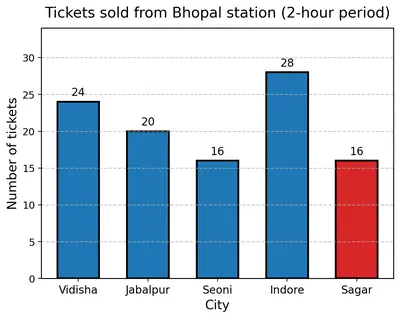
Pooja collected data on the number of tickets sold at the Bhopal railway station for a few different cities of Madhya Pradesh over a two-hour period.

CityVidishaJabalpurSeoniIndoreSagar
Number of tickets2420162816

She used this data and prepared a bar graph on the board to discuss the data with her students, but someone erased a portion of the graph.

(a) Write the number of tickets sold for Vidisha above the bar.

Solution

The data table shows:

  • Tickets for Vidisha  = $$24$$

Therefore the number that must be written above the Vidisha bar is $$24$$.

Answer

24

(b) Write the number of tickets sold for Jabalpur above the bar.

Solution

From the table:

  • Tickets for Jabalpur  = $$20$$

Hence the number to be written above the Jabalpur bar is $$20$$.

Answer

20

(c) The bar for Vidisha is 6 unit lengths and the bar for Jabalpur is 5 unit lengths. What is the scale for this graph?

Solution

We are told:

  • Vidisha bar  = 6 units ⇒ $$24$$ tickets
  • Jabalpur bar  = 5 units ⇒ $$20$$ tickets

To find the scale, divide the number of tickets by the number of unit lengths.

For Vidisha:
$$\text{Tickets per unit} = \frac{24}{6} = 4$$

For Jabalpur (check):
$$\frac{20}{5} = 4$$   ✔

Both give the same value, so

Scale:  1 unit length represents $$4$$ tickets.

Answer

1 unit length = 4 tickets

(d)

Draw the correct bar for Sagar.
Figure
Figure

Solution

The correct height for Sagar must show $$16$$ tickets.

Using the scale “1 unit = 4 tickets”:

$$\text{Required height (units)} = \frac{16}{4} = 4\text{ units}$$

How to draw:

  • Locate the column labelled “Sagar” on the horizontal axis.
  • From that position, draw a rectangle (bar) of width equal to the other bars.
  • Make its height exactly 4 unit divisions up the vertical axis (that will reach the 16-ticket mark).
  • Shade or colour the bar the same way as the others.

Answer

Draw Sagar’s bar 4 units high (to the 16-ticket mark).

(e) Add the scale of the bar graph by placing the correct numbers on the vertical axis.

Solution

Mark the vertical (y) axis so that every unit length stands for 4 tickets.

  • 0 (at the base line)
  • 4
  • 8
  • 12
  • 16
  • 20
  • 24
  • 28

This covers the tallest bar (Indore, 28 tickets). Extend further if you want equal spaces above.

Answer

Label the y-axis: 0, 4, 8, 12, 16, 20, 24, 28 (each one unit apart).

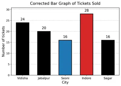
(f)

Are the bars for Seoni and Indore correct in this graph? If not, draw the correct bar(s).
Figure
Figure

Solution

Check the required heights with the scale “1 unit = 4 tickets”.

  • Seoni: $$16 \text{ tickets} \div 4 = 4 \text{ units}$$
  • Indore: $$28 \text{ tickets} \div 4 = 7 \text{ units}$$

If the existing bars on the graph are

  • 4 units high for Seoni and
  • 7 units high for Indore,

then they are already correct.

If they differ from these heights (for example, Seoni drawn with 5 units or Indore drawn with 6 units), erase them and redraw as follows:

  • Seoni → bar exactly 4 units tall (up to 16 on the scale).
  • Indore → bar exactly 7 units tall (up to 28 on the scale).

Answer

Correct bars should be 4 units for Seoni and 7 units for Indore; redraw if necessary.

33

Chinu listed the various means of transport that passed across the road in front of his house from 9 a.m. to 10 a.m.:

bikecarbikebusbikebike
bikeauto rickshawbicyclebullock cartbicycleauto rickshaw
carscootercarauto rickshawbicyclebike
carauto rickshawbikescooterbikecar
bicyclescooterbicyclescooterbikebus
auto rickshawauto rickshawbikebicyclebusbike
bicyclescooterbusscooterauto rickshawbike
scooterbicyclebikebullock cartauto rickshawscooter
carscooter

(a) Prepare a frequency distribution table for the data.

Solution

Step 1 – List all the observations
There are 50 observations (vehicles) in one hour.

Step 2 – Decide the categories
The different kinds of vehicles noticed are
bike, car, bus, auto rickshaw, bicycle, scooter, bullock cart.

Step 3 – Put tally marks while reading the list once only

Means of transportTally marksFrequency
Bike||||/ ||||/ |||13
Car||||/ |6
Bus||||4
Auto rickshaw||||/ |||8
Bicycle||||/ |||8
Scooter||||/ ||||9
Bullock cart||2

Step 4 – Add the tallies
The last column already shows the number of vehicles (frequency) of each kind. The total of the frequency column is $$13+6+4+8+8+9+2 = 50$$, which tallies with the total observations, so the work is correct.

Answer

Frequency table prepared. (See table.)

(b) Which means of transport was used the most?

Solution

From the frequency column in the table:
Bike appears 13 times, which is more than the frequency of every other vehicle.
Therefore the bike was the most frequently used means of transport during 9 a.m. – 10 a.m.

Answer

Bike

(c) If you were there to collect this data, how could you do it? Write the steps or process.

Solution

You can collect the data in the following systematic way:

  1. Stand (or sit) at a safe spot on the roadside exactly from 9 a.m. to 10 a.m. with a notebook and a pencil.
  2. Before starting, draw a small table in the notebook with three columns: “Type of vehicle”, “Tally marks” and “Frequency”. List the expected types of vehicles (bike, car, bus, auto rickshaw, bicycle, scooter, bullock cart, etc.) in the first column.
  3. As soon as you see a vehicle pass the observation line, quickly put one tally mark (a small vertical line) in the tally-mark column of the correct row.
  4. Every time the fifth tally for a vehicle is to be made, draw the fifth line across the previous four to make a gate group (||||/). This keeps counting fast and neat.
  5. Continue in the same way without talking or looking away, so that no vehicle is missed or counted twice.
  6. When the clock shows 10 a.m., stop observing. Now count the tally marks in each row and write the total number in the frequency column.
  7. Finally, add all the individual frequencies to be sure they equal the total number of vehicles actually noted. If the two numbers are the same, your data collection is complete and reliable.

Answer

Stand for one hour, make a tally-mark table, mark one tally for every passing vehicle in the correct row, group tallies in fives, stop at 10 a.m., count the tallies to get the frequencies and finally check the grand total.

34 Roll a die 30 times and record the number you obtain each time. Prepare a frequency distribution table using tally marks. Find the number that appeared:

(a) The minimum number of times.

Solution

Step 1 – Record the 30 outcomes

The 30 outcomes of the die-throws (in the order they occurred) were:

3, 2, 1, 6, 5, 6, 6, 4, 6, 3, 3, 5, 4, 1, 6, 2, 6, 2, 5, 5, 6, 3, 2, 6, 5, 5, 3, 6, 2, 4

Step 2 – Frequency distribution table

Going through the list once and putting a tally mark in the correct row (crossing every fifth tally as $$\bcancel{||||}$$):

Number on dieTally marksFrequency
1$$||$$2
2$$\bcancel{||||}$$5
3$$\bcancel{||||}$$5
4$$|||$$3
5$$\bcancel{||||}\,|$$6
6$$\bcancel{||||}\,||||$$9

Check: $$2+5+5+3+6+9=30$$, which equals the total number of throws.

Step 3 – Identify the smallest frequency

Comparing the frequencies $$2,\,5,\,5,\,3,\,6,\,9$$, the smallest is $$2$$, which corresponds to the number $$1$$ on the die.

∴ The number that appeared the minimum number of times is $$1$$, appearing only $$2$$ times.

Answer

The number that appeared the minimum number of times is 1 (it came up only 2 times in 30 throws).

(b) The maximum number of times.

Solution

From the same frequency distribution table prepared in part (a). A group of five tallies is written as four vertical lines with a slash through them: ||||/.

Number on dieTally marksFrequency
1||2
2||||/5
3||||/5
4|||3
5||||/ |6
6||||/ ||||9

Comparing the frequencies $$2,\,5,\,5,\,3,\,6,\,9$$, the largest is $$9$$, which corresponds to the number $$6$$ on the die.

∴ The number $$6$$ appeared the maximum number of times, namely $$9$$ times out of $$30$$ throws.

Answer

The number that appeared the maximum number of times is 6 (it came up 9 times in 30 throws).

(c) Find numbers that appeared an equal number of times.

Solution

Looking again at the frequencies obtained:

  • $$1 \rightarrow 2$$ times
  • $$2 \rightarrow 5$$ times
  • $$3 \rightarrow 5$$ times
  • $$4 \rightarrow 3$$ times
  • $$5 \rightarrow 6$$ times
  • $$6 \rightarrow 9$$ times

We see that the numbers $$2$$ and $$3$$ both have the same frequency, namely $$5$$. No other pair (or group) of numbers shares an equal frequency.

Answer

The numbers that appeared an equal number of times are 2 and 3 (each occurred 5 times).

35

Faiz prepared a frequency distribution table of data on the number of wickets taken by Jaspreet Bumrah in his last 30 matches:

Wickets TakenNumber of Matches
02
14
26
38
43
55
61
71

(a) What information is this table giving?

Solution

The first column of the table shows every score that Jaspreet Bumrah could make in a single match, namely 0, 1, 2, 3, 4, 5, 6 and 7 wickets.
The second column tells how many of his last 30 matches correspond to each of those wicket tallies.
In other words, the table is a frequency distribution: it tells the frequency (number of matches) for each possible number of wickets Bumrah took.

Answer

It shows, for each possible number of wickets (0 to 7), how many of his last 30 matches Bumrah took that many wickets.

(b) What may be the title of this table?

Solution

A good title must say what is being counted and for which period. Because the table records wickets taken by Jaspreet Bumrah in his last 30 matches, the title could be:

"Wickets taken by Jaspreet Bumrah in his last 30 matches"

Answer

Wickets taken by Jaspreet Bumrah in his last 30 matches

(c) What caught your attention in this table?

Solution

On quickly scanning the numbers, the largest frequency I notice is 8 matches with 3 wickets each. That tells me the most common performance in this period was taking 3 wickets in a match.

Answer

The first striking fact is that 3 wickets appears most often—8 times—which is the highest frequency in the table.

(d) In how many matches has Bumrah taken 4 wickets?

Solution

Look at the row where "Wickets Taken" is 4. The corresponding "Number of Matches" is 3. Therefore Bumrah took exactly 4 wickets in 3 of the 30 matches.

Answer

In 3 matches.

(e) Mayank says, "If we want to know the total number of wickets he has taken in his last 30 matches, we have to add the numbers 0, 1, 2, 3 …, up to 7." Can Mayank get the total number of wickets taken in this way? Why?

Solution

No. Adding only the numbers $$0,1,2,3,4,5,6,7$$ once each ignores the fact that every number of wickets occurred many times.
To find the total wickets we need to add “wickets × number of matches” for every row, not just the wicket numbers themselves.

Answer

No. Each wicket figure has to be counted as many times as it occurred; simply adding 0 + 1 + … + 7 counts each figure once instead of its actual frequency.

(f) How would you correctly figure out the total number of wickets taken by Bumrah in his last 30 matches, using this table?

Solution

Multiply each wicket figure by its frequency and then add:

$$0\times2 = 0$$
$$1\times4 = 4$$
$$2\times6 = 12$$
$$3\times8 = 24$$
$$4\times3 = 12$$
$$5\times5 = 25$$
$$6\times1 = 6$$
$$7\times1 = 7$$

Now add all these products:
$$0+4+12+24+12+25+6+7 = 90$$

So Bumrah took a total of 90 wickets in his last 30 matches.

Answer

Total wickets = 90

36

The following pictograph shows the number of tractors in five different villages.

VillagesNumber of Tractors (🚜 = 1 Tractor)
Village A🚜 🚜 🚜 🚜 🚜 🚜 (6 tractors)
Village B🚜 🚜 🚜 🚜 🚜 (5 tractors)
Village C🚜 🚜 🚜 🚜 🚜 🚜 🚜 🚜 (8 tractors)
Village D🚜 🚜 🚜 (3 tractors)
Village E🚜 🚜 🚜 🚜 🚜 🚜 (6 tractors)

Observe the pictograph and answer the following questions —

(a) Which village has the smallest number of tractors?

Solution

First write down the number of tractors in each village (counting the tractor pictures):

  • Village A : 6 tractors
  • Village B : 5 tractors
  • Village C : 8 tractors
  • Village D : 3 tractors
  • Village E : 6 tractors

The smallest number in this list is 3. That belongs to Village D.

Answer

Village D

(b) Which village has the most tractors?

Solution

Again list the numbers:

  • Village A : 6
  • Village B : 5
  • Village C : 8
  • Village D : 3
  • Village E : 6

The greatest number is 8, so Village C has the most tractors.

Answer

Village C

(c) How many more tractors does Village C have than Village B?

Solution

Number of tractors in Village C = 8
Number of tractors in Village B = 5

Difference = $$8 - 5 = 3$$

So Village C has 3 more tractors than Village B.

Answer

3 tractors

(d) Komal says, "Village D has half the number of tractors as Village E." Is she right?

Solution

Village D has 3 tractors.
Village E has 6 tractors.

Half of Village E’s tractors = $$\dfrac{1}{2} \times 6 = 3$$ tractors.

Since Village D actually has 3 tractors, Komal’s statement “Village D has half the number of tractors as Village E” is correct.

Answer

Yes, Komal is right.

37

The number of girl students in each class of a school is depicted by the pictograph (👧 = 4 Girls):

ClassesNumber of Girl Students
1👧 👧 👧 👧 👧 👧 (about 24)
2👧 👧 👧 👧 👧̷ (about 18)
3👧 👧 👧 👧 👧 (about 20)
4👧 👧 👧 👧̷ (about 14)
5👧 👧 👧̷ (about 10)
6👧 👧 👧 👧 (16)
7👧 👧 👧 (12)
8👧 👧̷ (about 6)

Observe this pictograph and answer the following questions:

(a) Which class has the least number of girl students?

Solution

Step 1 – Use the key
One symbol 👧 stands for $$4$$ girls. A half 👧 therefore stands for $$\dfrac{4}{2}=2$$ girls.

Step 2 – Write the exact numbers

ClassCount of full 👧Count of half 👧Total girls
160$$6\times4=24$$
241$$4\times4+1\times2=18$$
350$$5\times4=20$$
431$$3\times4+2=14$$
521$$2\times4+2=10$$
640$$4\times4=16$$
730$$3\times4=12$$
811$$1\times4+2=6$$

Step 3 – Compare
The smallest number is $$6$$ in Class 8.

Answer

Class 8

(b) What is the difference between the number of girls in Classes 5 and 6?

Solution

Girls in Class 5 = $$10$$ (from the table above).

Girls in Class 6 = $$16$$.

Required difference $$=16-10=6$$.

Answer

6 girls

(c) If two more girls were admitted in Class 2, how would the graph change?

Solution

Present strength of Class 2 = $$18$$ girls.

After admitting two more girls: $$18+2 = 20$$ girls.

Effect on the pictograph
$$20 \div 4 = 5$$, so we need exactly five complete 👧 symbols.
The existing half 👧 in Class 2 would be replaced by another half to make one full symbol (or simply draw one more half to complete the icon), giving 5 full 👧👧👧👧👧 and no half symbols.

Answer

The half 👧 will be converted into a full one, so Class 2 will show 5 complete 👧 symbols (20 girls).

(d) How many girls are there in Class 7?

Solution

From the earlier calculation, Class 7 has $$3$$ full symbols.

Number of girls $$=3\times4=12$$.

Answer

12 girls

38

Mudhol Hounds (a type of breed of Indian dogs) are largely found in North Karnataka's Bagalkote and Vijaypura districts. The government took an initiative to protect this breed by providing support to those who adopted these dogs. Due to this initiative, the number of these dogs increased. The number of Mudhol dogs in six villages of Karnataka are as follows —

Village A : 18, Village B : 36, Village C : 12, Village D : 48, Village E : 18, Village F : 24

Prepare a pictograph and answer the following questions:

(a) What will be a useful scale or key to draw this pictograph?

Solution

First note the number of dogs in each village:

$$18,\;36,\;12,\;48,\;18,\;24$$

To draw a pictograph we select a number that divides all of these figures so that every village can be shown with whole symbols.

The greatest common divisor of all the six numbers is $$6$$ because

  • $$18\div6 = 3$$
  • $$36\div6 = 6$$
  • $$12\div6 = 2$$
  • $$48\div6 = 8$$
  • $$24\div6 = 4$$

Using $$1$$ picture of a Mudhol dog to stand for $$6$$ dogs keeps the number of symbols small (the largest village will need only 8 symbols) and avoids fractions. Hence this is a convenient scale.

Key for the pictograph: one dog picture  =  $$6$$ Mudhol dogs.

Answer

Use one dog picture to represent 6 Mudhol dogs.

(b) How many symbols will you use to represent the dogs in Village B?

Solution

Village B has $$36$$ dogs.

With the chosen key (1 symbol = $$6$$ dogs):

Number of symbols $$=\dfrac{36}{6}=6$$.

So six dog pictures are needed for Village B.

Answer

6 symbols

(c) Kamini said that the number of these dogs in Village B and Village D together will be more than the number of these dogs in the other 4 villages. Is she right? Give reasons for your response.

Solution

First add the numbers for Village B and Village D:

$$36+48=84$$

Next add the numbers for the remaining four villages:

$$18+12+18+24=72$$

Compare the two totals:

$$84\gt72$$

Since $$84$$ (B + D) is greater than $$72$$ (A, C, E, F), Kamini’s statement is correct.

Answer

Yes. 36 + 48 = 84 > 18 + 12 + 18 + 24 = 72.

39

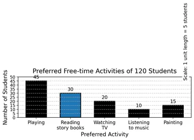
A survey of 120 school students was conducted to find out which activity they preferred to do in their free time:

Preferred ActivityNumber of Students
Playing45
Reading story books30
Watching TV20
Listening to music10
Painting15

Draw a bar graph to illustrate the above data taking the scale of 1 unit length = 5 students. Which activity is preferred by most students other than playing?

Figure
Figure

Solution

Step 1 : Rewrite the data clearly

Preferred ActivityNumber of students
Playing45
Reading story books30
Watching TV20
Listening to music10
Painting15

Step 2 : Choose a scale for the bar graph

The question tells us to take the scale

$$1\text{ unit length } = 5\text{ students}$$

That means for every 5 students, the bar will rise by 1 square (or 1 cm) on the graph paper.


Step 3 : Convert each number of students into "units of height"

Preferred ActivityNumber of studentsHeight of bar (in units)
Playing45$$\dfrac{45}{5}=9$$
Reading story books30$$\dfrac{30}{5}=6$$
Watching TV20$$\dfrac{20}{5}=4$$
Listening to music10$$\dfrac{10}{5}=2$$
Painting15$$\dfrac{15}{5}=3$$

Step 4 : Draw the axes

  • Draw two perpendicular lines. The horizontal line (x-axis) will show the activities.
  • The vertical line (y-axis) will show the number of students. Mark 0 at the origin.
  • Going up the y-axis, mark equal divisions of 1 unit, writing the scale beside it: 1 unit = 5 students. Hence label the y-axis 5, 10, 15, 20, …, 45.

Step 5 : Draw one bar for each activity

  • Above "Playing" draw a bar 9 units high (reaches up to 45).
  • Above "Reading story books" draw a bar 6 units high (up to 30).
  • Above "Watching TV" draw a bar 4 units high (up to 20).
  • Above "Listening to music" draw a bar 2 units high (up to 10).
  • Above "Painting" draw a bar 3 units high (up to 15).

All bars should have equal width and equal spacing between them.


Step 6 : Answer the question

The tallest bar is for "Playing" (45 students). Excluding this, the next tallest bar is for "Reading story books" (30 students).

Therefore, apart from playing, the activity preferred by the maximum number of students is Reading story books.

Answer

Other than playing, the most preferred activity is reading story books.

40

Students and teachers of a primary school decided to plant tree saplings in the school campus and in the surrounding village during the first week of July. Details of the saplings they planted are as follows — (bar graph showing: Monday — 52, Tuesday — 40, Wednesday — 30, Thursday — 40, Friday — 50, Saturday — 60, Sunday — 40)

(a) The total number of saplings planted on Wednesday and Thursday is _________.

Solution

From the bar graph we first copy the exact figures for the two required days:

  • Wednesday  = $$30$$ saplings
  • Thursday  = $$40$$ saplings

Add the two numbers exactly as we would do in our notebook:

$$30 + 40 = 70$$

Therefore, the children and teachers planted a total of $$70$$ saplings on Wednesday and Thursday taken together.

Answer

$$70$$ saplings

(b) The total number of saplings planted during the whole week is _________.

Solution

We list the number of saplings for every day and add them one by one.

DayNo. of saplings
Monday$$52$$
Tuesday$$40$$
Wednesday$$30$$
Thursday$$40$$
Friday$$50$$
Saturday$$60$$
Sunday$$40$$

Step-wise addition:

$$52 + 40 = 92$$

$$92 + 30 = 122$$

$$122 + 40 = 162$$

$$162 + 50 = 212$$

$$212 + 60 = 272$$

$$272 + 40 = 312$$

Hence, the total number of saplings planted in the whole week is $$312$$.

Answer

$$312$$ saplings

(c) The greatest number of saplings were planted on _________ and the least number of saplings were planted on _________. Why do you think that is the case? Why were more saplings planted on certain days of the week and less on others? Can you think of possible explanations or reasons? How could you try and figure out whether your explanations are correct?

Solution

Again reading the bar graph:

  • Monday – $$52$$
  • Tuesday – $$40$$
  • Wednesday – $$30$$
  • Thursday – $$40$$
  • Friday – $$50$$
  • Saturday – $$60$$
  • Sunday – $$40$$

Finding the greatest and the least numbers

The largest column is for Saturday with $$60$$ saplings, so Saturday is the day with the greatest number planted.

The smallest column is for Wednesday with only $$30$$ saplings, so Wednesday is the day with the least number planted.

Why might this have happened?

  • More saplings on Saturday: Saturday is normally a holiday or half-day for schools; children, teachers and even villagers may all be free, so more people can join the planting drive.
  • Fewer saplings on Wednesday: It is the middle of the working week when classes are running full time and everyone has less spare time.

How could we check whether these explanations are really correct?

  • Interview the students and teachers to ask on which days they were available and why.
  • Look at the school timetable or school calendar to see which days are half-days or holidays.
  • Compare the figures with data from other similar weeks; if Saturdays are always higher it supports the explanation.
  • Note any special events (e.g. a ‘Van Mahotsav’ function) that might have attracted extra volunteers on a particular day.

In this way we can collect further information to confirm or reject our initial reasons.

Answer

Greatest – Saturday (60 saplings);  Least – Wednesday (30 saplings).

41

The number of tigers in India went down drastically between 1900 and 1970. Project Tiger was launched in 1973 to track and protect the tigers in India. Starting in 2006, the exact number of tigers in India was tracked. Shagufta and Divya looked up information about the number of tigers in India between 2006 and 2022 in four-year intervals. They prepared a frequency table for this data and a bar graph to present this data, but there are a few mistakes in the graph. Can you find those mistakes and fix them?

YearNumber of Tigers (approx.)
20061400
20101700
20142200
20183000
20223700

Solution

Step 1 – Rewrite the collected data

YearNumber of Tigers
20061400
20101700
20142200
20183000
20223700

This frequency table is correct; we only have to check the bar graph that Shagufta and Divya prepared for it.

Step 2 – Recall the rules for a correct bar graph (Class 6 syllabus)

  • The horizontal axis (x-axis) must carry qualitative data – here the “Year”.
  • The vertical axis (y-axis) must carry quantitative data – here “Number of Tigers”.
  • All bars must have the same width and must be equally spaced.
  • The numerical scale on the y-axis must start from $$0$$ and go up in equal steps – e.g. $$200,\;500\text{ or }1000$$.
  • The top of every bar must be exactly level with the required value from the table.

Step 3 – Locate the mistakes in the given (wrong) graph

  1. Missing axis titles. Neither the x-axis nor the y-axis is labelled, so a reader cannot tell what the bars represent.
  2. Unequal scale on the y-axis. The graph jumps from “1000” straight to “2000”, then to “2600”, then to “3000”, so the divisions are not equal. This makes the bars look taller or shorter than they should be.
  3. Wrong height for the year 2014. In the graph the 2014 bar stops at about $$2100$$ instead of the correct $$2200$$.
  4. Bars touch each other and are of different widths. In a bar graph the bars must be of equal width with small, equal gaps between them.
  5. The years are not written in equal intervals on the x-axis. 2006 and 2010 are very close, while 2018 and 2022 are far apart.

Step 4 – Draw the corrected bar graph

Follow these instructions on graph paper:

  • Draw two perpendicular axes. Mark the horizontal axis “Year” and the vertical axis “Number of Tigers”.
  • Choose a convenient, equal scale on the y-axis. Example: let one small square represent $$100\text{ tigers}$$. Then the highest value $$3700$$ will be at $$37$$ small squares, which easily fits on ordinary graph paper.
  • Write the five years equally spaced on the x-axis: 2006, 2010, 2014, 2018, 2022.
  • Draw five bars of equal width (say 2 cm each) with a gap of 1 cm between any two bars.
  • For each year, take the bar straight up to the correct height calculated from the table:
YearHeight (in small squares, 1 square = 100 tigers)
200614
201017
201422
201830
202237
  • Shade or colour all the bars lightly and give the graph a title such as “Number of Tigers in India (2006–2022)”.

Now the bar graph satisfies every rule: equal scale, equal bar width, correctly plotted heights, labelled axes and title.

Step 5 – Summary of corrections

  • Add axis titles and an overall title.
  • Use an equal scale (e.g. 100 tigers per small square) on the y-axis; start at $$0$$.
  • Plot 2014 at $$2200$$, not $$2100$$.
  • Make all bars the same width with equal spacing.
  • Place the years at equal distances on the x-axis.

After these five corrections the bar graph accurately represents the tiger-population data from 2006 to 2022.

Answer

Mistakes found & fixed:

  1. Axes had no labels – now labelled “Year” and “Number of Tigers”.
  2. Y-axis scale was irregular – now equal steps of 100 (0, 100, 200 … 3700).
  3. 2014 bar was drawn to 2100 instead of 2200 – corrected.
  4. Bars were of different widths and touched – now equal width with equal gaps.
  5. Years on x-axis were unevenly spaced – now placed at equal intervals.

With these five changes the bar graph is accurate.

Section 4.5 – Artistic and Aesthetic Considerations (Figure it Out)

42 If you wanted to visually represent the data of the heights of the tallest persons in each class in your school, would you use a graph with vertical bars or horizontal bars? Why?

Solution

Step 1 – Recall what a bar graph is
A bar graph represents categories on one axis and the corresponding numerical values (called frequencies or measurements) on the other. Every category gets its own bar, and all bars must have equal width and equal spacing.

Step 2 – Identify the data we have
Here the categories are the classes in the school (for example Class 6A, 6B, 7A, …). The numerical values are the heights (say in cm) of the tallest student in each class.

Step 3 – Decide which axis should carry which item
It is easier to read a graph if the categories are written from left to right along the horizontal axis. Then we can let the vertical axis carry the scale for height (0 cm, 20 cm, 40 cm, …).

Step 4 – Choose the bar orientation
Because the categories are placed horizontally and the numerical scale is vertical, the bars will automatically rise vertically. This is the usual, most familiar way of drawing a bar graph for such data.

Step 5 – State the choice with reason
Therefore, we should draw vertical bars. They make it simple to compare the different heights and match the common classroom convention where the y-axis shows the measurement.

(Note: Horizontal bars would also work if we placed the classes on the vertical axis and the scale on the horizontal axis, but that is less common for this type of data.)

Answer

Use a graph with vertical bars, because we normally list the classes along the horizontal axis and show the heights on the vertical scale, so each bar must rise vertically.

43 If you were making a table of the longest rivers on each continent and their lengths, would you prefer to use a bar graph with vertical bars or with horizontal bars? Why? Try finding out this information, and then make the corresponding table and bar graph! Which continents have the longest rivers?

Solution

Step 1 · Deciding the orientation of the bars

When we make a bar graph we must be able to read two things easily:

  • the names of the items, and
  • the length of the bars (the numbers).

The names of rivers such as Mississippi–Missouri or Murray–Darling are rather long. If we draw vertical bars we would have to write these long names below the $x$-axis, one under another, and they would overlap or have to be written very slantingly. A horizontal bar graph leaves plenty of room on the left of every bar, so the labels can be written neatly. Therefore we prefer a graph with horizontal bars.

Step 2 · Collecting the data (one longest river from each continent)

ContinentRiver chosenApprox. length (km)
AfricaNile$$6\,650$$
South AmericaAmazon$$6\,400$$
AsiaYangtze$$6\,300$$
North AmericaMississippi–Missouri system$$6\,275$$
Australia/OceaniaMurray–Darling$$3\,672$$
EuropeVolga$$3\,530$$
AntarcticaOnyx$$32$$

(River lengths are rounded to the nearest $25\text{–}50\,\text{km}$ so that they are easy to plot.)

Step 3 · Choosing a scale

The longest river in the list is about $$6\,650\,\text{km}$$. We want a graph that fits comfortably on an ordinary sheet of paper. Let us decide on the scale

$$\text{1\ cm} \;\longrightarrow\; 500\,\text{km}$$

With this scale the longest bar will be

$$6\,650 \text{ km}\;\div\;500\,\text{km per cm}=13.3\,\text{cm}.$$

That fits nicely on a page.

Step 4 · Drawing the horizontal bar graph (description)

  1. Draw a long horizontal $x$-axis, mark equal divisions of $1\,\text{cm}$ (or $0.5\,\text{cm}$ if you like) and label them $0,500,1000,\dots ,7000\,\text{km}$.
  2. Draw a vertical $y$-axis on the left. On this axis leave equal gaps and write the river names with their continents: Nile (Africa), Amazon (S. America), Yangtze (Asia), Mississippi–Missouri (N. America), Murray–Darling (Australia), Volga (Europe), Onyx (Antarctica).
  3. For each river draw a bar of the appropriate length, measured from the $y$-axis according to the scale.
  4. Shade or colour all the bars lightly and write the exact value at the end of each bar if you wish.
  5. Add a title: "Longest River on each Continent" and write the scale under the graph.

(Because the answer must be text only, no picture is shown; follow the steps to get a neat graph.)

Step 5 · Reading the finished bar graph

Comparing the bar lengths, the four continents whose longest rivers are over $$6\,000\,\text{km}$$ are, in decreasing order:

  • Africa — Nile (about $$6\,650\,\text{km}$$),
  • South America — Amazon (about $$6\,400\,\text{km}$$),
  • Asia — Yangtze (about $$6\,300\,\text{km}$$), and
  • North America — Mississippi–Missouri (about $$6\,275\,\text{km}$$).

Australia’s Murray–Darling and Europe’s Volga are roughly half this length, while Antarctica’s Onyx is very small in comparison.

Conclusion

A horizontal bar graph is more convenient here because the labels are long. From the data we can see that Africa (Nile) has the single longest river, followed very closely by South America (Amazon), then Asia (Yangtze) and North America (Mississippi–Missouri).

Answer

Use a horizontal bar graph; it leaves enough space to write the long river names.
The continents with the longest rivers are, in order, Africa (Nile ≈ 6 650 km), South America (Amazon ≈ 6 400 km), Asia (Yangtze ≈ 6 300 km) and North America (Mississippi–Missouri ≈ 6 275 km).

44 What is $$5642 \times 2$$?

Solution

The problem asks us to multiply the 4-digit number $$5642$$ by $$2$$.

  1. Write the numbers one below the other in the standard multiplication layout.

    ThousandsHundredsTensOnes
    Multiplicand5642
    Multiplier$$\times\;2$$
  2. Multiply each digit, starting from the ones place, and carry over whenever the product is 10 or more.

    • Ones place: $$2 \times 2 = 4$$ (no carry). Write $$4$$ in the ones column.
    • Tens place: $$2 \times 4 = 8$$ (no carry). Write $$8$$ in the tens column.
    • Hundreds place: $$2 \times 6 = 12$$. Write $$2$$ in the hundreds column and carry $$1$$ thousand.
    • Thousands place: $$2 \times 5 = 10$$, then add the carried $$1$$ to get $$11$$. Write $$11$$ in the thousands (and ten-thousands) columns.

    The partial products and carries can be shown in a short column-method table:

    Ten-thousandsThousandsHundredsTensOnes
    Result11284
  3. Read off the final product.

    \[11284\]

Therefore, $$5642 \times 2 = 11284$$.

Answer

$$5642 \times 2 = 11284$$

NCERT Solutions for Class 6
Maths
NCERT Solutions for Class 6 Maths
Chapter-wise step-by-step
solutions with explanations
explore solutions Maths bg
Science
NCERT Solutions for Class 6 Science
Chapter-wise step-by-step
solutions with explanations
explore solutions Science bg

Frequently Asked Questions

50,000+ JEE Students Trusted Our Score Calculator

Predict your JEE Main percentile, rank & performance in seconds