Instructions
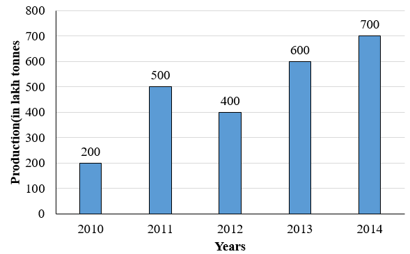
The following bar graph shows the production of Iron in a country (in lakh tonnes) in different years.
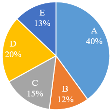
The pie chart shows the production of Iron (in lakh tonnes) by five different companies A, B, C, D and E in 2013. These companies are the only ones to produce iron in all the given years.
Question 68
Company D produced 75% more iron in 2014 than produced by it in 2013. What percent of iron produced in 2014 was prod uced by company D?
Create a FREE account and get:
- Download Maths Shortcuts PDF
- Get 300+ previous papers with solutions PDF
- 500+ Online Tests for Free


