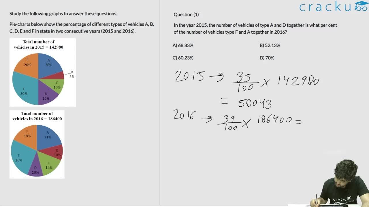
Study the following graphs to answer these questions.
Pie-charts below show the percentage of different types of vehicles A, B, C, D, E and F in state in two consecutive years (2015 and 2016).


From 2015 to 2016, in the case of whigh of the following types of vehicles, the change was maximum?
Solution
For A:
In 2015, 20% of 142,980 = 28,596
In 2016, 21% of 186,400 = 39,144
Difference = 10,548
For B:
In 2015, 5% of 142,980 = 7149
In 2016, 10% of 186,400 = 18,640
Difference = 11,491
For C:
In 2015, 10% of 142,980 = 14,298
In 2016, 15% of 186,400 = 27,960
Difference = 13,662
For E:
In 2015, 30% of 142,980 = 42,896
In 2016, 26% of 186,400 = 48,464
Difference = 5,568
From this, we can see that C had the maximum difference of 13,662 from 2015 to 2016
Get AI Help
Video Solution
Click on the Email ☝️ to Watch the Video Solution

SRCC Quant Questions | SRCC Quantitative Ability
SRCC DILR Questions | LRDI Questions For SRCC
SRCC Verbal Ability Questions | VARC Questions For SRCC
Free SRCC DILR Questions
Book Free CAT Mentorship
Get personalized CAT strategy from a 99%iler
500+ students mentored
OTP Verification
Enter the 6-digit code sent to your phone
Booking Summary
Enter OTP
Didn't receive the OTP?


