Instructions
Study the line graph and answer the question that follows.
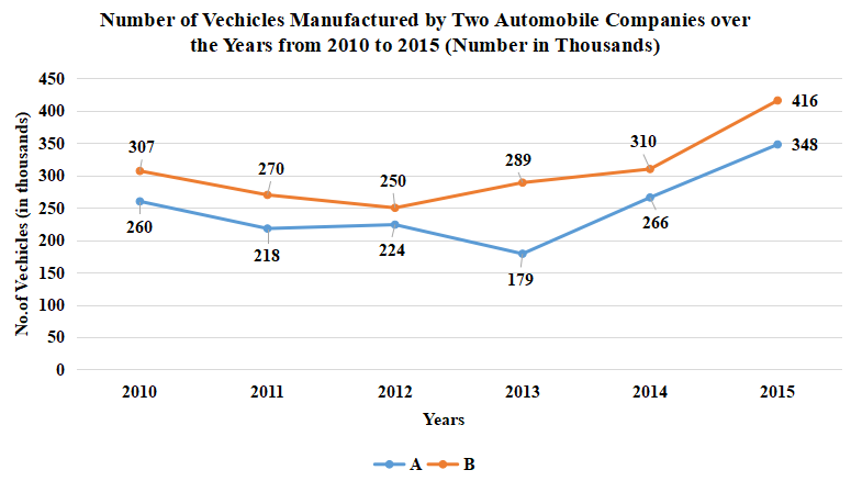
The line graph represents the number of vehicles (in thousands) manufactured by two automobile companies A and B over the years from 2010 to 2015. The X-axis represents the years and the Y-axis represents number ofvehicles in thousands.
(The data shown here is only for mathematical exercise. They do not represent the actual figures of the country.)
Question 51
If there was an increase of 24%in the average number of vehicles (in thousands) manufactured by Company B during 2011 to 2014 with respect to number of vehicles manufactured by Company A in 2009. then how many vehicles (in thousands) did Company A manufacture in 2009?
Create a FREE account and get:
- Free SSC Study Material - 18000 Questions
- 230+ SSC previous papers with solutions PDF
- 100+ SSC Online Tests for Free


