
SNAP Data Interpretation (Bar Graph) Questions PDF
Data Interpretation (Bar Graph) is an important topic in the Quant section of the SNAP Exam. Quant is a scoring section in SNAP, so it is advised to practice as much as questions from quant. This article provides some of the most important Data Interpretation Questions for SNAP. One can also download this Free Data Interpretation Questions for SNAP PDF with detailed answers by Cracku. These questions will help you practice and solve the Data Interpretation questions in the SNAP exam. Utilize this PDF practice set, which is one of the best sources for practicing.
Download Data Interpretation (Bar Graph) Questions for SNAP
Enroll to SNAP 2022 Crash Course
Question 1: Study the following graph and answer the question that follows.
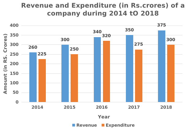
What is the total ratio of the revenue of the company in 2016 and 2018 to that of the total expenditure in 2015 and 2017 respectively?
a) 143:105
b) 130:103
c) 115:114
d) 105:143
1) Answer (A)
Solution:
Total revenue of the company in 2016 and 2018 = 340 + 375 = 715
Total expenditure of the company in 2015 and 2017 = 250 + 275 = 525
Required Ratio = 715 : 525
i.e; 143 : 105
Hence, option A is correct.
Question 2: Study the following graph and answer question that follows.

The expenditure of the company in 2016 is what percentage more then the average revenue (per year) in 2014, 2015 and 2018 (correct to the nearest integer)?
a) 3%
b) 5%
c) 6%
d) 4%
2) Answer (A)
Solution:
Expenditure of the company in 2016 = 320
Average revenue in 2014,2015 and 2018
$\therefore\frac{\left(revenue\ in\ 2014+revenue\ in\ 2015+revenue\ in\ 2018\right)}{3}$
$\therefore\frac{\left(260+300+375\right)}{3}$
= 311.67
Required percentage = $\frac{\left(320-311.67\right)}{311.67}$
$=2.67\simeq\ 3\%$
Hence, option A is correct
Question 3: The bar graph given below shows the sales of Newspapers (in lakh number) from six branches of a Media Publication Company during two consecutive years 2017 and 2018.
(Note: The data shown below is only for mathematical exercise. They do not represent the actual figures).
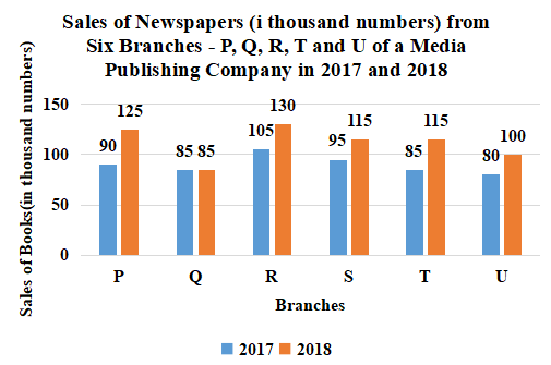
Total Sales of U for both the years is what percent (correct to one place of decimal) of the combined Sales of the branches Q and R for 2017 and 2018?
a) 48.6%
b) 67.1%
c) 44.4%
d) 41.0%
3) Answer (C)
Solution:
Total Sales of U for both the years = 80 + 100
= 180
Total sales of Q for 2017 and 2018 = 85 + 85
= 170
Total sales of R for 2017 and 2018 = 105 + 130
= 235
The combined Sales of the branches Q and R for 2017 and 2018 = 170 + 235
= 405
Required percentage = $\frac{180}{405}\times$100
= 44.4%
Hence, the correct answer is Option C
Question 4: Bar graph shows the number of males and females in five organizations A, B, C, D and E.
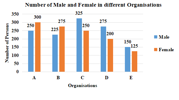
What is the ratio of number of males working in organizations C, D and E taken together to that of females working in organizations A, B and C taken together?
a) 10:11
b) 49:46
c) 11:10
d) 46:49
4) Answer (A)
Solution:
Number of males working in organizations C, D and E taken together = 325 + 275 + 150 = 750
Number of females working in organizations A, B and C taken together = 300 + 275 + 250 = 825
Required ratio = 750 : 825
= 10 : 11
Hence, the correct answer is Option A
Question 5: The following bar graph shows the amount(in Lakh Rs.) invested by a Company in purchasing raw material over the years and the values (in Lakh Rs.) of finished goods sold by the Company over the years.
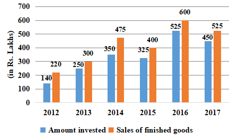
The ratio of total amount invested for purchasing raw material from 2013 to 2015 to the total sales of finished goods in 2014, 2016 and 2017 is:
a) 27 : 56
b) 56 : 27
c) 64 : 37
d) 37 : 64
5) Answer (D)
Solution:
Total amount invested for purchasing raw material from 2013 to 2015 = 250 + 350 + 325 = 925
The total sales of finished goods in 2014, 2016 and 2017 = 475 + 600 + 525 = 1600
Required ratio = 925 : 1600
= 37 : 64
Hence, the correct answer is Option D
Take SNAP mock tests here
Enrol to 10 SNAP Latest Mocks For Just Rs. 499
Question 6: Bar graph shows the number of males and females in five organizations A, B, C, D and E.
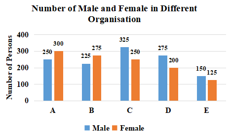
For which organisation, difference between the number of males and the average number of females of all the organisations is minimum?
a) D
b) C
c) A
d) B
6) Answer (D)
Solution:
The average number of females in all the organisations = $\frac{300+275+250+200+125}{5}$ = $\frac{1150}{5}$ = 230
For Organisation A, difference between the number of males and the average number of females of all the organisations = 250 – 230 = 20
For Organisation B, difference between the number of males and the average number of females of all the organisations = 230 – 225 = 5
For Organisation C, difference between the number of males and the average number of females of all the organisations = 325 – 230 = 95
For Organisation D, difference between the number of males and the average number of females of all the organisations = 275 – 230 = 45
$\therefore$ For Organisation B, difference between the number of males and the average number of females of all the organisations is minimum.
Hence, the correct answer is Option D
Question 7: The given bar graph shows the biscuit exports of India over a period of five years. Study the graph and answer the
question that follow.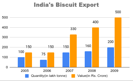
What was the percentage drop in the export quantity from 2005 to 2006?
a) 75%
b) 100%
c) 50%
d) 25%
7) Answer (D)
Solution:
From the bar graph,
Export quantity of India in 2005 = 100
Export quantity of India in 2006 = 75
$\therefore\ $Required percentage drop = $\frac{100-75}{100}\times100=$ 25%
Hence, the correct answer is Option D
Question 8: The given bar graph shows the biscuit exports of India over a period of five years. Study the graph and answer the question that follow.
In which year, the percentage increase in exports was maximum from its preceding year:
a) 2007
b) 2006
c) 2009
d) 2008
8) Answer (A)
Solution:
From the bar graph,
Percentage increase in exports from 2006 to 2007 = $\frac{150-75}{75}\times100=$ 100%
Percentage increase in exports from 2007 to 2008 = $\frac{160-150}{150}\times100=$ 6.66%
Percentage increase in exports from 2008 to 2009 = $\frac{200-160}{200}\times100=$ 20%
From 2005 to 2006, there was decrease in exports.
$\therefore\ $The percentage increase in exports was maximum in 2007 from its preceding year.
Hence, the correct answer is Option A
Question 9: The given bar-graph represents the number of teachers in different weight groups. Study the graph and answer the question that follows.
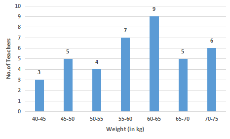
In which of the following weight groups is the number of teachers the maximum?
a) 45 – 50
b) 60 – 65
c) 65 – 70
d) 40 – 45
9) Answer (B)
Solution:
From the bar graph,
Number of teachers in the weight group 45 – 50 = 5
Number of teachers in the weight group 60 – 65 = 9
Number of teachers in the weight group 65 – 70 = 5
Number of teachers in the weight group 40 – 45 = 3
$\therefore\ $The number of teachers in the weight group 60 – 65 is highest.
Hence, the correct answer is Option B


