
Data Interpretation Chart Questions for MAH MBA CET PDF
Here you can download the important Data Interpretation chart (pie, tables, line, etc,.) questions PDF with solutions for MAH MBA CET by Cracku. These questions will help you to make practise and ace the Data Interpretation section in the MAH MBA CET exam. So kindly download the PDF for reference and do more practice.
The only trick to cracking this section is just practising the different types of chart questions. Use this Data Interpretation chart questions with solution PDF for practising. MBA CET is a speed-based exam so increase your speed of solving the question in this section by practising the question in given below PDF.
Click on the below link to download the data interpretation chart questions PDF
Download Data Interpretation Chart Questions for MAH-CET PDF
Enroll to MAH-CET Crash Course
Instructions
Read the information given below and answer the 3 associated questions.
The following graph depicts sector-wise percentage contributions to the gross domestic product (GDP) of nine nations, labelled “Nation A”, “Nation B” and so on. It is known that these nations are Brazil, China, France, Germany,India, Japan, Russia, the UK and the USA, but not necessarily in the same order.

The following, however, are known:
i) The GDPs of the nine nations (in US $ trillion) are:

ii) China has the highest agriculture sector GDP, valued at US $1 trillion, followed respectively by the USA and India
iii) In terms of percentage contribution to the respective nations’ GDPs by their service sectors, the UK and France are respectively the first and the second
iv) Nation A, Nation B and Nation G have the same GDP
v) The GDPofIndia’s industry sector is lower than the GDP of Russia’s industry sector. However,it is larger than that of Brazil’s industry sector
Question 1: Which of the following information, when considered in addition to the given information, does not allow us to completely identify the nine nations in the graph?
a) Germany’s industry GDP is US $1.2 trillion
b) The nation ranked fourth in terms of agriculture GDP has its agriculture GDP valued at US $150 billion
c) In terms of percentage contribution to the respective nations’ GDP, France and Japan’s agriculture sectors contribute the same
d) Japan’s industry GDP is US $1.25 trillion
e) Both Japan’s and Germany’s industry GDPs are more than US $1 trillion
1) Answer (A)
Solution:
FRom ii, China is F.
FRom iv and v, India must be A, Brazil must be G and Russia must be B.
India’s GDP due to agriculture = 17% of 2 trillion =0.34 trillion.
FRom i, USA GDP due to agriculture> 0.34 trillion and <1 trillion i.e. it’s percentage must be >2% and less than 5.8%
So, USA can be C/E/H.
From point 3, UK must be D and France must be H=> U.S.A must be C/E.
Now, Germany and Japan can be C or I.
Option A: If Germany is C, then its GDP will be 1 but given its gdp is 1.2 So, C is not Germany. If Germany is I, then its GDP will be 1.2trillion. Hence, Germany is I => Japan is C/E and USA is C/E. If USA is C then its GDP due to agriculture is not 3rd highest. So, USA is E and Japan is C.
Option A is correct.
Question 2: Based on the given information, which of the following CANNOT be ruled out?
a) US is Nation I
b) Russia is Nation G
c) China is Nation C
d) Japan is Nation E
e) India is Nation B
2) Answer (D)
Solution:
FRom ii, China is F.
FRom iv and v, India must be A, Brazil must be G and Russia must be B.
India’s GDP due to agriculture = 17% of 2 trillion =0.34 trillion.
FRom i, USA GDP due to agriculture> 0.34 trillion and <1 trillion i.e. it’s percentage must be >2% and less than 5.8%
So, USA can be C/E/H.
From point 3, UK must be D and France must be H=> U.S.A must be C/E.
Now, Germany and Japan can be C or I or E.
.’. Everything except option D can be ruled out.
Question 3: Based on the given information, how many nations can be uniquely identified?
a) 6
b) 9
c) 3
d) 2
e) 7
3) Answer (A)
Solution:
FRom ii, China is F.
FRom iv and v, India must be A, Brazil must be G and Russia must be B.
India’s GDP due to agriculture = 17% of 2 trillion =0.34 trillion.
FRom i, USA GDP due to agriculture> 0.34 trillion and <1 trillion i.e. it’s percentage must be >2% and less than 5.8%
So, USA can be C/E/H.
From point 3, UK must be D and France must be H=> U.S.A must be C/E.
Now, Germany and Japan can be C or I.
6 nations can be uniquely identified.
Instructions
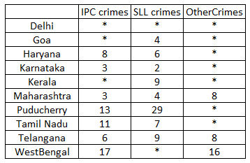
The Ministry of Home Affairs is analysing crimes committed by foreigners in different states and union territories (UT) of India. All cases refer to the ones registered against foreigners in 2016.
The number of cases – classified into three categories: IPC crimes, SLL crimes and other crimes – for nine states/UTs are shown in the figure below. These nine belong to the top ten states/UTs in terms of the total number of cases registered. The remaining state (among top ten) is West Bengal, where all the 520 cases registered were SLL crimes.
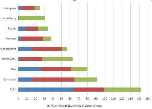
The table below shows the ranks of the ten states/UTs mentioned above among ALL states/UTs of India in terms of the number of cases registered in each of the three category of crimes. A state/UT is given rank r for a category of crimes if there are (r‐1) states/UTs having a larger number of cases registered in that category of crimes. For example, if two states have the same number of cases in a category, and exactly three other states/UTs have larger numbers of cases registered in the same category, then both the states are given rank 4 in that category. Missing ranks in the table are denoted by *.
Question 4: What is the sum of the ranks of Delhi in the three categories of crimes?
4) Answer: 5
Solution:
The data can be tabulated as follows(approximately):
The data can be tabulated as follows(approximately):
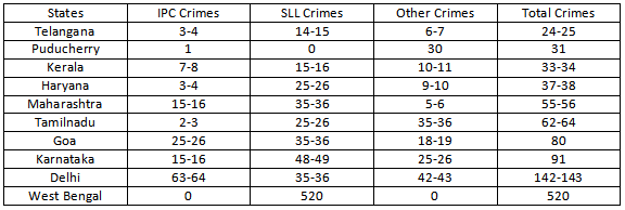
The rank of Delhi in IPC crimes should be 1 because the states which are not in table cannot crime more than that of Telangana which is 24-25.
Similarly Delhi Rank in Other crimes will be 1.
Now in SLL crimes clearly West Bengal has rank 1. It is given that Karnataka has rank 2. The rank 3 can go to either Goa, Delhi and Maharashtra but Goa and Maharashtra already have rank 4. So Delhi will have rank 3. Also no state outside of the table can be ranked 3 in SLL crimes as maximum number of crime should be less than that of Telangana(24-25). Here the number of SLL crimes is 35-36.
Hence the sum of the ranks = 1+3+1=5
Question 5: Which of the following is DEFINITELY true about the ranks of states/UT in the ‘other crimes’ category?
i) Tamil Nadu: 2
ii) Puducherry: 3
a) both i) and ii)
b) only ii)
c) neither i) , nor ii)
d) only i)
5) Answer (A)
Solution:
The data can be tabulated as follows(approximately):
From the table, the rank of Tamilnadu in other crimes is 2. The states which are not in the table will have crimes less than Telangana(i.e 24-25)
From the table the rank of Pudducherry in other crimes is 3.
Question 6: In the two states where the highest total number of cases are registered, the ratio of the total number of cases in IPC crimes to the total number in SLL crimes is closest to
a) 3 : 2
b) 19 : 20
c) 11 : 10
d) 1 : 9
6) Answer (D)
Solution:
The data can be tabulated as follows(approximately):
The highest cases are registered in West Bengal and Delhi.
The total number of IPC crimes = 63-64
The total number of SLL crimes = 520+35-36 = 555-556
Hence the ratio = (63-64)/(555-556) = 0.11 (Approximately) = 1:9
Question 7: What is the rank of Kerala in the ‘IPC crimes’ category?
7) Answer: 5
Solution:
The data can be tabulated as follows(approximately):
Rank of Delhi in IPC crimes category = 1, The rank of Karnataka and Maharashtra is 3(from table), then the rank of Goa can only be 2.
The rank of Telangana is 6 which has less |IPC crimes than Kerala, which means the rank of Kerala can be less than or equal to 5.
Now, there are two states with 3 ranks, so there will be no rank 4, there can only be rank 5 which is Kerala.
Instructions
Answer the questions with the given information and the data.
The figures given below show the amount of work distribution (in operational hours) for a toy manufacturing company having manufacturing plants in Chennai and Kanpur. Each plant carries out six activities. Planned operational cost per hour of Chennai and Kanpur plants are ₹ 250 and %₹300 respectively. However, the actual operational cost per hour is ₹ 270 in Chennai and ₹ 315 in Kanpur.
Cost Difference (in %)=Absolute ((Actual Cost —- Planned Cost) / Planned Cost) x 100
.png)
Question 8: Whichof following activities has maximum cost difference in Kanpur Plant ?
a) Activity 1
b) Activity 3
c) Activity 4
d) Activity 5
8) Answer (B)
Solution:

ACtivity 1 : 50/100 * 100 = 50%
Activity 3 : 100/150 *100= 66.6%
Activity 4 : 50/100 *100 = 50%
Activity 5 = 50/250 * 100 = 20%
Activity 3 is the correct answer.
Question 9: In how many activities plant in Chennai could meet at least 50% shortfall in the actual operational hours compared to planned operational hours of plant in Kanpur ?
a) 1
b) 2
c) 3
d) 4
9) Answer (B)
Solution:

In Activity 1, 50% shortfall of planned and actual in Kanpur is 25. Excess in chennai is 25. Hence this activity is counted.
In Activity 2 there is no shortfall
In Activity 3, the 50% shortfall is 50. Excess in chennai is 28. Hence this is incorrect
In Activity 4 and 5 there is no shortfall
In Activity 6 the 50% shortfall is 25. Excess in Chennai is 78. Hence, this activity is counted.
Question 10: Overall Cost difference in Chennai plant is approximately :
a) 39%
b) 41%
c) 65%
d) 70%
10) Answer (B)
Solution:

Planned cost in chennai = 1032 * 250=258000
Actual cost in chennai = 1350 * 270 = 364500
Cost difference = (106500/258000)*100 = 41%
Take Free MAH-CET mock tests here
Question 11: In how manyactivities plant in Chennai has higher planned operational hours as compared to plant in Kanpur ?
a) 1
b) 2
c) 3
d) 4
11) Answer (B)
Solution:

Chennai has more planned operational hours in Activity 2 and 6.
Instructions
Answer the questions with the given information and the graph.
The analyst at a retail giant has modelled the consumer spending and consumer sentiment to prepare a strategy on product offers in the upcoming festive season. The data given in the figure are from last 10 years on 3 parameters namely, food spending (Food_Spend), style spending (Style_Spend), and sentiment index (Sentiment_Index). Study the figure below and answer the following questions :

Question 12: In which year, highest annual percentage change in StyleSpend is recorded ?
a) 2015
b) 2014
c) 2013
d) 2011
12) Answer (C)
Solution:
2015 = (450-300)/300 = 0.5
2014 = (650-300)/650 =0.54
2013 = (620-350)/350 = 0.77
2011 = (350-300)/350= 0.14
The highest percentage change is in the year 2013
Question 13: In which year, ratio of percentage annual change in Style_Spend to percentage annual change in Sentiment_Index is highest ?
a) 2011
b) 2012
c) 2014
d) 2017
13) Answer (C)
Solution:
2015 = (450-300)/300 = 0.5
2014 = (650-300)/650 =0.54
2013 = (620-350)/350 = 0.77
2011 Style spend = (350-300)/350= 0.14
2011 sentiment index = 140/250 = 0.56
2011 ratio = 1/4.
2012 Style spend = 50/300 = 1/6
2012 sentiment index = 140/390
Ratio 2012 = 0.06
2014 Style spend = (650-300)/650 =0.54
2014 sentiment index =360/750=0.48
Ratio = 1.1
2017 style spend = 100/450
2017 sentiment Index = 160/550
Ratio = 0.75
Option C is the correct answer.
Question 14: From the years mentioned below, in which year Food_Spend as a proportion of Style_Spend is lowest ?
a) 2012
b) 2013
c) 2015
d) 2016
14) Answer (B)
Solution:
2012 : 520/350 = 1.49
2013 : 700/650 = 1.07
2015 : 520/450 = 1.15
2016 : 520 / 450= 1.15
2013 is the lowest and hence it is the correct answer.
Question 15: From the years mentioned below, in which year total of Food_Spend and StyleSpend as a proportion of Sentiment_Index is lowest ?
a) 2011
b) 2013
c) 2016
d) 2017
15) Answer (C)
Solution:
2011 : 910/390= 2.33
2013: 1330/750= 1.77
2016: 970/550 = 1.75
2017: 960/370 = 2.6
Option C , 2016 is the correct answer.
Instructions
The break-up of the students in a university by subject major is given in the polar pie-chart. The bar chart shows the number of students who major in physics by geographic location.


Question 16: If the proportion of physics majors who are from Delhi is the same as the proportion of engineering majors who are from Delhi, how many engineering majors are from Delhi?
a) 22
b) 26
c) 18
d) 20
e) 24
16) Answer (D)
Solution:
Total number of Physics major from all locations = 225
$\therefore $ Total number of students = $\frac{225}{0.18}$ = 1250
Number of engineering students = 20% * 1250 = 250
So, basis the given condition we have
$\frac{18}{225}$=$\frac{x}{250}$
=> x = 20
Hence, option D
(Note: This question has been presented as was in the actual paper and has been solved by the aid of visual inference)
Question 17: How many students major in chemistry?
a) 200
b) 175
c) 170
d) 190
e) 180
17) Answer (B)
Solution:
Total number of Physics major from all locations = 225
$\therefore $ Total number of students = $\frac{225}{0.18}$ = 1250
Number of students majoring in chemistry = 14 % * 1250 = 175
Hence, option B.
Question 18: 12% of all students are from Chennai. What is the largest possible percentage of economics students that can be from Chennai, rounded off to the nearest integer?
a) 73%
b) 77%
c) 75%
d) 71%
e) 69%
18) Answer (A)
Solution:
Total number of Physics major from all locations = 225
$\therefore $ Total number of students = $\frac{225}{0.18}$ = 1250
Students from Chennai = 12% * 1250 = 150
Given, number of Physics majors from chennai = 40
$\therefore $ maximum possible number of economic students from chennai = 150 – 40 = 110
Maximum percentage of students = $\frac{110}{150}$ * 100 % = 73.33 %
Hence, option A.
Instructions
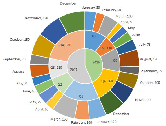
The multi-layered pie-chart below shows the sales of LED television sets for a big retail electronics outlet during 2016 and 2017. The outer layer shows the monthly sales during this period, with each label showing the month followed by sales figure of that month. For some months, the sales figures are not given in the chart. The middle-layer shows quarterwise aggregate sales figures (in some cases, aggregate quarter-wise sales numbers are not given next to the quarter). The innermost layer shows annual sales. It is known that the sales figures during the three months of the second quarter (April, May, June) of 2016 form an arithmetic progression, as do the three monthly sales figures in the fourth quarter (October, November, December) of that year.
Question 19: During which month was the percentage increase in sales from the previous month’s sales the highest?
a) March of 2017
b) October of 2017
c) March of 2016
d) October of 2016
19) Answer (B)
Solution:
We have been given details about the quarterly sales figures. Also, we have been given details about the sales figures every month. Some of the data are missing and some additional conditions have been given in the question. Let us try to complete the pie chart as much as possible with the data available to us.
It is known that the sales figures during the three months of the second quarter (April, May, June) of 2016 form an arithmetic progression.
We know that the sales in April is 40.
Let the sales in May be 40+x and the sales in June be 40+2x.
We know that the total sales in Q2 is 150.
=> 40 + 40 + x + 40 + 2x = 150
3x = 30
x = 10
Therefore, sales in May 2016 = 40 + 10 = 50
Sales in June 2016 = 40 + 20 = 60
Similarly, it has been given that the sales in October, November, and December 2016 form an arithmetic progression.
Sales in October = 100
Sales in Q4 = 360
Let the sales in November be 100+y and the sales in December be 100+2y.
100 + 100 + y + 100 + 2y = 360
300 + 3y = 360
=> y = 20
Sales in November 2016 = 120 and Sales in December 2016 = 140
Sales in Q1 of 2016 = Sum of the sales in the months of January, February, and March 2016
= 80 + 60 + 100
= 240
Sales in Q3 of 2016 = Sum of the sales in the months of July, August, and September 2016
= 75 + 120 + 55
= 250
Sales in Q1 of 2017 = 120 + 100 + 160 = 380
Sales in Q2 of 2017 = 65 + 75 + 60 = 200
We know that sales in Q3 of 2017 = 220
Let the sales in August of 2017 be ‘a’.
60 + 70 + a = 220
=> a = 90
Sales in August 2017 = 90
We know that sales in Q4 of 2017 = 500
Let the sales in December of 2017 be ‘d’.
150 + 170 + d = 500
=> d = 180
Sales in December 2017 = 180

March of 2017:
Sales in March of 2017 = 160
Sales in February of 2017 = 100
% increase = 60/100 = 60%
October of 2017:
Sales in October of 2017 = 150
Sales in September of 2017 = 70
As we can see, the sales has increased by more than 100%.
March of 2016:
Sales in March of 2016 = 100
Sales in February of 2016 = 60
% increase in sales is less than 100%.
October of 2016:
Sales in October of 2016 = 100
Sales in September of 2016 = 55
% increase is less than 100%
As we can see, the percentage increase in sale as compared to the previous month was highest in October of 2017 among the given options. Therefore, option B is the right answer.
Question 20: During which quarter was the percentage decrease in sales from the previous quarter’s sales the highest?
a) Q2 of 2017
b) Q4 of 2017
c) Q2 of 2016
d) Q1 of 2017
20) Answer (A)
Solution:
We have been given details about the quarterly sales figures. Also, we have been given details about the sales figures every month. Some of the data are missing and some additional conditions have been given in the question. Let us try to complete the pie chart as much as possible with the data available to us.
It is known that the sales figures during the three months of the second quarter (April, May, June) of 2016 form an arithmetic progression.
We know that the sales in April is 40.
Let the sales in May be 40+x and the sales in June be 40+2x.
We know that the total sales in Q2 is 150.
=> 40 + 40 + x + 40 + 2x = 150
3x = 30
x = 10
Therefore, sales in May 2016 = 40 + 10 = 50
Sales in June 2016 = 40 + 20 = 60
Similarly, it has been given that the sales in October, November, and December 2016 form an arithmetic progression.
Sales in October = 100
Sales in Q4 = 360
Let the sales in November be 100+y and the sales in December be 100+2y.
100 + 100 + y + 100 + 2y = 360
300 + 3y = 360
=> y = 20
Sales in November 2016 = 120 and Sales in December 2016 = 140
Sales in Q1 of 2016 = Sum of the sales in the months of January, February, and March 2016
= 80 + 60 + 100
= 240
Sales in Q3 of 2016 = Sum of the sales in the months of July, August, and September 2016
= 75 + 120 + 55
= 250
Sales in Q1 of 2017 = 120 + 100 + 160 = 380
Sales in Q2 of 2017 = 65 + 75 + 60 = 200
We know that sales in Q3 of 2017 = 220
Let the sales in August of 2017 be ‘a’.
60 + 70 + a = 220
=> a = 90
Sales in August 2017 = 90
We know that sales in Q4 of 2017 = 500
Let the sales in December of 2017 be ‘d’.
150 + 170 + d = 500
=> d = 180
Sales in December 2017 = 180
Q2 of 2017:
Sales in Q2 of 2017 = 200
Sales in Q1 of 2017 = 380
% decrease = 180/380
Q4 of 2017:
We can eliminate this option since the sales has increased in Q4 of 2017 as compared to the previous quarter.
Q2 of 2016:
Sales in Q2 of 2016 = 150
Sales in Q1 of 2016 = 240
% decrease = 90/240
Q1 of 2017:
Sales in Q1 of 2017 has increased as compared to sales in the previous quarter. We can eliminate this option as well.
180/380 is very close to 50%. 90/240 is closer to 33.33%. Therefore, option A is the right answer.
Question 21: In which quarter of 2017 was the percentage increase in sales from the same quarter of 2016 the highest?
a) Q2
b) Q1
c) Q4
d) Q3
21) Answer (B)
Solution:
We have been given details about the quarterly sales figures. Also, we have been given details about the sales figures every month. Some of the data are missing and some additional conditions have been given in the question. Let us try to complete the pie chart as much as possible with the data available to us.
It is known that the sales figures during the three months of the second quarter (April, May, June) of 2016 form an arithmetic progression.
We know that the sales in April is 40.
Let the sales in May be 40+x and the sales in June be 40+2x.
We know that the total sales in Q2 is 150.
=> 40 + 40 + x + 40 + 2x = 150
3x = 30
x = 10
Therefore, sales in May 2016 = 40 + 10 = 50
Sales in June 2016 = 40 + 20 = 60
Similarly, it has been given that the sales in October, November, and December 2016 form an arithmetic progression.
Sales in October = 100
Sales in Q4 = 360
Let the sales in November be 100+y and the sales in December be 100+2y.
100 + 100 + y + 100 + 2y = 360
300 + 3y = 360
=> y = 20
Sales in November 2016 = 120 and Sales in December 2016 = 140
Sales in Q1 of 2016 = Sum of the sales in the months of January, February, and March 2016
= 80 + 60 + 100
= 240
Sales in Q3 of 2016 = Sum of the sales in the months of July, August, and September 2016
= 75 + 120 + 55
= 250
Sales in Q1 of 2017 = 120 + 100 + 160 = 380
Sales in Q2 of 2017 = 65 + 75 + 60 = 200
We know that sales in Q3 of 2017 = 220
Let the sales in August of 2017 be ‘a’.
60 + 70 + a = 220
=> a = 90
Sales in August 2017 = 90
We know that sales in Q4 of 2017 = 500
Let the sales in December of 2017 be ‘d’.
150 + 170 + d = 500
=> d = 180
Sales in December 2017 = 180
Among the given 4 options, we have to find the quarter in which the increase in sale from the previous quarter was the highest.
Q2:
Sales in 2017 = 200
Sales in 2016 = 150
Q1:
Sales in 2017 = 380
Sales in 2016 = 240
Q3:
Sales in 2017 = 220
Sales in 2016 = 250
Q4:
Sales in 2017 = 500
Sales in 2016 = 360
We can eliminate Q3 since the sales has decreased.
Growth in Q2 sales = 50/150 = 1/3 = 33.33%
Growth in Q1 sales = (380-240)/240 = 140/240 = 58.33%
Growth in Q4 sales = (500-360)/360 = 140/360
140/240 > 140/360
Therefore, Q1 has recorded the highest growth in sales and hence, option B is the right answer.
Question 22: What is the percentage increase in sales in December 2017 as compared to the sales in December 2016?
a) 38.46
b) 22.22
c) 28.57
d) 50.00
22) Answer (C)
Solution:
We have been given details about the quarterly sales figures. Also, we have been given details about the sales figures every month. Some of the data are missing and some additional conditions have been given in the question. Let us try to complete the pie chart as much as possible with the data available to us.
It is known that the sales figures during the three months of the second quarter (April, May, June) of 2016 form an arithmetic progression.
We know that the sales in April is 40.
Let the sales in May be 40+x and the sales in June be 40+2x.
We know that the total sales in Q2 is 150.
=> 40 + 40 + x + 40 + 2x = 150
3x = 30
x = 10
Therefore, sales in May 2016 = 40 + 10 = 50
Sales in June 2016 = 40 + 20 = 60
Similarly, it has been given that the sales in October, November, and December 2016 form an arithmetic progression.
Sales in October = 100
Sales in Q4 = 360
Let the sales in November be 100+y and the sales in December be 100+2y.
100 + 100 + y + 100 + 2y = 360
300 + 3y = 360
=> y = 20
Sales in November 2016 = 120 and Sales in December 2016 = 140
Sales in Q1 of 2016 = Sum of the sales in the months of January, February, and March 2016
= 80 + 60 + 100
= 240
Sales in Q3 of 2016 = Sum of the sales in the months of July, August, and September 2016
= 75 + 120 + 55
= 250
Sales in Q1 of 2017 = 120 + 100 + 160 = 380
Sales in Q2 of 2017 = 65 + 75 + 60 = 200
We know that sales in Q3 of 2017 = 220
Let the sales in August of 2017 be ‘a’.
60 + 70 + a = 220
=> a = 90
Sales in August 2017 = 90
We know that sales in Q4 of 2017 = 500
Let the sales in December of 2017 be ‘d’.
150 + 170 + d = 500
=> d = 180
Sales in December 2017 = 180
Sales in December 2016 = 140
Sales in December 2017 = 180
Percentage change = (180-140)/140 = 40/140 = 28.57%
Therefore, option C is the right answer.
Instructions
The graph below represent the performance of four professors, across years. measured on four variables: Percentage of time spent on research, teaching, feedback on (a scale of 10. right-hand side) and number of publications (right-hand side). Assume that the cumulative time spent per year on research and teaching activities are sane for all four professors and each of them taught only one course of 90 classroom hours.
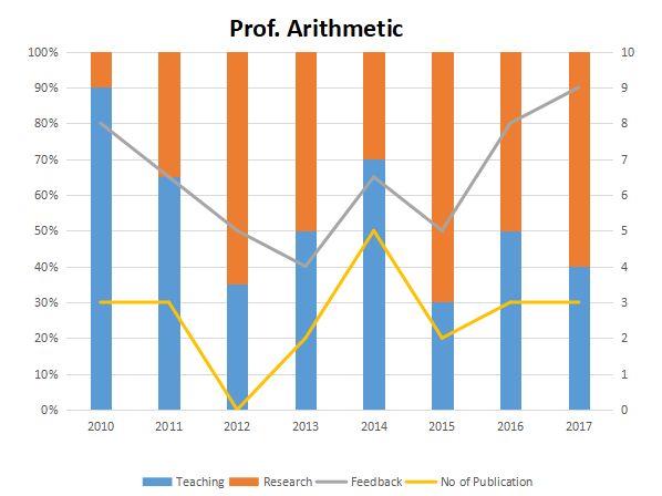
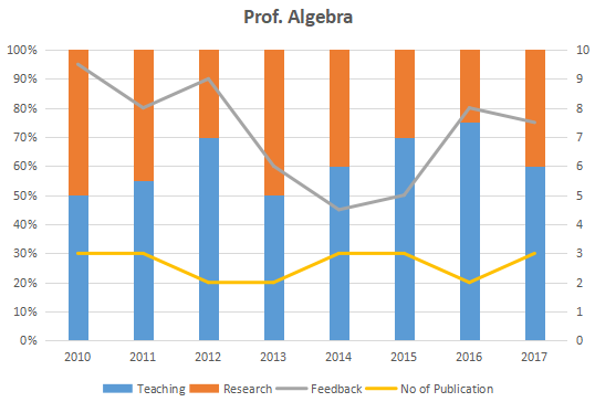
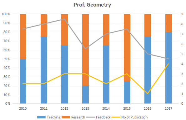
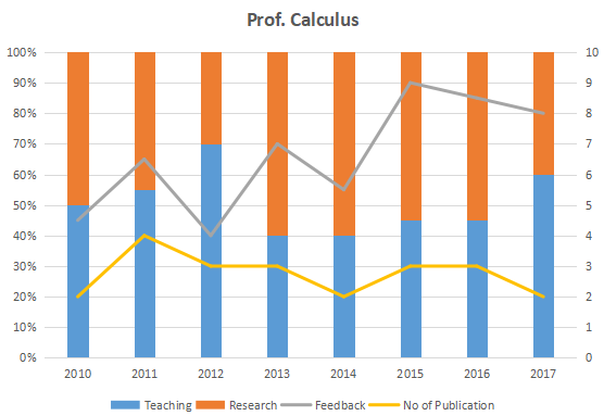
Question 23: Research efficiency is the ratio of cumulative number of publication for a period of 3 years to the cumulative number of hours spent on research activity in those 3 years. Which of the following professors is the least efficient researcher for the period 2015 to 2017?
a) Professor Artihmetic
b) Professor Algebra
c) Professor Geometry
d) Professor Calculus
e) Cannot be determined as research is expressed in percentage
23) Answer (A)
Solution:
Research efficiency = (total number of publications)/(total time spent in research)
Prof. Arithmetic: RE = (8) / [90*(0.7 + 0.5 + 0.6)] = 8 / (18 * 9)
Prof. Algebra: RE = (8) / [90*(0.3 + 0.4 + 0.25)] = 8 / (9.5 * 9)
Prof. Geometry: RE = (8) / [90*(0.75 + 0.25 + 2)] = 8 / (12 * 9)
Prof. Calculus: RE = (8) / [90*(0.55 + 0.55 + 0.4)] = 8 / (15 * 9)
Thus, we can observe that Prof. Arithmetic has the lowest efficiency.
Hence, option A is the answer.
Question 24: Count the number of instances in which “annual decreasing efforts in research” is accompanied with “annual increase in feedback”?
a) 5
b) 7
c) 9
d) 11
e) None of the above
24) Answer (C)
Solution:
Prof. Arithmetic: There are two such instances, during 2013-14 and 2015-16
Prof. Algebra: There are three such instances, during 2011-12, 2014-15 and 2015-16
Prof. Geometry: There are two such instances, during 2010-11 and 2013-14
Prof. Calculus: There are two such instances, during 2010-11 and 2014-15
Thus, there are 2+3+2+2 = 9 such instances.
Hence, option C is the answer.
Question 25: Which of the following, shows the maximum year to year percentage growth in feedback?
a) Professor Artihmetic during 2013-2014
b) Professor Algebra during 2015-2016
c) Professor Calculus during 2012-2013
d) Professor Calculus during 2014-2015
e) None of the above
25) Answer (C)
Solution:
Let the required percentage be P.
Option A: PA = (6.5 – 4) * 100/ 4 = 62.5%
Option B: PB = (8 – 5) * 100/ 5 = 60%
Option C: PC = (7 – 4) * 100/ 4 = 75%
Option D: PD = (9 – 5.5) * 100/ 5.5 = 63.63%
Thus, option C shows the maximum year-on-year growth and is the answer.
Instructions
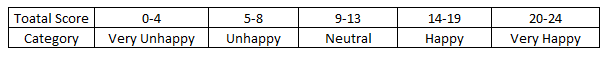
Simple Happiness index (SHI) of a country is computed on the basis of three, parameters: social support (S),freedom to life choices (F) and corruption perception (C). Each of these three parameters is measured on a scale of 0 to 8 (integers only). A country is then categorised based on the total score obtained by summing the scores of all the three parameters, as shown in the following table:
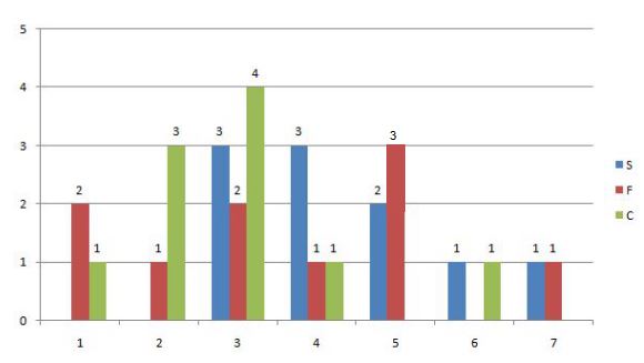
Following diagram depicts the frequency distribution of the scores in S, F and C of 10 countries – Amda, Benga, Calla, Delma, Eppa, Varsa, Wanna, Xanda,Yanga and Zooma:
Further, the following are known.
1. Amda and Calla jointly have the lowest total score, 7, with identical scores in all the three parameters.
2. Zooma has a total score of 17.
3. All the 3 countries, which are categorised as happy, have the highest score ln exactly one parameter.
Question 26: If Benga scores 16 and Delma scores 15, then what is the maximum number of countries with a score of 13?
a) 0
b) 1
c) 2
d) 3
26) Answer (B)
Solution:
S: 3,3,3,4,4,4,5,5,6,7
F: 1,1,2,3,3,4,5,5,5,7
C: 1,2,2,2,3,3,3,3,4,6
Given that Benga scores 16, and Delma scores 15.
The possibility is Benga: 5,5,6 and Delma: 7,5,3
If Benga’s distribution is 7,3,6 then Delma can’t score 15.
Strike off those numbers.
S: 3,3,3,4,4,4,5,5,6,7
F: 1,1,2,3,3,4,5,5,5,7
C: 1,2,2,2,3,3,3,3,4,6
We have to maximum number of countries with score 13. This score does not comes under the category of happy. So to score 13, the distribution can be 5,5,3. Hence, maximum 1 country is possible.
Question 27: Benga and Delma, two countries categorized as happy, are tied with the same total score. What is the
maximum score they can have?
a) 14
b) 15
c) 16
d) 17
27) Answer (B)
Solution:
S: 3,3,3,4,4,4,5,5,6,7
F: 1,1,2,3,3,4,5,5,5,7
C: 1,2,2,2,3,3,3,3,4,6
Benga and Delma, two countries categorized as happy, are tied with the same total score.
The best numbers remaining are 7,5,6 which adds upto 18, If Benga scores 18, then Delma can’t score 18.
Similarly both can’t score 17 and 16. Both can score 15 and their distribution will be:
Benga: 7,5,3
Delma: 4,5,6 or 5,4,6
Question 28: What is Zooma’s score in S?
28) Answer: 6
Solution:
The frequency distribution is:
S: 3,3,3,4,4,4,5,5,6,7
F: 1,1,2,3,3,4,5,5,5,7
C: 1,2,2,2,3,3,3,3,4,6
or
S: 3,3,3,4,4,4,5,5,6,7
F: 1,1,2,3,3,4,5,5,5,7
C: 1,2,2,2,3,3,3,3,4,6
Zooma(Z) has a total score of 17 (comes under happy category), and other 2 countries, which are categorized as happy, have the highest score in exactly one parameter.
Suppose the other two countries are P and Q
Z have two possibilities for S, F, C : (6,7,4) & (6,5,6)
All the other cases are negated because “All the 3 countries, which are categorised as happy, have the highest score ln exactly one parameter.”
For Example : 7,7,3 is not possible because 7 being the highest score is there in two parameters.
So, it scored 6 in S in both the cases.
Question 29: What is Amda’s score in F?
29) Answer: 1
Solution:
The frequency distribution is:
S: 3,3,3,4,4,4,5,5,6,7
F: 1,1,2,3,3,4,5,5,5,7
C: 1,2,2,2,3,3,3,3,4,6
or
S: 3,3,3,4,4,4,5,5,6,7
F: 1,1,2,3,3,4,5,5,5,7
C: 1,2,2,2,3,3,3,3,4,6
Given Amda and Cadella score is 7 each with identical in all parameters. So it can score either 3,1,3 in S,F,C respectively or 4,1,2 in S,F,C respectively. In both the cases, its score in F is 1.
Instructions
Exhibit I as under provides the data of India’s Merchandize Imports (Billion US Dollar) on left axis and Percentage of Food: Fuel, Manufactures and Ores & Metals lmports of India’s on the right axis. Similarly; Exhibit 2 provides data of India’s Merchandize Exports (Billion US Dollar) on left axis and Percentage exports of Food, Fuel, Manufactures and Ores & Metals on the right axis. Attempt the questions in the context of information provided as under:
A.Trade Balance = Import Minus Exports
b:Trade Deficit If Imports are more than Exports
c:TradeSurplus= If Exports are more than Imports
Exhibit 1: India’s Total Merchandize Imports (US Dollar in Billion) and Percentage Imports of Food, Fuel, Manufacturers and Ores and Metals (2012 – 2016)

Exhibit 2: India’s Total Merchandize Exports (US Dollar in
Billion) and Percentage Exports of Food, Fuel, Manufacturers and Ores
and Metals (2012 – 2016)

Question 30: Assuming India’s absolute trade deficit grows by 54 Billion USDollar and exports become 324 Billion US Dollar in the year 2017. What shall be India’s absolute imports of food and fuel in 2017 if sectoral composition of food, fuel, manufactures, ores and metals remain· same as that of 2016?
a) 36 Billion US Dollar & 119.S Billion USDollar
b) 38 Billion US Dollar & 117.5 Billion USDollar
c) 34 Billion US Dollar & 118.5 Billion US Dollar
d) 38 Billion US Dollar & 116.5 Billion US Dollar
30) Answer (A)
Solution:
Trade deficit = Import – Export
India’ trade deficit in 2016 = 350 – 250 = 100 (USD in billions)
India’ trade deficit in 2017 = 100+54 = 154 (USD in billions)
154 = Import – 324
Hence, import = 324+154 = 478 (USD in billions)
India food import percentage in 2017 = India food import percentage in 2016 = 7.5 (Given)
India food import percentage in 2017 = India food import percentage in 2016 = 25 (Given)
India’s food export in 2017 = 478*7.5/100 = 35.85 = 36(Approx) (USD in billion)
India’s fuel export in 2017 = 478*25/100 = 119.5 (USD in billion)
Question 31: Assuming India’s imports and exportS grow by 10% in 2017 and sectoral share of fuel in both importS andexports grow by 5 percentage basis, what shall be theapproximate deficit of fuel trade in the year 2017?
a) 88 Billion Fuel Trade Deficit
b) 74 Billion Fuel Trade Deficit
c) 85 Billion Fuel Trade Deficit
d) 78 Billion Fuel Trade Deficit
31) Answer (B)
Solution:
India’s import in 2017 = import in 2016*(1 + (10/100)) (Since growth rate is 10 percent)
= 350 * 1.1 = 385 (USD in billions)
India’s export in 2017 = export in 2016*(1 + (10/100)) (Since growth rate is 10 percent)
= 250*1.1 = 275 (USD in billions)
New sectoral share of fuel in imports = 25+5 =30 percent
New sectoral share of fuel in exports = 10+5 =15 percent
India’s fuel imports in 2017 = 385*30/100 = 115.5 (USD in billion)
India’s fuel exports in 2017 = 275*15/100 = 41.25 (USD in billion)
Trade deficit of fuel = Fuel import – fuel export = 115.5 – 41.25 = 74.25 (USD in billions)
Question 32: In which year, trade deficit of fuel has been the second lowest?
a) 2015
b) 2014
c) 2013
d) 2016
32) Answer (A)
Solution:
Trade deficit of fuel = import of the fuel – export of the fuel = total import * percentage of fuel import – total import * percentage of fuel export
For year 2013, trade deficit of fuel = (475*42)/100 – (350*25)/100 = 199.50 – 87.5 = 112 (US dollar in billions)
For year 2014, trade deficit of fuel = (450*40)/100 – (325*20)/100 = 180 – 65 =115 (US dollars in billions)
For year 2015, trade deficit of fuel = (375*30)/100 – (275*10)/100 = 112.50 – 27.5 = 85 (US dollars in billions)
For year 2016, trade deficit of fuel = (350*25)/100 – (250*10)/100 = 87.5 – 25 = 62.5 (US dollars in billions)
Trade deficit of fuel is 2nd lowest for year 2015.
Question 33: What is the proportion of positive and negative Manufactures trade balance in the period 2012-2016 ?
a) 3:2
b) 2:3
c) 1:4
d) None oftbeabove
33) Answer (B)
Solution:
Trade balance = Imports – Exports
For 2012:
Manufactures Trade balance = Manufactures import – manufactures export
= 500*(35/100) – 275*(65/100) = -3.75 (From Graph)
For 2013:
Manufactures Trade balance = 475*(40/100) – 350*(60/100) = -20
For 2014:
Manufactures Trade balance = 450*(45/100) – 325*(55/100) = 23.75
For 2015:
Manufactures Trade balance = 375*(50/100) – 275*(70/100) = -5
For 2016:
Manufactures Trade balance = 350*(55/100) – 250*(75/100) = 5
Number of positive trade balances = 2
Number of negative trade balances = 3
Proportion of positive and negative trade balances = 2:3
Question 34: What shall be approximate Manufactures exports of India in the year 2016 based on average exports for the period 2012-2016?
a) 221 Billion US Dollar
b) 209 Billion US Dollar
c) 239 Billion US Dollar
d) 236 Billion US Dollar
34) Answer (A)
Solution:
Average export for the period 2012-2016 = (Sum of all exports in 2012-2016)/5 = (275+350+325+275+250)/5 =295 (US dollar in billions)
Manufactures Export of India in 2016 = 75 percent of the exports (from graph) = (295*75)/100 = 221.25 (US dollar in billions)
Instructions
The following 2 bar charts represent revenues and expenses (in thousands) of A Ltd, B Ltd, and C Ltd over a period of five years.
Revenues of A Ltd, B Ltd, C Ltd for the period 2011-2015


Question 35: For which of the following years the percentage of rise/fall in profit from the previous year was the maximum for A Ltd?
a) 2012
b) 2013
c) 2014
d) 2015
35) Answer (B)
Solution:
Percentage rise or fall in profit of A for a given year from previous year = |((Profit of A for the given year – profit of A for the previous year)/(profit of A for the previous year))|*100
Profit of A for year 2011 = Revenue of A in 2011 – expense of A in 2011 = 120-105 (in thousands)
Profit of A for year 2012 = 165-185 = -20 (in thousands)
Profit of A for year 2013 = 135-100 = 35 (in thousands)
Profit of A for year 2014 = 180-120 = 60 (in thousands)
Profit of A for year 2015 = 150-110 = 40 (in thousands)
Percentage rise or fall in profit of A for year 2012 = |((profit of A for year 2012 – profit of A for year 2011)/(profit of A for year 2011))|*100
= |((-20-15)/15)|*100 = 233.33
Similarly,
for year 2013, Percentage rise or fall in profit of A = |((35- (-20) )/-20)|*100 = 275
for year 2014, Percentage rise or fall in profit of A = |((60-35)/35)|*100 = 71.43
for year 2015, Percentage rise or fall in profit of A = |((40-60)/60)|*100 = 33.33
Here, rise in profit of A for the year 2013 is highest.
=
Question 36: What was the approximate absolute difference between the average revenue of A Ltd in 2011, 2012 and 2013 and the average revenue of B Ltd in 2013, 2014 and 2015?
a) 20
b) 160
c) 20000
d) 26000
36) Answer (C)
Solution:
Average revenue of A in 2011, 2012 and 2013 = (Sum of revenues of A in 2011,2012 and 2013)/3 = (120000+165000+135000)/3 (Since values given are in thousands)
= 140000
Average revenue of B in 2013, 2014 and 2015 = (Sum of revenues of B in 2013,2014 and 2015)/3 = (165000+150000+165000)/3 =160000
Absolute difference = 160000-140000 = 20000
Question 37: What was the approximate percentage decline in the revenue of C Ltd in 2015 as compared to the revenue in 2012?
a) 16
b) 25
c) 33
d) 40
37) Answer (C)
Solution:
Revenue of C in 2012 = 180,000
Revenue of C in 2015 = 120,000
Decline in revenue = 180,000-120,000 = 60,000
Percentage decline in revenue = (Decline in revenue/Revenue of C in 2012)*100 = (60,000/180,000)*100 = 33.33
Question 38: For which year, the average annual revenue (considering all three companies) was the maximum?
a) 2011
b) 2012
c) 2013
d) 2014
38) Answer (B)
Solution:
Average annual revenue = Sum of annual revenue of A,B and C for the given year/3 (Here 3 is the total number of companies)
Average revenue for year 2011(in thousands) = (120+180+150)/3 = 450/3
Average revenue for year 2012(in thousands) = (165+150+180)/3 = 495/3
Average revenue for year 2013(in thousands) = (135+165+180)/3 = 480/3
Average revenue for year 2014(in thousands) = (180+150+135)/3 = 465/3
Here, Average annual revenue for 2012 is the highest.
Question 39: For which company, the average annual expenses were maximum in the given period?
a) A Ltd
b) B Ltd
c) C Ltd
d) Both A Ltd and B Ltd
39) Answer (C)
Solution:
Average annual expense for A(in thousands) = Sum of all annual expenses for A(in thousands)/Total no of years = (105+185+100+120+110)/100 = 620/5
Similarly,
Average annual expense for B(in thousands) = (135+115+130+125+135)/5 = 640/5
Average annual expense for C(in thousands) = (165+155+190+100+100)/5 = 710/5
C has the highest average expense for given period.
Instructions
T-Nation, a T-shirt manufacturing company has unleashed 5-5-5 strategy, five brands (Ultimate Supreme, Smash, Paramount, Astute), five sizes, (S, M, L, XL, XXL), and five Stores (S1, S2, S3, S4, S5) to capture New Delhi market. Number of T-Shirts in each of the store is given in the stacked bar chart below.

Note: Visibility of a brand in a store is given by number of T-Shirts of the brand in the store by total number of T-Shirts in the store. Visibility across the stores is measured by sum of the scores of visibility of a brand in a store.
Question 40: Approximately, by what percentage are Smash T-shirts greater than Ultimate T-shirts in all the stores together?
a) 79
b) 50
c) 35
d) 23
40) Answer (D)
Solution:
Number of Smash T shirts in all stores = 85 +137+30+60+108 = 420
Number of Ultimate T shirts in all stores = 57+84+30+48+122 = 341
Required percentage = 81*100/341 = 23
Question 41: What is the approximate share of Supreme brand in all stores together?
a) 19
b) 22
c) 18
d) 20
41) Answer (B)
Solution:
Total number of T shirts in all stores = 450+480+440+280+350 = 2000
Number of T shirts of supreme brand in all stores = 128+55+79+111+65 = 438
Percentage share = 438*100/2000= 22 (Approx)
Question 42: Suppose, size M constitutes 22% of all the T-Shirts owned by T-nation. It is also given that ‘size M T-shirt’ in stores 1, 2 and 5 are 10% of the total T-shirts in these stores. Then, the total number of T-Shirts of size M in store 4 cannot be less than
a) 23
b) 28
c) 32
d) 44
42) Answer (A)
Solution:
Total number of T shirts in all stores = 450+480+440+280+350 = 2000
Number of T shirts of size M = 2000*22/100 = 440
Total no of T shirts in store 1 = 111+69+85+128+57 = 450
Total no of T shirts in store 2 = 48+116+137+55+84 = 440
Total no of T shirts in store 5 = 80+105+108+65+122 = 480
Number of T shirts of size M in store 1,2 and 5 = (450+440+480)*10/100 = 137
T shirts of size M in store 3 and 4 = 440 -137 = 303
The number of T shirts of size M will be minimum in store 4 if the number of T shirts of size M will be maximum in store 3.
The number of T shirts of size M in store 3 = 280 (if all T shirts in store 3 are size M)
The number of T shirts of size M in store 4 = 303-280 = 23
Question 43: Which brand has lowest visibility score in any of the stores?
a) Astute
b) Smash
c) Paramount
d) Ultimate
43) Answer (A)
Solution:
Visibility of a brand in a store = Total number of T shirts of the brand/Total no of T shirts in the store
Visibility across the stores = Sum of the scores of visibility of a brand in a store
Total no of T shirts in store 1 = 111+69+85+128+57 = 450
Total no of T shirts in store 2 = 48+116+137+55+84 = 440
Total no of T shirts in store 3 =91+50+30+79+30 = 280
Total no of T shirts in store 4 = 30+101+60+111+48 = 350
Total no of T shirts in store 5 = 80+105+108+65+122 = 480
Visibility of Astute in
store 1 = (111/450) , store 2 = (48/440) = 0.1091, store 3 = (91/280), store 4 = (30/350) = 0.0857, store 5 = (80/480)
Visibility of Supreme in
store 1 = (128/450), store 2 = (55/440), store 3 = (79/280), store 4 = (111/350), store 5 = (65/480) = 0.1354
Visibility of Paramount in
store 1=(69/450), store 2= (116/440), store 3 = (50/280), store 4 =(101/350), store 5 = (105/480)
Visibility of Smash in
Store 1 = (85/450) store 2 = (137/440), store 3 = (30/280)0.1071 , store 4 = (60/350), store 5 = (108/480)
Visibility of Ultimate in
Store 1 = (57/450)=0.1267 store 2 = (84/440), store 3 = (30/280), store 4 = (48/350), store 5 =(122/480)
In store 1,Ultimate has lowest visibility.
In store 2, Astute has lowest visibility.
Comparing lowest visibility from each store, visibility of Astute in store 4 is the lowest.
Question 44: Which brand of T-Shirt has more visibility across the stores?
a) Astute
b) Supreme
c) Paramount
d) Smash
44) Answer (B)
Solution:
Visibility of a brand in a store = Total number of T shirts of the brand/Total no of T shirts in the store
Visibility across the stores = Sum of the scores of visibility of a brand in a store
Total no of T shirts in store 1 = 111+69+85+128+57 = 450
Total no of T shirts in store 2 = 48+116+137+55+84 = 440
Total no of T shirts in store 3 =91+50+30+79+30 = 280
Total no of T shirts in store 4 = 30+101+60+111+48 = 350
Total no of T shirts in store 5 = 80+105+108+65+122 = 480
Visibility of Astute across stores = (111/450) + (48/440) + (91/280) + (30/350) + (80/480) = 0.933
Visibility of Supreme across stores = (128/450) + (55/440) + (79/280) + (111/350) + (65/480) = 1.144
Visibility of Paramount across stores = (69/450) + (116/440) + (50/280) + (101/350) + (105/480) = 1.1
Visibility of Smash across stores = (85/450) + (137/440) + (30/280) + (60/350) + (108/480) = 1.06
Supreme has highest visibility across stores.
Instructions
Answer the questions based on the following two graphs, assuming that there is no fixed cost component and all the units produced are sold in the same year.
Year wise graph of price of a unit

Year wise graph of revenue and total profit.
Question 45: If the price per unit decreases by 20% during 2000-2004 and cost per unit increases by 20% during 2005-2010, then the cumulative profit for the entire period 2000-2010 decreases by:
a) Rs. 1650
b) Rs. 1550
c) Rs. 1300
d) Rs. 1250
45) Answer (B)
Solution:
Let’s calculate No of Units as Revenue / Unit price.
Per Unit cost as (Revenue – Profit ) / No of Units.
Costs Incurred = Revenue – Profit
In that way, we calculate the table as follows.
Profit before the changes=1700
Profit after the changes= 150
Cumulative change in the profit = 1550
Hence B is the correct answer.
Question 46: If the price per unit decreases by 20% during 2000-2004 and cost per unit increases by 20% during 2005-2010, then during how many number of years there is loss?
a) 3 years
b) 4 years
c) 5 years
d) 7 years
46) Answer (C)
Solution:
Let’s calculate No of Units as Revenue / Unit price.
Per Unit cost as (Revenue – Profit ) / No of Units.
Costs Incurred = Revenue – Profit
If there is a percent 20 % increase in the cost price for year 2005-10 and the 20% decrease in price during 2000-2004.
In that way, we calculate the table as follows.
The company will incur a loss if unit price is lesser than unit cost price.
Thus for 2000, 2001, 2003, 2004 and 2008 there will be net loss. For 5 years there was a loss.
Hence C is the correct answer.
Question 47: If volatility of a variable during 2000-2010 is defined as $\frac{Maximum Value – Minimum Value}{Average Value}$, then which of the following is TRUE ?
a) Price per unit has highest volatility
b) Cost per unit has highest volatility
c) Total profit has highest volatility
d) Revenue has highest volatility
47) Answer (C)
Solution:
Let’s calculate No of Units as Revenue / Unit price.
Per Unit cost as (Revenue – Profit ) / No of Units.
In that way, we calculate the table as follows.

Let’s solve the options one by one,
Option A : Volatility for price per unit : 14-8/11.45 = 0.524
Option B :Volatility for Cost per unit : 13-5/8.91 = 0.898
Option C:Volatility for Total profit : 400-0/154.54 = 2.588
Option D:Volatility for Revenue = 1400-200/809.1 = 1.48
Among the above values ,volatility for total profit is the highest .
Hence C is the correct answer.
Question 48: What is the approximate average quantity sold during the period 2000-2010?
a) 64 units
b) 70 units
c) 77 units
d) 81 units
48) Answer (B)
Solution:
Let’s calculate No of Units as Revenue / Unit price.
Per Unit cost as (Revenue – Profit ) / No of Units.
In that way, we calculate the table as follows.
Average quantity sold =Sum of the quantities sold / No of years.
=70+100+100+75+100+50+20+50+60+80+60/11
=69.5
=Approx 70
Hence B is the correct answer.
Question 49: In which year per unit cost is HIGHEST?
a) 2002
b) 2001
c) 2005
d) 2007
49) Answer (B)
Solution:
Let’s calculate No of Units as Revenue / Unit price.
Per Unit cost as (Revenue – Profit ) / No of Units.
In that way, we calculate the table as follows.
It is clear from the table per unit cost in the year 2001 is the highest.
Hence B is the correct answer.
Question 50: The total volume of soaps sold is 680 lakhs units. The volume of Lux sold is 136 lakh units. If the percentage of Lifebuoy sold is 30%, Camay 10%, Liril 15% and Mysore Sandal 10%, answer the following questions.
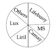
What is the market share of others in percentage points?
a) 15
b) 13.5
c) 16.8
d) 16
50) Answer (A)
Solution:
Given, Total volume of soaps sold = 680 lakh units.
Volume of Lux sold = 136 lakh units.
$\Rightarrow$ Percentage of Lux sold = $\frac{136}{680}\times 100$ = 20%
Also given,
percentage of Lifebuoy sold is 30%,
percentage of Camay 10%,
percentage of Liril 15% and
percentage of Mysore Sandal 10%
From the pie chart
The percentage of Lux + Lifeboy + Camay + Liril + Mysore Sandal + Others sold = 100%
$\Rightarrow$ The market share of others = 100 – 20 – 30 – 10 – 15 – 10 = 15%


